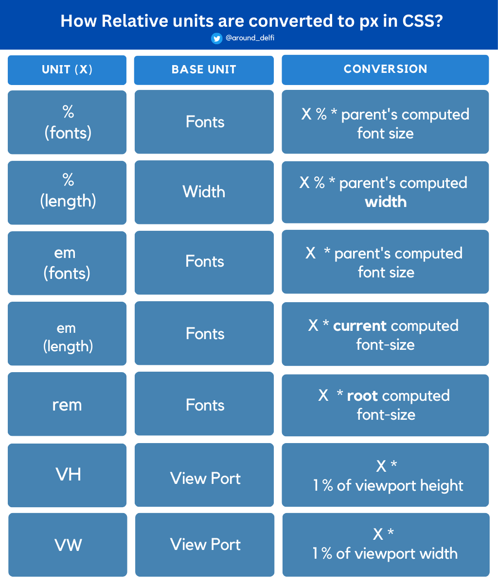
em
Element's font size
Relative to parent font size
swap_horiz
1em = parent element's font-size
rem
Root em
Relative to root font size
swap_horiz
1rem = root element's font-size
%
Percentage
Relative to parent element
swap_horiz
100% = same size as parent
vh
Viewport height
Relative to viewport height
swap_horiz
1vh = 1% of viewport height
vw
Viewport width
Relative to viewport width
swap_horiz
1vw = 1% of viewport width
vmin/vmax
Viewport min/max
Relative to smaller/larger dimension
swap_horiz
1vmin = 1% of smaller viewport dimension
lightbulb
Key Benefits
Relative units create more flexible, responsive layouts that adapt to different screen sizes and user preferences. They're essential for modern web design and accessibility.
tips_and_updates Best Practices
check_circle
Use rem for font sizes and spacing
check_circle
Use em for components that should scale with font size
check_circle
Use vh/vw for full-screen elements
check_circle
Use % for responsive grid layouts