Overview
Infographic
Slides and video
Through this presentation, these slides, and this video, you’ll get familiar with the key contents of this unit.
Introduction
When styling links, it is important to understand how to make use of pseudo-classes to style link states effectively, and how to style links for use in common varied interface features such as navigation menus and tabs. We’ll look at all these topics in this unit.
Let’s look at some links
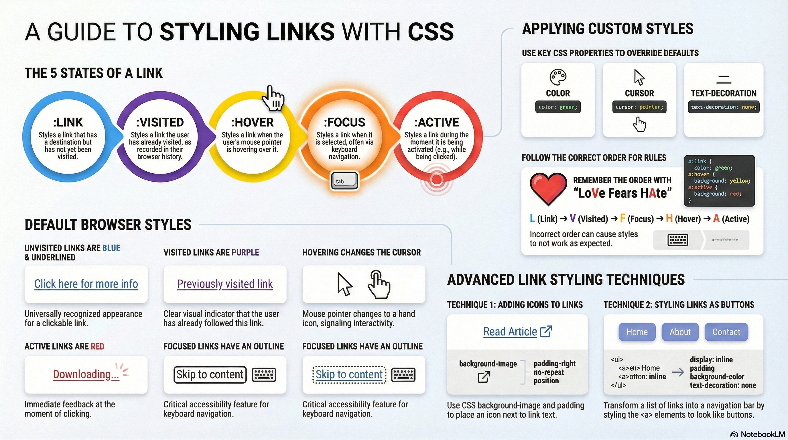
The first thing to understand is the concept of link states (different states that links can exist in, which can be styled using different pseudo-classes):
- Link: A link which has a destination (i.e. not just a named anchor), styled using the :link pseudo class.
- Visited: A link when it has already been visited (exists in the browser’s history), styled using the :visited pseudo class.
- Hover: A link when it is being hovered over by a user’s mouse pointer, styled using the :hover pseudo class.
- Focus: A link when it has been focused (for example moved to by a keyboard user using the
Tabkey or similar, or programmatically focused using HTMLElement.focus()). This is styled using the :focus pseudo class. - Active: A link when it is being activated (e.g. clicked on), styled using the :active pseudo class.
Default styles
The following example illustrates what a link will behave like by default (the CSS is simply enlarging and centering the text to make it stand out more):
/* Sets the paragraph font size to 2rem and centers the text */
p {
  font-size: 2rem;
  text-align: center;
}
<p><a href="https://fernandoruizrico.com" target="_blank">A simple link</a></p>
You’ll notice a few things as you explore the default styles:
- Links are underlined.
- Unvisited links are blue.
- Visited links are purple.
- Hovering a link makes the mouse pointer change to a little hand icon.
- Focused links have an outline around them. You should be able to focus on the links with the keyboard by pressing the tab key (On Mac, you’ll need to use option + tab, or enable the Full Keyboard Access option by pressing Ctrl + F7).
- Active links are red. You can try this feature by holding down the mouse button on the link as you click it.
Proposed exercise: Larger and centered links
Create a web page with at least 5 paragraphs, each one with a different link to any sites you like. You also have to style your page so that the links are double the size of the rest of the text, and they are aligned in the center of the window, as done in the example above.
You are not just limited to the above properties to style your links, you are free to use any properties you like.
Styling some links
Interestingly enough, the default styles used for the links are nearly the same as they were back in the early days of browsers in the mid-1990s. This is because users know and have come to expect this behaviour (if links were styled differently, it would confuse a lot of people). This doesn’t mean that you shouldn’t style links at all, just that you should not stray too far from the expected behaviour. You should at least:
- Use underlining for links, but not for other things. If you don’t want to underline links, at least highlight them in some other way.
- Make them react in some way when hovered/focused, and in a slightly different way when activated.
The default styles can be turned off/changed using the following CSS properties:
- color for the text color.
- cursor for the mouse pointer style, although you shouldn’t turn this off unless you’ve got a very good reason.
- outline for the text outline (an outline is similar to a border, the only difference being that border takes up space in the box and an outline doesn’t; it just sits over the top of the background). The outline is a useful accessibility aid, so think carefully before turning it off; you should at least double up the styles given to the link hover state on the focus state too.
Now that we’ve looked at the default states in some detail, let’s look at a typical set of link styles. To start off with, we’ll write out our empty rulesets:
/* Unvisited links */
a:link {
}

/* Previously visited links */
a:visited {
}

/* Selected via keyboard (e.g., Tab key) */
a:focus {
}

/* Mouse cursor is over the link */
a:hover {
}

/* Being clicked (mouse button held down) */
a:active {
}
This order is important because the link styles build on one another, for example the styles in the first rule will apply to all the subsequent ones, and when a link is being activated, it is usually also being hovered over. If you put these in the wrong order, and you’re changing the same properties in each ruleset, things won’t work as you expect. To remember the order, you could try using a mnemonic like LoVe Fears HAte.
Now let’s add some more information to get this styled properly:
/* Sets the paragraph font size to 2rem and centers the text */
p {
  font-size: 2rem;
  text-align: center;
}

/* Sets the text color for unvisited links to green */
a:link {
  color: green;
}

/* Sets the text color for links that have already been visited to olive */
a:visited {
  color: olive;
}

/* Sets the background color to orange when the link is focused (keyboard selection) */
a:focus {
  background-color: orange;
}

/* Changes background to yellow and adds a red wavy underline on hover */
a:hover {
  background-color: yellow;
  text-decoration: underline red wavy;
}

/* Changes background to red while the link is actively being clicked */
a:active {
  background-color: red;
}
We’ll also provide some sample HTML to apply the CSS to:
<p>There are several browsers available, such as:</p>

<p><a href="https://www.mozilla.org/en-US/firefox/new/" target="_blank">Mozilla Firefox</a></p>
<p><a href="https://www.google.com/chrome/" target="_blank">Google Chrome</a></p>
<p><a href="https://www.apple.com/safari/" target="_blank">Apple Safari</a></p>
Putting the two together gives us this result:
Proposed exercise: Styling colors and text decoration
Create a new web page with at least 5 links pointing to your preferred websites. You must change the default colors and decorations so that each possible state (link, visited, focus, hover, active) has other color than the default one, and also another decoration, as done in the example above, where the “underline red wavy” text decoration is used.
As you have seen, you can change the color of the text using thecolorproperty, and the background color using thebackgroundproperty. Also remember you can have a look at the different colors here: https://developer.mozilla.org/en-US/docs/Web/CSS/color_value. About the text decoration, remember it can be easily changed with the text-decoration property.
Including icons on links
Some developers include icons on links to provide more of an indicator as to what kind of content the link points to. Let’s look at a really simple example that adds an icon to external links (links that lead to other sites). Such an icon usually looks like a little arrow pointing out of a box.
For this example, we will use the same HTML as before:
<p>There are several browsers available, such as:</p>

<p><a href="https://www.mozilla.org/en-US/firefox/new/" target="_blank">Mozilla Firefox</a></p>
<p><a href="https://www.google.com/chrome/" target="_blank">Google Chrome</a></p>
<p><a href="https://www.apple.com/safari/" target="_blank">Apple Safari</a></p>
And we will adjust the CSS code:
p {
  /* Sets the font size to 2rem (relative to the root HTML element size) */
  font-size: 2rem;

  /* Horizontally centers the text within the paragraph container */
  text-align: center;
}

a {
  /* Sets the source URL for the external link icon */
  background-image: url('https://api.iconify.design/mdi:external-link.svg');

  /* Prevents the icon from tiling or repeating */
  background-repeat: no-repeat;

  /* Positions the icon at the far right*/
  background-position: right;

  /* Sets the dimensions of the background icon */
  background-size: 2rem;

  /* Adds some space to the right so the text does not overlap the icon */
  padding-right: 2.5rem;
}
Or even better, you may use the equivalent shorter version:
/* Sets the paragraph font size to 2rem and centers the text */
p {
  font-size: 2rem;
  text-align: center;
}

a {
  /* Defines the image, stops repetition, and aligns it to right */
  background: url('https://api.iconify.design/mdi:external-link.svg') no-repeat right;

  /* Sets the dimensions of the background icon */
  background-size: 2rem;

  /* Adds internal spacing to the right to keep the text from covering the icon */
  padding-right: 2.5rem;
}
The previous two CSS rules gives us this result on our HTML code:
So what’s going on here? We’ll skip the CSS related to the paragraphs, as it’s just the same information you’ve looked at before. The last rule however is interesting: here we are inserting a custom background image on external links using background shorthand instead of the individual properties. We set the path to the image we want to insert and specify no-repeat to ensure only one copy appears. Then, we position it all the way to the right.
We also use background-size to specify the size we want the background image to be shown at. So that you get a good result, it is useful to have a larger icon and then resize it like this as needed for responsive web design purposes.
Finally, we set some padding-right on the links to make space for the background image to appear in, so we aren’t overlapping it with the text.
Where to find more icons
Iconify is a massive library that hosts almost every popular icon set (Google Material, FontAwesome, etc.) on their servers. They provide a public address (API) that allows you to request an icon just by typing its name in the URL. To create a link, you only need one URL structure:
https://api.iconify.design/+ [ICON_ID] +.svg
Find your Icon ID & create the link
- Go to the official search engine: icon-sets.iconify.design
- Type a keyword (e.g., “link”, “site”, “web”, etc.) in the search box located at the top right corner and press the search button.
- Click on an icon you like.
- Look for the “Icon name” (displayed clearly at the bottom of the page). For example, if you search for “link” and choose a Material Design icon, the code is
mdi:external-link. - Take that code and paste it into the formula:
- Icon name:
mdi:external-link - Icon URL:
https://api.iconify.design/mdi:external-link.svg
- Icon name:
Customize the color (Optional)
This is the best part. You can change the color directly in the link by adding ?color=... at the end:
- Using color name, for example “red”:
https://api.iconify.design/mdi:external-link.svg?color=red - Using Hex Code, for example #00FF00 (green):
https://api.iconify.design/mdi:external-link.svg?color=%2300FF00(Note: In URLs, use%23instead of#)
Proposed exercise: Links with icons
Create a new web page with at least 5 links pointing to your preferred websites (you can use the code you wrote before) and include an icon at the end of each one. Also change some other styles as the text color or text decoration, and also the color of the icons.
Note: You may use any icon you like from https://icon-sets.iconify.design/ as explained before.
Styling links as buttons
The tools you’ve explored so far in this article can also be used in other ways. For example, states like hover can be used to style many different elements, not just links — you might want to style the hover state of paragraphs, list items, or other things.
In addition, links are quite commonly styled to look and behave like buttons in certain circumstances — a website navigation menu is usually marked up as a list containing links, and this can be easily styled to look like a set of control buttons or tabs that provide the user with access to other parts of the site. Let’s explore how.
First, some HTML:
<ul class="navbar">
  <li><a href="https://en.wikipedia.org/wiki/CSS">Wikipedia</a></li>
  <li><a href="https://css-tricks.com/">CSS Tricks</a></li>
  <li><a href="https://www.w3schools.com/css/">W3Schools</a></li>
  <li><a href="https://marksheet.io/css-basics.html">Marksheet</a></li>
</ul>
And now our CSS:
/* General class for navigation bar */
.navbar {
  font-size: 1.25rem;
  font-family: sans-serif;
  text-align: center;
  background: yellow;
}

/* Select only the list items (li) inside the navigation bar */
ul.navbar li {
  display: inline;
}

/* Select only the links (a) inside the navigation bar */
ul.navbar a {
  text-decoration: none;
  display: inline-block;
  padding: 1rem;
}

/* Select only the links inside the navigation bar when mouse over them (a:hover) */
ul.navbar a:hover {
  background: orange;
}

/* Select only the links inside the navigation bar when mouse pressing (a:active) */
ul.navbar a:active {
  color: white;
  background: red;
}
This gives us the following result:
Let’s explain what’s going on here, focusing on the most interesting parts:
- Creating a new class for the list:
- We have created the
navbarclass so that only the items inside that class have the style of a navigation bar. ul.navbar: By putting this before any selector, the CSS properties between braces will apply only to the items inside an unordered list with classnavbar.
- We have created the
- The styles related to the
<ul>element:- We change the font-size to enlarge the text a little bit.
- We change the font-family so that it is different from the rest of the text.
- We change the text-align so that the links are centered .
- We change the background to yellow color.
<li>elements will normally behave like block elements (they sit on their own lines). In this case, we want to create a horizontal list of links, so we set the display property to inline, which causes the list items to sit on the same line one after the other (they now behave like inline elements).
- The styles related to the
<a>elements:- We start by turning off the default text-decoration (we don’t want those spoiling our look).
- Next, we set the display to
inline-block(this will allow to size them, as we will explain in another unit).
- We set the padding to 1rem to give the buttons some space around the text (we will also explain this in another unit).
- We also change the color of the items when the mouse is over them, and when they are being pressed.
Proposed exercise: Navigation bar and links with icons
Create a web page with a navigation bar of your own style. You can change any properties you like (colors, text decoration, font size, font family, etc.). After that, just below insert some other links you like. You can also try to use some other CSS rules to style these links, as shown below:
Quiz
Test your skills with this quiz about styling links.