This project is a simple web application designed to calculate the average grade for eight modules in the course “Technician in Microcomputer Systems and Networks.” Below, each file will be explained and we will see how they are linked together.
File “index.html”
This is the backbone of the application. It defines the content and layout of the web page.
Page header:
Sets the title as “Average Grade Calculator.”
Links the CSS (style.css) for styling and JavaScript (script.js) for interactivity.
Main content:
A table lists eight modules, each with a grade and two buttons (- and +) to decrease or increase the grade.
An average grade is calculated and displayed at the bottom of the table.
Key elements:
Each grade cell has a unique ID (module1, module2, …, module8) to identify it.
Buttons use onclick attributes to trigger JavaScript functions (increaseGrade and decreaseGrade).
<!DOCTYPE html>
<html lang="en">

<head>
  <!-- Define the character encoding for the document -->
  <meta charset="UTF-8">
  <!-- Set the viewport to ensure the page is mobile-friendly -->
  <meta name="viewport" content="width=device-width, initial-scale=1.0">
  <!-- Link to an external stylesheet -->
  <link rel="stylesheet" href="style.css">
  <!-- Page title -->
  <title>Average Grade Calculator</title>
</head>

<body>
  <!-- Main heading of the page -->
  <h1>Technician in Microcomputer Systems and Networks - Grade calculator</h1>

  <!-- Table to display modules, grades, and actions -->
  <table>
    <!-- Table header -->
    <thead>
      <tr>
        <th>Module</th>
        <th>Grade</th>
        <th>Actions</th>
      </tr>
    </thead>
    <!-- Table body -->
    <tbody>
      <!-- Each row corresponds to a module -->
      <tr>
        <td>Assembly and Maintenance of Computers</td>
        <td id="module1">0</td>
        <td>
          <!-- Buttons to decrease and increase the grade -->
          <button onclick="decreaseGrade('module1')">-</button>
          <button onclick="increaseGrade('module1')">+</button>
        </td>
      </tr>
      <tr>
        <td>Single-user Operating Systems</td>
        <td id="module2">0</td>
        <td>
          <button onclick="decreaseGrade('module2')">-</button>
          <button onclick="increaseGrade('module2')">+</button>
        </td>
      </tr>
      <tr>
        <td>Office Automation Applications</td>
        <td id="module3">0</td>
        <td>
          <button onclick="decreaseGrade('module3')">-</button>
          <button onclick="increaseGrade('module3')">+</button>
        </td>
      </tr>
      <tr>
        <td>Network Operating Systems</td>
        <td id="module4">0</td>
        <td>
          <button onclick="decreaseGrade('module4')">-</button>
          <button onclick="increaseGrade('module4')">+</button>
        </td>
      </tr>
      <tr>
        <td>Local Networks</td>
        <td id="module5">0</td>
        <td>
          <button onclick="decreaseGrade('module5')">-</button>
          <button onclick="increaseGrade('module5')">+</button>
        </td>
      </tr>
      <tr>
        <td>Computer Safety</td>
        <td id="module6">0</td>
        <td>
          <button onclick="decreaseGrade('module6')">-</button>
          <button onclick="increaseGrade('module6')">+</button>
        </td>
      </tr>
      <tr>
        <td>Network Services</td>
        <td id="module7">0</td>
        <td>
          <button onclick="decreaseGrade('module7')">-</button>
          <button onclick="increaseGrade('module7')">+</button>
        </td>
      </tr>
      <tr>
        <td>Web Applications</td>
        <td id="module8">0</td>
        <td>
          <button onclick="decreaseGrade('module8')">-</button>
          <button onclick="increaseGrade('module8')">+</button>
        </td>
      </tr>
    </tbody>
    <!-- Table footer to display the average grade -->
    <tfoot>
      <tr>
        <td>Average</td>
        <td id="result" colspan="2">0</td>
      </tr>
    </tfoot>
  </table>

  <!-- Link to the JavaScript file for functionality -->
  <script src="script.js"></script>
</body>

</html>
File “script.js”
This JavaScript file contains the logic for updating the grades and calculating the average.
Global variable:
sum: Tracks the total sum of all grades.
Functions:
increaseGrade(moduleId):
Checks if the grade is less than 10.
Increases the grade by 1 and updates the total sum.
Recalculates the average by calling calculateAverage.
decreaseGrade(moduleId):
Checks if the grade is greater than 0.
Decreases the grade by 1 and updates the total sum.
Recalculates the average.
calculateAverage():
Divides the total sum by the number of modules (8).
Displays the result in the table footer with two decimal places.
// Variable to store the total sum of grades
let sum = 0;

/**
 * Increases the grade for the given module if it's less than 10.
 * Updates the total sum and recalculates the average.
 */
function increaseGrade(moduleId) {
    // Get the current grade for the module and check if it's below 10
    if (document.getElementById(moduleId).innerText < 10) {
        // Increment the grade for the module
        document.getElementById(moduleId).innerText++;
        // Increment the total sum
        sum++;
        // Recalculate and update the average
        calculateAverage();
    }
}

/**
 * Decreases the grade for the given module if it's greater than 0.
 * Updates the total sum and recalculates the average.
 */
function decreaseGrade(moduleId) {
    // Get the current grade for the module and check if it's above 0
    if (document.getElementById(moduleId).innerText > 0) {
        // Decrement the grade for the module
        document.getElementById(moduleId).innerText--;
        // Decrement the total sum
        sum--;
        // Recalculate and update the average
        calculateAverage();
    }
}

/**
 * Calculates and updates the average grade.
 * Assumes there are 8 modules.
 */
function calculateAverage() {
    // Calculate the average and display it with 2 decimal places
    document.getElementById('result').innerText = (sum / 8).toFixed(2);
}
File “style.css”
This file styles the HTML elements to make the interface visually appealing.
Body styling:
Sets a clean sans-serif font for readability.
Table styling:
Makes the table full-width and centers its content.
Adds borders around cells for clarity.
Header rows (<thead>) have a dark green background with bold, white text for contrast.
Buttons:
Styled with a green background, rounded corners, and hover effects to darken the color.
/* Global font settings: use a sans-serif font for the entire page */
body {
    font-family: Arial, sans-serif; /* Set a clean sans-serif font */
}

/* Basic styles for the table */
table {
    width: 100%; /* Make the table take up the full width of the window */
    border-collapse: collapse; /* Remove spacing between table cells */
    text-align: center; /* Center align text within table cells */
}

/* Add a border to table headers and cells */
th, td {
    border: 1px solid black; /* Solid black border around cells */
}

/* Table header styles */
thead th {
    background-color: #006b5f; /* Set a dark green background color */
    color: #ffffff; /* Use white text for contrast */
    font-weight: bold; /* Make text bold */
    padding: 15px; /* Add padding for better spacing */
}

/* Table cell styles */
td {
    padding: 12px; /* Add padding inside cells for better readability */
    vertical-align: middle; /* Vertically center align cell content */
    text-align: center; /* Default horizontal alignment is centered */
}

/* Align the text in the first column to the left */
td:first-child {
    text-align: left; /* Left-align only the first cell in each row */
}

/* Button styles */
button {
    background-color: #009879; /* Use a soft green background */
    color: white; /* Set white text for contrast */
    border: none; /* Remove the default border */
    padding: 5px 10px; /* Add padding inside the button */
    cursor: pointer; /* Show a pointer cursor on hover */
    border-radius: 5px; /* Add rounded corners */
}

/* Change button appearance when hovered */
button:hover {
    background-color: #007a63; /* Darken the button background on hover */
}
How the files work together
Initial page load:
The grades are set to 0.
The average is displayed as 0.
User interaction:
Clicking + increases the grade of the selected module (up to 10).
Clicking - decreases the grade (down to 0).
Real-time update:
The JavaScript functions dynamically adjust the grades and calculate the new average without refreshing the page.
The result
You can click here to see how this average grade calculator works.
Through this presentation, these slides, and this video, you’ll get familiar with the key contents of this unit.
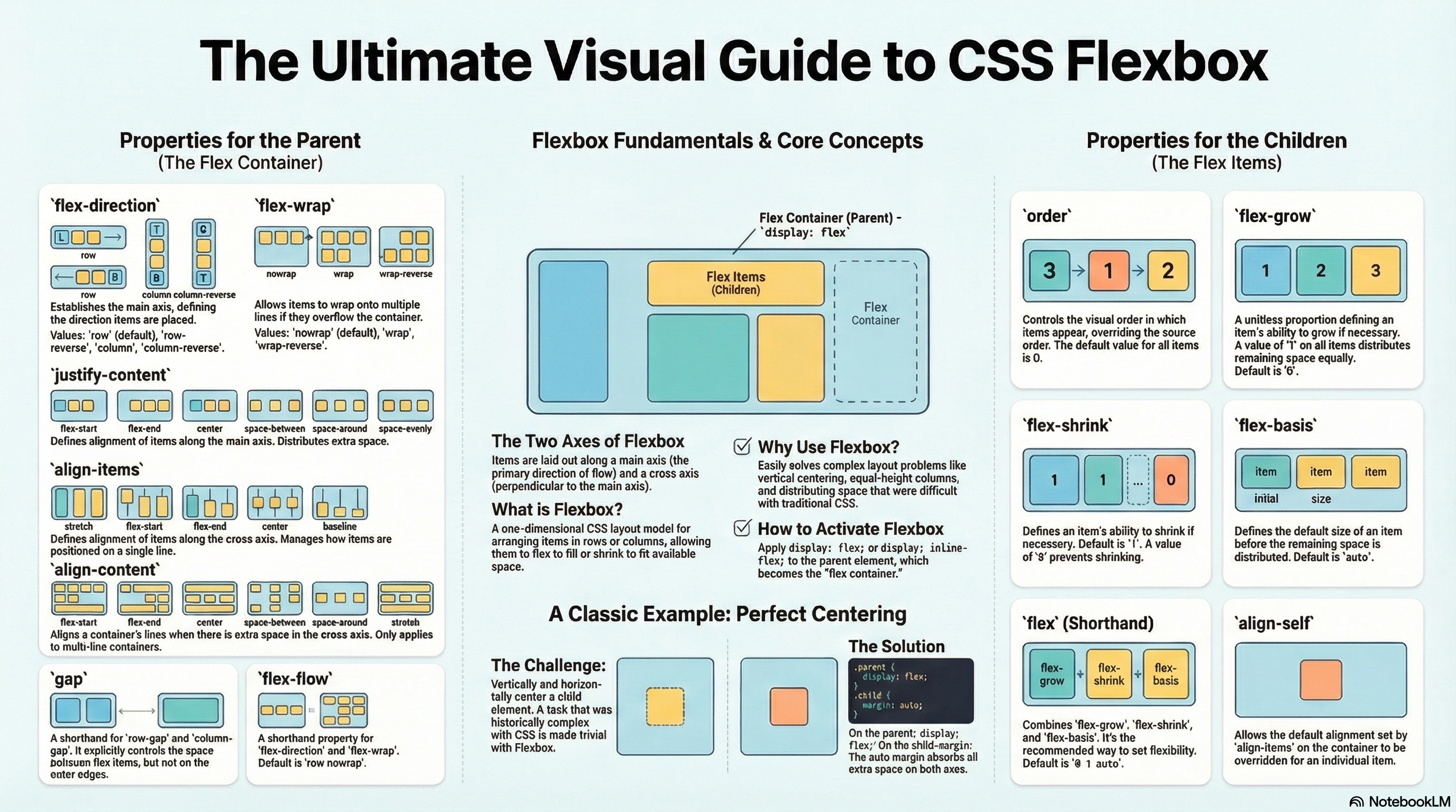
Why flexbox?
Flexbox is a one-dimensional layout method for laying out items in rows or columns. Items flex to fill additional space and shrink to fit into smaller spaces. This unit explains all the fundamentals.
For a long time, the only reliable cross browser-compatible tools available for creating CSS layouts were things like floats and positioning. These are fine, and they work, but in some ways they are also rather limiting and frustrating.
The following simple layout requirements are either difficult or impossible to achieve with such tools, in any kind of convenient, flexible way:
Vertically centering a block of content inside its parent.
Making all the children of a container take up an equal amount of the available width/height, regardless of how much width/height is available.
Making all columns in a multiple-column layout adopt the same height even if they contain a different amount of content.
As you’ll see in subsequent sections, flexbox makes a lot of layout tasks much easier. Let’s dig in!
Introducing a simple example
In this unit we are going to get you to work through a series of exercises to help you understand how flexbox works. To get started, we will use some simple code like this one:
<header>
  <h1>Valencian Community</h1>
</header>

<section>
  <article>
    <h2>Alicante</h2>
    <p>The campus of the University of Alicante lies in San Vicente del Raspeig, bordering the city of Alicante to the north. More than 25,000 students attend the University.</p>
  </article>

  <article>
    <h2>Valencia</h2>
    <p>Valencia is the capital of the autonomous community of Valencia and the third-largest city in Spain after Madrid and Barcelona, surpassing 800,000 inhabitants in the municipality.</p>
  </article>

  <article>
    <h2>Castellón</h2>
    <p>The city is notorious for its music festivals, among which we find: the Tanned Tin music festival for alternative music, the Benicàssim's International Festival, the Arenal Sound and the Rototom Sunsplash Festival, known for its reggae music.</p>
  </article>
</section>
* {
  box-sizing: border-box; /* Includes padding and border in the total width/height of each element */
  font-family: sans-serif; /* Sets the basic text font for the entire page */
}

header {
  background: purple; /* Header background color */
  border: 1px solid black; /* Header border */
  height: 75px; /* Fixed height of the header */
}

h1 {
  text-align: center; /* Centers the text horizontally */
  color: white; /* White text color */
  line-height: 75px; /* Centers the text vertically inside the header */
  margin: 0; /* Removes the default title margin */
}

article {
  padding: 1%; /* Internal padding for the article */
  border: 1px solid purple; /* Article border */
  background: aqua; /* Article background color */
}
You’ll see that we have a <header> element with a top level heading inside it, and a <section> element containing three <article>s. We are going to use these to create a fairly standard three column layout.
Proposed exercise: Simple boxes
Using the code of the previous example, create a new webpage with a similar content. You can use any other colors and styles you like.
Specifying what elements to lay out as flexible boxes
To start with, we need to select which elements are to be laid out as flexible boxes. To do this, we set a special value of display on the parent element of the elements you want to affect. In this case we want to lay out the <article> elements, so we set this on the <section>:
section {
  display: flex; /* Converts the element into a flexible container to use Flexbox */
}
This causes the <section> element to become a flex container, and its children to become flex items. The result of this should be something like so:
So, this single declaration gives us everything we need — incredible, right? We have our multiple column layout with equal-sized columns, and the columns are all the same height. This is because the default values given to flex items (the children of the flex container) are set up to solve common problems such as this.
To be clear, let’s reiterate what is happening here. The element we’ve given a display value of flex to is acting like a block-level element in terms of how it interacts with the rest of the page, but its children are being laid out as flex items. The next section will explain in more detail what this means. Note also that you can use a display value of inline-flex if you wish to lay out an element’s children as flex items, but have that element behave like an inline element.
Proposed exercise: Flexible boxes
Add some CSS code to the previous exercise so that all the contents inside the <section> element are displayed as flexible boxes (display:flex) which are shown from left to right, all of them having the same height.
As explained, you only have to add three lines of code and everything is done! You will have flexible boxes:
section {
  display: flex; /* Converts the element into a flexible container to use Flexbox */
}
The flex model
When elements are laid out as flex items, they are laid out along two axes:
The main axis is the axis running in the direction the flex items are being laid out in (e.g. as rows across the page, or columns down the page.) The start and end of this axis are called the main start and main end.
The cross axis is the axis running perpendicular to the direction the flex items are being laid out in. The start and end of this axis are called the cross start and cross end.
The parent element that has display: flex set on it (the <section> in our example) is called the flex container.
The items being laid out as flexible boxes inside the flex container are called flex items (the <article> elements in our example).
Bear this terminology in mind as you go through subsequent sections. You can always refer back to it if you get confused about any of the terms being used.
Columns or rows?
Flexbox provides a property called flex-direction that specifies what direction the main axis runs in (what direction the flexbox children are laid out in). By default this is set to row, which causes them to be laid out in a row in the direction your browser’s default language works in (usually from left to right), but you can also use the following declaration inside your <section> rule: flex-direction: column (this would put the items back in a column layout, much like they were before we added any CSS).
Wrapping
One issue that arises when you have a fixed amount of width or height in your layout is that eventually your flexbox children will overflow their container, breaking the layout. And also if you have many boxes, the final result will be presented with some quite narrow columns. Have a look at our example when we add more columns:
Here we see that the children are indeed breaking out of their container for small screens of filling the window with narrow columns. One way in which you can fix this is to use the following declaration of your <section> rule:
section {
  display: flex; /* Converts the element into a Flex Container */
  flex-wrap: wrap; /* Allows items to wrap to a new line when they run out of horizontal space */
  gap: 1%; /* Sets the spacing (gutters) between rows and columns of items */
  justify-content: space-between; /* Distributes items along the main axis, placing maximum space between them */
}
Also, we should use the following declaration for your <article> rule:
article {
  padding: 1%; /* Internal spacing around content */
  margin-top: 1%; /* External spacing above the articles */
  flex-basis: 49%; /* Sets the desired initial width (base size) to 49% */
  flex-grow: 1; /* Allows the article to grow and fill any available space on its line */
  border: 1px solid purple; /* Border of the articles */
  background: aqua; /* Background color of the articles */
}
You’ll see that the layout looks much better with the flexbox CSS code we are using:
We now have multiple rows, as many flexbox children are fitted onto each row as makes sense, and any overflow is moved down to the next line. The flex-basis:49% declaration set on the articles means that each will be at least half the window size (49% wide, since we have 1% margins). You might also notice that the last few children on the last row are each made wider so that the entire row is still filled.
But there’s more we can do here. For example, you can try changing your flex-direction property value to row-reverse. Now you’ll see that you still have your multiple row layout, but it starts from the opposite corner of the browser window and flows in reverse.
Proposed exercise: Wrapped content
Using the code of the last example above, add three more towns you like (to show at least 9 towns in total), and also insert a picture for each one. You may also change the colors of the boxes and text as you like, or you can even add more styles to your code (box and text shadows, etc.).
Through this presentation, these slides, and this video, you’ll get familiar with the key contents of this unit.
Introduction
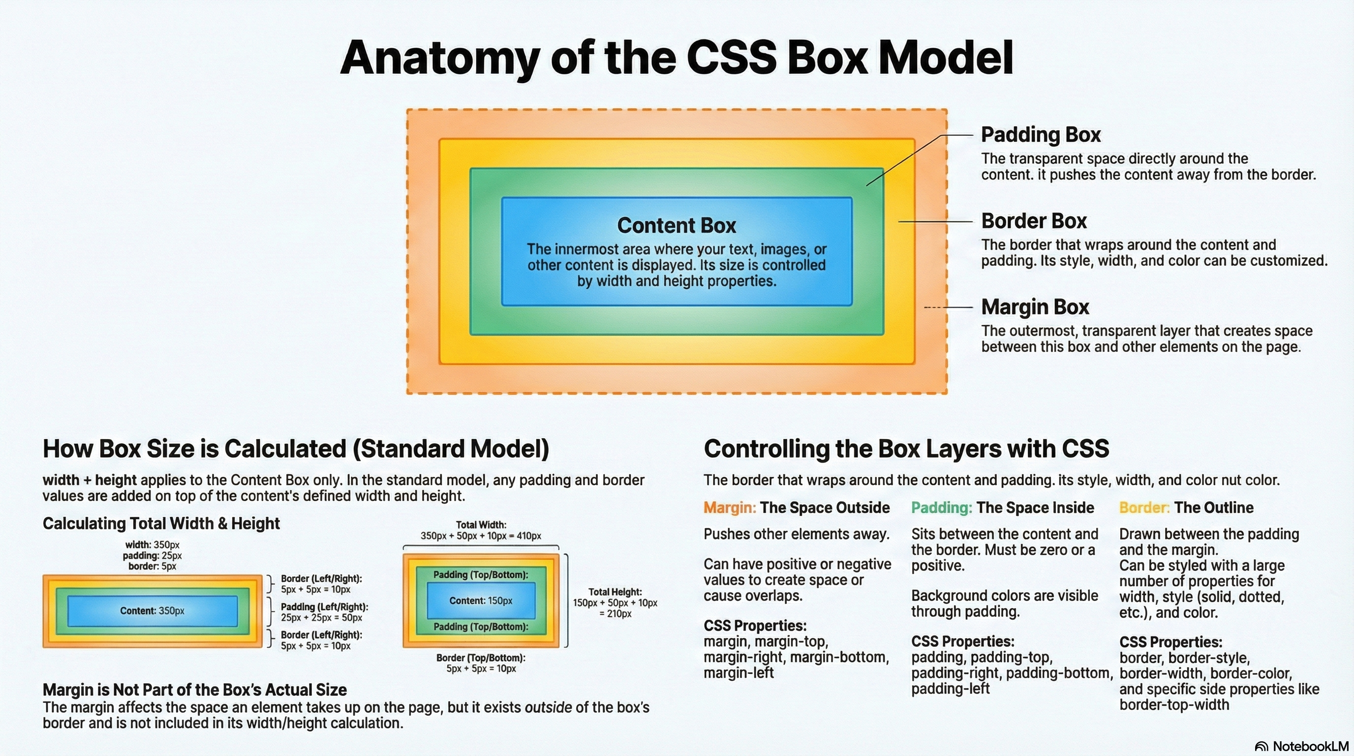
Everything in CSS has a box around it, and understanding these boxes is key to being able to create layouts with CSS, or to align items with other items. In this lesson, we will take a proper look at the CSS Box Model so that you can build more complex layout tasks with an understanding of how it works and the terminology that relates to it.
What is the CSS box model?
The full CSS box model applies to block boxes. This model defines how the different parts of a box (margin, border, padding, and content) work together to create a box that you can see on the page.
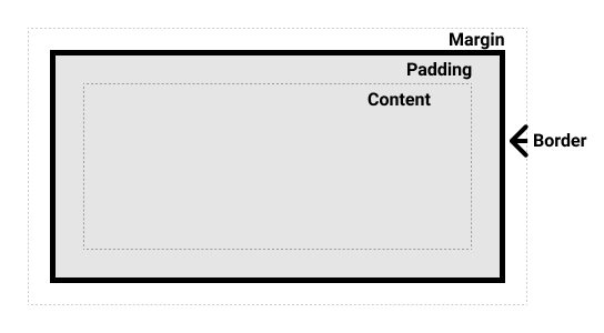
Parts of a box
When making up a block box in CSS we will have to keep in mind the following parts:
Content box: The area where your content is displayed, which can be sized using properties like width and height.
Padding box: The padding sits around the content as white space; its size can be controlled using padding and related properties.
Border box: The border box wraps the content and any padding. Its size and style can be controlled using border and related properties.
Margin box: The margin is the outermost layer, wrapping the content, padding and border as whitespace between this box and other elements. Its size can be controlled using margin and related properties.
The below diagram shows these layers:
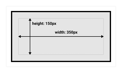
In the standard box model, if you give a box a width and a height attribute, this defines the width and height of the content box. Any padding and border is then added to that width and height to get the total size taken up by the box. This is shown in the image below.
If we assume that the box has the following CSS defining width, height, margin, border, and padding:
The space taken up by our box using the standard box model will actually be 410px (350 + 25 + 25 + 5 + 5), and the height 210px (150 + 25 + 25 + 5 + 5), as the padding and border are added to the width used for the content box:
The margin is not counted towards the actual size of the box. Sure, it affects the total space that the box will take up on the page, but only the space outside the box. The box’s area stops at the border (it does not extend into the margin).
Proposed exercise: Playing with box models
In the below example, you can see a couple of boxes with a CSS class which gives some values to width, height, margin, border, and padding. Using that code, create a web page with five different boxes, each one with different styles. You have to change also the color of the text (you can choose the colors your like). And finally add some shadows to the text using different styles and colors.
<div class="box1">This is a 250x200px box with a 5px red border, and lightgray background, 10px padding and 25px margin.</div>
<div class="box2">This is a 300x200px box with a 7px green border, gray background, white text color, 5px padding and 0px margin.</div>
...
And the result:
Margins, padding and borders
You’ve already seen the margin, padding, and border properties at work in the example above. The properties used in that example are shorthands and allow us to set all four sides of the box at once. These shorthands also have equivalent longhand properties, which allow control over the different sides of the box individually.
Let’s explore these properties in more detail.
Margin
The margin is an invisible space around your box. It pushes other elements away from the box. Margins can have positive or negative values. Setting a negative margin on one side of your box can cause it to overlap other things on the page.
We can control all margins of an element at once using the margin property, or each side individually using the equivalent longhand properties:
Create a web page with the example below, and change the margin values to see how the boxes are pushed around due to the margin creating or removing space (if it is a negative margin) between this element and the containing element. Finally, add three more boxes with any style you like inside the same container.
<div class="container">
  <div class="box1">This is a box with 50% width and 10px from top and left inside a container</div>
  <div class="box2">This is a box with 50% width and 10px from top and 50px left inside a container</div>
  <div class="box3">This is a box with 50% width and 10px from top and 100px left inside a container</div>
  ...
</div>
Padding
The padding sits between the border and the content area. Unlike margins you cannot have negative amounts of padding, so the value must be 0 or a positive value. Any background applied to your element will display behind the padding, and it is typically used to push the content away from the border.
We can control the padding on each side of an element individually using the padding property, or each side individually using the equivalent longhand properties:
If you change the values for padding on the classes .box in the example below you can see that this changes where the text begins in relation to the box. Padding can be changed on any element, and will make space between its border and whatever is inside the element. Create a web page with the code below and add three more boxes using different paddings and styles.
<div class="box1">
  This is a box without padding
</div>
<div class="box2">
  This is a box with 25 px padding
</div>
<div class="box3">
  This is a box with 50px padding
</div>
...
Borders
The border is drawn between the margin and the padding of a box. If you are using the standard box model, the size of the border is added to the width and height of the box.
For styling borders, there are a large number of properties (there are four borders, and each border has a style, width and color that we might want to manipulate).
You can set the width, style, or color of all four borders at once using the border property.
To set the properties of each side individually, you can use:
In the example below we have used various shorthands and longhands to style the borders. Create a new web page with that code and have a play around with the different properties to check that you understand how they work. Finally add three more boxes and set the border styles as you like.
You can have a look at the MDN pages (linked above) to get information about the different styles of border you can choose from. Also you can have a look at the different colors here: https://developer.mozilla.org/en-US/docs/Web/CSS/color_value.
<div class="box1">This is a box with different types of borders</div>
<div class="box2">This is another box with different types of borders</div>
<div class="box1">
  <div class="box2">This is a box with different types of borders inside another box</div>
</div>
<div class="box3">
  <div class="box3">
    <div class="box3">
      <div class="box3">
        <div class="box3">
          <div class="box3">
            These are boxes inside boxes
          </div>
        </div>
      </div>
    </div>
  </div>
</div>
...
Quiz
Test your skills with this quiz about the box model.
Through this presentation, these slides, and this video, you’ll get familiar with the key contents of this unit.
Introduction
Lists behave like any other text for the most part, but there are some CSS properties specific to lists that you need to know about, and some best practices to consider. This unit explains all.
A simple list example
To begin with, let’s look at a simple example with lists. Throughout this unit, we’ll look at unordered, ordered, and description lists (all have styling features that are similar, and some that are particular to their type of list). The HTML for our example looks like so:
<h2>Shopping (unordered list)</h2>

<ul>
  <li>Hummus</li>
  <li>Pita</li>
  <li>Green salad</li>
  <li>Halloumi</li>
</ul>

<h2>Recipe (ordered list)</h2>

<ol>
  <li>Toast pita, leave to cool, then slice down the edge.</li>
  <li>Fry the halloumi in a shallow, non-stick pan, until browned on both sides.</li>
  <li>Wash and chop the salad.</li>
  <li>Fill pita with salad, hummus, and fried halloumi.</li>
</ol>

<h2>Ingredients (description list)</h2>

<dl>
  <dt>Hummus</dt>
  <dd>A thick dip/sauce generally made from chick peas blended with tahini, lemon juice, salt, garlic, and other ingredients.</dd>
  <dt>Pita</dt>
  <dd>A soft, slightly leavened flatbread.</dd>
  <dt>Halloumi</dt>
  <dd>A semi-hard, unripened, brined cheese with a higher-than-usual melting point, usually made from goat/sheep milk.</dd>
  <dt>Green salad</dt>
  <dd>That green healthy stuff that many of us just use to garnish kebabs.</dd>
</dl>
The list elements probably will have the following styling defaults:
The <ul> and <ol> elements have a top and bottom margin of 16px (1em) and a padding-left of 40px (2.5em).
The list items (<li> elements) have no set defaults for spacing.
The <dl> element has a top and bottom margin of 16px (1em), but no padding set.
The <dd> elements have margin-left of 40px (2.5em).
The <p> elements we’ve included for reference have a top and bottom margin of 16px (1em), the same as the different list types.
Proposed exercise: Lists with default styling
Create a web page with the list of the previous example, and check the result in your browser. It should be displayed with the default styling (no CSS must be used right now).
You should get something like this:
Handling list styling
When styling lists, you need to adjust their styles so they keep the same vertical spacing as their surrounding elements (such as paragraphs and images; sometimes called vertical rhythm), and the same horizontal spacing as each other.
Some CSS for the text styling and spacing could be as follows:
The first rule sets a sitewide font and a baseline font size of 10px. These are inherited by everything on the page.
Rules 2 and 3 set relative font sizes for the headings, and different list types (the children of the list elements inherit these). This means that each list will have the same font size and top and bottom spacing, helping to keep the vertical rhythm consistent.
Rule 4 sets the same line-height on list items, so that each individual list item will have the same spacing between lines. This will also help to keep the vertical rhythm consistent.
Rules 5 and 6 apply to the description list. We set the same line-height on the description list terms and descriptions as we did with the list items. Again, consistency is good! We also make the description terms have bold font, so they visually stand out easier.
Proposed exercise: Lists with your own styles
Create a web page with the lists and styles of the previous example, and change or add any new styles you like. Now you have to create a CSS file and link it from the HTML code. Finally check the result in your browser and validate your code.
Your result may look now something like this:
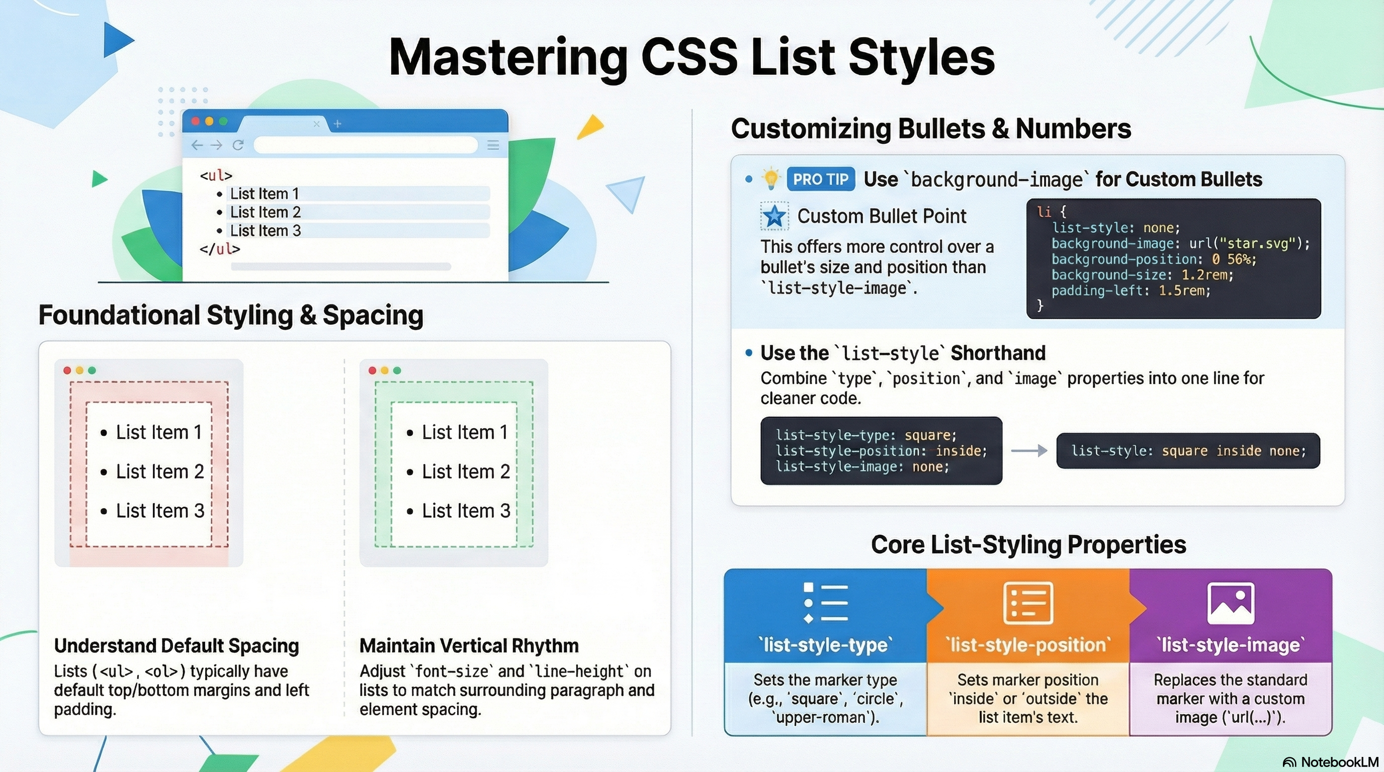
List-specific styles
Now that we’ve looked at general spacing techniques for lists, let’s explore some list-specific properties. As seen in a previous unit, there are three properties you should know about to start with, which can be set on both <ul> or <ol> elements:
list-style-type: Sets the type of bullets to use for the list, for example, square or circle bullets for an unordered list, or numbers, letters or roman numerals for an ordered list.
list-style-position: Sets whether the bullets appear inside the list items, or outside them before the start of each item.
list-style-image: Allows you to use a custom image for the bullet, rather than a simple square or circle.
Bullet and number styles
As mentioned above, the list-style-type property allows you to set what type of bullet to use for the bullet points. In our example, we can set the ordered list to use uppercase roman numerals, with:
ol {
  list-style-type: upper-roman;
}
Bullet position
The list-style-position property sets whether the bullets appear inside the list items, or outside them before the start of each item. The default value is outside, which causes the bullets to sit outside the list items, as seen above.
If you set the value to inside, the bullets will sit inside the lines:
ol {
  list-style-type: upper-roman;
  list-style-position: inside;
}
Using a custom bullet image
The list-style-image property allows you to use a custom image for your bullet. The syntax is pretty simple:
ul {
  list-style-image: url("https://api.iconify.design/mdi:star.svg?color=red");
}
However, this property is a bit limited in terms of controlling the position, size, etc. of the bullets. You are better off using the background family of properties, which you may also find in the Backgrounds and borders article.
In our example, we have styled the unordered list like so:
ul {
  padding-left: 2rem;
  list-style-type: none;
}

ul li {
  padding-left: 2rem;
  background-image: url("https://api.iconify.design/mdi:star.svg?color=red");
  background-position: left;
  background-size: 1.6rem 1.6rem;
  background-repeat: no-repeat;
}
Here we’ve done the following:
Set the padding-left of the <ul> down from the default 40px to 20px, then set the same amount on the list items. This is so that overall the list items are still lined up with the order list items and the description list descriptions, but the list items have some padding for the background images to sit inside. If we didn’t do this, the background images would overlap with the list item text, which would look messy.
Set the list-style-type to none, so that no bullet appears by default. We’re going to use background properties to handle the bullets instead.
Inserted a bullet onto each unordered list item. The relevant properties are as follows:
background-image: This references the path to the image file you want to use as the bullet.
background-position: This defines where in the background of the selected element the image will appear. In this case we are using left, which means the bullet will appear on the left of each list item.
background-size: This sets the size of the background image. We ideally want the bullets to be the same size as the list items (or very slightly smaller or larger). We are using a size of 1.6rem (16px), which fits very nicely with the 20px padding we’ve allowed for the bullet to sit inside (16px plus 4px of space between the bullet and the list item text works well).
background-repeat: By default, background images repeat until they fill up the available background space. We only want one copy of the image inserted in each case, so we set this to a value of no-repeat.
Proposed exercise: Putting it all together
Using the code of the previous exercise, change the defaults bullets to use an image, and also change the default numbering, and any other styles you like. Finally check the result in your browser and do not forget to validate your code.
Your result may look now something like this:
List-style shorthand
It is also worth to know that we may set the three properties mentioned in the section above using a single shorthand property, list-style. For example, the following CSS:
ul {
  list-style-type: disc;
  list-style-image: url(example.png);
  list-style-position: inside;
}
Could be replaced by this:
ul {
  list-style: disc url(example.png) inside;
}
The values can be listed in any order, and you can use one, two or all three (the default values used for the properties that are not included are disc, none, and outside). If both a type and an image are specified, the type is used as a fallback if the image can’t be loaded for some reason.
Quiz
Test your skills with this quiz about styling lists.
Through this presentation, these slides, and this video, you’ll get familiar with the key contents of this unit.
Introduction
When styling links, it is important to understand how to make use of pseudo-classes to style link states effectively, and how to style links for use in common varied interface features such as navigation menus and tabs. We’ll look at all these topics in this unit.
Let’s look at some links
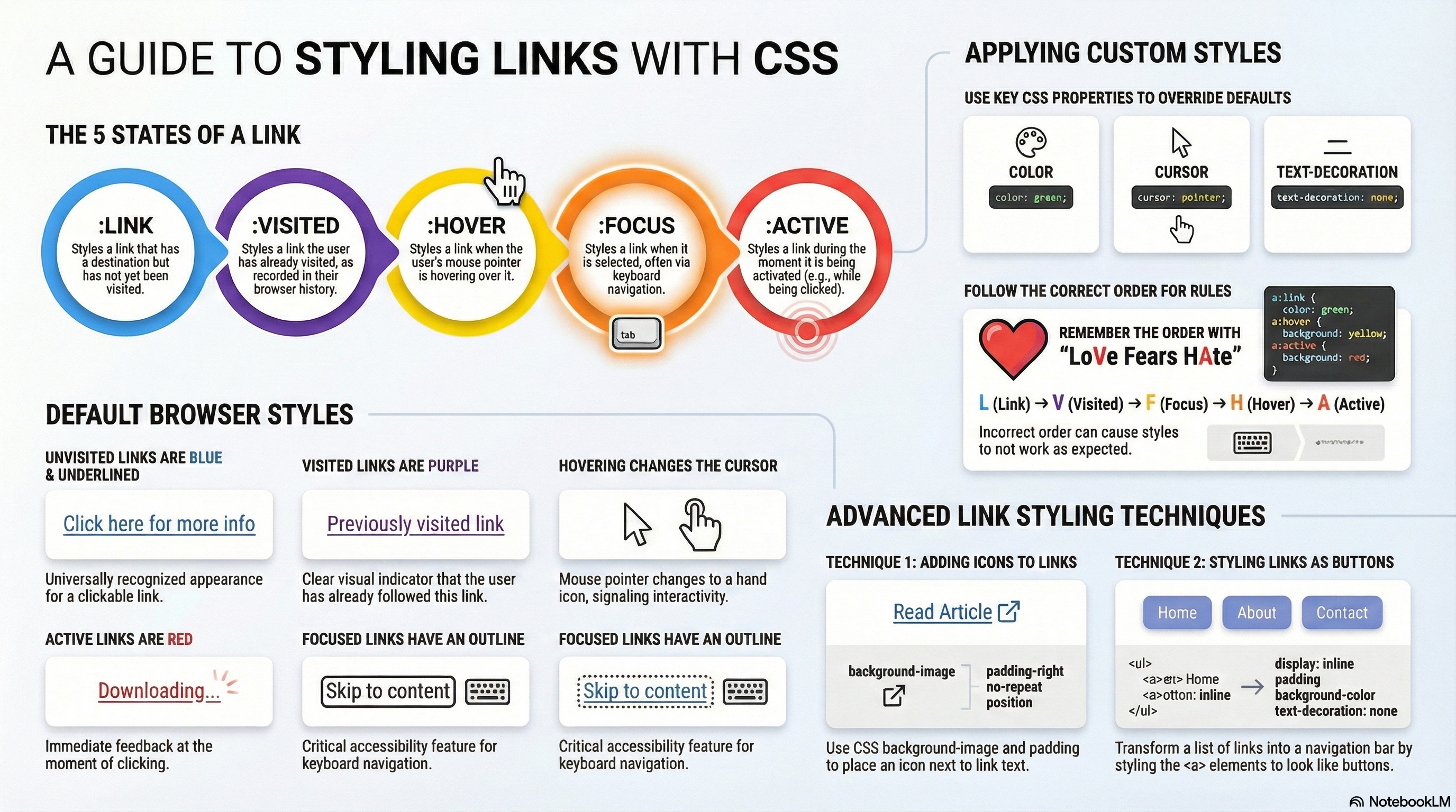
The first thing to understand is the concept of link states (different states that links can exist in, which can be styled using different pseudo-classes):
Link: A link which has a destination (i.e. not just a named anchor), styled using the :link pseudo class.
Visited: A link when it has already been visited (exists in the browser’s history), styled using the :visited pseudo class.
Hover: A link when it is being hovered over by a user’s mouse pointer, styled using the :hover pseudo class.
Focus: A link when it has been focused (for example moved to by a keyboard user using the Tab key or similar, or programmatically focused using HTMLElement.focus()). This is styled using the :focus pseudo class.
Active: A link when it is being activated (e.g. clicked on), styled using the :active pseudo class.
Default styles
The following example illustrates what a link will behave like by default (the CSS is simply enlarging and centering the text to make it stand out more):
/* Sets the paragraph font size to 2rem and centers the text */
p {
  font-size: 2rem;
  text-align: center;
}
You’ll notice a few things as you explore the default styles:
Links are underlined.
Unvisited links are blue.
Visited links are purple.
Hovering a link makes the mouse pointer change to a little hand icon.
Focused links have an outline around them. You should be able to focus on the links with the keyboard by pressing the tab key (On Mac, you’ll need to use option + tab, or enable the Full Keyboard Access option by pressing Ctrl + F7).
Active links are red. You can try this feature by holding down the mouse button on the link as you click it.
Proposed exercise: Larger and centered links
Create a web page with at least 5 paragraphs, each one with a different link to any sites you like. You also have to style your page so that the links are double the size of the rest of the text, and they are aligned in the center of the window, as done in the example above.
You are not just limited to the above properties to style your links, you are free to use any properties you like.
Styling some links
Interestingly enough, the default styles used for the links are nearly the same as they were back in the early days of browsers in the mid-1990s. This is because users know and have come to expect this behaviour (if links were styled differently, it would confuse a lot of people). This doesn’t mean that you shouldn’t style links at all, just that you should not stray too far from the expected behaviour. You should at least:
Use underlining for links, but not for other things. If you don’t want to underline links, at least highlight them in some other way.
Make them react in some way when hovered/focused, and in a slightly different way when activated.
The default styles can be turned off/changed using the following CSS properties:
cursor for the mouse pointer style, although you shouldn’t turn this off unless you’ve got a very good reason.
outline for the text outline (an outline is similar to a border, the only difference being that border takes up space in the box and an outline doesn’t; it just sits over the top of the background). The outline is a useful accessibility aid, so think carefully before turning it off; you should at least double up the styles given to the link hover state on the focus state too.
Now that we’ve looked at the default states in some detail, let’s look at a typical set of link styles. To start off with, we’ll write out our empty rulesets:
/* Unvisited links */
a:link {
}

/* Previously visited links */
a:visited {
}

/* Selected via keyboard (e.g., Tab key) */
a:focus {
}

/* Mouse cursor is over the link */
a:hover {
}

/* Being clicked (mouse button held down) */
a:active {
}
This order is important because the link styles build on one another, for example the styles in the first rule will apply to all the subsequent ones, and when a link is being activated, it is usually also being hovered over. If you put these in the wrong order, and you’re changing the same properties in each ruleset, things won’t work as you expect. To remember the order, you could try using a mnemonic like LoVe Fears HAte.
Now let’s add some more information to get this styled properly:
/* Sets the paragraph font size to 2rem and centers the text */
p {
  font-size: 2rem;
  text-align: center;
}

/* Sets the text color for unvisited links to green */
a:link {
  color: green;
}

/* Sets the text color for links that have already been visited to olive */
a:visited {
  color: olive;
}

/* Sets the background color to orange when the link is focused (keyboard selection) */
a:focus {
  background-color: orange;
}

/* Changes background to yellow and adds a red wavy underline on hover */
a:hover {
  background-color: yellow;
  text-decoration: underline red wavy;
}

/* Changes background to red while the link is actively being clicked */
a:active {
  background-color: red;
}
We’ll also provide some sample HTML to apply the CSS to:
<p>There are several browsers available, such as:</p>

<p><a href="https://www.mozilla.org/en-US/firefox/new/" target="_blank">Mozilla Firefox</a></p>
<p><a href="https://www.google.com/chrome/" target="_blank">Google Chrome</a></p>
<p><a href="https://www.apple.com/safari/" target="_blank">Apple Safari</a></p>
Putting the two together gives us this result:
Proposed exercise: Styling colors and text decoration
Create a new web page with at least 5 links pointing to your preferred websites. You must change the default colors and decorations so that each possible state (link, visited, focus, hover, active) has other color than the default one, and also another decoration, as done in the example above, where the “underline red wavy” text decoration is used.
As you have seen, you can change the color of the text using the color property, and the background color using the background property. Also remember you can have a look at the different colors here: https://developer.mozilla.org/en-US/docs/Web/CSS/color_value. About the text decoration, remember it can be easily changed with the text-decoration property.
Including icons on links
Some developers include icons on links to provide more of an indicator as to what kind of content the link points to. Let’s look at a really simple example that adds an icon to external links (links that lead to other sites). Such an icon usually looks like a little arrow pointing out of a box.
For this example, we will use the same HTML as before:
<p>There are several browsers available, such as:</p>

<p><a href="https://www.mozilla.org/en-US/firefox/new/" target="_blank">Mozilla Firefox</a></p>
<p><a href="https://www.google.com/chrome/" target="_blank">Google Chrome</a></p>
<p><a href="https://www.apple.com/safari/" target="_blank">Apple Safari</a></p>
And we will adjust the CSS code:
p {
  /* Sets the font size to 2rem (relative to the root HTML element size) */
  font-size: 2rem;

  /* Horizontally centers the text within the paragraph container */
  text-align: center;
}

a {
  /* Sets the source URL for the external link icon */
  background-image: url('https://api.iconify.design/mdi:external-link.svg');

  /* Prevents the icon from tiling or repeating */
  background-repeat: no-repeat;

  /* Positions the icon at the far right*/
  background-position: right;

  /* Sets the dimensions of the background icon */
  background-size: 2rem;

  /* Adds some space to the right so the text does not overlap the icon */
  padding-right: 2.5rem;
}
Or even better, you may use the equivalent shorter version:
/* Sets the paragraph font size to 2rem and centers the text */
p {
  font-size: 2rem;
  text-align: center;
}

a {
  /* Defines the image, stops repetition, and aligns it to right */
  background: url('https://api.iconify.design/mdi:external-link.svg') no-repeat right;

  /* Sets the dimensions of the background icon */
  background-size: 2rem;

  /* Adds internal spacing to the right to keep the text from covering the icon */
  padding-right: 2.5rem;
}
The previous two CSS rules gives us this result on our HTML code:
So what’s going on here? We’ll skip the CSS related to the paragraphs, as it’s just the same information you’ve looked at before. The last rule however is interesting: here we are inserting a custom background image on external links using background shorthand instead of the individual properties. We set the path to the image we want to insert and specify no-repeat to ensure only one copy appears. Then, we position it all the way to the right.
We also use background-size to specify the size we want the background image to be shown at. So that you get a good result, it is useful to have a larger icon and then resize it like this as needed for responsive web design purposes.
Finally, we set some padding-right on the links to make space for the background image to appear in, so we aren’t overlapping it with the text.
Where to find more icons
Iconify is a massive library that hosts almost every popular icon set (Google Material, FontAwesome, etc.) on their servers. They provide a public address (API) that allows you to request an icon just by typing its name in the URL. To create a link, you only need one URL structure:
Type a keyword (e.g., “link”, “site”, “web”, etc.) in the search box located at the top right corner and press the search button.
Click on an icon you like.
Look for the “Icon name” (displayed clearly at the bottom of the page). For example, if you search for “link” and choose a Material Design icon, the code is mdi:external-link.
Create a new web page with at least 5 links pointing to your preferred websites (you can use the code you wrote before) and include an icon at the end of each one. Also change some other styles as the text color or text decoration, and also the color of the icons.
The tools you’ve explored so far in this article can also be used in other ways. For example, states like hover can be used to style many different elements, not just links — you might want to style the hover state of paragraphs, list items, or other things.
In addition, links are quite commonly styled to look and behave like buttons in certain circumstances — a website navigation menu is usually marked up as a list containing links, and this can be easily styled to look like a set of control buttons or tabs that provide the user with access to other parts of the site. Let’s explore how.
/* General class for navigation bar */
.navbar {
  font-size: 1.25rem;
  font-family: sans-serif;
  text-align: center;
  background: yellow;
}

/* Select only the list items (li) inside the navigation bar */
ul.navbar li {
  display: inline;
}

/* Select only the links (a) inside the navigation bar */
ul.navbar a {
  text-decoration: none;
  display: inline-block;
  padding: 1rem;
}

/* Select only the links inside the navigation bar when mouse over them (a:hover) */
ul.navbar a:hover {
  background: orange;
}

/* Select only the links inside the navigation bar when mouse pressing (a:active) */
ul.navbar a:active {
  color: white;
  background: red;
}
This gives us the following result:
Let’s explain what’s going on here, focusing on the most interesting parts:
Creating a new class for the list:
We have created the navbar class so that only the items inside that class have the style of a navigation bar.
ul.navbar: By putting this before any selector, the CSS properties between braces will apply only to the items inside an unordered list with class navbar.
The styles related to the <ul> element:
We change the font-size to enlarge the text a little bit.
We change the font-family so that it is different from the rest of the text.
We change the text-align so that the links are centered .
<li> elements will normally behave like block elements (they sit on their own lines). In this case, we want to create a horizontal list of links, so we set the display property to inline, which causes the list items to sit on the same line one after the other (they now behave like inline elements).
The styles related to the <a> elements:
We start by turning off the default text-decoration (we don’t want those spoiling our look).
Next, we set the display to inline-block (this will allow to size them, as we will explain in another unit).
We set the padding to 1rem to give the buttons some space around the text (we will also explain this in another unit).
We also change the color of the items when the mouse is over them, and when they are being pressed.
Proposed exercise: Navigation bar and links with icons
Create a web page with a navigation bar of your own style. You can change any properties you like (colors, text decoration, font size, font family, etc.). After that, just below insert some other links you like. You can also try to use some other CSS rules to style these links, as shown below:
Quiz
Test your skills with this quiz about styling links.
Through this presentation, these slides, and this video, you’ll get familiar with the key contents of this unit.
Introduction
Here we’ll go through all the basic fundamentals of text/font styling in detail, including setting font weight, family and style, font shorthand, text alignment and other effects, and line and letter spacing.
What is involved in styling text in CSS?
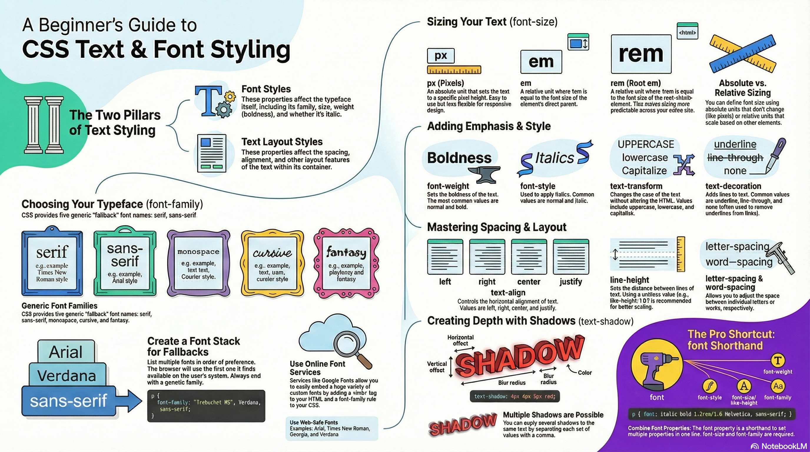
The CSS properties used to style text generally fall into two categories, which we’ll look at separately in this unit:
Font styles: Properties that affect the font that is applied to the text, affecting what font is applied, how big it is, whether it is bold, italic, etc.
Text layout styles: Properties that affect the spacing and other layout features of the text, allowing manipulation of, for example, the space between lines and letters, and how the text is aligned within the content box.
Bear in mind that the text inside an element is all affected as one single entity. You can’t select and style subsections of text unless you wrap them in an appropriate element (such as a <span> or <strong>, for example).
Font color
Let’s move straight on to look at properties for styling fonts. In this section we’ll apply some different CSS properties to the same HTML sample.
The color property sets the color of the foreground content of the selected elements (which is usually the text, but can also include a couple of other things, such as an underline or overline placed on text using the text-decoration property):
p {
  color: red;
}
Proposed exercise
Create a new web page made of 2 files: one HTML file with the code below, and another one with some CSS code to change the <h1> and <p> elements to any color you like. Do not forget to link the CSS file from the HTML file, and validate your code.
<h1>Tommy the cat</h1>

<p>Well I remember it as though it were a meal ago...</p>

<p>Said Tommy the Cat as he reeled back to clear whatever foreign matter may have nestled its way into his mighty throat. Many a fat alley rat had met its demise while staring point blank down the cavernous barrel of this awesome prowling machine. Truly a wonder of nature this urban predator — Tommy the cat had many a story to tell. But it was a rare occasion such as this that he did.</p>
Font families
To set a different font on your text, you use the font-family property — this allows you to specify a font (or list of fonts) for the browser to apply to the selected elements. The browser will only apply a font if it is available on the machine the website is being accessed on; if not, it will just use a browser default font. A simple example looks like so:
p {
  font-family: arial;
}
This would make all paragraphs on a page adopt the arial font, which is found on any computer.
Default fonts
CSS defines five generic names for fonts: serif, sans-serif, monospace, cursive and fantasy. Those are very generic and the exact font face used when using those generic names is up to each browser and can vary for each operating system they are running on. It represents a worst case scenario where the browser will try to do its best to provide at least a font that looks appropriate. serif, sans-serif and monospace are quite predictable and should provide something reasonable. On the other hand, cursive and fantasy are less predictable and we recommend using them very carefully, testing as you go.
The five names are defined as follows (you will find below some examples about how they look like):
serif: Fonts that have serifs (the flourishes and other small details you see at the ends of the strokes in some typefaces).
sans-serif: Fonts that don’t have serifs.
monospace: Fonts where every character has the same width, typically used in code listings.
cursive: Fonts that are intended to emulate handwriting, with flowing, connected strokes.
fantasy: Fonts that are intended to be decorative.
Proposed exercise: Default fonts
Using the code of the previous exercise, copy and paste the paragraphs several times (5 in total) and define some classes to apply all default fonts (serif, sans-serif, monospace, cursive, fantasy). You must set a different font and color each time. Your source code and the result should look something like this:
HTML code:
<h1>Tommy the cat</h1>

<p class="serif">Well I remember it as though it were a meal ago...</p>
<p class="serif">Said Tommy the Cat as he reeled back to clear whatever foreign matter may have nestled its way into his mighty throat. Many a fat alley rat had met its demise while staring point blank down the cavernous barrel of this awesome prowling machine. Truly a wonder of nature this urban predator — Tommy the cat had many a story to tell. But it was a rare occasion such as this that he did.</p>

...

<p class="fantasy">Well I remember it as though it were a meal ago...</p>
<p class="fantasy">Said Tommy the Cat as he reeled back to clear whatever foreign matter may have nestled its way into his mighty throat. Many a fat alley rat had met its demise while staring point blank down the cavernous barrel of this awesome prowling machine. Truly a wonder of nature this urban predator — Tommy the cat had many a story to tell. But it was a rare occasion such as this that he did.</p>
Speaking of font availability, there are only a certain number of fonts that are generally available across all systems and can therefore be used without much worry. These are the so-called web safe fonts.
Most of the time, as web developers we want to have more specific control over the fonts used to display our text content. The problem is to find a way to know which font is available on the computer used to see our web pages. There is no way to know this in every case, but the web safe fonts are known to be available on nearly all instances of the most used operating systems (Windows, macOS, the most common Linux distributions, Android, and iOS).
The list of actual web safe fonts will change as operating systems evolve, but it’s reasonable to consider the following fonts web safe, at least for now (many of them have been popularized thanks to the Microsoft Core fonts for the Web initiative in the late 90s and early 2000s):
Arial (sans-serif)
Courier New (monospace)
Georgia (serif)
Times New Roman (serif)
Trebuchet MS (sans-serif)
Verdana (sans-serif)
Among various resources, the cssfontstack.com website maintains a list of web safe fonts available on Windows and macOS operating systems, which can help you make your decision about what you consider safe for your usage.
Proposed exercise: Main safe fonts
Create a new web page with a header (<h1>) and six other paragraphs (<p>) with any content you like, and set a different font for each of them (Arial, Courier New, Georgia, Times New Roman, Trebuchet MS, Verdana). You can also change the color of the text too.
Font names that have more than one word (like Trebuchet MS) need to be surrounded by quotes, for example:
font-family: "Trebuchet MS";
Font stacks
Since you can’t guarantee the availability of the fonts you want to use on your webpages (even a web font could fail for some reason), you can supply a font stack so that the browser has multiple fonts it can choose from. This simply involves a font-family value consisting of multiple font names separated by commas, e.g.
p {
  font-family: "Trebuchet MS", Verdana, sans-serif;
}
In such a case, the browser starts at the beginning of the list and looks to see if that font is available on the machine. If it is, it applies that font to the selected elements. If not, it moves on to the next font, and so on.
It is a good idea to provide a suitable generic font name at the end of the stack so that if none of the listed fonts are available, the browser can at least provide something approximately suitable. To emphasise this point, paragraphs are given the browser’s default serif font if no other option is available — which is usually Times New Roman — this is no good for a sans-serif font!
Proposed exercise: More safe fonts and font stacks
Create a new web page with a header and five other paragraphs with any content you like, and set a different font for each of them, but this time you cannot use any font used previously: you must select some other fonts from cssfontstack.com. Moreover, in this exercise you have to use font stacks to ensure at least one font is always available, and you can also change the color too. Finally, check your web page using several browsers from several devices and operating systems, to make sure that all fonts are shown.
If you are changing the color and the font family using font stacks, your CSS and HTML code should look like this:
Online font services generally store and serve fonts for you, so you don’t have to worry about the font availability, and generally you just need to insert a simple line or two of code into your site to make everything work. Examples include Adobe Fonts and Cloud.typography. Most of these services are subscription-based, with the notable exception of Google Fonts, a useful free service, especially for rapid testing work and writing demos.
Most of these services are easy to use, so we won’t cover them in great detail. Let’s have a quick look at Google fonts, so you can get the idea. These are the steps that you have to follow to use one or several of the fonts they provide:
You may use the filters to display the kinds of fonts you like.
To select a font family, click on it.
Once you have selected the font, press the Get font button on the upper right corner.
Press now the <> Get embed code button on the upper right corner.
Copy the code shown inside the box labeled with Embed code in the <head> of your html. Those are the links to the selected font.
Paste the code into the head of your HTML file. Put it above the existing <link> elements you may have on your web page, so that the font is imported before you try to use it in your own CSS.
You then need to select the font using a CSS declaration inside your CSS to apply the custom font to your HTML, as for example: font-family: "Permanent Marker";
Proposed exercise: Google fonts
Create a web page with ten paragraphs, each one using a different Google font.
For example, to use the Google fonts “Nerko One”, “Permanent Marker” and “Rock Salt”, your HTML code should look like this:
<!doctype html>
<html>
  <head>
    <meta charset="utf-8">
    <title>Web font example</title>
    <link rel="preconnect" href="https://fonts.gstatic.com">
    <link rel="stylesheet" href="https://fonts.googleapis.com/css2?family=Nerko+One&family=Permanent+Marker&family=Rock+Salt&display=swap">
    <link rel="stylesheet" href="styles.css">
  </head>
  <body>
    <h1>Web font example</h1>
    <p class="nerko">This is a text with Nerko One font</p>
    <p class="marker">This is a text with Permanent Marker font</p>
    <p class="rock">This is a text with Rock Salt</p>
  </body>
</html>
Font size (set with the font-size property) can take values measured in several units (such as percentages), however the most common units you’ll use to size text are:
px (pixels): The number of pixels high you want the text to be (this is an absolute unit).
em: 1 em is equal to the font size set on the parent element of the current element we are styling (more specifically, the width of a capital letter M contained inside the parent element.) This can become tricky to work out if you have a lot of nested elements with different font sizes set, but t is quite natural once you get used to it, and you can use em to size everything, not just text. You can have an entire website sized using em, which makes maintenance easy.
rem: These work just like em, except that 1 rem is equal to the font size set on the root element of the document (i.e. <html>), not the parent element. This makes doing the maths to work out your font sizes much easier, although if you want to support really old browsers, you might struggle (rem is not supported in Internet Explorer 8 and below).
Absolute size (pixels)
The easiest way to change the size of your text is setting a specific number of pixels. However, this might not be the best solution, since in case you want to increase (or decrease) the size of all text in your website, you should change each value manually (one time per each CSS rule). So, we are going ahead with a first exercise using pixels, but after that we will use a more convenient way in another exercise using relative values.
Proposed exercise: Absolute sizing with “px”
Create a new web page with at least 15 paragraphs of some text you like, and set the font size for each paragraph a bit larger each time. You must use pixels to set each font size.
Your source code and result should look like this (you may choose any class names, colors and sizes you like):
<p class="ten">This is a text with 10 px font size</p>
<p class="eleven">This is a text with 11 px font size</p>
<p class="twelve">This is a text with 12 px font size</p>
<p class="thirteen">This is a text with 13 px font size</p>
...
Relative size (“em” and “rem”)
The font-size of an element is inherited from that element’s parent element. This all starts with the root element of the entire document (<html>) the font-size of which is set to 16 px as standard across browsers. Any paragraph (or another element that doesn’t have a different size set by the browser) inside the root element will have a final size of 16 px. Other elements may have different default sizes, for example an <h1> element has a size of 2 em set by default, so it will have a final size of 32 px.
Things become more tricky when you start altering the font size of nested elements. For example, if you had an <article> element in your page, and set its font-size to 1.5 em (which would compute to 24 px final size), and then wanted the paragraphs inside the <article> elements to have a computed font size of 20 px, what em value would you use?
<!-- document base font-size is 16px -->
<article> <!-- If my font-size is 1.5em -->
  <p>My paragraph</p> <!-- How do I compute to 20px font-size? -->
</article>
You would need to set its em value to 20/24, or 0.83333333 em. The maths can be complicated, so you need to be careful about how you style things. It is best to use rem where you can, to keep things simple, and avoid setting the font-size of container elements where possible.
When sizing your text, it is usually a good idea to set the base font-size of the document to 10px, so that then the maths is a lot easier to work out (required (r)em values are then the pixel font size divided by 10, not 16). After doing that, you can easily size the different types of text in your document to what you want. Also it is a good idea to list all your font-size rulesets in a designated area in your stylesheet, so they are easy to find.
Proposed exercise: Relative sizing with “rem”
Create a new web page with at least 15 paragraphs of some text you like, and set the font size for each paragraph a bit larger each time. This time, you must use relative sizing to set each font size (for example, with “rem” units). When you finish writing your code, check the results using your browser, and set different values for the main size (inside the <html> element) and check that the size of all the paragraphs changes accordingly.
Your source code and result should look like this (you may choose any class names, colors and sizes you like):
<p>This is a text with 1 rem font size</p>
<p class="eleven">This is a text with 1.1 rem font size</p>
<p class="twelve">This is a text with 1.2 rem font size</p>
<p class="thirteen">This is a text with 1.3 rem font size</p>
...
Font style, font weight, text transform, and text decoration
CSS provides four common properties to alter the visual weight/emphasis of text:
font-style: Used to turn italic text on and off. Possible values are as follows (you’ll rarely use this, unless you want to turn some italic styling off for some reason):
normal: Sets the text to the normal font (turns existing italics off)
italic: Sets the text to use the italic version of the font if available; if not available, it will simulate italics with oblique instead.
oblique: Sets the text to use a simulated version of an italic font, created by slanting the normal version.
font-weight: Sets how bold the text is. This has many values available in case you have many font variants available (such as -light, -normal, -bold, -extrabold, -black, etc.), but realistically you’ll rarely use any of them except for normal and bold:
normal, bold: Normal and bold font weight
lighter, bolder: Sets the current element’s boldness to be one step lighter or heavier than its parent element’s boldness.
100–900: Numeric boldness values that provide finer grained control than the above keywords, if needed.
text-transform: Allows you to set your font to be transformed. Values include:
none: Prevents any transformation.
uppercase: Transforms ALL TEXT TO CAPITALS.
lowercase: Transforms all text to lower case.
capitalize: Transforms all words to Have The First Letter Capitalized.
full-width: Transforms all glyphs to be written inside a fixed-width square, similar to a monospace font, allowing aligning of e.g. Latin characters along with Asian language glyphs (like Chinese, Japanese, Korean).
text-decoration: Sets/unsets text decorations on fonts (you’ll mainly use this to unset the default underline on links when styling them.) Available values are:
none: Unsets any text decorations already present.
underline: Underlines the text.
overline: Gives the text an overline.
line-through: Puts a strikethrough over the text.
You may use some combinations of the options above. For example:
p {
  font-weight: bold;
  text-transform: uppercase;
  text-decoration: line-through;
}
You should also note that text-decoration can accept multiple values at once, if you want to add multiple decorations simultaneously, for example text-decoration: underline overline. Also note that text-decoration is a shorthand property for text-decoration-line, text-decoration-style, and text-decoration-color. You can use combinations of these property values to create interesting effects, for example:
p {
  font-weight: bold;
  text-transform: uppercase;
  text-decoration: line-through red wavy;
}
Proposed exercise: Style, weight, transform and decoration
Create a website with at least 15 paragraphs to show most of the values that can be used with font-style , font-weight , font-transform and font-decoration properties.
This is an example of the result you should get (you may choose your own combinations):
Text drop shadows
You can apply drop shadows to your text using the text-shadow property. This takes up to four values, as shown in the example below:
text-shadow: 4px 4px 5px red;
The four properties are as follows:
The horizontal offset of the shadow from the original text. This can take most available CSS length and size units, but you’ll most commonly use px. Positive values move the shadow right, and negative values left. This value has to be included.
The vertical offset of the shadow from the original text; behaves basically just like the horizontal offset, except that it moves the shadow up/down, not left/right. This value has to be included.
The blur radius. A higher value means the shadow is dispersed more widely. If this value is not included, it defaults to 0, which means no blur. This can take most available CSS length and size units.
The base color of the shadow, which can take any CSS color unit. If not included, it defaults to currentColor, i.e. the shadow’s color is taken from the element’s color property.
You can also apply multiple shadows to the same text by including multiple shadow values separated by commas, for example:
text-shadow: 1px 1px 1px red,
             2px 2px 1px red;
Proposed exercise: Simple shadows
Create a website with at least 15 paragraphs with shadows, each one with different offsets and colors. You can also change any other properties you like, such as the font-family. You should use Google Fonts to ensure that everything is displayed in the right way for all the operating systems and browsers.
This is an example of the result you should get (you may choose your own combinations):
Proposed exercise: Multiple shadows
Create a website with at least 10 paragraphs each one with multiple shadows and also different offsets and colors. You can also change any other properties you like, such as the font-family and font-size. You should use Google Fonts to ensure that everything is displayed in the right way for all the operating systems and browsers.
This is an example of the result you should get (you may choose your own combinations):
Text-alignment
The text-align property is used to control how text is aligned within its containing content box. The available values are as follows, and work in pretty much the same way as they do in a regular word processor application:
left: Left-justifies the text.
right: Right-justifies the text.
center: Centers the text.
justify: Makes the text spread out, varying the gaps in between the words so that all lines of text are the same width. You need to use this carefully, since sometimes it can look terrible, especially when applied to a paragraph with lots of long words in it. If you are going to use this, you should also think about using something else along with it, such as hyphens, to break some of the longer words across lines.
For example, you can center some text just by using the following CSS code:
text-align: center;
Proposed exercise: Alignment types
Create a web page with 4 headers and 4 paragraphs, each one with a different alignment type.
You can use any text you like, but keeping in mind that you must insert several lines to properly see how the alignment is done:
Line height
The line-height property sets the height of each line of text. This can take most length and size units, but can also take a unitless value, which acts as a multiplier and is generally considered the best option (the font-size is multiplied to get the line-height). Body text generally looks nicer and is easier to read when the lines are spaced apart; the recommended line height is around 1.5 – 2 (double spaced.) So to set our lines of text to 1.6 times the height of the font, you’d use this:
line-height: 1.6;
Proposed exercise: Line heights
Create a web page with at least 3 headers and 3 paragraphs, each one with a different line height.
Letter and word spacing
The letter-spacing and word-spacing properties allow you to set the spacing between letters and words in your text. You won’t use these very often, but might find a use for them to get a certain look, or to improve the legibility of a particularly dense font. They can take most length and size units.
So as an example, we could apply some word-spacing and letter-spacing like this:
word-spacing: 4px;
letter-spacing: 4px;
Proposed exercise: Spacing
Create a web page with at least 2 headers and 2 paragraphs, each one with different word and letter spacing (you may choose any values you like).
Font shorthand
Many font properties can also be set through the shorthand property font. These are written in the following order: font-style, font-variant, font-weight, font-stretch, font-size, line-height, and font-family. Among all those properties, only font-size and font-family are required when using the font shorthand property. A forward slash has to be put in between the font-size and line-height properties.
A full example would look like this:
font: italic normal bold normal 3em/1.5 Helvetica, Arial, sans-serif;
Proposed exercise: Font properties in one line
Create a new web page with at least five paragraphs and change the font properties using one single CSS line (font shorthand) for each one.
Other properties worth looking at
The above properties give you an idea of how to start styling text on a webpage, but there are many more properties you could use. We just wanted to cover the most important ones here. Once you’ve become used to using the above, you should also explore the following:
Font styles:
font-variant: Switch between small caps and normal font alternatives.
font-kerning: Switch font kerning options on and off.
font-variant-numeric: Control the usage of alternate glyphs for numbers, fractions, and ordinal markers.
font-variant-position: Control the usage of alternate glyphs of smaller sizes positioned as superscript or subscript.
font-size-adjust: Adjust the visual size of the font independently of its actual font size.
font-stretch: Switch between possible alternative stretched versions of a given font.
text-underline-position: Specify the position of underlines set using the text-decoration-line property underline value.
text-rendering: Try to perform some text rendering optimization.
Text layout styles:
text-indent: Specify how much horizontal space should be left before the beginning of the first line of the text content.
text-overflow: Define how overflowed content that is not displayed is signaled to users.
white-space: Define how whitespace and associated line breaks inside the element are handled.
word-break: Specify whether to break lines within words.
direction: Define the text direction (This depends on the language and usually it’s better to let HTML handle that part as it is tied to the text content.)
hyphens: Switch on and off hyphenation for supported languages.
line-break: Relax or strengthen line breaking for Asian languages.
text-align-last: Define how the last line of a block or a line, right before a forced line break, is aligned.
Through this presentation, these slides, and this video, you’ll get familiar with the key contents of this unit.
Introduction
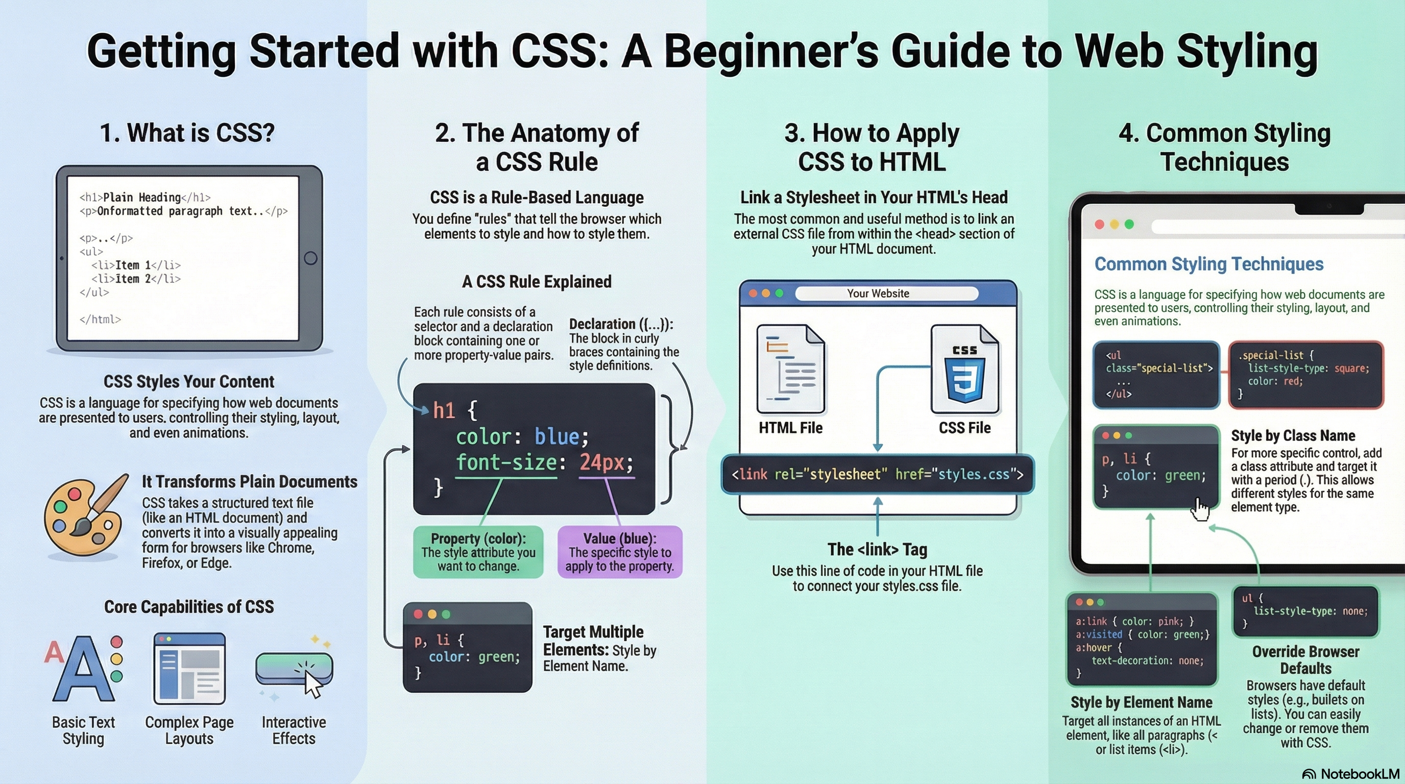
In the HTML units we covered what HTML is, and how it is used to mark up documents. These documents will be readable in a web browser. Headings will look larger than regular text, paragraphs break onto a new line and have space between them. Links are colored and underlined to distinguish them from the rest of the text. What you are seeing is the browser’s default styles (very basic styles that the browser applies to HTML to make sure it will be basically readable even if no explicit styling is specified by the author of the page). However, the web would be a boring place if all websites looked like that. Using CSS you can control exactly how HTML elements look in the browser, presenting your markup using whatever design you like.
What is CSS for?
As we have mentioned before, CSS is a language for specifying how documents are presented to users (how they are styled, laid out, etc).
A document is usually a text file structured using a markup language (HTML is the most common markup language).
Presenting a document to a user means converting it into a form usable by your audience. Browsers, like Firefox, Chrome, or Edge , are designed to present documents visually, for example, on a computer screen, projector or printer.
CSS can be used for very basic document text styling (for example changing the color and size of headings and links). It can also be used to create layout (for example turning a single column of text into a layout with a main content area and a sidebar for related information). It can even be used for effects such as animation.
CSS syntax
CSS is a rule-based language: you define rules specifying groups of styles that should be applied to particular elements or groups of elements on your web page. For example “I want the main heading on my page to be shown as large blue text.”
The following code shows a very simple CSS rule that would achieve the styling described above:
h1 {
    color: blue;
}
The rule opens with a selector . This selects the HTML element that we are going to style. In this case we are styling level one headings (<h1>).
We then have a set of curly braces { }. Inside those will be one or more declarations, which take the form of property and value pairs. Each pair specifies a property of the element(s) we are selecting, then a value that we’d like to give the property.
Before the colon, we have the property, and after the colon, the value. CSS properties have different allowable values, depending on which property is being specified. In our example, we have the color property, which can take various color values. We may also have some other properties inside the braces, such as the font-size property to change the size of the text (this property can take various size units as a value).
A CSS stylesheet may also contain many such rules, written one after the other:
h1 {
    color: blue;
}

p {
    color: green;
}
You will find that you can quickly learn some values, whereas others you will need to look up. The individual property pages on MDN (CSS reference) give you a quick way to look up properties and their values when you forget, or want to know what else you can use as a value.
Adding CSS to our document
The very first thing we need to do is to tell the HTML document that we have some CSS rules we want to use. There are three different ways to apply CSS to an HTML document that you’ll commonly come across, however, for now, we will look at the most usual and useful way of doing so: linking CSS from the head of your document.
For example, to link and use the file styles.css, you just have to add the following line somewhere inside the <head> section of the HTML document (the .css extension shows that it is a CSS file):
<link rel="stylesheet" href="styles.css">
This <link> element tells the browser that we have a stylesheet, using the rel attribute, and the location of that stylesheet as the value of the href attribute. You can test that the CSS works by adding some rules to styles.css. For example, using your code editor you may add the following code to your CSS file:
h1 {
  color: blue;
}
If you save your HTML and CSS files and reload the page in a web browser, the <h1> headers should now be blue. If that happens, congratulations (you have successfully applied some CSS to an HTML document). If that doesn’t happen, carefully check that you’ve typed everything correctly.
Proposed exercise: Linking files and adding styles
Our starting point in this unit is an HTML document. Copy the code below and save it into a new HTML file to work on your own computer. After that, create a new CSS file to set all <h1> titles to red color and save it as styles.css in the same folder as the HTML document. Finally check the results using your browser and do not forget to validate the code.
Remember that the most important part in this exercise is that you link your CSS file by putting a single line inside your <head> section; after that, inside styles.css you will only need to insert three lines:
HTML file:
<!doctype html>
<html lang="en">
<head>
    <meta charset="utf-8">
    <title>Getting started with CSS</title>

    <!-- We will use the styles which are inside 'styles.css' -->
    <link rel="stylesheet" href="styles.css">
</head>
<body>
    <h1>I am a level one heading</h1>

    <p>This is a paragraph of text.</p>
    <p>This is a paragraph and also a link to <a href="https://google.com">Google</a>.</p>

    <ul>
        <li>Item one</li>
        <li>Item two</li>
        <li>Item three</li>
    </ul>
</body>
</html>
CSS file (styles.css):
h1 {
  ...
}
Proposed exercise: Styling headers
Using the HTML and CSS files of the previous exercise, add some <h2> headers and change their colors. You can try several colors and choose anyone you like (red, green, blue, gray, purple, olive, navy, etc). As usual, check the results using your browser and do not forget to validate the code.
By making our heading blue or red, we have already demonstrated that we can target and style an HTML element. We do this by targeting an element selector (this is a selector that directly matches an HTML element name). To target all paragraphs in the document you would use the selector p. For example, to turn all paragraphs green you would use:
p {
  color: green;
}
You can target multiple selectors at once, by separating the selectors with a comma. For example, if you want all paragraphs and all list items to be green, your rule will look like this:
p, li {
    color: green;
}
Proposed exercise: Change color of several elements
Using the HTML and CSS files of the previous exercise, change the color of the paragraphs and items in the list. You can try several colors and choose anyone you like (red, green, blue, gray, purple, olive, navy, etc). As usual, check the results using your browser and do not forget to validate the code.
Another type of styling we shall take a look at in this unit is the ability to style things based on their state. A straightforward example of this is when styling links. When we style a link we need to target the <a> (anchor) element. This has different states depending on whether it is unvisited, visited, being hovered over, focused via the keyboard, or in the process of being clicked (activated). You can use CSS to target these different states. For example, the CSS below styles unvisited links pink and visited links green:
You can also change the way the link looks when the user hovers over it, for example removing the underline, which is achieved by the next rule:
a:hover {
  text-decoration: none;
}
In the above example, we have removed the underline on our link on hover. You could remove the underline from all states of a link. It is worth remembering however that in a real site, you want to ensure that visitors know that a link is a link. Leaving the underline in place, can be an important clue for people to realize that some text inside a paragraph can be clicked on (this is the behavior they are used to). As with everything in CSS, there is the potential to make the document less accessible with your changes. We will aim to highlight potential pitfalls in appropriate places.
Proposed exercise: Styling links
Using the HTML and CSS files of the previous exercise, insert several paragraphs with some other links to your preferred pages, and change the color of all the links. You must also use different colours when the link has been visited, and when the mouse is over the link. You can try several colors and choose anyone you like (red, green, blue, gray, purple, olive, navy, etc). As usual, check the results using your browser and do not forget to validate the code.
When we look at a well-marked up HTML document, even something as simple as our example, we can see how the browser is making the HTML readable by adding some default styling. Headings are large and bold and our list has bullets. As we said before, this happens because browsers have internal stylesheets containing default styles, which they apply to all pages by default; without them all of the text would run together in a clump and we would have to style everything from scratch. All modern browsers display HTML content by default in pretty much the same way.
However, you will often want something other than the choice the browser has made. This can be done by simply choosing the HTML element that you want to change, and using a CSS rule to change the way it looks. A good example is our <ul>, an unordered list. It has list bullets, and if I decide I don’t want those bullets I can remove them like so:
ul {
  list-style-type: none;
}
The list-style-type property is a good property to look at on MDN to see which values are supported. Take a look at the page for list-style-type and you will find an interactive example at the top of the page to try some different values in, then all allowable values are detailed further down the page. Looking at that page you will discover that in addition to removing the list bullets you can change them.
Proposed exercise: Changing list bullets
Using the HTML and CSS files of the previous exercise, try to set the list-style-type to square. As usual, check the results using your browser and do not forget to validate the code.
You should get something like this:
Proposed exercise: Changing list numbers
Using the HTML and CSS files of the previous exercise, add an ordered list (<ol>) and set the list-style-type to upper-roman. As usual, check the results using your browser and do not forget to validate the code.
You should get something like this:
Adding classes
So far we have styled elements based on their HTML element names. This works as long as you want all of the elements of that type in your document to look the same. Most of the time that isn’t the case and so you will need to find a way to select a subset of the elements without changing the others. The most common way to do this is to add a class to your HTML element and target that class.
In your HTML document, you can add a class attribute to any element. For example, your list may look like this when using the class attribute:
After that, in the CSS you can target the classes of square-red-list and circle-blue-list by creating specific selectors that start with a full stop character. For example:
To see what the result is, you only need to save and refresh.
Proposed exercise: Different styles for each list
Using the HTML and CSS files of the previous exercise, add several lists to get something similar to the result below. As usual, check the results using your browser and do not forget to validate the code:
Regarding the unordered lists (<ul>) you have to create 4 different classes, each one using a different value for the list-style-type property (none, disc, circle, square). For the ordered lists (<ol>) you have to create another classes, each one also using a different value for the list-style-type property (upper-roman, lower-greek, lower-alpha, upper-alpha).
Proposed exercise: Using CSS to style headers, paragraphs and general text
Change the color of any elements you like from your previous HTML exercises about links in unit 3 (https://fernandoruizrico.com/html-unit-3/). Do not forget to validate your code again.