Overview
Infographic
Slides and video
Through this presentation, these slides, and this video, you’ll get familiar with the key contents of this unit.
Introduction
Here we’ll go through all the basic fundamentals of text/font styling in detail, including setting font weight, family and style, font shorthand, text alignment and other effects, and line and letter spacing.
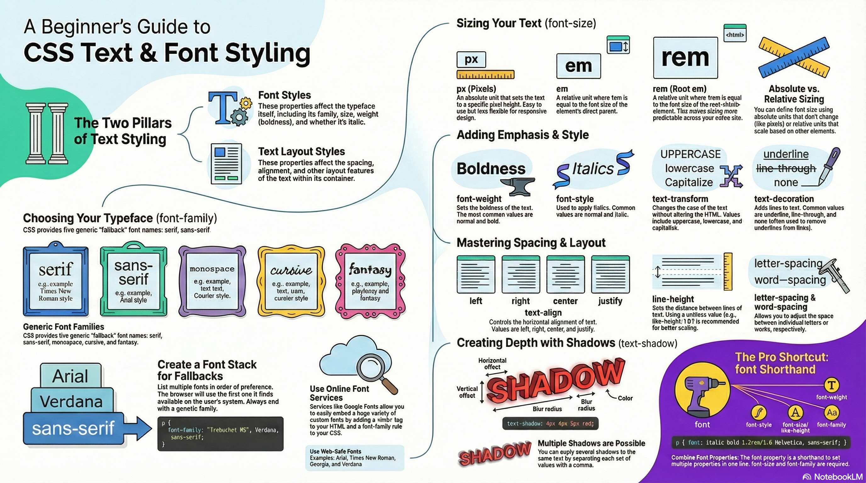
What is involved in styling text in CSS?
The CSS properties used to style text generally fall into two categories, which we’ll look at separately in this unit:
- Font styles: Properties that affect the font that is applied to the text, affecting what font is applied, how big it is, whether it is bold, italic, etc.
- Text layout styles: Properties that affect the spacing and other layout features of the text, allowing manipulation of, for example, the space between lines and letters, and how the text is aligned within the content box.
Bear in mind that the text inside an element is all affected as one single entity. You can’t select and style subsections of text unless you wrap them in an appropriate element (such as a <span> or <strong>, for example).
Font color
Let’s move straight on to look at properties for styling fonts. In this section we’ll apply some different CSS properties to the same HTML sample.
The color property sets the color of the foreground content of the selected elements (which is usually the text, but can also include a couple of other things, such as an underline or overline placed on text using the text-decoration property):
p {
  color: red;
}
Proposed exercise
Create a new web page made of 2 files: one HTML file with the code below, and another one with some CSS code to change the <h1> and <p> elements to any color you like. Do not forget to link the CSS file from the HTML file, and validate your code.
<h1>Tommy the cat</h1>

<p>Well I remember it as though it were a meal ago...</p>

<p>Said Tommy the Cat as he reeled back to clear whatever foreign matter may have nestled its way into his mighty throat. Many a fat alley rat had met its demise while staring point blank down the cavernous barrel of this awesome prowling machine. Truly a wonder of nature this urban predator — Tommy the cat had many a story to tell. But it was a rare occasion such as this that he did.</p>
Font families
To set a different font on your text, you use the font-family property — this allows you to specify a font (or list of fonts) for the browser to apply to the selected elements. The browser will only apply a font if it is available on the machine the website is being accessed on; if not, it will just use a browser default font. A simple example looks like so:
p {
  font-family: arial;
}
This would make all paragraphs on a page adopt the arial font, which is found on any computer.
Default fonts
CSS defines five generic names for fonts: serif, sans-serif, monospace, cursive and fantasy. Those are very generic and the exact font face used when using those generic names is up to each browser and can vary for each operating system they are running on. It represents a worst case scenario where the browser will try to do its best to provide at least a font that looks appropriate. serif, sans-serif and monospace are quite predictable and should provide something reasonable. On the other hand, cursive and fantasy are less predictable and we recommend using them very carefully, testing as you go.
The five names are defined as follows (you will find below some examples about how they look like):
serif: Fonts that have serifs (the flourishes and other small details you see at the ends of the strokes in some typefaces).sans-serif: Fonts that don’t have serifs.monospace: Fonts where every character has the same width, typically used in code listings.cursive: Fonts that are intended to emulate handwriting, with flowing, connected strokes.fantasy: Fonts that are intended to be decorative.
Proposed exercise: Default fonts
Using the code of the previous exercise, copy and paste the paragraphs several times (5 in total) and define some classes to apply all default fonts (serif, sans-serif, monospace, cursive, fantasy). You must set a different font and color each time. Your source code and the result should look something like this:
HTML code:
<h1>Tommy the cat</h1>

<p class="serif">Well I remember it as though it were a meal ago...</p>
<p class="serif">Said Tommy the Cat as he reeled back to clear whatever foreign matter may have nestled its way into his mighty throat. Many a fat alley rat had met its demise while staring point blank down the cavernous barrel of this awesome prowling machine. Truly a wonder of nature this urban predator — Tommy the cat had many a story to tell. But it was a rare occasion such as this that he did.</p>

...

<p class="fantasy">Well I remember it as though it were a meal ago...</p>
<p class="fantasy">Said Tommy the Cat as he reeled back to clear whatever foreign matter may have nestled its way into his mighty throat. Many a fat alley rat had met its demise while staring point blank down the cavernous barrel of this awesome prowling machine. Truly a wonder of nature this urban predator — Tommy the cat had many a story to tell. But it was a rare occasion such as this that he did.</p>
CSS code:
.serif {
    font-family: serif;
    color: blue;
}

...

.fantasy {
    font-family: fantasy;
    color: green;
}
And the result:
Web safe fonts
Speaking of font availability, there are only a certain number of fonts that are generally available across all systems and can therefore be used without much worry. These are the so-called web safe fonts.
Most of the time, as web developers we want to have more specific control over the fonts used to display our text content. The problem is to find a way to know which font is available on the computer used to see our web pages. There is no way to know this in every case, but the web safe fonts are known to be available on nearly all instances of the most used operating systems (Windows, macOS, the most common Linux distributions, Android, and iOS).
The list of actual web safe fonts will change as operating systems evolve, but it’s reasonable to consider the following fonts web safe, at least for now (many of them have been popularized thanks to the Microsoft Core fonts for the Web initiative in the late 90s and early 2000s):
- Arial (sans-serif)
- Courier New (monospace)
- Georgia (serif)
- Times New Roman (serif)
- Trebuchet MS (sans-serif)
- Verdana (sans-serif)
Among various resources, the cssfontstack.com website maintains a list of web safe fonts available on Windows and macOS operating systems, which can help you make your decision about what you consider safe for your usage.
Proposed exercise: Main safe fonts
Create a new web page with a header (<h1>) and six other paragraphs (<p>) with any content you like, and set a different font for each of them (Arial, Courier New, Georgia, Times New Roman, Trebuchet MS, Verdana). You can also change the color of the text too.
Font names that have more than one word (likeTrebuchet MS) need to be surrounded by quotes, for example:
font-family: "Trebuchet MS";
Font stacks
Since you can’t guarantee the availability of the fonts you want to use on your webpages (even a web font could fail for some reason), you can supply a font stack so that the browser has multiple fonts it can choose from. This simply involves a font-family value consisting of multiple font names separated by commas, e.g.
p {
  font-family: "Trebuchet MS", Verdana, sans-serif;
}
In such a case, the browser starts at the beginning of the list and looks to see if that font is available on the machine. If it is, it applies that font to the selected elements. If not, it moves on to the next font, and so on.
It is a good idea to provide a suitable generic font name at the end of the stack so that if none of the listed fonts are available, the browser can at least provide something approximately suitable. To emphasise this point, paragraphs are given the browser’s default serif font if no other option is available — which is usually Times New Roman — this is no good for a sans-serif font!
Proposed exercise: More safe fonts and font stacks
Create a new web page with a header and five other paragraphs with any content you like, and set a different font for each of them, but this time you cannot use any font used previously: you must select some other fonts from cssfontstack.com. Moreover, in this exercise you have to use font stacks to ensure at least one font is always available, and you can also change the color too. Finally, check your web page using several browsers from several devices and operating systems, to make sure that all fonts are shown.
If you are changing the color and the font family using font stacks, your CSS and HTML code should look like this:
.font-book {
  color: blue;
  font-family: "Book Antiqua", Arial, sans-serif;
}
<p class="font-book"> ... </p>
Using an online font service
Online font services generally store and serve fonts for you, so you don’t have to worry about the font availability, and generally you just need to insert a simple line or two of code into your site to make everything work. Examples include Adobe Fonts and Cloud.typography. Most of these services are subscription-based, with the notable exception of Google Fonts, a useful free service, especially for rapid testing work and writing demos.
Most of these services are easy to use, so we won’t cover them in great detail. Let’s have a quick look at Google fonts, so you can get the idea. These are the steps that you have to follow to use one or several of the fonts they provide:
- Go to Google Fonts.
- You may use the filters to display the kinds of fonts you like.
- To select a font family, click on it.
- Once you have selected the font, press the
Get fontbutton on the upper right corner. - Press now the
<> Get embed codebutton on the upper right corner. - Copy the code shown inside the box labeled with
Embed code in the <head> of your html. Those are the links to the selected font. - Paste the code into the head of your HTML file. Put it above the existing
<link>elements you may have on your web page, so that the font is imported before you try to use it in your own CSS. - You then need to select the font using a CSS declaration inside your CSS to apply the custom font to your HTML, as for example:
font-family: "Permanent Marker";
Proposed exercise: Google fonts
Create a web page with ten paragraphs, each one using a different Google font.
For example, to use the Google fonts “Nerko One”, “Permanent Marker” and “Rock Salt”, your HTML code should look like this:
<!doctype html>
<html>
  <head>
    <meta charset="utf-8">
    <title>Web font example</title>
    <link rel="preconnect" href="https://fonts.gstatic.com">
    <link rel="stylesheet" href="https://fonts.googleapis.com/css2?family=Nerko+One&family=Permanent+Marker&family=Rock+Salt&display=swap">
    <link rel="stylesheet" href="styles.css">
  </head>
  <body>
    <h1>Web font example</h1>
    <p class="nerko">This is a text with Nerko One font</p>
    <p class="marker">This is a text with Permanent Marker font</p>
    <p class="rock">This is a text with Rock Salt</p>
  </body>
</html>
The CSS code inside your own file styles.css:
.nerko {
  font-family: 'Nerko One', cursive;
}
.marker {
  font-family: 'Permanent Marker', cursive;
}
.rock {
  font-family: 'Rock Salt', cursive;
}
And the result:
Font size
Font size (set with the font-size property) can take values measured in several units (such as percentages), however the most common units you’ll use to size text are:
px(pixels): The number of pixels high you want the text to be (this is an absolute unit).em: 1emis equal to the font size set on the parent element of the current element we are styling (more specifically, the width of a capital letter M contained inside the parent element.) This can become tricky to work out if you have a lot of nested elements with different font sizes set, but t is quite natural once you get used to it, and you can useemto size everything, not just text. You can have an entire website sized usingem, which makes maintenance easy.rem: These work just likeem, except that 1remis equal to the font size set on the root element of the document (i.e.<html>), not the parent element. This makes doing the maths to work out your font sizes much easier, although if you want to support really old browsers, you might struggle (remis not supported in Internet Explorer 8 and below).
Absolute size (pixels)
The easiest way to change the size of your text is setting a specific number of pixels. However, this might not be the best solution, since in case you want to increase (or decrease) the size of all text in your website, you should change each value manually (one time per each CSS rule). So, we are going ahead with a first exercise using pixels, but after that we will use a more convenient way in another exercise using relative values.
Proposed exercise: Absolute sizing with “px”
Create a new web page with at least 15 paragraphs of some text you like, and set the font size for each paragraph a bit larger each time. You must use pixels to set each font size.
Your source code and result should look like this (you may choose any class names, colors and sizes you like):
.ten {
  color: black;
  font-size: 10px;
}

.eleven {
  color: blue;
  font-size: 11px;
}

.twelve {
  color: green;
  font-size: 12px;
}

.thirteen {
  color: brown;
  font-size: 13px;
}

...
<p class="ten">This is a text with 10 px font size</p>
<p class="eleven">This is a text with 11 px font size</p>
<p class="twelve">This is a text with 12 px font size</p>
<p class="thirteen">This is a text with 13 px font size</p>
...
Relative size (“em” and “rem”)
The font-size of an element is inherited from that element’s parent element. This all starts with the root element of the entire document (<html>) the font-size of which is set to 16 px as standard across browsers. Any paragraph (or another element that doesn’t have a different size set by the browser) inside the root element will have a final size of 16 px. Other elements may have different default sizes, for example an <h1> element has a size of 2 em set by default, so it will have a final size of 32 px.
Things become more tricky when you start altering the font size of nested elements. For example, if you had an <article> element in your page, and set its font-size to 1.5 em (which would compute to 24 px final size), and then wanted the paragraphs inside the <article> elements to have a computed font size of 20 px, what em value would you use?
<!-- document base font-size is 16px -->
<article> <!-- If my font-size is 1.5em -->
  <p>My paragraph</p> <!-- How do I compute to 20px font-size? -->
</article>
You would need to set its em value to 20/24, or 0.83333333 em. The maths can be complicated, so you need to be careful about how you style things. It is best to use rem where you can, to keep things simple, and avoid setting the font-size of container elements where possible.
When sizing your text, it is usually a good idea to set the base font-size of the document to 10px, so that then the maths is a lot easier to work out (required (r)em values are then the pixel font size divided by 10, not 16). After doing that, you can easily size the different types of text in your document to what you want. Also it is a good idea to list all your font-size rulesets in a designated area in your stylesheet, so they are easy to find.
Proposed exercise: Relative sizing with “rem”
Create a new web page with at least 15 paragraphs of some text you like, and set the font size for each paragraph a bit larger each time. This time, you must use relative sizing to set each font size (for example, with “rem” units). When you finish writing your code, check the results using your browser, and set different values for the main size (inside the <html> element) and check that the size of all the paragraphs changes accordingly.
Your source code and result should look like this (you may choose any class names, colors and sizes you like):
html {
  color: black;
  font-size: 10px;
}

.eleven {
  color: blue;
  font-size: 1.1rem;
}

.twelve {
  color: green;
  font-size: 1.2rem;
}

.thirteen {
  color: olive;
  font-size: 1.3rem;
}

...
<p>This is a text with 1 rem font size</p>
<p class="eleven">This is a text with 1.1 rem font size</p>
<p class="twelve">This is a text with 1.2 rem font size</p>
<p class="thirteen">This is a text with 1.3 rem font size</p>
...
Font style, font weight, text transform, and text decoration
CSS provides four common properties to alter the visual weight/emphasis of text:
- font-style: Used to turn italic text on and off. Possible values are as follows (you’ll rarely use this, unless you want to turn some italic styling off for some reason):
normal: Sets the text to the normal font (turns existing italics off)italic: Sets the text to use the italic version of the font if available; if not available, it will simulate italics with oblique instead.oblique: Sets the text to use a simulated version of an italic font, created by slanting the normal version.
- font-weight: Sets how bold the text is. This has many values available in case you have many font variants available (such as -light, -normal, -bold, -extrabold, -black, etc.), but realistically you’ll rarely use any of them except for
normalandbold:normal,bold: Normal and bold font weightlighter,bolder: Sets the current element’s boldness to be one step lighter or heavier than its parent element’s boldness.100–900: Numeric boldness values that provide finer grained control than the above keywords, if needed.
- text-transform: Allows you to set your font to be transformed. Values include:
none: Prevents any transformation.uppercase: Transforms ALL TEXT TO CAPITALS.lowercase: Transforms all text to lower case.capitalize: Transforms all words to Have The First Letter Capitalized.full-width: Transforms all glyphs to be written inside a fixed-width square, similar to a monospace font, allowing aligning of e.g. Latin characters along with Asian language glyphs (like Chinese, Japanese, Korean).
- text-decoration: Sets/unsets text decorations on fonts (you’ll mainly use this to unset the default underline on links when styling them.) Available values are:
none: Unsets any text decorations already present.underline: Underlines the text.overline: Gives the text an overline.line-through: Puts astrikethrough over the text.
You may use some combinations of the options above. For example:
p {
  font-weight: bold;
  text-transform: uppercase;
  text-decoration: line-through;
}
You should also note that text-decoration can accept multiple values at once, if you want to add multiple decorations simultaneously, for example text-decoration: underline overline. Also note that text-decoration is a shorthand property for text-decoration-line, text-decoration-style, and text-decoration-color. You can use combinations of these property values to create interesting effects, for example:
p {
  font-weight: bold;
  text-transform: uppercase;
  text-decoration: line-through red wavy;
}
Proposed exercise: Style, weight, transform and decoration
Create a website with at least 15 paragraphs to show most of the values that can be used with
This is an example of the result you should get (you may choose your own combinations):font-style,font-weight,font-transformandfont-decorationproperties.
Text drop shadows
You can apply drop shadows to your text using the text-shadow property. This takes up to four values, as shown in the example below:
text-shadow: 4px 4px 5px red;
The four properties are as follows:
- The horizontal offset of the shadow from the original text. This can take most available CSS length and size units, but you’ll most commonly use
px. Positive values move the shadow right, and negative values left. This value has to be included. - The vertical offset of the shadow from the original text; behaves basically just like the horizontal offset, except that it moves the shadow up/down, not left/right. This value has to be included.
- The blur radius. A higher value means the shadow is dispersed more widely. If this value is not included, it defaults to 0, which means no blur. This can take most available CSS length and size units.
- The base color of the shadow, which can take any CSS color unit. If not included, it defaults to currentColor, i.e. the shadow’s color is taken from the element’s color property.
You can also apply multiple shadows to the same text by including multiple shadow values separated by commas, for example:
text-shadow: 1px 1px 1px red,
             2px 2px 1px red;
Proposed exercise: Simple shadows
Create a website with at least 15 paragraphs with shadows, each one with different offsets and colors. You can also change any other properties you like, such as the font-family. You should use Google Fonts to ensure that everything is displayed in the right way for all the operating systems and browsers.
This is an example of the result you should get (you may choose your own combinations):
Proposed exercise: Multiple shadows
Create a website with at least 10 paragraphs each one with multiple shadows and also different offsets and colors. You can also change any other properties you like, such as the font-family and font-size. You should use Google Fonts to ensure that everything is displayed in the right way for all the operating systems and browsers.
This is an example of the result you should get (you may choose your own combinations):
Text-alignment
The text-align property is used to control how text is aligned within its containing content box. The available values are as follows, and work in pretty much the same way as they do in a regular word processor application:
left: Left-justifies the text.right: Right-justifies the text.center: Centers the text.justify: Makes the text spread out, varying the gaps in between the words so that all lines of text are the same width. You need to use this carefully, since sometimes it can look terrible, especially when applied to a paragraph with lots of long words in it. If you are going to use this, you should also think about using something else along with it, such as hyphens, to break some of the longer words across lines.
For example, you can center some text just by using the following CSS code:
text-align: center;
Proposed exercise: Alignment types
Create a web page with 4 headers and 4 paragraphs, each one with a different alignment type.
You can use any text you like, but keeping in mind that you must insert several lines to properly see how the alignment is done:
Line height
The line-height property sets the height of each line of text. This can take most length and size units, but can also take a unitless value, which acts as a multiplier and is generally considered the best option (the font-size is multiplied to get the line-height). Body text generally looks nicer and is easier to read when the lines are spaced apart; the recommended line height is around 1.5 – 2 (double spaced.) So to set our lines of text to 1.6 times the height of the font, you’d use this:
line-height: 1.6;
Proposed exercise: Line heights
Create a web page with at least 3 headers and 3 paragraphs, each one with a different line height.
Letter and word spacing
The letter-spacing and word-spacing properties allow you to set the spacing between letters and words in your text. You won’t use these very often, but might find a use for them to get a certain look, or to improve the legibility of a particularly dense font. They can take most length and size units.
So as an example, we could apply some word-spacing and letter-spacing like this:
word-spacing: 4px;
letter-spacing: 4px;
Proposed exercise: Spacing
Create a web page with at least 2 headers and 2 paragraphs, each one with different word and letter spacing (you may choose any values you like).
Font shorthand
Many font properties can also be set through the shorthand property font. These are written in the following order: font-style, font-variant, font-weight, font-stretch, font-size, line-height, and font-family. Among all those properties, only font-size and font-family are required when using the font shorthand property. A forward slash has to be put in between the font-size and line-height properties.
A full example would look like this:
font: italic normal bold normal 3em/1.5 Helvetica, Arial, sans-serif;
Proposed exercise: Font properties in one line
Create a new web page with at least five paragraphs and change the font properties using one single CSS line (font shorthand) for each one.
Other properties worth looking at
The above properties give you an idea of how to start styling text on a webpage, but there are many more properties you could use. We just wanted to cover the most important ones here. Once you’ve become used to using the above, you should also explore the following:
Font styles:
- font-variant: Switch between small caps and normal font alternatives.
- font-kerning: Switch font kerning options on and off.
- font-feature-settings: Switch various OpenType font features on and off.
- font-variant-alternates: Control the use of alternate glyphs for a given font-face.
- font-variant-caps: Control the use of alternate capital glyphs.
- font-variant-east-asian: Control the usage of alternate glyphs for East Asian scripts, like Japanese and Chinese.
- font-variant-ligatures: Control which ligatures and contextual forms are used in text.
- font-variant-numeric: Control the usage of alternate glyphs for numbers, fractions, and ordinal markers.
- font-variant-position: Control the usage of alternate glyphs of smaller sizes positioned as superscript or subscript.
- font-size-adjust: Adjust the visual size of the font independently of its actual font size.
- font-stretch: Switch between possible alternative stretched versions of a given font.
- text-underline-position: Specify the position of underlines set using the
text-decoration-linepropertyunderlinevalue. - text-rendering: Try to perform some text rendering optimization.
Text layout styles:
- text-indent: Specify how much horizontal space should be left before the beginning of the first line of the text content.
- text-overflow: Define how overflowed content that is not displayed is signaled to users.
- white-space: Define how whitespace and associated line breaks inside the element are handled.
- word-break: Specify whether to break lines within words.
- direction: Define the text direction (This depends on the language and usually it’s better to let HTML handle that part as it is tied to the text content.)
- hyphens: Switch on and off hyphenation for supported languages.
- line-break: Relax or strengthen line breaking for Asian languages.
- text-align-last: Define how the last line of a block or a line, right before a forced line break, is aligned.
- text-orientation: Define the orientation of the text in a line.
- overflow-wrap: Specify whether or not the browser may break lines within words in order to prevent overflow.
- writing-mode: Define whether lines of text are laid out horizontally or vertically and the direction in which subsequent lines flow.
Quiz
Test your skills with this quiz about text formatting.