CSS. Unit 6. Flexbox.

Why flexbox?

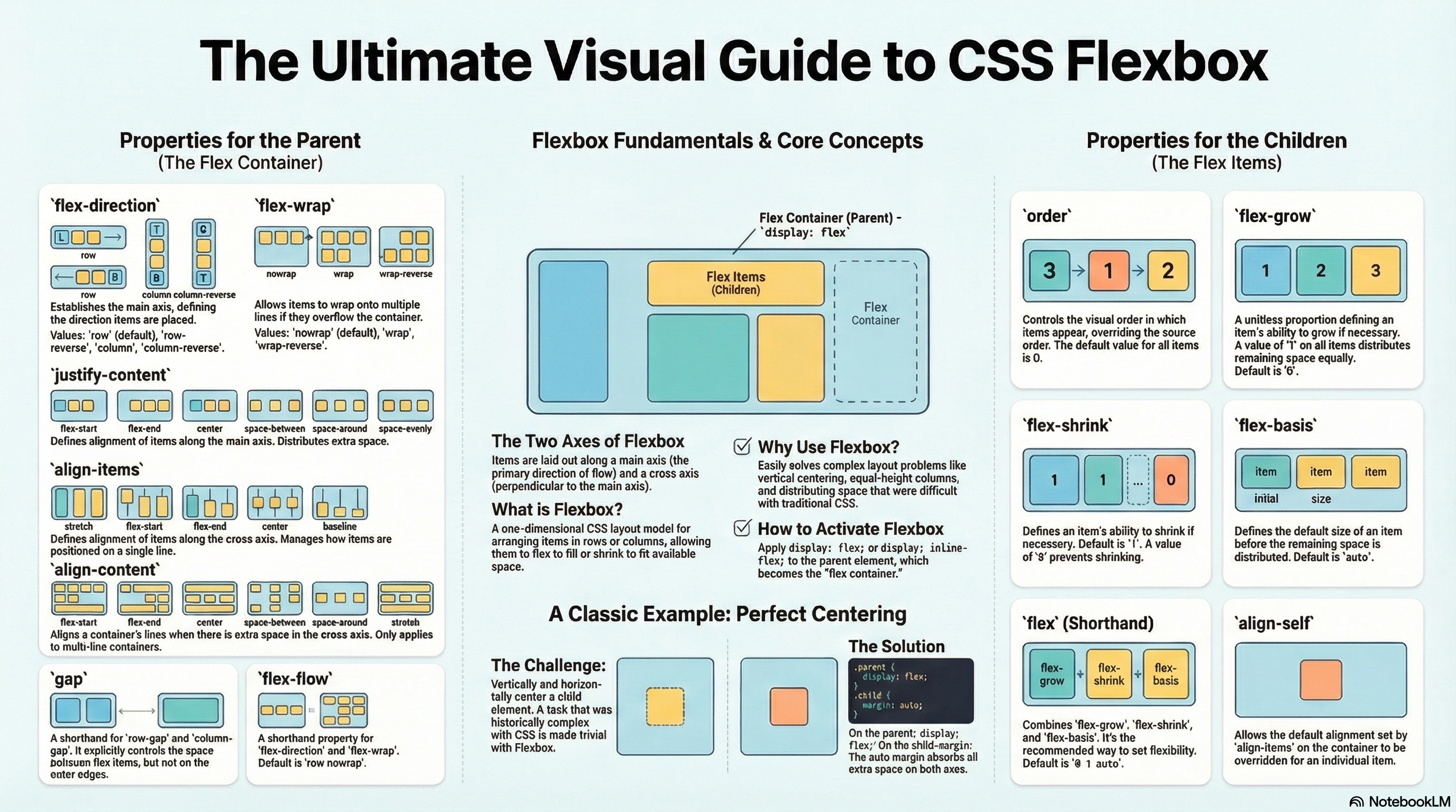
Flexbox is a one-dimensional layout method for laying out items in rows or columns. Items flex to fill additional space and shrink to fit into smaller spaces. This unit explains all the fundamentals.

For a long time, the only reliable cross browser-compatible tools available for creating CSS layouts were things like floats and positioning. These are fine, and they work, but in some ways they are also rather limiting and frustrating.

The following simple layout requirements are either difficult or impossible to achieve with such tools, in any kind of convenient, flexible way:

  • Vertically centering a block of content inside its parent.
  • Making all the children of a container take up an equal amount of the available width/height, regardless of how much width/height is available.
  • Making all columns in a multiple-column layout adopt the same height even if they contain a different amount of content.

As you’ll see in subsequent sections, flexbox makes a lot of layout tasks much easier. Let’s dig in!

Introducing a simple example

In this unit we are going to get you to work through a series of exercises to help you understand how flexbox works. To get started, we will use some simple code like this one:

<header>
  <h1>Valencian Community</h1>
</header>

<section>
  <article>
    <h2>Alicante</h2>
    <p>The campus of the University of Alicante lies in San Vicente del Raspeig, bordering the city of Alicante to the north. More than 25,000 students attend the University.</p>
  </article>

  <article>
    <h2>Valencia</h2>
    <p>Valencia is the capital of the autonomous community of Valencia and the third-largest city in Spain after Madrid and Barcelona, surpassing 800,000 inhabitants in the municipality.</p>
  </article>

  <article>
    <h2>Castellón</h2>
    <p>The city is notorious for its music festivals, among which we find: the Tanned Tin music festival for alternative music, the Benicàssim's International Festival, the Arenal Sound and the Rototom Sunsplash Festival, known for its reggae music.</p>
  </article>
</section>
html {
  font-family: sans-serif;
}

body {
   margin: 0;
}

header {
  background: purple;
  height: 75px;
}

h1 {
  text-align: center;
  color: white;
  line-height: 75px;
  margin: 0;
}

article {
  padding: 1%;
  margin: 1%;
  background: aqua;
}

Valencian Community

Alicante

The campus of the University of Alicante lies in San Vicente del Raspeig, bordering the city of Alicante to the north. More than 25,000 students attend the University.

Valencia

Valencia is the capital of the autonomous community of Valencia and the third-largest city in Spain after Madrid and Barcelona, surpassing 800,000 inhabitants in the municipality.

Castellón

The city is notorious for its music festivals, among which we find: the Tanned Tin music festival for alternative music, the Benicàssim’s International Festival, the Arenal Sound and the Rototom Sunsplash Festival, known for its reggae music.

You’ll see that we have a <header> element with a top level heading inside it, and a <section> element containing three <article>s. We are going to use these to create a fairly standard three column layout.

Proposed exercise: Simple boxes

Using the code of the previous example, create a new webpage with a similar content. You can use any other colors and styles you like.

Specifying what elements to lay out as flexible boxes

To start with, we need to select which elements are to be laid out as flexible boxes. To do this, we set a special value of display on the parent element of the elements you want to affect. In this case we want to lay out the <article> elements, so we set this on the <section>:

section {
  display: flex;
}

This causes the <section> element to become a flex container, and its children to become flex items. The result of this should be something like so:

Valencian Community

Alicante

The campus of the University of Alicante lies in San Vicente del Raspeig, bordering the city of Alicante to the north. More than 25,000 students attend the University.

Valencia

Valencia is the capital of the autonomous community of Valencia and the third-largest city in Spain after Madrid and Barcelona, surpassing 800,000 inhabitants in the municipality.

Castellón

The city is notorious for its music festivals, among which we find: the Tanned Tin music festival for alternative music, the Benicàssim’s International Festival, the Arenal Sound and the Rototom Sunsplash Festival, known for its reggae music.

So, this single declaration gives us everything we need — incredible, right? We have our multiple column layout with equal-sized columns, and the columns are all the same height. This is because the default values given to flex items (the children of the flex container) are set up to solve common problems such as this.

To be clear, let’s reiterate what is happening here. The element we’ve given a   display value of flex to is acting like a block-level element in terms of how it interacts with the rest of the page, but its children are being laid out as flex items. The next section will explain in more detail what this means. Note also that you can use a display value of inline-flex if you wish to lay out an element’s children as flex items, but have that element behave like an inline element.

Proposed exercise: Flexible boxes

Add some CSS code to the previous exercise so that all the contents inside the <section> element are displayed as flexible boxes (display:flex) which are shown from left to right, all of them having the same height.

As explained, you only have to add three lines of code and everything is done! You will have flexible boxes:
section {
  display: flex;
}

The flex model

When elements are laid out as flex items, they are laid out along two axes:

  • The main axis is the axis running in the direction the flex items are being laid out in (e.g. as rows across the page, or columns down the page.) The start and end of this axis are called the main start and main end.
  • The cross axis is the axis running perpendicular to the direction the flex items are being laid out in. The start and end of this axis are called the cross start and cross end.
  • The parent element that has display: flex set on it (the <section> in our example) is called the flex container.
  • The items being laid out as flexible boxes inside the flex container are called flex items (the <article> elements in our example).

Bear this terminology in mind as you go through subsequent sections. You can always refer back to it if you get confused about any of the terms being used.

Columns or rows?

Flexbox provides a property called flex-direction that specifies what direction the main axis runs in (what direction the flexbox children are laid out in). By default this is set to row, which causes them to be laid out in a row in the direction your browser’s default language works in (usually from left to right), but you can also use the following declaration inside your <section> rule:

flex-direction: column;

This would put the items back in a column layout, much like they were before we added any CSS.

Wrapping

One issue that arises when you have a fixed amount of width or height in your layout is that eventually your flexbox children will overflow their container, breaking the layout. And also if you have many boxes, the final result will be presented with some quite narrow columns. Have a look at our example:

Valencian Community

Alicante

The campus of the University of Alicante lies in San Vicente del Raspeig, bordering the city of Alicante to the north. More than 25,000 students attend the University.

Valencia

Valencia is the capital of the autonomous community of Valencia and the third-largest city in Spain after Madrid and Barcelona, surpassing 800,000 inhabitants in the municipality.

Castellón

The city is notorious for its music festivals, among which we find: the Tanned Tin music festival for alternative music, the Benicàssim’s International Festival, the Arenal Sound and the Rototom Sunsplash Festival, known for its reggae music.

Alcoy

Alcoy is an industrial and university city, region and municipality located in the province of Alicante. The Serpis river crosses the municipal boundary.

Benidorm

It has been a tourist destination since its port was extended and the first hotels were built. Today it is known for its beaches and skyscrapers and receives as many tourists from abroad as from Spain.

Here we see that the children are indeed breaking out of their container for small screens of filling the window with narrow columns. One way in which you can fix this is to add the following declaration to your <section> rule:

section {
  ...
  flex-wrap: wrap;
}

Also, add the following declaration to your <article> rule:

article {
  ...
  flex: 48%;
}

You’ll see that the layout looks much better with this included:

Valencian Community

Alicante

The campus of the University of Alicante lies in San Vicente del Raspeig, bordering the city of Alicante to the north. More than 25,000 students attend the University.

Valencia

Valencia is the capital of the autonomous community of Valencia and the third-largest city in Spain after Madrid and Barcelona, surpassing 800,000 inhabitants in the municipality.

Castellón

The city is notorious for its music festivals, among which we find: the Tanned Tin music festival for alternative music, the Benicàssim’s International Festival, the Arenal Sound and the Rototom Sunsplash Festival, known for its reggae music.

Alcoy

Alcoy is an industrial and university city, region and municipality located in the province of Alicante. The Serpis river crosses the municipal boundary.

Benidorm

It has been a tourist destination since its port was extended and the first hotels were built. Today it is known for its beaches and skyscrapers and receives as many tourists from abroad as from Spain.

We now have multiple rows — as many flexbox children are fitted onto each row as makes sense, and any overflow is moved down to the next line. The flex:48% declaration set on the articles means that each will be at least half the window size (48% wide, since we have 1% margins on both left and right). You might also notice that the last few children on the last row are each made wider so that the entire row is still filled.

But there’s more we can do here. For example, you can try changing your flex-direction property value to row-reverse. Now you’ll see that you still have your multiple row layout, but it starts from the opposite corner of the browser window and flows in reverse.

Proposed exercise: Wrapped content

Using the code of the last example above, add three more towns you like (to show at least 9 towns in total), and also insert a picture for each one. You may also change the colors of the boxes and text as you like, or you can even add more styles to your code (box and text shadows, etc.).

For example:

Valencian Community

Alicante

The campus of the University of Alicante lies in San Vicente del Raspeig, bordering the city of Alicante to the north. More than 25,000 students attend the University.

Valencia

Valencia is the capital of the autonomous community of Valencia and the third-largest city in Spain after Madrid and Barcelona, surpassing 800,000 inhabitants in the municipality.

Castellón

The city is notorious for its music festivals, among which we find: the Tanned Tin music festival for alternative music, the Benicàssim’s International Festival, the Arenal Sound and the Rototom Sunsplash Festival, known for its reggae music.

Benidorm

It has been a tourist destination since its port was extended and the first hotels were built. Today it is known for its beaches and skyscrapers and receives as many tourists from abroad as from Spain.

CSS. Unit 5. The box model.

Introduction

Everything in CSS has a box around it, and understanding these boxes is key to being able to create layouts with CSS, or to align items with other items. In this lesson, we will take a proper look at the CSS Box Model so that you can build more complex layout tasks with an understanding of how it works and the terminology that relates to it.

What is the CSS box model?

The full CSS box model applies to block boxes. This model defines how the different parts of a box (margin, border, padding, and content) work together to create a box that you can see on the page.

Parts of a box

When making up a block box in CSS we will have to keep in mind the following parts:

  • Content box: The area where your content is displayed, which can be sized using properties like width and height.
  • Padding box: The padding sits around the content as white space; its size can be controlled using padding and related properties.
  • Border box: The border box wraps the content and any padding. Its size and style can be controlled using border and related properties.
  • Margin box: The margin is the outermost layer, wrapping the content, padding and border as whitespace between this box and other elements. Its size can be controlled using margin and related properties.

The below diagram shows these layers:

In the standard box model, if you give a box a width and a height attribute, this defines the width and height of the content box. Any padding and border is then added to that width and height to get the total size taken up by the box. This is shown in the image below.

If we assume that the box has the following CSS defining widthheightmarginborder, and padding:

.box {
  width: 350px;
  height: 150px;
  margin: 10px;
  padding: 25px;
  border: 5px solid black;
}

The space taken up by our box using the standard box model will actually be 410px (350 + 25 + 25 + 5 + 5), and the height 210px (150 + 25 + 25 + 5 + 5), as the padding and border are added to the width used for the content box:

The margin is not counted towards the actual size of the box. Sure, it affects the total space that the box will take up on the page, but only the space outside the box. The box’s area stops at the border (it does not extend into the margin).

Proposed exercise: Playing with box models

In the below example, you can see a couple of boxes with a CSS class which gives some values to width, height, marginborder, and padding. Using that code, create a web page with five different boxes, each one with different styles. You have to change also the color of the text (you can choose the colors your like). And finally add some shadows to the text using different styles and colors.

You can have a look at the different colors here: https://developer.mozilla.org/en-US/docs/Web/CSS/color_value

CSS code:

.box1 {
  border: 5px solid red;
  background-color: lightgray;
  padding: 10px;
  margin: 25px;
  width: 250px;
  height: 200px;
  ...
}

.box2 {
  border: 7px solid green;
  background-color: gray;
  padding: 5px;
  margin: 0px;
  width: 300px;
  height: 200px;
  color: white;
  ...
}

...

HTML code:

<div class="box1">This is a 250x200px box with a 5px red border, and lightgray background, 10px padding and 25px margin.</div>
<div class="box2">This is a 300x200px box with a 7px green border, gray background, white text color, 5px padding and 0px margin.</div>
...

And the result:

This is a 250x200px box with a 5px red border, and lightgray background, and 10px padding and 25px margin.
This is a 300x200px box with a 7px green border, gray background, white text color, and 5px padding and 0px margin.

Margins, padding and borders

You’ve already seen the marginpadding, and border properties at work in the example above. The properties used in that example are shorthands and allow us to set all four sides of the box at once. These shorthands also have equivalent longhand properties, which allow control over the different sides of the box individually.

Let’s explore these properties in more detail.

Margin

The margin is an invisible space around your box. It pushes other elements away from the box. Margins can have positive or negative values. Setting a negative margin on one side of your box can cause it to overlap other things on the page.

We can control all margins of an element at once using the margin property, or each side individually using the equivalent longhand properties:

Proposed exercise: Custom margins

Create a web page with the example below, and change the margin values to see how the boxes are pushed around due to the margin creating or removing space (if it is a negative margin) between this element and the containing element. Finally, add three more boxes with any style you like inside the same container.

.container {
  border: 5px solid red; 
}

.box1 {
  border: 5px solid green;
  margin-top: 10px;
  margin-left: 10px;
  width: 50%;
}

.box2 {
  border: 5px solid blue;
  margin-top: 10px;
  margin-left: 50px;
  width: 50%;
}

.box3 {
  border: 5px solid orange;
  margin-top: 10px;
  margin-left: 100px;
  width: 50%;
}
...
<div class="container">
  <div class="box1">This is a box with 50% width and 10px from top and left inside a container</div>
  <div class="box2">This is a box with 50% width and 10px from top and 50px left inside a container</div>
  <div class="box3">This is a box with 50% width and 10px from top and 100px left inside a container</div>
  ...
</div>
This is a box with 50% width and 10px from top and left inside a container
This is a box with 50% width and 10px from top and 50px left inside a container
This is a box with 50% width and 10px from top and 100px left inside a container

Padding

The padding sits between the border and the content area. Unlike margins you cannot have negative amounts of padding, so the value must be 0 or a positive value. Any background applied to your element will display behind the padding, and it is typically used to push the content away from the border.

We can control the padding on each side of an element individually using the padding property, or each side individually using the equivalent longhand properties:

Proposed exercise: Custom padding

If you change the values for padding on the classes .box in the example below you can see that this changes where the text begins in relation to the box. Padding can be changed on any element, and will make space between its border and whatever is inside the element. Create a web page with the code below and add three more boxes using different paddings and styles.

.box1 {
  border: 5px solid red;
  margin: 10px;
  ...
}

.box2 {
  border: 5px solid blue;
  margin: 10px;
  padding: 25px;
  ...
}

.box3 {
  border: 5px solid green;
  margin: 10px;
  padding: 50px;
  ...
}
...
<div class="box1">
  This is a box without padding
</div>
<div class="box2">
  This is a box with 25 px padding
</div>
<div class="box3">
  This is a box with 50px padding
</div>
...
This is a box without padding
This is a box with 25 px padding
This is a box with 50px padding

Borders

The border is drawn between the margin and the padding of a box. If you are using the standard box model, the size of the border is added to the width and height of the box.

For styling borders, there are a large number of properties (there are four borders, and each border has a style, width and color that we might want to manipulate).

You can set the width, style, or color of all four borders at once using the border property.

To set the properties of each side individually, you can use:

To set the width, style, or color of all sides, use the following:

To set the width, style, or color of a single side, you can use one of the most granular longhand properties:

Proposed exercise: Custom borders

In the example below we have used various shorthands and longhands to style the borders. Create a new web page with that code and have a play around with the different properties to check that you understand how they work. Finally add three more boxes and set the border styles as you like.

You can have a look at the MDN pages (linked above) to get information about the different styles of border you can choose from. Also you can have a look at the different colors here: https://developer.mozilla.org/en-US/docs/Web/CSS/color_value
.box1 {
  border-top: 5px dotted green;
  border-right: 5px dashed orange;
  border-bottom: 5px dotted red;
  border-left: 5px dashed blue;
  padding: 15px;
  margin-top: 15px;
  margin-bottom: 15px;
  text-align: center;
  ...
}

.box2 {
  border: 5px solid black;
  border-left-width: 10px;
  border-right-width: 10px;
  border-top-color: aqua;
  border-bottom-color: pink;
  padding: 15px;
  text-align: center;
  ...
}

.box3 {
  border: 2px solid black;
  padding: 10px;
  ...
}

...
<div class="box1">This is a box with different types of borders</div>
<div class="box2">This is another box with different types of borders</div>
<div class="box1">
  <div class="box2">This is a box with different types of borders inside another box</div>
</div>
<div class="box3">
  <div class="box3">
    <div class="box3">
      <div class="box3">
        <div class="box3">
          <div class="box3">
            These are boxes inside boxes
          </div>
        </div>
      </div>
    </div>
  </div>
</div>
...
This is a box with different types of borders
This is another box with different types of borders
This is a box with different types of borders inside another box
These are boxes inside boxes

CSS. Unit 4. Styling lists.

Introduction

Lists behave like any other text for the most part, but there are some CSS properties specific to lists that you need to know about, and some best practices to consider. This unit explains all.

A simple list example

To begin with, let’s look at a simple example with lists. Throughout this unit, we’ll look at unordered, ordered, and description lists (all have styling features that are similar, and some that are particular to their type of list). The HTML for our example looks like so:

<h2>Shopping (unordered list)</h2>

<ul>
  <li>Hummus</li>
  <li>Pita</li>
  <li>Green salad</li>
  <li>Halloumi</li>
</ul>

<h2>Recipe (ordered list)</h2>

<ol>
  <li>Toast pita, leave to cool, then slice down the edge.</li>
  <li>Fry the halloumi in a shallow, non-stick pan, until browned on both sides.</li>
  <li>Wash and chop the salad.</li>
  <li>Fill pita with salad, hummus, and fried halloumi.</li>
</ol>

<h2>Ingredients (description list)</h2>

<dl>
  <dt>Hummus</dt>
  <dd>A thick dip/sauce generally made from chick peas blended with tahini, lemon juice, salt, garlic, and other ingredients.</dd>
  <dt>Pita</dt>
  <dd>A soft, slightly leavened flatbread.</dd>
  <dt>Halloumi</dt>
  <dd>A semi-hard, unripened, brined cheese with a higher-than-usual melting point, usually made from goat/sheep milk.</dd>
  <dt>Green salad</dt>
  <dd>That green healthy stuff that many of us just use to garnish kebabs.</dd>
</dl>

The list elements probably will have the following styling defaults:

  • The <ul> and <ol> elements have a top and bottom margin of 16px (1em)  and a padding-left of 40px (2.5em).
  • The list items (<li> elements) have no set defaults for spacing.
  • The <dl> element has a top and bottom margin of 16px (1em), but no padding set.
  • The <dd> elements have margin-left of 40px (2.5em).
  • The <p> elements we’ve included for reference have a top and bottom margin of 16px (1em), the same as the different list types.

Proposed exercise: Lists with default styling

Create a web page with the list of the previous example, and check the result in your browser. It should be displayed with the default styling (no CSS must be used right now).

You should get something like this:

Shopping (unordered list)

  • Hummus
  • Pita
  • Green salad
  • Halloumi

Recipe (ordered list)

  1. Toast pita, leave to cool, then slice down the edge.
  2. Fry the halloumi in a shallow, non-stick pan, until browned on both sides.
  3. Wash and chop the salad.
  4. Fill pita with salad, hummus, and fried halloumi.

Ingredients (description list)

Hummus
A thick dip/sauce generally made from chick peas blended with tahini, lemon juice, salt, garlic, and other ingredients.
Pita
A soft, slightly leavened flatbread.
Halloumi
A semi-hard, unripened, brined cheese with a higher-than-usual melting point, usually made from goat/sheep milk.
Green salad
That green healthy stuff that many of us just use to garnish kebabs.

Handling list styling

When styling lists, you need to adjust their styles so they keep the same vertical spacing as their surrounding elements (such as paragraphs and images; sometimes called vertical rhythm), and the same horizontal spacing as each other.

Some CSS for the text styling and spacing could be as follows:

html {
  font-family: Helvetica, Arial, sans-serif;
  font-size: 10px;
}

h2 {
  font-size: 2rem;
  text-shadow: 1px 1px 5px orange;
}

ul, ol, dl {
  font-size: 1.5rem;
}

li {
  line-height: 1.5;
}

dd, dt {
  line-height: 1.5;
}

dt {
  font-weight: bold;
  padding-left: 2rem;
}
  • The first rule sets a sitewide font and a baseline font size of 10px. These are inherited by everything on the page.
  • Rules 2 and 3 set relative font sizes for the headings, and different list types (the children of the list elements inherit these). This means that each list will have the same font size and top and bottom spacing, helping to keep the vertical rhythm consistent.
  • Rule 4 sets the same line-height on list items, so that each individual list item will have the same spacing between lines. This will also help to keep the vertical rhythm consistent.
  • Rules 5 and 6 apply to the description list. We set the same line-height on the description list terms and descriptions as we did with the list items. Again, consistency is good! We also make the description terms have bold font, so they visually stand out easier.

Proposed exercise: Lists with your own styles

Create a web page with the lists and styles of the previous example, and change or add any new styles you like. Now you have to create a CSS file and link it from the HTML code. Finally check the result in your browser and validate your code.

Your result may look now something like this:

Shopping (unordered list)

  • Hummus
  • Pita
  • Green salad
  • Halloumi

Recipe (ordered list)

  1. Toast pita, leave to cool, then slice down the edge.
  2. Fry the halloumi in a shallow, non-stick pan, until browned on both sides.
  3. Wash and chop the salad.
  4. Fill pita with salad, hummus, and fried halloumi.

Ingredients (description list)

Hummus
A thick dip/sauce generally made from chick peas blended with tahini, lemon juice, salt, garlic, and other ingredients.
Pita
A soft, slightly leavened flatbread.
Halloumi
A semi-hard, unripened, brined cheese with a higher-than-usual melting point, usually made from goat/sheep milk.
Green salad
That green healthy stuff that many of us just use to garnish kebabs.

List-specific styles

Now that we’ve looked at general spacing techniques for lists, let’s explore some list-specific properties. As seen in a previous unit, there are three properties you should know about to start with, which can be set on both <ul> or <ol> elements:

  • list-style-type: Sets the type of bullets to use for the list, for example, square or circle bullets for an unordered list, or numbers, letters or roman numerals for an ordered list.
  • list-style-position: Sets whether the bullets appear inside the list items, or outside them before the start of each item.
  • list-style-image: Allows you to use a custom image for the bullet, rather than a simple square or circle.

Bullet and number styles

As mentioned above, the list-style-type property allows you to set what type of bullet to use for the bullet points. In our example, we can set the ordered list to use uppercase roman numerals, with:

ol {
  list-style-type: upper-roman;
}
  1. Toast pita, leave to cool, then slice down the edge.
  2. Fry the halloumi in a shallow, non-stick pan, until browned on both sides.
  3. Wash and chop the salad.
  4. Fill pita with salad, hummus, and fried halloumi.

Bullet position

The list-style-position property sets whether the bullets appear inside the list items, or outside them before the start of each item. The default value is outside, which causes the bullets to sit outside the list items, as seen above.

If you set the value to inside, the bullets will sit inside the lines:

ol {
  list-style-type: upper-roman;
  list-style-position: inside;
}
  1. Toast pita, leave to cool, then slice down the edge.
  2. Fry the halloumi in a shallow, non-stick pan, until browned on both sides.
  3. Wash and chop the salad.
  4. Fill pita with salad, hummus, and fried halloumi.

Using a custom bullet image

The list-style-image property allows you to use a custom image for your bullet. The syntax is pretty simple:

ul {
  list-style-image: url("https://mdn.github.io/learning-area/css/styling-text/styling-lists/star.svg");
}

However, this property is a bit limited in terms of controlling the position, size, etc. of the bullets. You are better off using the background family of properties, which you may also find in the Backgrounds and borders article.

In our example, we have styled the unordered list like so:

ul {
  padding-left: 2rem;
  list-style-type: none;
}

ul li {
  padding-left: 2rem;
  background-image: url("https://mdn.github.io/learning-area/css/styling-text/styling-lists/star.svg");
  background-position: 0 0;
  background-size: 1.6rem 1.6rem;
  background-repeat: no-repeat;
}
  • Hummus
  • Pita
  • Green salad
  • Halloumi

Here we’ve done the following:

  • Set the padding-left of the <ul> down from the default 40px to 20px, then set the same amount on the list items. This is so that overall the list items are still lined up with the order list items and the description list descriptions, but the list items have some padding for the background images to sit inside. If we didn’t do this, the background images would overlap with the list item text, which would look messy.
  • Set the list-style-type to none, so that no bullet appears by default. We’re going to use background properties to handle the bullets instead.
  • Inserted a bullet onto each unordered list item. The relevant properties are as follows:
    • background-image: This references the path to the image file you want to use as the bullet.
    • background-position: This defines where in the background of the selected element the image will appear. In this case we are saying 0 0, which means the bullet will appear in the very top left of each list item.
    • background-size: This sets the size of the background image. We ideally want the bullets to be the same size as the list items (or very slightly smaller or larger). We are using a size of 1.6rem (16px), which fits very nicely with the 20px padding we’ve allowed for the bullet to sit inside (16px plus 4px of space between the bullet and the list item text works well).
    • background-repeat: By default, background images repeat until they fill up the available background space. We only want one copy of the image inserted in each case, so we set this to a value of no-repeat.

Proposed exercise: Putting it all together

Using the code of the previous exercise, change the defaults bullets to use an image, and also change the default numbering, and any other styles you like. Finally check the result in your browser and do not forget to validate your code.

Your result may look now something like this:

Shopping (unordered list)

  • Hummus
  • Pita
  • Green salad
  • Halloumi

Recipe (ordered list)

  1. Toast pita, leave to cool, then slice down the edge.
  2. Fry the halloumi in a shallow, non-stick pan, until browned on both sides.
  3. Wash and chop the salad.
  4. Fill pita with salad, hummus, and fried halloumi.

Ingredients (description list)

Hummus
A thick dip/sauce generally made from chick peas blended with tahini, lemon juice, salt, garlic, and other ingredients.
Pita
A soft, slightly leavened flatbread.
Halloumi
A semi-hard, unripened, brined cheese with a higher-than-usual melting point, usually made from goat/sheep milk.
Green salad
That green healthy stuff that many of us just use to garnish kebabs.

List-style shorthand

It is also worth to know that we may set the three properties mentioned in the section above using a single shorthand property, list-style. For example, the following CSS:

ul {
  list-style-type: disc;
  list-style-image: url(example.png);
  list-style-position: inside;
}

Could be replaced by this:

ul {
  list-style: disc url(example.png) inside;
}

The values can be listed in any order, and you can use one, two or all three (the default values used for the properties that are not included are discnone, and outside). If both a type and an image are specified, the type is used as a fallback if the image can’t be loaded for some reason.

Quiz

Test your skills with this quiz about styling lists.