Phaser. Unit 1. Your first game

Introduction

Phaser is one of the best frameworks to develop Desktop and mobile HTML games. You will be able to create 2D games and make them available to everyone with a simple domain with less than 10MB storage capacity. Also, it is fast, free, and opensource!

You may find more information at the Phaser official page and you may also have a look at some interesting demonstrations at the examples page.

HTML and CSS code

The first thing we should do is linking the Phaser library. We will use the last version at the time this unit has been written:

<script src="https://cdn.jsdelivr.net/npm/[email protected]/dist/phaser.min.js"></script>

After that we are going to insert some CSS code to remove any margin and padding, and also to remove the scrollbars, so that all the window size is used when the game is started:

html, body {
    margin: 0px;
    padding: 0px;
    overflow: hidden;
    height: 100%;
} 

And finally we are going to use a single file to put all the code inside. This is going to be the basic structure of the “.html” file:

<!doctype html>
<html lang="en">
<head>
    <meta charset="UTF-8" />
    <title>First game with Phaser 3</title>
    <script src="https://cdn.jsdelivr.net/npm/[email protected]/dist/phaser.min.js"></script>
    <style type="text/css">
        html, body {
            margin: 0px;
            padding: 0px;
            overflow: hidden;
            height: 100%;
        }
    </style>
</head>
<body>
    <script type="text/javascript">
        ...
    </script>
</body>
</html>

Constants

We are going to define some constants at the beginning of the code so that we can easily change the game appearance, difficulty, and some other parameters:

// The game will use the whole window
const screenWidth = window.innerWidth;
const screenHeight = window.innerHeight;

// The world width will be 10 times the size of the screen
const worldWidth = screenWidth*10;

// Height of platform and joystick size (at the bottom)
const platformHeight = screenHeight/6;
const joystickSize = platformHeight/3;

// Both x and y velocity (depending on the screen size) 
const velocityX = screenWidth/4;
const velocityY = screenHeight/2;

// Number of clouds, tries, fires and coins
const numClouds = 50;
const numTrees = 100;
const numFires = 25;
const numCoins = 50;

Phaser configuration and other variables

Following the constants we are going to create some variables so keep all the information about the game and also to start the initialization of Phaser:

var config = {
    type: Phaser.AUTO,
    width: screenWidth,
    height: screenHeight,
    physics: {
        default: 'arcade',
        arcade: {
            gravity: { y: velocityY }
        }
    },
    scene: {
        preload: preload,
        create: create,
        update: update
    }
};

var platform, player, bell, dead;
var cursors, joyStick;
var score = 0, lives = 5, scoreText = null;
var gameOver = false;

// Init Phaser
var game = new Phaser.Game(config);

The assets (images, sprites and sounds)

We will need some images, sprites and sounds. You may use any assets you like, but we are also providing some examples so that you can easily start testing (they can also be downloaded here):

Images

Cloud

Tree
Bomb
Restart button

Sprites (player and animated objects)

Player
Fire
Coin

Sounds and music

When the player gets a coin
When the user gets hurt by a bomb or a fire
Background music always playing

Loading all the assets

So that we can use all those images, sprites and music, they have to be loaded previously. That is the purpose of the “preload()” function. We will also include here the initialization of the joystick so that we can use it in another section of this unit.

Proposed exercise: Game initialization

Create a specific folder for your game in your domain to put all the code and assets inside. After that, create an “index.html” inside that folder with the code below, and also create an “assets” folder to put all the images and sounds, which can be downloaded here. After uploading everything to your domain, test the game using the url of that folder in your browser, and you should get a full black screen. Click on it and the background music should start playing.

You can see the result here (you can also look at the source code by pressing Ctrl+U).
<!doctype html>
<html lang="en">

<head>
    <meta charset="UTF-8" />
    <title>First game with Phaser 3</title>
    <script src="https://cdn.jsdelivr.net/npm/[email protected]/dist/phaser.min.js"></script>
    <style type="text/css">
        html, body {
            margin: 0px;
            padding: 0px;
            overflow: hidden;
            height: 100%;
        }
    </style>
</head>

<body>
    <script type="text/javascript">
        const screenWidth = window.innerWidth;
        const screenHeight = window.innerHeight;

        const worldWidth = screenWidth * 10;

        const platformHeight = screenHeight / 6;
        const joystickSize = platformHeight / 3;

        const velocityX = screenWidth / 4;
        const velocityY = screenHeight / 2;

        const numTrees = 100;
        const numClouds = 50;
        const numFires = 25;
        const numCoins = 50;

        var config = {
            type: Phaser.AUTO,
            width: screenWidth,
            height: screenHeight,
            physics: {
                default: 'arcade',
                arcade: {
                    gravity: { y: velocityY }
                }
            },
            scene: {
                preload: preload,
                create: create,
                update: update
            }
        };

        var platform, player, bell, dead;
        var cursors, joyStick;
        var score = 0, lives = 5, scoreText = null;
        var gameOver = false;

        var game = new Phaser.Game(config);

        function preload() {
            // Load joyStick
            this.load.plugin('rexvirtualjoystickplugin', 'https://cdn.jsdelivr.net/npm/[email protected]/dist/rexvirtualjoystickplugin.min.js', true);
       
            // Load images
            this.load.image('cloud', 'assets/cloud.png');
            this.load.image('tree', 'assets/tree.png');
            this.load.image('bomb', 'assets/bomb.png');
            this.load.image('restart', 'assets/restart.png');
            this.load.spritesheet('dude', 'assets/dude.png', { frameWidth: 32, frameHeight: 48 });
            this.load.spritesheet('fire', 'assets/fire.png', { frameWidth: 32, frameHeight: 32 });
            this.load.spritesheet('coin', 'assets/coin.png', { frameWidth: 32, frameHeight: 32 });

            // Load sounds and music
            this.load.audio('bell', 'assets/ding.mp3');
            this.load.audio('dead', 'assets/dead.mp3');
            this.load.audio('music', 'assets/music.mp3');
        }

        function initSounds() {
            bell = this.sound.add('bell');
            dead = this.sound.add('dead');
            this.sound.add('music', {volume:0.5}).play({ loop: -1 });
        }

        function create() {
            initSounds.call(this);
        }

        function update() {
        }
    </script>
</body>
</html>

Proposed exercise: Using your own music

Download any other music file you like to use it as a background music and change the JavaScript code inside the “preload()” function to set the file name accordingly. Also in the “initSounds()” function you will find that you may change the volume of the music (volume:0.5). Try changing that value from 0.1 to 1 and you will notice that the volume of the music will also change.

You may find in the following sites some free images and sounds which you can download and use for your own game:

Sky and platform

Once we have initialized Phaser and after loading all the assets, we can go ahead and paint something on the screen. We are going the create a couple of rectangles filled with any color we like, and this way we will create the sky and the platform.

We will use the following colors (you may find more information about colors in hexadecimal notation here):

  • Sky (light blue): 0x87CEEB
  • Platform (brown): 0xB76743

Proposed exercise: Adding sky and platform

Add the function “createWorld()” (provided below) to your code, and modify the calling function “create()” so that it is called when the game is started (also shown below). Finally test everything in your browser from your domain. You may also change the colors of both the platform and the sky.

You may easily get the hexadecimal code of any color you like with a simple color picker. About the music, do not forget to click on the screen after loading the game (the music will not start playing unless the browser gets the focus). Also, you can see the result here (you can look at the source code by pressing Ctrl+U).
  1. This is the new function you have to insert in your code to create the world:
function createWorld() {
    this.cameras.main.setBounds(0, 0, worldWidth, screenHeight);
    this.physics.world.setBounds(0, 0, worldWidth, screenHeight);

    // Sky
    sky = this.add.rectangle(0, 0, worldWidth, screenHeight, 0x87CEEB).setOrigin(0);

    // Platform
    platform = this.add.rectangle(0, screenHeight, worldWidth, platformHeight, 0xB76743).setOrigin(1);
    this.physics.add.existing(platform);
    platform.body.setCollideWorldBounds(true);
}
  1. Do not forget to update the “create()” function to create the world (sky, platform, camera, and world boundaries). This is the only line you should add to that function:
function create() {
    ...
    createWorld.call(this);            
}

Objects in background (trees)

We will first create the trees so that they remain in the background. We may create all of them using the same image. We will just change the size of the trees by scaling them randomly, and we will also choose a random position for each of them. Finally we will use a loop to print as many trees as we like.

Proposed exercises: Adding the trees

Add the code below to your file and check the results. After that, change the value of the constant “numTrees” (at the top of your code) and also the value of the “scale” variable to check how easily you can customize your game. Refresh the page several times and you will notice that the generated trees have random sizes and they also appear in random positions. Finally, look for another image (a tree or any other object) and change the code accordingly to use your own image.

You can see the result here (you can look at the source code by pressing Ctrl+U). Also, as listed above, you may find many free assets in OpenGameArt.
  1. This is the new function you have to insert in your code to create each tree:
function createTree() {
    const x = Phaser.Math.Between(0, worldWidth);
    const y = screenHeight-platformHeight;
    const scale = Phaser.Math.FloatBetween(0.5, 2);
    this.add.image(x, y, 'tree').setOrigin(1).setScale(scale);
}
  1. Do not forget to update the “create()” function to create all the trees. You only need one single line to create all trees at once using a loop:
function create() {
    ...
    for(i=0; i<numTrees; i++) createTree.call(this);          
}

The animations (sprites)

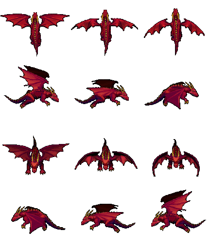
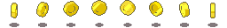
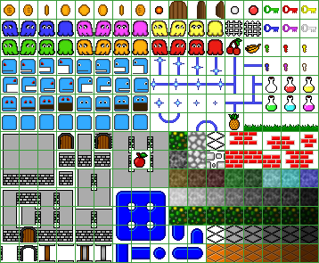
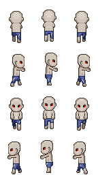
We will use sprites to create the player and the animated objects. For example, let’s have a look at the player:

Sprite with three player animations

We may appreciate that we have 9 pictures divided into 3 different groups. This way, we may easily create all three animations:

  • Left: Pictures from 0 to 3
  • Turn: Picture number 4
  • Right: Pictures from 5 to 8

Controlling the player’s animations

So that this game can be used in both desktop and mobile devices, we have to initialize both the cursor keys and the joystick. Once this is done, we must change the player’s velocity and the current animation when the user presses the keys or moves the joystick. In the next exercise we will first define the animations inside the “createAnimations()” function, and after that we will go ahead with the “createPlayer()” function, where we will display the player. We will finally include in the “update()” function some conditions to adjust the player’s speed and current animation.

Proposed exercise: Adding the player

Add the code below to your game and check both the player animations and movements. After that, look for another sprite and change the code accordingly to use your own sprite. Finally, change the values of the constants “velocityX” and “velocityY” (at the top of your code) and check the results.

You can see the result here (you can look at the source code by pressing Ctrl+U). Also, as listed above, you may find many free assets in OpenGameArt and choose other sprites you like.
  1. These are the new functions you have to insert in your code to create the animations and initialize everything related to the player:
function createAnimations() {
    // Player
    this.anims.create({
        key: 'left',
        frames: this.anims.generateFrameNumbers('dude', { start: 0, end: 3 }),
        frameRate: 10,
        repeat: -1
    });
    this.anims.create({
        key: 'turn',
        frames: [{ key: 'dude', frame: 4 }]
    });
    this.anims.create({
        key: 'right',
        frames: this.anims.generateFrameNumbers('dude', { start: 5, end: 8 }),
        frameRate: 10,
        repeat: -1
    });
    // Fire
    this.anims.create({
        key: 'burning',
        frames: this.anims.generateFrameNumbers('fire', { start: 0, end: 4 }),
        frameRate: 10,
        repeat: -1
    });
    // Coin
    this.anims.create({
        key: 'rotate',
        frames: this.anims.generateFrameNumbers('coin', { start: 0, end: 7 }),
        frameRate: 10,
        repeat: -1
    });            
}

function createPlayer() {
    player = this.physics.add.sprite(0, screenHeight-platformHeight, 'dude').setOrigin(1).setScale(3).setBounce(0.2).setCollideWorldBounds(true);
    this.physics.add.collider(player, platform);
    this.cameras.main.startFollow(player, true, 0.05, 0.05);
    // Cursor keys and joystick
    cursors = this.input.keyboard.createCursorKeys();
    joyStick = this.plugins.get('rexvirtualjoystickplugin').add(this, {
        x: screenWidth / 2,
        y: screenHeight - joystickSize*1.5,
        radius: joystickSize
    }).on('update', update, this);
}
  1. Also you have to insert some code inside the “update()” function to respond to the cursor keys and the joystick:
function update() {
    if (gameOver) return;

    if (cursors.left.isDown || joyStick.left) {
        player.setVelocityX(-velocityX).anims.play('left', true);
    }
    else if (cursors.right.isDown || joyStick.right) {
        player.setVelocityX(velocityX).anims.play('right', true);
    }
    else {
        player.setVelocityX(0).anims.play('turn');
    }

    if ((cursors.up.isDown || joyStick.up) && player.body.touching.down) {
        player.setVelocityY(-velocityY);
    }
}
  1. And finally do not forget to update the “create()” function to create the animations and the player. You just have to insert a couple of new lines:
function create() {
    ...
    createAnimations.call(this); 
    createPlayer.call(this);
}

The clouds, the score, the fires and the coins

We will create many different objects (clouds, fires and coins) at once using the same images. We will just change the size of the objects by scaling them randomly, and we will use a loop to print as many objects as we like choosing random positions.

Proposed exercises: Adding the clouds

Add the code below to your file and check the results. After that, change the value of the constant “numClouds” (at the top of your code) and also the value of the “scale” variable to check how easily you can customize your game. Refresh the page several times and you will notice that the generated clouds and also the trees have random sizes and they appear in random positions. Finally, look for another image (a cloud or any other object) and change the code accordingly to use your own image.

You can see the result here (you can look at the source code by pressing Ctrl+U). Also, as listed above, you may find many free assets in OpenGameArt and choose the images you like.
function createCloud() {
    const x = Phaser.Math.Between(0, worldWidth);
    const y = Phaser.Math.Between(0, screenHeight-platformHeight*2);
    const scale = Phaser.Math.FloatBetween(0.5, 1.5);
    this.add.image(x, y, 'cloud').setScale(scale);
}
function create() {
    ...
    for(i=0; i<numClouds; i++) createCloud.call(this);
}

Proposed exercise: Adding the score

Using the global variables, we may easily show both the score and number of remaining lives. Add the code below to your game and check the results. After that, change the value of the constant “numLives” (at the top of your code) and also the value of the “scale” variable to check how easily you can customize that text.

You can see the result here (you can look at the source code by pressing Ctrl+U).
function showScore() {
    if (!scoreText) scoreText = this.add.text(16, 16, '', { fontSize:(screenWidth/20)+'px', fill:'#000' }).setScrollFactor(0);
    scoreText.setText('Score:' + score + ' / Lives:' + lives);
}
function create() {
    ...
    showScore.call(this);
}

Proposed exercises: Adding the fires and the coins

Add the code below to your game and check the results. After that, change the value of the constants “numFires” and “numCoins” (at the top of your code) and also the value of the “scale” variables to check how easily you can customize your game. Finally, look for another sprites (fires, coins, or any other objects) and change the code accordingly to use your own sprites.

You may click here to see how the game looks like. As listed above, you may find many free assets in OpenGameArt.
function createFire() {
    const x = Phaser.Math.Between(screenWidth/2, worldWidth);
    const y = Phaser.Math.Between(screenHeight-platformHeight, screenHeight);
    let fire = this.physics.add.sprite(x, y, 'fire').setOrigin(1).setScale(3).setImmovable(true).anims.play('burning', true)
    fire.body.setAllowGravity(false);
    this.physics.add.collider(player, fire, hitBombOrFire, null, this);   
}

function createCoin() {     
    const x = Phaser.Math.Between(screenWidth/2, worldWidth);
    const bounce = Phaser.Math.FloatBetween(0.1, 0.5);
    let coin = this.physics.add.sprite(x, 0, 'coin').setOrigin(1).setScale(3).setBounce(bounce).anims.play('rotate');
    coin.body.setOffset(0, -10);
    this.physics.add.collider(coin, platform);
    this.physics.add.overlap(player, coin, collectCoin, null, this);
}

function createBomb() {
    const x = Phaser.Math.Between(0, worldWidth);
    const v = Phaser.Math.Between(-velocityX, velocityX);
    let bomb = this.physics.add.image(x, 0, 'bomb').setScale(2).setBounce(1).setCollideWorldBounds(true).setVelocity(v, velocityY);
    bomb.body.setAllowGravity(false);
    this.physics.add.collider(bomb, platform);     
    this.physics.add.collider(player, bomb, hitBombOrFire, null, this);   
}

function collectCoin(player, coin) { 
    bell.play();
    coin.destroy();
    createCoin.call(this);
    createBomb.call(this);    

    score += 10;
    if (score % 100 == 0) lives++;
    showScore();
}

function hitBombOrFire(player, thing) {
    dead.play();
    lives--;
    showScore();
    player.setTint(0xff0000).anims.play('turn');

    if (lives == 0) {
        this.physics.pause();
        gameOver = true;
        this.add.image(screenWidth/2, screenHeight/2, 'restart').setScale(5).setScrollFactor(0).setInteractive().on('pointerdown', ()=>location.reload());                
    }
    else {
        thing.destroy();
        setTimeout(()=>player.clearTint(), 3000);
    }
}
function create() {
    ...
    for(i=0; i<numCoins; i++) createFire.call(this);
    for(i=0; i<numCoins; i++) createCoin.call(this);
}

Enjoy the game!

You may enjoy playing this wonderful game online here.

CSS. Unit 6. Flexbox.

Why flexbox?

Flexbox is a one-dimensional layout method for laying out items in rows or columns. Items flex to fill additional space and shrink to fit into smaller spaces. This unit explains all the fundamentals.

For a long time, the only reliable cross browser-compatible tools available for creating CSS layouts were things like floats and positioning. These are fine, and they work, but in some ways they are also rather limiting and frustrating.

The following simple layout requirements are either difficult or impossible to achieve with such tools, in any kind of convenient, flexible way:

  • Vertically centering a block of content inside its parent.
  • Making all the children of a container take up an equal amount of the available width/height, regardless of how much width/height is available.
  • Making all columns in a multiple-column layout adopt the same height even if they contain a different amount of content.

As you’ll see in subsequent sections, flexbox makes a lot of layout tasks much easier. Let’s dig in!

Introducing a simple example

In this unit we are going to get you to work through a series of exercises to help you understand how flexbox works. To get started, we will use some simple code like this one:

<header>
  <h1>Valencian Community</h1>
</header>

<section>
  <article>
    <h2>Alicante</h2>
    <p>The campus of the University of Alicante lies in San Vicente del Raspeig, bordering the city of Alicante to the north. More than 25,000 students attend the University.</p>
  </article>

  <article>
    <h2>Valencia</h2>
    <p>Valencia is the capital of the autonomous community of Valencia and the third-largest city in Spain after Madrid and Barcelona, surpassing 800,000 inhabitants in the municipality.</p>
  </article>

  <article>
    <h2>Castellón</h2>
    <p>The city is notorious for its music festivals, among which we find: the Tanned Tin music festival for alternative music, the Benicàssim's International Festival, the Arenal Sound and the Rototom Sunsplash Festival, known for its reggae music.</p>
  </article>
</section>
html {
  font-family: sans-serif;
}

body {
   margin: 0;
}

header {
  background: purple;
  height: 75px;
}

h1 {
  text-align: center;
  color: white;
  line-height: 75px;
  margin: 0;
}

article {
  padding: 1%;
  margin: 1%;
  background: aqua;
}

Valencian Community

Alicante

The campus of the University of Alicante lies in San Vicente del Raspeig, bordering the city of Alicante to the north. More than 25,000 students attend the University.

Valencia

Valencia is the capital of the autonomous community of Valencia and the third-largest city in Spain after Madrid and Barcelona, surpassing 800,000 inhabitants in the municipality.

Castellón

The city is notorious for its music festivals, among which we find: the Tanned Tin music festival for alternative music, the Benicàssim’s International Festival, the Arenal Sound and the Rototom Sunsplash Festival, known for its reggae music.

You’ll see that we have a <header> element with a top level heading inside it, and a <section> element containing three <article>s. We are going to use these to create a fairly standard three column layout.

Proposed exercise: Simple boxes

Using the code of the previous example, create a new webpage with a similar content. You can use any other colors and styles you like.

Specifying what elements to lay out as flexible boxes

To start with, we need to select which elements are to be laid out as flexible boxes. To do this, we set a special value of display on the parent element of the elements you want to affect. In this case we want to lay out the <article> elements, so we set this on the <section>:

section {
  display: flex;
}

This causes the <section> element to become a flex container, and its children to become flex items. The result of this should be something like so:

Valencian Community

Alicante

The campus of the University of Alicante lies in San Vicente del Raspeig, bordering the city of Alicante to the north. More than 25,000 students attend the University.

Valencia

Valencia is the capital of the autonomous community of Valencia and the third-largest city in Spain after Madrid and Barcelona, surpassing 800,000 inhabitants in the municipality.

Castellón

The city is notorious for its music festivals, among which we find: the Tanned Tin music festival for alternative music, the Benicàssim’s International Festival, the Arenal Sound and the Rototom Sunsplash Festival, known for its reggae music.

So, this single declaration gives us everything we need — incredible, right? We have our multiple column layout with equal-sized columns, and the columns are all the same height. This is because the default values given to flex items (the children of the flex container) are set up to solve common problems such as this.

To be clear, let’s reiterate what is happening here. The element we’ve given a   display value of flex to is acting like a block-level element in terms of how it interacts with the rest of the page, but its children are being laid out as flex items. The next section will explain in more detail what this means. Note also that you can use a display value of inline-flex if you wish to lay out an element’s children as flex items, but have that element behave like an inline element.

Proposed exercise: Flexible boxes

Add some CSS code to the previous exercise so that all the contents inside the <section> element are displayed as flexible boxes (display:flex) which are shown from left to right, all of them having the same height.

As explained, you only have to add three lines of code and everything is done! You will have flexible boxes:
section {
  display: flex;
}

The flex model

When elements are laid out as flex items, they are laid out along two axes:

  • The main axis is the axis running in the direction the flex items are being laid out in (e.g. as rows across the page, or columns down the page.) The start and end of this axis are called the main start and main end.
  • The cross axis is the axis running perpendicular to the direction the flex items are being laid out in. The start and end of this axis are called the cross start and cross end.
  • The parent element that has display: flex set on it (the <section> in our example) is called the flex container.
  • The items being laid out as flexible boxes inside the flex container are called flex items (the <article> elements in our example).

Bear this terminology in mind as you go through subsequent sections. You can always refer back to it if you get confused about any of the terms being used.

Columns or rows?

Flexbox provides a property called flex-direction that specifies what direction the main axis runs in (what direction the flexbox children are laid out in). By default this is set to row, which causes them to be laid out in a row in the direction your browser’s default language works in (usually from left to right), but you can also use the following declaration inside your <section> rule:

flex-direction: column;

This would put the items back in a column layout, much like they were before we added any CSS.

Wrapping

One issue that arises when you have a fixed amount of width or height in your layout is that eventually your flexbox children will overflow their container, breaking the layout. And also if you have many boxes, the final result will be presented with some quite narrow columns. Have a look at our example:

Valencian Community

Alicante

The campus of the University of Alicante lies in San Vicente del Raspeig, bordering the city of Alicante to the north. More than 25,000 students attend the University.

Valencia

Valencia is the capital of the autonomous community of Valencia and the third-largest city in Spain after Madrid and Barcelona, surpassing 800,000 inhabitants in the municipality.

Castellón

The city is notorious for its music festivals, among which we find: the Tanned Tin music festival for alternative music, the Benicàssim’s International Festival, the Arenal Sound and the Rototom Sunsplash Festival, known for its reggae music.

Alcoy

Alcoy is an industrial and university city, region and municipality located in the province of Alicante. The Serpis river crosses the municipal boundary.

Benidorm

It has been a tourist destination since its port was extended and the first hotels were built. Today it is known for its beaches and skyscrapers and receives as many tourists from abroad as from Spain.

Here we see that the children are indeed breaking out of their container for small screens of filling the window with narrow columns. One way in which you can fix this is to add the following declaration to your <section> rule:

section {
  ...
  flex-wrap: wrap;
}

Also, add the following declaration to your <article> rule:

article {
  ...
  flex: 48%;
}

You’ll see that the layout looks much better with this included:

Valencian Community

Alicante

The campus of the University of Alicante lies in San Vicente del Raspeig, bordering the city of Alicante to the north. More than 25,000 students attend the University.

Valencia

Valencia is the capital of the autonomous community of Valencia and the third-largest city in Spain after Madrid and Barcelona, surpassing 800,000 inhabitants in the municipality.

Castellón

The city is notorious for its music festivals, among which we find: the Tanned Tin music festival for alternative music, the Benicàssim’s International Festival, the Arenal Sound and the Rototom Sunsplash Festival, known for its reggae music.

Alcoy

Alcoy is an industrial and university city, region and municipality located in the province of Alicante. The Serpis river crosses the municipal boundary.

Benidorm

It has been a tourist destination since its port was extended and the first hotels were built. Today it is known for its beaches and skyscrapers and receives as many tourists from abroad as from Spain.

We now have multiple rows — as many flexbox children are fitted onto each row as makes sense, and any overflow is moved down to the next line. The flex:48% declaration set on the articles means that each will be at least half the window size (48% wide, since we have 1% margins on both left and right). You might also notice that the last few children on the last row are each made wider so that the entire row is still filled.

But there’s more we can do here. For example, you can try changing your flex-direction property value to row-reverse. Now you’ll see that you still have your multiple row layout, but it starts from the opposite corner of the browser window and flows in reverse.

Proposed exercise: Wrapped content

Using the code of the last example above, add three more towns you like (to show at least 9 towns in total), and also insert a picture for each one. You may also change the colors of the boxes and text as you like, or you can even add more styles to your code (box and text shadows, etc.).

For example:

Valencian Community

Alicante

The campus of the University of Alicante lies in San Vicente del Raspeig, bordering the city of Alicante to the north. More than 25,000 students attend the University.

Valencia

Valencia is the capital of the autonomous community of Valencia and the third-largest city in Spain after Madrid and Barcelona, surpassing 800,000 inhabitants in the municipality.

Castellón

The city is notorious for its music festivals, among which we find: the Tanned Tin music festival for alternative music, the Benicàssim’s International Festival, the Arenal Sound and the Rototom Sunsplash Festival, known for its reggae music.

Benidorm

It has been a tourist destination since its port was extended and the first hotels were built. Today it is known for its beaches and skyscrapers and receives as many tourists from abroad as from Spain.

CSS. Unit 5. The box model.

Introduction

Everything in CSS has a box around it, and understanding these boxes is key to being able to create layouts with CSS, or to align items with other items. In this lesson, we will take a proper look at the CSS Box Model so that you can build more complex layout tasks with an understanding of how it works and the terminology that relates to it.

What is the CSS box model?

The full CSS box model applies to block boxes. This model defines how the different parts of a box (margin, border, padding, and content) work together to create a box that you can see on the page.

Parts of a box

When making up a block box in CSS we will have to keep in mind the following parts:

  • Content box: The area where your content is displayed, which can be sized using properties like width and height.
  • Padding box: The padding sits around the content as white space; its size can be controlled using padding and related properties.
  • Border box: The border box wraps the content and any padding. Its size and style can be controlled using border and related properties.
  • Margin box: The margin is the outermost layer, wrapping the content, padding and border as whitespace between this box and other elements. Its size can be controlled using margin and related properties.

The below diagram shows these layers:

In the standard box model, if you give a box a width and a height attribute, this defines the width and height of the content box. Any padding and border is then added to that width and height to get the total size taken up by the box. This is shown in the image below.

If we assume that the box has the following CSS defining widthheightmarginborder, and padding:

.box {
  width: 350px;
  height: 150px;
  margin: 10px;
  padding: 25px;
  border: 5px solid black;
}

The space taken up by our box using the standard box model will actually be 410px (350 + 25 + 25 + 5 + 5), and the height 210px (150 + 25 + 25 + 5 + 5), as the padding and border are added to the width used for the content box:

The margin is not counted towards the actual size of the box. Sure, it affects the total space that the box will take up on the page, but only the space outside the box. The box’s area stops at the border (it does not extend into the margin).

Proposed exercise: Playing with box models

In the below example, you can see a couple of boxes with a CSS class which gives some values to width, height, marginborder, and padding. Using that code, create a web page with five different boxes, each one with different styles. You have to change also the color of the text (you can choose the colors your like). And finally add some shadows to the text using different styles and colors.

You can have a look at the different colors here: https://developer.mozilla.org/en-US/docs/Web/CSS/color_value

CSS code:

.box1 {
  border: 5px solid red;
  background-color: lightgray;
  padding: 10px;
  margin: 25px;
  width: 250px;
  height: 200px;
  ...
}

.box2 {
  border: 7px solid green;
  background-color: gray;
  padding: 5px;
  margin: 0px;
  width: 300px;
  height: 200px;
  color: white;
  ...
}

...

HTML code:

<div class="box1">This is a 250x200px box with a 5px red border, and lightgray background, 10px padding and 25px margin.</div>
<div class="box2">This is a 300x200px box with a 7px green border, gray background, white text color, 5px padding and 0px margin.</div>
...

And the result:

This is a 250x200px box with a 5px red border, and lightgray background, and 10px padding and 25px margin.
This is a 300x200px box with a 7px green border, gray background, white text color, and 5px padding and 0px margin.

Margins, padding and borders

You’ve already seen the marginpadding, and border properties at work in the example above. The properties used in that example are shorthands and allow us to set all four sides of the box at once. These shorthands also have equivalent longhand properties, which allow control over the different sides of the box individually.

Let’s explore these properties in more detail.

Margin

The margin is an invisible space around your box. It pushes other elements away from the box. Margins can have positive or negative values. Setting a negative margin on one side of your box can cause it to overlap other things on the page.

We can control all margins of an element at once using the margin property, or each side individually using the equivalent longhand properties:

Proposed exercise: Custom margins

Create a web page with the example below, and change the margin values to see how the boxes are pushed around due to the margin creating or removing space (if it is a negative margin) between this element and the containing element. Finally, add three more boxes with any style you like inside the same container.

.container {
  border: 5px solid red; 
}

.box1 {
  border: 5px solid green;
  margin-top: 10px;
  margin-left: 10px;
  width: 50%;
}

.box2 {
  border: 5px solid blue;
  margin-top: 10px;
  margin-left: 50px;
  width: 50%;
}

.box3 {
  border: 5px solid orange;
  margin-top: 10px;
  margin-left: 100px;
  width: 50%;
}
...
<div class="container">
  <div class="box1">This is a box with 50% width and 10px from top and left inside a container</div>
  <div class="box2">This is a box with 50% width and 10px from top and 50px left inside a container</div>
  <div class="box3">This is a box with 50% width and 10px from top and 100px left inside a container</div>
  ...
</div>
This is a box with 50% width and 10px from top and left inside a container
This is a box with 50% width and 10px from top and 50px left inside a container
This is a box with 50% width and 10px from top and 100px left inside a container

Padding

The padding sits between the border and the content area. Unlike margins you cannot have negative amounts of padding, so the value must be 0 or a positive value. Any background applied to your element will display behind the padding, and it is typically used to push the content away from the border.

We can control the padding on each side of an element individually using the padding property, or each side individually using the equivalent longhand properties:

Proposed exercise: Custom padding

If you change the values for padding on the classes .box in the example below you can see that this changes where the text begins in relation to the box. Padding can be changed on any element, and will make space between its border and whatever is inside the element. Create a web page with the code below and add three more boxes using different paddings and styles.

.box1 {
  border: 5px solid red;
  margin: 10px;
  ...
}

.box2 {
  border: 5px solid blue;
  margin: 10px;
  padding: 25px;
  ...
}

.box3 {
  border: 5px solid green;
  margin: 10px;
  padding: 50px;
  ...
}
...
<div class="box1">
  This is a box without padding
</div>
<div class="box2">
  This is a box with 25 px padding
</div>
<div class="box3">
  This is a box with 50px padding
</div>
...
This is a box without padding
This is a box with 25 px padding
This is a box with 50px padding

Borders

The border is drawn between the margin and the padding of a box. If you are using the standard box model, the size of the border is added to the width and height of the box.

For styling borders, there are a large number of properties (there are four borders, and each border has a style, width and color that we might want to manipulate).

You can set the width, style, or color of all four borders at once using the border property.

To set the properties of each side individually, you can use:

To set the width, style, or color of all sides, use the following:

To set the width, style, or color of a single side, you can use one of the most granular longhand properties:

Proposed exercise: Custom borders

In the example below we have used various shorthands and longhands to style the borders. Create a new web page with that code and have a play around with the different properties to check that you understand how they work. Finally add three more boxes and set the border styles as you like.

You can have a look at the MDN pages (linked above) to get information about the different styles of border you can choose from. Also you can have a look at the different colors here: https://developer.mozilla.org/en-US/docs/Web/CSS/color_value
.box1 {
  border-top: 5px dotted green;
  border-right: 5px dashed orange;
  border-bottom: 5px dotted red;
  border-left: 5px dashed blue;
  padding: 15px;
  margin-top: 15px;
  margin-bottom: 15px;
  text-align: center;
  ...
}

.box2 {
  border: 5px solid black;
  border-left-width: 10px;
  border-right-width: 10px;
  border-top-color: aqua;
  border-bottom-color: pink;
  padding: 15px;
  text-align: center;
  ...
}

.box3 {
  border: 2px solid black;
  padding: 10px;
  ...
}

...
<div class="box1">This is a box with different types of borders</div>
<div class="box2">This is another box with different types of borders</div>
<div class="box1">
  <div class="box2">This is a box with different types of borders inside another box</div>
</div>
<div class="box3">
  <div class="box3">
    <div class="box3">
      <div class="box3">
        <div class="box3">
          <div class="box3">
            These are boxes inside boxes
          </div>
        </div>
      </div>
    </div>
  </div>
</div>
...
This is a box with different types of borders
This is another box with different types of borders
This is a box with different types of borders inside another box
These are boxes inside boxes

CSS. Unit 4. Styling lists.

Introduction

Lists behave like any other text for the most part, but there are some CSS properties specific to lists that you need to know about, and some best practices to consider. This unit explains all.

A simple list example

To begin with, let’s look at a simple example with lists. Throughout this unit, we’ll look at unordered, ordered, and description lists (all have styling features that are similar, and some that are particular to their type of list). The HTML for our example looks like so:

<h2>Shopping (unordered list)</h2>

<ul>
  <li>Hummus</li>
  <li>Pita</li>
  <li>Green salad</li>
  <li>Halloumi</li>
</ul>

<h2>Recipe (ordered list)</h2>

<ol>
  <li>Toast pita, leave to cool, then slice down the edge.</li>
  <li>Fry the halloumi in a shallow, non-stick pan, until browned on both sides.</li>
  <li>Wash and chop the salad.</li>
  <li>Fill pita with salad, hummus, and fried halloumi.</li>
</ol>

<h2>Ingredients (description list)</h2>

<dl>
  <dt>Hummus</dt>
  <dd>A thick dip/sauce generally made from chick peas blended with tahini, lemon juice, salt, garlic, and other ingredients.</dd>
  <dt>Pita</dt>
  <dd>A soft, slightly leavened flatbread.</dd>
  <dt>Halloumi</dt>
  <dd>A semi-hard, unripened, brined cheese with a higher-than-usual melting point, usually made from goat/sheep milk.</dd>
  <dt>Green salad</dt>
  <dd>That green healthy stuff that many of us just use to garnish kebabs.</dd>
</dl>

The list elements probably will have the following styling defaults:

  • The <ul> and <ol> elements have a top and bottom margin of 16px (1em)  and a padding-left of 40px (2.5em).
  • The list items (<li> elements) have no set defaults for spacing.
  • The <dl> element has a top and bottom margin of 16px (1em), but no padding set.
  • The <dd> elements have margin-left of 40px (2.5em).
  • The <p> elements we’ve included for reference have a top and bottom margin of 16px (1em), the same as the different list types.

Proposed exercise: Lists with default styling

Create a web page with the list of the previous example, and check the result in your browser. It should be displayed with the default styling (no CSS must be used right now).

You should get something like this:

Shopping (unordered list)

  • Hummus
  • Pita
  • Green salad
  • Halloumi

Recipe (ordered list)

  1. Toast pita, leave to cool, then slice down the edge.
  2. Fry the halloumi in a shallow, non-stick pan, until browned on both sides.
  3. Wash and chop the salad.
  4. Fill pita with salad, hummus, and fried halloumi.

Ingredients (description list)

Hummus
A thick dip/sauce generally made from chick peas blended with tahini, lemon juice, salt, garlic, and other ingredients.
Pita
A soft, slightly leavened flatbread.
Halloumi
A semi-hard, unripened, brined cheese with a higher-than-usual melting point, usually made from goat/sheep milk.
Green salad
That green healthy stuff that many of us just use to garnish kebabs.

Handling list styling

When styling lists, you need to adjust their styles so they keep the same vertical spacing as their surrounding elements (such as paragraphs and images; sometimes called vertical rhythm), and the same horizontal spacing as each other.

Some CSS for the text styling and spacing could be as follows:

html {
  font-family: Helvetica, Arial, sans-serif;
  font-size: 10px;
}

h2 {
  font-size: 2rem;
  text-shadow: 1px 1px 5px orange;
}

ul, ol, dl {
  font-size: 1.5rem;
}

li {
  line-height: 1.5;
}

dd, dt {
  line-height: 1.5;
}

dt {
  font-weight: bold;
  padding-left: 2rem;
}
  • The first rule sets a sitewide font and a baseline font size of 10px. These are inherited by everything on the page.
  • Rules 2 and 3 set relative font sizes for the headings, and different list types (the children of the list elements inherit these). This means that each list will have the same font size and top and bottom spacing, helping to keep the vertical rhythm consistent.
  • Rule 4 sets the same line-height on list items, so that each individual list item will have the same spacing between lines. This will also help to keep the vertical rhythm consistent.
  • Rules 5 and 6 apply to the description list. We set the same line-height on the description list terms and descriptions as we did with the list items. Again, consistency is good! We also make the description terms have bold font, so they visually stand out easier.

Proposed exercise: Lists with your own styles

Create a web page with the lists and styles of the previous example, and change or add any new styles you like. Now you have to create a CSS file and link it from the HTML code. Finally check the result in your browser and validate your code.

Your result may look now something like this:

Shopping (unordered list)

  • Hummus
  • Pita
  • Green salad
  • Halloumi

Recipe (ordered list)

  1. Toast pita, leave to cool, then slice down the edge.
  2. Fry the halloumi in a shallow, non-stick pan, until browned on both sides.
  3. Wash and chop the salad.
  4. Fill pita with salad, hummus, and fried halloumi.

Ingredients (description list)

Hummus
A thick dip/sauce generally made from chick peas blended with tahini, lemon juice, salt, garlic, and other ingredients.
Pita
A soft, slightly leavened flatbread.
Halloumi
A semi-hard, unripened, brined cheese with a higher-than-usual melting point, usually made from goat/sheep milk.
Green salad
That green healthy stuff that many of us just use to garnish kebabs.

List-specific styles

Now that we’ve looked at general spacing techniques for lists, let’s explore some list-specific properties. As seen in a previous unit, there are three properties you should know about to start with, which can be set on both <ul> or <ol> elements:

  • list-style-type: Sets the type of bullets to use for the list, for example, square or circle bullets for an unordered list, or numbers, letters or roman numerals for an ordered list.
  • list-style-position: Sets whether the bullets appear inside the list items, or outside them before the start of each item.
  • list-style-image: Allows you to use a custom image for the bullet, rather than a simple square or circle.

Bullet and number styles

As mentioned above, the list-style-type property allows you to set what type of bullet to use for the bullet points. In our example, we can set the ordered list to use uppercase roman numerals, with:

ol {
  list-style-type: upper-roman;
}
  1. Toast pita, leave to cool, then slice down the edge.
  2. Fry the halloumi in a shallow, non-stick pan, until browned on both sides.
  3. Wash and chop the salad.
  4. Fill pita with salad, hummus, and fried halloumi.

Bullet position

The list-style-position property sets whether the bullets appear inside the list items, or outside them before the start of each item. The default value is outside, which causes the bullets to sit outside the list items, as seen above.

If you set the value to inside, the bullets will sit inside the lines:

ol {
  list-style-type: upper-roman;
  list-style-position: inside;
}
  1. Toast pita, leave to cool, then slice down the edge.
  2. Fry the halloumi in a shallow, non-stick pan, until browned on both sides.
  3. Wash and chop the salad.
  4. Fill pita with salad, hummus, and fried halloumi.

Using a custom bullet image

The list-style-image property allows you to use a custom image for your bullet. The syntax is pretty simple:

ul {
  list-style-image: url("https://mdn.github.io/learning-area/css/styling-text/styling-lists/star.svg");
}

However, this property is a bit limited in terms of controlling the position, size, etc. of the bullets. You are better off using the background family of properties, which you may also find in the Backgrounds and borders article.

In our example, we have styled the unordered list like so:

ul {
  padding-left: 2rem;
  list-style-type: none;
}

ul li {
  padding-left: 2rem;
  background-image: url("https://mdn.github.io/learning-area/css/styling-text/styling-lists/star.svg");
  background-position: 0 0;
  background-size: 1.6rem 1.6rem;
  background-repeat: no-repeat;
}
  • Hummus
  • Pita
  • Green salad
  • Halloumi

Here we’ve done the following:

  • Set the padding-left of the <ul> down from the default 40px to 20px, then set the same amount on the list items. This is so that overall the list items are still lined up with the order list items and the description list descriptions, but the list items have some padding for the background images to sit inside. If we didn’t do this, the background images would overlap with the list item text, which would look messy.
  • Set the list-style-type to none, so that no bullet appears by default. We’re going to use background properties to handle the bullets instead.
  • Inserted a bullet onto each unordered list item. The relevant properties are as follows:
    • background-image: This references the path to the image file you want to use as the bullet.
    • background-position: This defines where in the background of the selected element the image will appear. In this case we are saying 0 0, which means the bullet will appear in the very top left of each list item.
    • background-size: This sets the size of the background image. We ideally want the bullets to be the same size as the list items (or very slightly smaller or larger). We are using a size of 1.6rem (16px), which fits very nicely with the 20px padding we’ve allowed for the bullet to sit inside (16px plus 4px of space between the bullet and the list item text works well).
    • background-repeat: By default, background images repeat until they fill up the available background space. We only want one copy of the image inserted in each case, so we set this to a value of no-repeat.

Proposed exercise: Putting it all together

Using the code of the previous exercise, change the defaults bullets to use an image, and also change the default numbering, and any other styles you like. Finally check the result in your browser and do not forget to validate your code.

Your result may look now something like this:

Shopping (unordered list)

  • Hummus
  • Pita
  • Green salad
  • Halloumi

Recipe (ordered list)

  1. Toast pita, leave to cool, then slice down the edge.
  2. Fry the halloumi in a shallow, non-stick pan, until browned on both sides.
  3. Wash and chop the salad.
  4. Fill pita with salad, hummus, and fried halloumi.

Ingredients (description list)

Hummus
A thick dip/sauce generally made from chick peas blended with tahini, lemon juice, salt, garlic, and other ingredients.
Pita
A soft, slightly leavened flatbread.
Halloumi
A semi-hard, unripened, brined cheese with a higher-than-usual melting point, usually made from goat/sheep milk.
Green salad
That green healthy stuff that many of us just use to garnish kebabs.

List-style shorthand

It is also worth to know that we may set the three properties mentioned in the section above using a single shorthand property, list-style. For example, the following CSS:

ul {
  list-style-type: disc;
  list-style-image: url(example.png);
  list-style-position: inside;
}

Could be replaced by this:

ul {
  list-style: disc url(example.png) inside;
}

The values can be listed in any order, and you can use one, two or all three (the default values used for the properties that are not included are discnone, and outside). If both a type and an image are specified, the type is used as a fallback if the image can’t be loaded for some reason.

Quiz

Test your skills with this quiz about styling lists.

CSS. Unit 3. Styling links.

Introduction

When styling links, it is important to understand how to make use of pseudo-classes to style link states effectively, and how to style links for use in common varied interface features such as navigation menus and tabs. We’ll look at all these topics in this unit.

Let’s look at some links

The first thing to understand is the concept of link states (different states that links can exist in, which can be styled using different pseudo-classes):

  • Link: A link which has a destination (i.e. not just a named anchor), styled using the :link pseudo class.
  • Visited: A link when it has already been visited (exists in the browser’s history), styled using the :visited pseudo class.
  • Hover: A link when it is being hovered over by a user’s mouse pointer, styled using the :hover pseudo class.
  • Focus: A link when it has been focused (for example moved to by a keyboard user using the Tab key or similar, or programmatically focused using HTMLElement.focus()). This is styled using the :focus pseudo class.
  • Active: A link when it is being activated (e.g. clicked on), styled using the :active pseudo class.

Default styles

The following example illustrates what a link will behave like by default (the CSS is simply enlarging and centering the text to make it stand out more):

p {
  font-size: 2rem;
  text-align: center;
}
<p><a href="https://fernandoruizrico.com" target="_blank">A simple link</a></p>

A simple link

You’ll notice a few things as you explore the default styles:

  • Links are underlined.
  • Unvisited links are blue.
  • Visited links are purple.
  • Hovering a link makes the mouse pointer change to a little hand icon.
  • Focused links have an outline around them. You should be able to focus on the links with the keyboard by pressing the tab key (On Mac, you’ll need to use option + tab, or enable the Full Keyboard Access: All controls option by pressing Ctrl + F7.)
  • Active links are red. You can try this feature by holding down the mouse button on the link as you click it.

Proposed exercise: Larger and centered links

Create a web page with at least 5 paragraphs, each one with a different link to any sites you like. You also have to style your page so that the links are double the size of the rest of the text, and they are aligned in the center of the window, as done in the example above.

You are not just limited to the above properties to style your links, you are free to use any properties you like.

Styling some links

Interestingly enough, the default styles used for the links are nearly the same as they were back in the early days of browsers in the mid-1990s. This is because users know and have come to expect this behaviour (if links were styled differently, it would confuse a lot of people). This doesn’t mean that you shouldn’t style links at all, just that you should not stray too far from the expected behaviour. You should at least:

  • Use underlining for links, but not for other things. If you don’t want to underline links, at least highlight them in some other way.
  • Make them react in some way when hovered/focused, and in a slightly different way when activated.

The default styles can be turned off/changed using the following CSS properties:

  • color for the text color.
  • cursor for the mouse pointer style, although you shouldn’t turn this off unless you’ve got a very good reason.
  • outline for the text outline (an outline is similar to a border, the only difference being that border takes up space in the box and an outline doesn’t; it just sits over the top of the background). The outline is a useful accessibility aid, so think carefully before turning it off; you should at least double up the styles given to the link hover state on the focus state too.

Now that we’ve looked at the default states in some detail, let’s look at a typical set of link styles. To start off with, we’ll write out our empty rulesets:

a:link {
}

a:visited {
}

a:focus {
}

a:hover {
}

a:active {
}

This order is important because the link styles build on one another, for example the styles in the first rule will apply to all the subsequent ones, and when a link is being activated, it is usually also being hovered over. If you put these in the wrong order, and you’re changing the same properties in each ruleset, things won’t work as you expect. To remember the order, you could try using a mnemonic like LoVFears HAte.

Now let’s add some more information to get this styled properly:

p {
  font-size: 2rem;
  text-align: center;
}

a:link {
  color: green;
}

a:visited {
  color: olive;
}

a:focus {
  background: orange;
}

a:hover {   
  background: yellow;
  text-decoration: underline red wavy;
}

a:active {
  background: red;
}

We’ll also provide some sample HTML to apply the CSS to:

<p>There are several browsers available, such as:</p>
<p><a href="https://www.mozilla.org/en-US/firefox/new/" target="_blank">Mozilla Firefox</a></p>
<p><a href="https://www.google.com/chrome/" target="_blank">Google Chrome</a></p>
<p><a href="https://www.apple.com/safari/" target="_blank">Apple Safari</a></p>

Putting the two together gives us this result:

There are several browsers available, such as:

Mozilla Firefox

Google Chrome

Apple Safari

Proposed exercise: Styling colors and text decoration

Create a new web page with at least 5 links pointing to your preferred websites. You must change the default colors and decorations so that each possible state (link, visited, focus, hover, active) has other color than the default one, and also another decoration, as done in the example above, where the “underline red wavy” text decoration is used.

As you have seen, you can change the color of the text using the color property, and the background color using the background property. Also remember you can have a look at the different colors here: https://developer.mozilla.org/en-US/docs/Web/CSS/color_value. About the text decoration, remember it can be easily changed with the text-decoration property.

Including icons on links

Some developers include icons on links to provide more of an indicator as to what kind of content the link points to. Let’s look at a really simple example that adds an icon to external links (links that lead to other sites). Such an icon usually looks like a little arrow pointing out of a box (for this example, we’ll use this great example from icons8.com).

For this example, we will use the same HTML as before:

<p>There are several browsers available, such as:</p>
<p><a href="https://www.mozilla.org/en-US/firefox/new/" target="_blank">Mozilla Firefox</a></p>
<p><a href="https://www.google.com/chrome/" target="_blank">Google Chrome</a></p>
<p><a href="https://www.apple.com/safari/" target="_blank">Apple Safari</a></p>

And we will adjust the CSS code:

p {
  font-size: 2rem;
  text-align: center;
}

a {
  background: url('https://mdn.mozillademos.org/files/12982/external-link-52.png') no-repeat 100% 0;
  background-size: 2rem;
  padding-right: 2.5rem;
}

Putting the two together gives us this result:

There are several browsers available, such as:

Mozilla Firefox

Google Chrome

Apple Safari

So what’s going on here? We’ll skip the CSS related to the paragraphs, as it’s just the same information you’ve looked at before. The last rule however is interesting : here we are inserting a custom background image on external links using background shorthand instead of the individual properties. We set the path to the image we want to insert, specify no-repeat so we only get one copy inserted, and then specify the position as 100% of the way over to the right of the text content, and 0 pixels from the top.

We also use background-size to specify the size we want the background image to be shown at. So that you get a good result, it is useful to have a larger icon and then resize it like this as needed for responsive web design purposes.

Finally, we set some padding-right on the links to make space for the background image to appear in, so we aren’t overlapping it with the text.

Proposed exercise: Links with icons

Create a new web page with at least 5 links pointing to your preferred websites (you can use the code you wrote before) and include an icon at the end of each one. Also change some other styles as the text color or text decoration.

Styling links as buttons

The tools you’ve explored so far in this article can also be used in other ways. For example, states like hover can be used to style many different elements, not just links — you might want to style the hover state of paragraphs, list items, or other things.

In addition, links are quite commonly styled to look and behave like buttons in certain circumstances — a website navigation menu is usually marked up as a list containing links, and this can be easily styled to look like a set of control buttons or tabs that provide the user with access to other parts of the site. Let’s explore how.

First, some HTML:

<ul class="navbar">
  <li><a href="#">Home</a></li>
  <li><a href="#">News</a></li>
  <li><a href="#">Contact</a></li>
  <li><a href="#">About</a></li>
</ul>

And now our CSS:

/* General class for navigation bar */
.navbar {
  font-size: 1.25rem;
  font-family: sans-serif;
  text-align: center;
  background: yellow;
}

/* Select only the list items (li) inside the navigation bar */
ul.navbar li {
  display: inline;
}

/* Select only the links (a) inside the navigation bar */
ul.navbar a {
  text-decoration: none;
  display: inline-block;
  padding: 1rem;
}

/* Select only the links inside the navigation bar when mouse over them (a:hover) */
ul.navbar a:hover {     
  background: orange;
}

/* Select only the links inside the navigation bar when mouse pressing (a:active) */
ul.navbar a:active {
  color: white;
  background: red;
}

This gives us the following result:

Let’s explain what’s going on here, focusing on the most interesting parts:

  • Creating a new class for the list:
    • We have created the navbar class so that only the items inside that class have the style of a navigation bar.
    • ul.navbar: By putting this before any selector, the CSS properties between braces will apply only to the items inside an unordered list with class navbar.
  • The styles related to the <ul> element:
    • We change the font-size to enlarge the text a little bit.
    • We change the font-family so that it is different from the rest of the text.
    • We change the text-align so that the links are centered .
    • We change the background to yellow color.
    • <li> elements will normally behave like block elements (they sit on their own lines). In this case, we want to create a horizontal list of links, so we set the display property to inline, which causes the list items to sit on the same line one after the other (they now behave like inline elements).
  • The styles related to the <a> elements:
    • We start by turning off the default text-decoration (we don’t want those spoiling our look).
    • Next, we set the display to inline-block (this will allow to size them, as we will explain in another unit).
    • We set the padding to 1rem to give the buttons some space around the text (we will also explain this in another unit).
    • We also change the color of the items when the mouse is over them, and when they are being pressed.

Proposed exercise: Navigation bar

Create a web page with a navigation bar of your own style. You can change any properties you like (colors, text decoration, font size, font family, etc.). After that, just below insert some other links you like. You can also try to use some other CSS rules to style these links, as shown below:

There are several browsers available, such as:

Mozilla Firefox

Google Chrome

Apple Safari

Quiz

Test your skills with this quiz about styling links.

CSS. Unit 2. Text and font styling.

Introduction

Here we’ll go through all the basic fundamentals of text/font styling in detail, including setting font weight, family and style, font shorthand, text alignment and other effects, and line and letter spacing.

What is involved in styling text in CSS?

The CSS properties used to style text generally fall into two categories, which we’ll look at separately in this unit:

  • Font styles: Properties that affect the font that is applied to the text, affecting what font is applied, how big it is, whether it is bold, italic, etc.
  • Text layout styles: Properties that affect the spacing and other layout features of the text, allowing manipulation of, for example, the space between lines and letters, and how the text is aligned within the content box.

Bear in mind that the text inside an element is all affected as one single entity. You can’t select and style subsections of text unless you wrap them in an appropriate element (such as a <span> or <strong>, for example).

Font color

Let’s move straight on to look at properties for styling fonts. In this section we’ll apply some different CSS properties to the same HTML sample.

The color property sets the color of the foreground content of the selected elements (which is usually the text, but can also include a couple of other things, such as an underline or overline placed on text using the text-decoration property):

p {
  color: red;
}

Proposed exercise

Create a new web page made of 2 files: one HTML file with the code below, and another one with some CSS code to change the <h1> and <p> elements to any color you like. Do not forget to link the CSS file from the HTML file, and validate your code.

<h1>Tommy the cat</h1>

<p>Well I remember it as though it were a meal ago...</p>

<p>Said Tommy the Cat as he reeled back to clear whatever foreign matter may have nestled its way into his mighty throat. Many a fat alley rat had met its demise while staring point blank down the cavernous barrel of this awesome prowling machine. Truly a wonder of nature this urban predator — Tommy the cat had many a story to tell. But it was a rare occasion such as this that he did.</p>

Font families

To set a different font on your text, you use the font-family property — this allows you to specify a font (or list of fonts) for the browser to apply to the selected elements. The browser will only apply a font if it is available on the machine the website is being accessed on; if not, it will just use a browser default font. A simple example looks like so:

p {
  font-family: arial;
}

This would make all paragraphs on a page adopt the arial font, which is found on any computer.

Default fonts

CSS defines five generic names for fonts:  serifsans-serifmonospacecursive and fantasy. Those are very generic and the exact font face used when using those generic names is up to each browser and can vary for each operating system they are running on. It represents a worst case scenario where the browser will try to do its best to provide at least a font that looks appropriate. serifsans-serif and monospace are quite predictable and should provide something reasonable. On the other hand, cursive and fantasy are less predictable and we recommend using them very carefully, testing as you go.

The five names are defined as follows (you will find below some examples about how they look like):

  • serif: Fonts that have serifs (the flourishes and other small details you see at the ends of the strokes in some typefaces).
  • sans-serif: Fonts that don’t have serifs.
  • monospace: Fonts where every character has the same width, typically used in code listings.
  • cursive: Fonts that are intended to emulate handwriting, with flowing, connected strokes.
  • fantasy: Fonts that are intended to be decorative.
  • This is serif
  • This is sans-serif
  • This is monospace
  • This is cursive
  • This is fantasy

Proposed exercise: Default fonts

Using the code of the previous exercise, copy and paste the paragraphs several times (5 in total) and define some classes to apply all default fonts (serif, sans-serif, monospace, cursive, fantasy). You must set a different font and color each time. Your source code and the result should look something like this:

HTML code:

<h1>Tommy the cat</h1>

<p class="serif">Well I remember it as though it were a meal ago...</p>
<p class="serif">Said Tommy the Cat as he reeled back to clear whatever foreign matter may have nestled its way into his mighty throat. Many a fat alley rat had met its demise while staring point blank down the cavernous barrel of this awesome prowling machine. Truly a wonder of nature this urban predator — Tommy the cat had many a story to tell. But it was a rare occasion such as this that he did.</p>

...

<p class="fantasy">Well I remember it as though it were a meal ago...</p>
<p class="fantasy">Said Tommy the Cat as he reeled back to clear whatever foreign matter may have nestled its way into his mighty throat. Many a fat alley rat had met its demise while staring point blank down the cavernous barrel of this awesome prowling machine. Truly a wonder of nature this urban predator — Tommy the cat had many a story to tell. But it was a rare occasion such as this that he did.</p>

CSS code:

.serif {
    font-family: serif;
    color: blue;
}

...

.fantasy {
    font-family: fantasy;
    color: green;
}

And the result:

Tommy the cat

Well I remember it as though it were a meal ago…

Said Tommy the Cat as he reeled back to clear whatever foreign matter may have nestled its way into his mighty throat. Many a fat alley rat had met its demise while staring point blank down the cavernous barrel of this awesome prowling machine. Truly a wonder of nature this urban predator — Tommy the cat had many a story to tell. But it was a rare occasion such as this that he did.

Web safe fonts

Speaking of font availability, there are only a certain number of fonts that are generally available across all systems and can therefore be used without much worry. These are the so-called web safe fonts.

Most of the time, as web developers we want to have more specific control over the fonts used to display our text content. The problem is to find a way to know which font is available on the computer used to see our web pages. There is no way to know this in every case, but the web safe fonts are known to be available on nearly all instances of the most used operating systems (Windows, macOS, the most common Linux distributions, Android, and iOS).

The list of actual web safe fonts will change as operating systems evolve, but it’s reasonable to consider the following fonts web safe, at least for now (many of them have been popularized thanks to the Microsoft Core fonts for the Web initiative in the late 90s and early 2000s):

  • Arial (sans-serif)
  • Courier New (monospace)
  • Georgia (serif)
  • Times New Roman (serif)
  • Trebuchet MS (sans-serif)
  • Verdana (sans-serif)

Among various resources, the cssfontstack.com website maintains a list of web safe fonts available on Windows and macOS operating systems, which can help you make your decision about what you consider safe for your usage.

Proposed exercise: Main safe fonts

Create a new web page with a header (<h1>) and six other paragraphs (<p>) with any content you like, and set a different font for each of them (Arial, Courier New, Georgia, Times New Roman, Trebuchet MS, Verdana). You can also change the color of the text too.

Font names that have more than one word (like Trebuchet MS) need to be surrounded by quotes, for example:
font-family: "Trebuchet MS";

Font stacks

Since you can’t guarantee the availability of the fonts you want to use on your webpages (even a web font could fail for some reason), you can supply a font stack so that the browser has multiple fonts it can choose from. This simply involves a font-family value consisting of multiple font names separated by commas, e.g.

p {
  font-family: "Trebuchet MS", Verdana, sans-serif;
}

In such a case, the browser starts at the beginning of the list and looks to see if that font is available on the machine. If it is, it applies that font to the selected elements. If not, it moves on to the next font, and so on.

It is a good idea to provide a suitable generic font name at the end of the stack so that if none of the listed fonts are available, the browser can at least provide something approximately suitable. To emphasise this point, paragraphs are given the browser’s default serif font if no other option is available — which is usually Times New Roman — this is no good for a sans-serif font!

Proposed exercise: More safe fonts and font stacks

Create a new web page with a header and five other paragraphs with any content you like, and set a different font for each of them, but this time you cannot use any font used previously: you must select some other fonts from cssfontstack.com. Moreover, in this exercise you have to use font stacks to ensure at least one font is always available, and you can also change the color too. Finally, check your web page using several browsers from several devices and operating systems, to make sure that all fonts are shown.

If you are changing the color and the font family using font stacks, your CSS and HTML code should look like this:
.font-book {
  color: blue;
  font-family: "Book Antiqua", Arial, sans-serif;
}
<p class="font-book"> ... </p>

Using an online font service

Online font services generally store and serve fonts for you, so you don’t have to worry about the font availability, and generally you just need to insert a simple line or two of code into your site to make everything work. Examples include Adobe Fonts and Cloud.typography. Most of these services are subscription-based, with the notable exception of Google Fonts, a useful free service, especially for rapid testing work and writing demos.

Most of these services are easy to use, so we won’t cover them in great detail. Let’s have a quick look at Google fonts, so you can get the idea. These are the steps that you have to follow to use one or several of the fonts they provide:

  1. Go to Google Fonts.
  2. You may use the filters to display the kinds of fonts you like.
  3. To select a font family, click on it, and after that press the “+ Select this style” option on the right hand side.
  4. When you’ve chosen the font families, press the “View your selected families” icon at the top right corner of the page.
  5. In the resulting screen, you first need to copy the line of HTML code shown and paste it into the head of your HTML file. Put it above the existing <link> element, so that the font is imported before you try to use it in your CSS.
  6. You then need to copy the CSS declarations listed into your CSS as appropriate, to apply the custom fonts to your HTML.

Proposed exercise: Google fonts

Create a web page with ten paragraphs, each one using a different Google font.

For example, to use the Google fonts “Nerko One”, “Permanent Marker” and “Rock Salt”, your HTML code should look like this:
<!doctype html>
<html>
  <head>
    <meta charset="utf-8">
    <title>Web font example</title>
    <link rel="preconnect" href="https://fonts.gstatic.com">
    <link rel="stylesheet" href="https://fonts.googleapis.com/css2?family=Nerko+One&family=Permanent+Marker&family=Rock+Salt&display=swap">
    <link rel="stylesheet" href="styles.css">
  </head>
  <body>
    <h1>Web font example</h1>
    <p class="nerko">This is a text with Nerko One font</p>
    <p class="marker">This is a text with Permanent Marker font</p>
    <p class="rock">This is a text with Rock Salt</p>
  </body>
</html>

The CSS code inside your own file styles.css:

.nerko {
  font-family: 'Nerko One', cursive;
}
.marker {
  font-family: 'Permanent Marker', cursive;
}
.rock {
  font-family: 'Rock Salt', cursive;
}

And the result:

This is a text with Nerko One font

This is a text with Permanent Market font

This is a text with Rock Salt font

Font size

Font size (set with the font-size property) can take values measured in several units (such as percentages), however the most common units you’ll use to size text are:

  • px (pixels): The number of pixels high you want the text to be (this is an absolute unit).
  • em: 1 em is equal to the font size set on the parent element of the current element we are styling (more specifically, the width of a capital letter M contained inside the parent element.) This can become tricky to work out if you have a lot of nested elements with different font sizes set, but t is quite natural once you get used to it, and you can use em to size everything, not just text. You can have an entire website sized using em, which makes maintenance easy.
  • rem: These work just like em, except that 1 rem is equal to the font size set on the root element of the document (i.e. <html>), not the parent element. This makes doing the maths to work out your font sizes much easier, although if you want to support really old browsers, you might struggle (rem is not supported in Internet Explorer 8 and below).

Absolute size (pixels)

The easiest way to change the size of your text is setting a specific number of pixels. However, this might not be the best solution, since in case you want to increase (or decrease) the size of all text in your website, you should change each value manually (one time per each CSS rule). So, we are going ahead with a first exercise using pixels, but after that we will use a more convenient way in another exercise using relative values.

Proposed exercise: Absolute sizing with “px”

Create a new web page with at least 15 paragraphs of some text you like, and set the font size for each paragraph a bit larger each time. You must use pixels to set each font size.

Your source code and result should look like this (you may choose any class names, colors and sizes you like):
.ten {
  color: black;
  font-size: 10px;
}

.eleven {
  color: blue;
  font-size: 11px;
}

.twelve {
  color: green;
  font-size: 12px;
}

.thirteen {
  color: brown;
  font-size: 13px;
}

...
<p class="ten">This is a text with 10 px font size</p>
<p class="eleven">This is a text with 11 px font size</p>
<p class="twelve">This is a text with 12 px font size</p>
<p class="thirteen">This is a text with 13 px font size</p>
...

This is a text with 10 px font size

This is a text with 11 px font size

This is a text with 12 px font size

This is a text with 13 px font size

This is a text with 14 px font size

Relative size (“em” and “rem”)

The font-size of an element is inherited from that element’s parent element. This all starts with the root element of the entire document  (<html>) the font-size of which is set to 16 px as standard across browsers. Any paragraph (or another element that doesn’t have a different size set by the browser) inside the root element will have a final size of 16 px. Other elements may have different default sizes, for example an <h1> element has a size of 2 em set by default, so it will have a final size of 32 px.

Things become more tricky when you start altering the font size of nested elements. For example, if you had an <article> element in your page, and set its font-size to 1.5 em (which would compute to 24 px final size), and then wanted the paragraphs inside the <article> elements to have a computed font size of 20 px, what em value would you use?

<!-- document base font-size is 16px -->
<article> <!-- If my font-size is 1.5em -->
  <p>My paragraph</p> <!-- How do I compute to 20px font-size? -->
</article>

You would need to set its em value to 20/24, or 0.83333333 em. The maths can be complicated, so you need to be careful about how you style things. It is best to use rem where you can, to keep things simple, and avoid setting the font-size of container elements where possible.

When sizing your text, it is usually a good idea to set the base font-size of the document to 10px, so that then the maths is a lot easier to work out (required (r)em values are then the pixel font size divided by 10, not 16). After doing that, you can easily size the different types of text in your document to what you want. Also it is a good idea to list all your font-size rulesets in a designated area in your stylesheet, so they are easy to find.

Proposed exercise: Relative sizing with “rem”

Create a new web page with at least 15 paragraphs of some text you like, and set the font size for each paragraph a bit larger each time. This time, you must use relative sizing to set each font size (for example, with “rem” units). When you finish writing your code, check the results using your browser, and set different values for the main size (inside the <html> element) and check that the size of all the paragraphs changes accordingly.

Your source code and result should look like this (you may choose any class names, colors and sizes you like):
html {
  color: black;
  font-size: 10px;
}

.eleven {
  color: blue;
  font-size: 1.1rem;
}

.twelve {
  color: green;
  font-size: 1.2rem;
}

.thirteen {
  color: olive;
  font-size: 1.3rem;
}

...
<p>This is a text with 1 rem font size</p>
<p class="eleven">This is a text with 1.1 rem font size</p>
<p class="twelve">This is a text with 1.2 rem font size</p>
<p class="thirteen">This is a text with 1.3 rem font size</p>
...

This is a text with 1 rem font size

This is a text with 1.1 rem font size

This is a text with 1.2 rem font size

This is a text with 1.3 rem font size

This is a text with 1.4 rem font size

Font style, font weight, text transform, and text decoration

CSS provides four common properties to alter the visual weight/emphasis of text:

  • font-style: Used to turn italic text on and off. Possible values are as follows (you’ll rarely use this, unless you want to turn some italic styling off for some reason):
    • normal: Sets the text to the normal font (turns existing italics off)
    • italic: Sets the text to use the italic version of the font if available; if not available, it will simulate italics with oblique instead.
    • oblique: Sets the text to use a simulated version of an italic font, created by slanting the normal version.
  • font-weight: Sets how bold the text is. This has many values available in case you have many font variants available (such as -light-normal-bold-extrabold-black, etc.), but realistically you’ll rarely use any of them except for normal and bold:
    • normalbold: Normal and bold font weight
    • lighterbolder: Sets the current element’s boldness to be one step lighter or heavier than its parent element’s boldness.
    • 100900: Numeric boldness values that provide finer grained control than the above keywords, if needed. 
  • text-transform: Allows you to set your font to be transformed. Values include:
    • none: Prevents any transformation.
    • uppercase: Transforms ALL TEXT TO CAPITALS.
    • lowercase: Transforms all text to lower case.
    • capitalize: Transforms all words to Have The First Letter Capitalized.
    • full-width: Transforms all glyphs to be written inside a fixed-width square, similar to a monospace font, allowing aligning of e.g. Latin characters along with Asian language glyphs (like Chinese, Japanese, Korean).
  • text-decoration: Sets/unsets text decorations on fonts (you’ll mainly use this to unset the default underline on links when styling them.) Available values are:
    • none: Unsets any text decorations already present.
    • underline: Underlines the text.
    • overline: Gives the text an overline.
    • line-through: Puts a strikethrough over the text.

You may use some combinations of the options above. For example:

p {
  font-weight: bold;
  text-transform: uppercase;
  text-decoration: line-through;
}

This an uppercase text with line through text decoration

You should also note that text-decoration can accept multiple values at once, if you want to add multiple decorations simultaneously, for example text-decoration: underline overline. Also note that text-decoration is a shorthand property for text-decoration-linetext-decoration-style, and text-decoration-color. You can use combinations of these property values to create interesting effects, for example:

p {
  font-weight: bold;
  text-transform: uppercase;
  text-decoration: line-through red wavy;
}

This a bold uppercase text with a text decoration of a red wavy line through

Proposed exercise: Style, weight, transform and decoration

Create a website with at least 15 paragraphs to show most of the values that can be used with font-style , font-weight , font-transform and font-decoration properties.

This is an example of the result you should get (you may choose your own combinations):

This is a normal text

This is an italic text

This is a bold text

This is an uppercase and italic text

This is a bold and uppercase text

This is a capitalized text with a weight of 500

This is a capitalized text with a weight of 600

This is a capitalized text with a weight of 700

This is a capitalized text with a weight of 800

This is a capitalized text with a weight of 900

This is an uppercase bold text with an orange line through decoration

This is an uppercase bold text with a blue line through decoration

This is a capitalized bold text with a wavy red line through

This is an uppercase bold text underlined and also with red line-through

Text drop shadows

You can apply drop shadows to your text using the text-shadow property. This takes up to four values, as shown in the example below:

text-shadow: 4px 4px 5px red;

The four properties are as follows:

  1. The horizontal offset of the shadow from the original text. This can take most available CSS length and size units, but you’ll most commonly use px. Positive values move the shadow right, and negative values left. This value has to be included.
  2. The vertical offset of the shadow from the original text; behaves basically just like the horizontal offset, except that it moves the shadow up/down, not left/right. This value has to be included.
  3. The blur radius. A higher value means the shadow is dispersed more widely. If this value is not included, it defaults to 0, which means no blur. This can take most available CSS length and size units.
  4. The base color of the shadow, which can take any CSS color unit. If not included, it defaults to currentColor, i.e. the shadow’s color is taken from the element’s color property.

You can also apply multiple shadows to the same text by including multiple shadow values separated by commas, for example:

text-shadow: 1px 1px 1px red,
             2px 2px 1px red;

Proposed exercise: Simple shadows

Create a website with at least 15 paragraphs with shadows, each one with different offsets and colors. You can also change any other properties you like, such as the font-family. You should use Google Fonts to ensure that everything is displayed in the right way for all the operating systems and browsers.

This is an example of the result you should get (you may choose your own combinations):

This is a white text with Permanent Marker font and 2 px offset black shadow with 5 px blur

This is a text with Permanent Marker font and 2 px offset yellow shadow without blur

This is a text with Permanent Marker font and 3 px offset yellow shadow with 5 px blur

This is a text with Nerko One font and 2 px offset orange shadow without blur

This is a text with Nerko One font and 2 px offset orange shadow with 5 px blur

This is a bold text with Rock Salt font and 2 px offset red shadow without blur

This is a bold text with Rock Salt font and 2 px offset red shadow with 5 px blur

Proposed exercise: Multiple shadows

Create a website with at least 10 paragraphs each one with multiple shadows and also different offsets and colors. You can also change any other properties you like, such as the font-family and font-size. You should use Google Fonts to ensure that everything is displayed in the right way for all the operating systems and browsers.

This is an example of the result you should get (you may choose your own combinations):

This is a bold white text with Sedgwick Ave font and 1 px offset red shadow and 3 px offset black shadow with 5 px blur

This is a bold text with Sedgwick Ave font and 2 px offset yellow shadow and also a 3 px offset blue shadow without blur

This is a bold text with Sedgwick Ave font and 3 px offset yellow shadow and also a 6 px offset blue shadow with 5 px blur

This is a text with Lakki Reddy font and 1 px offset orange shadow and also a 2 px offset red shadow without blur

This is a text with Lakki Reddy font and 3 px offset orange shadow and also a 6 px offset red shadow with 5 px blur

This is an orange bold text with Gloria Hallelujah font and 2 px offset red shadow and also a 4 px offset blue shadow without blur

This is an orange bold text with Gloria Hallelujah font and 3 px offset red shadow and also a 6 px blue shadow with 5 px blur

Text-alignment

The text-align property is used to control how text is aligned within its containing content box. The available values are as follows, and work in pretty much the same way as they do in a regular word processor application:

  • left: Left-justifies the text.
  • right: Right-justifies the text.
  • center: Centers the text.
  • justify: Makes the text spread out, varying the gaps in between the words so that all lines of text are the same width. You need to use this carefully, since sometimes it can look terrible, especially when applied to a paragraph with lots of long words in it. If you are going to use this, you should also think about using something else along with it, such as hyphens, to break some of the longer words across lines.

For example, you can center some text just by using the following CSS code:

text-align: center;

Proposed exercise: Alignment types

Create a web page with 4 headers and 4 paragraphs, each one with a different alignment type.

You can use any text you like, but keeping in mind that you must insert several lines to properly see how the alignment is done:

This is left alignment

Well I remember it as though it were a meal ago… Said Tommy the Cat as he reeled back to clear whatever foreign matter may have nestled its way into his mighty throat. Many a fat alley rat had met its demise while staring point blank down the cavernous barrel of this awesome prowling machine. Truly a wonder of nature this urban predator. Tommy the cat had many a story to tell. But it was a rare occasion such as this that he did.

This is right alignment

Well I remember it as though it were a meal ago… Said Tommy the Cat as he reeled back to clear whatever foreign matter may have nestled its way into his mighty throat. Many a fat alley rat had met its demise while staring point blank down the cavernous barrel of this awesome prowling machine. Truly a wonder of nature this urban predator. Tommy the cat had many a story to tell. But it was a rare occasion such as this that he did.

This is center alignment

Well I remember it as though it were a meal ago… Said Tommy the Cat as he reeled back to clear whatever foreign matter may have nestled its way into his mighty throat. Many a fat alley rat had met its demise while staring point blank down the cavernous barrel of this awesome prowling machine. Truly a wonder of nature this urban predator. Tommy the cat had many a story to tell. But it was a rare occasion such as this that he did.

This is justify alignment

Well I remember it as though it were a meal ago… Said Tommy the Cat as he reeled back to clear whatever foreign matter may have nestled its way into his mighty throat. Many a fat alley rat had met its demise while staring point blank down the cavernous barrel of this awesome prowling machine. Truly a wonder of nature this urban predator. Tommy the cat had many a story to tell. But it was a rare occasion such as this that he did.

Line height

The line-height property sets the height of each line of text. This can take most length and size units, but can also take a unitless value, which acts as a multiplier and is generally considered the best option (the font-size is multiplied to get the line-height). Body text generally looks nicer and is easier to read when the lines are spaced apart; the recommended line height is around 1.5 – 2 (double spaced.) So to set our lines of text to 1.6 times the height of the font, you’d use this:

line-height: 1.6;

Proposed exercise: Line heights

Create a web page with at least 3 headers and 3 paragraphs, each one with a different line height.

This text has 0.8 line height:

Well I remember it as though it were a meal ago… Said Tommy the Cat as he reeled back to clear whatever foreign matter may have nestled its way into his mighty throat. Many a fat alley rat had met its demise while staring point blank down the cavernous barrel of this awesome prowling machine. Truly a wonder of nature this urban predator. Tommy the cat had many a story to tell. But it was a rare occasion such as this that he did.

This text has 1.2 line height:

Well I remember it as though it were a meal ago… Said Tommy the Cat as he reeled back to clear whatever foreign matter may have nestled its way into his mighty throat. Many a fat alley rat had met its demise while staring point blank down the cavernous barrel of this awesome prowling machine. Truly a wonder of nature this urban predator. Tommy the cat had many a story to tell. But it was a rare occasion such as this that he did.

This text has 1.6 line height:

Well I remember it as though it were a meal ago… Said Tommy the Cat as he reeled back to clear whatever foreign matter may have nestled its way into his mighty throat. Many a fat alley rat had met its demise while staring point blank down the cavernous barrel of this awesome prowling machine. Truly a wonder of nature this urban predator. Tommy the cat had many a story to tell. But it was a rare occasion such as this that he did.

Letter and word spacing

The letter-spacing and word-spacing properties allow you to set the spacing between letters and words in your text. You won’t use these very often, but might find a use for them to get a certain look, or to improve the legibility of a particularly dense font. They can take most length and size units.

So as an example, we could apply some word-spacing and letter-spacing like this:

word-spacing: 4px;
letter-spacing: 4px;

Proposed exercise: Spacing

Create a web page with at least 2 headers and 2 paragraphs, each one with different word and letter spacing (you may choose any values you like).

This text has 10 px word spacing:

Well I remember it as though it were a meal ago… Said Tommy the Cat as he reeled back to clear whatever foreign matter may have nestled its way into his mighty throat. Many a fat alley rat had met its demise while staring point blank down the cavernous barrel of this awesome prowling machine. Truly a wonder of nature this urban predator. Tommy the cat had many a story to tell. But it was a rare occasion such as this that he did.

This text has 5 px letter spacing:

Well I remember it as though it were a meal ago… Said Tommy the Cat as he reeled back to clear whatever foreign matter may have nestled its way into his mighty throat. Many a fat alley rat had met its demise while staring point blank down the cavernous barrel of this awesome prowling machine. Truly a wonder of nature this urban predator. Tommy the cat had many a story to tell. But it was a rare occasion such as this that he did.

Font shorthand

Many font properties can also be set through the shorthand property font. These are written in the following order:  font-stylefont-variantfont-weightfont-stretchfont-sizeline-height, and font-family. Among all those properties, only font-size and font-family are required when using the font shorthand property. A forward slash has to be put in between the font-size and line-height properties.

A full example would look like this:

font: italic normal bold normal 3em/1.5 Helvetica, Arial, sans-serif;

Proposed exercise: Font properties in one line

Create a new web page with at least five paragraphs and change the font properties using one single CSS line (font shorthand) for each one.

This is a big bold italic text with Special Elite font family.

This is a bigger bold italic text with Bonbon font family.

Other properties worth looking at

The above properties give you an idea of how to start styling text on a webpage, but there are many more properties you could use. We just wanted to cover the most important ones here. Once you’ve become used to using the above, you should also explore the following:

Font styles:

Text layout styles:

  • text-indent: Specify how much horizontal space should be left before the beginning of the first line of the text content.
  • text-overflow: Define how overflowed content that is not displayed is signaled to users.
  • white-space: Define how whitespace and associated line breaks inside the element are handled.
  • word-break: Specify whether to break lines within words.
  • direction: Define the text direction (This depends on the language and usually it’s better to let HTML handle that part as it is tied to the text content.)
  • hyphens: Switch on and off hyphenation for supported languages.
  • line-break: Relax or strengthen line breaking for Asian languages.
  • text-align-last: Define how the last line of a block or a line, right before a forced line break, is aligned.
  • text-orientation: Define the orientation of the text in a line.
  • overflow-wrap: Specify whether or not the browser may break lines within words in order to prevent overflow.
  • writing-mode: Define whether lines of text are laid out horizontally or vertically and the direction in which subsequent lines flow.

Quiz

Test your skills with this quiz about text formatting.

CSS. Unit 1. First steps.

Introduction

In the HTML units we covered what HTML is, and how it is used to mark up documents. These documents will be readable in a web browser. Headings will look larger than regular text, paragraphs break onto a new line and have space between them. Links are colored and underlined to distinguish them from the rest of the text. What you are seeing is the browser’s default styles (very basic styles that the browser applies to HTML to make sure it will be basically readable even if no explicit styling is specified by the author of the page). However, the web would be a boring place if all websites looked like that. Using CSS you can control exactly how HTML elements look in the browser, presenting your markup using whatever design you like.

What is CSS for?

As we have mentioned before, CSS is a language for specifying how documents are presented to users (how they are styled, laid out, etc).

document is usually a text file structured using a markup language (HTML is the most common markup language).

Presenting a document to a user means converting it into a form usable by your audience. Browsers, like FirefoxChrome, or Edge , are designed to present documents visually, for example, on a computer screen, projector or printer.

CSS can be used for very basic document text styling (for example changing the color and size of headings and links). It can also be used to create layout (for example turning a single column of text into a layout with a main content area and a sidebar for related information). It can even be used for effects such as animation.

CSS syntax

CSS is a rule-based language: you define rules specifying groups of styles that should be applied to particular elements or groups of elements on your web page. For example “I want the main heading on my page to be shown as large blue text.”

The following code shows a very simple CSS rule that would achieve the styling described above:

h1 {
    color: blue;
}

The rule opens with a selector . This selects the HTML element that we are going to style. In this case we are styling level one headings (<h1>).

We then have a set of curly braces { }. Inside those will be one or more declarations, which take the form of property and value pairs. Each pair specifies a property of the element(s) we are selecting, then a value that we’d like to give the property.

Before the colon, we have the property, and after the colon, the value. CSS properties have different allowable values, depending on which property is being specified. In our example, we have the color property, which can take various color values. We may also have some other properties inside the braces, such as the font-size property to change the size of the text (this property can take various size units as a value).

A CSS stylesheet may also contain many such rules, written one after the other:

h1 {
    color: blue;
}

p {
    color: green;
}

You will find that you can quickly learn some values, whereas others you will need to look up. The individual property pages on MDN (CSS reference) give you a quick way to look up properties and their values when you forget, or want to know what else you can use as a value.

Adding CSS to our document

The very first thing we need to do is to tell the HTML document that we have some CSS rules we want to use. There are three different ways to apply CSS to an HTML document that you’ll commonly come across, however, for now, we will look at the most usual and useful way of doing so: linking CSS from the head of your document.

For example, to link and use the file styles.css, you just have to add the following line somewhere inside the <head> section of the HTML document (the .css extension shows that it is a CSS file):

<link rel="stylesheet" href="styles.css">

This <link> element tells the browser that we have a stylesheet, using the rel attribute, and the location of that stylesheet as the value of the href attribute. You can test that the CSS works by adding some rules to styles.css. For example, using your code editor you may add the following code to your CSS file:

h1 {
  color: blue;
}

If you save your HTML and CSS files and reload the page in a web browser, the <h1> headers should now be blue. If that happens, congratulations (you have successfully applied some CSS to an HTML document). If that doesn’t happen, carefully check that you’ve typed everything correctly.

Proposed exercise: Linking files and adding styles

Our starting point in this unit is an HTML document. Copy the code below and save it into a new HTML file to work on your own computer. After that, create a new CSS file to set all <h1> titles to red color and save it as styles.css in the same folder as the HTML document. Finally check the results using your browser and do not forget to validate the code.

Remember that the most important part in this exercise is that you link your CSS file by putting a single line inside your <head> section; after that, inside styles.css you will only need to insert three lines:
  1. HTML file:
<!doctype html>
<html lang="en">
<head>
    <meta charset="utf-8">
    <title>Getting started with CSS</title>

    <!-- We will use the styles which are inside 'styles.css' -->
    <link rel="stylesheet" href="styles.css">
</head>
<body>   
    <h1>I am a level one heading</h1>

    <p>This is a paragraph of text.</p> 
    <p>This is a paragraph and also a link to <a href="https://google.com">Google</a>.</p>

    <ul>
        <li>Item one</li>
        <li>Item two</li>
        <li>Item three</li>
    </ul>
</body>
</html>
  1. CSS file (styles.css):
h1 {
  ...
}

Proposed exercise: Styling headers

Using the HTML and CSS files of the previous exercise, add some <h2> headers and change their colors. You can try several colors and choose anyone you like (red, green, blue, gray, purple, olive, navy, etc). As usual, check the results using your browser and do not forget to validate the code.

You may find the keywords to set many colors at https://developer.mozilla.org/en-US/docs/Web/CSS/color_value.

Styling HTML elements

By making our heading blue or red, we have already demonstrated that we can target and style an HTML element. We do this by targeting an element selector (this is a selector that directly matches an HTML element name). To target all paragraphs in the document you would use the selector p. For example, to turn all paragraphs green you would use:

p {
  color: green;
}

You can target multiple selectors at once, by separating the selectors with a comma. For example, if you want all paragraphs and all list items to be green, your rule will look like this:

p, li {
    color: green;
}

Proposed exercise: Change color of several elements

Using the HTML and CSS files of the previous exercise, change the color of the paragraphs and items in the list. You can try several colors and choose anyone you like (red, green, blue, gray, purple, olive, navy, etc). As usual, check the results using your browser and do not forget to validate the code.

Remember you may find the keywords to set many colors at https://developer.mozilla.org/en-US/docs/Web/CSS/color_value.

Styling things based on state

Another type of styling we shall take a look at in this unit is the ability to style things based on their state. A straightforward example of this is when styling links. When we style a link we need to target the <a> (anchor) element. This has different states depending on whether it is unvisited, visited, being hovered over, focused via the keyboard, or in the process of being clicked (activated). You can use CSS to target these different states. For example, the CSS below styles unvisited links pink and visited links green:

a:link {
  color: pink;
}

a:visited {
  color: green;
}

You can also change the way the link looks when the user hovers over it, for example removing the underline, which is achieved by the next rule:

a:hover {
  text-decoration: none;
}

In the above example, we have removed the underline on our link on hover. You could remove the underline from all states of a link. It is worth remembering however that in a real site, you want to ensure that visitors know that a link is a link. Leaving the underline in place, can be an important clue for people to realize that some text inside a paragraph can be clicked on (this is the behavior they are used to). As with everything in CSS, there is the potential to make the document less accessible with your changes. We will aim to highlight potential pitfalls in appropriate places.

Proposed exercise: Styling links

Using the HTML and CSS files of the previous exercise, insert several paragraphs with some other links to your preferred pages, and change the color of all the links. You must also use different colours when the link has been visited, and when the mouse is over the link. You can try several colors and choose anyone you like (red, green, blue, gray, purple, olive, navy, etc). As usual, check the results using your browser and do not forget to validate the code.

Remember you may find the keywords to set many colors at https://developer.mozilla.org/en-US/docs/Web/CSS/color_value.

Changing the default behavior of elements

When we look at a well-marked up HTML document, even something as simple as our example, we can see how the browser is making the HTML readable by adding some default styling. Headings are large and bold and our list has bullets. As we said before, this happens because browsers have internal stylesheets containing default styles, which they apply to all pages by default; without them all of the text would run together in a clump and we would have to style everything from scratch. All modern browsers display HTML content by default in pretty much the same way.

However, you will often want something other than the choice the browser has made. This can be done by simply choosing the HTML element that you want to change, and using a CSS rule to change the way it looks.  A good example is our <ul>, an unordered list. It has list bullets, and if I decide I don’t want those bullets I can remove them like so:

ul {
  list-style-type: none;
}

The list-style-type property is a good property to look at on MDN to see which values are supported. Take a look at the page for list-style-type and you will find an interactive example at the top of the page to try some different values in, then all allowable values are detailed further down the page. Looking at that page you will discover that in addition to removing the list bullets you can change them.

Proposed exercise: Changing list bullets

Using the HTML and CSS files of the previous exercise, try to set the list-style-type to square. As usual, check the results using your browser and do not forget to validate the code.

You should get something like this:
  • Item one
  • Item two
  • Item three

Proposed exercise: Changing list numbers

Using the HTML and CSS files of the previous exercise, add an ordered list (<ol>) and set the list-style-type to upper-roman. As usual, check the results using your browser and do not forget to validate the code.

You should get something like this:
  • Item one
  • Item two
  • Item three
  1. Item one
  2. Item two
  3. Item three

Adding classes

So far we have styled elements based on their HTML element names. This works as long as you want all of the elements of that type in your document to look the same. Most of the time that isn’t the case and so you will need to find a way to select a subset of the elements without changing the others. The most common way to do this is to add a class to your HTML element and target that class.

In your HTML document, you can add a class attribute to any element. For example, your list may look like this when using the class attribute:

<ul class="square-red-list">
  <li>Item one</li>
  <li>Item two</li>
  <li>Item three</li>
</ul>
<ul class="circle-blue-list">
  <li>Item one</li>
  <li>Item two</li>
  <li>Item three</li>
</ul>

After that, in the CSS you can target the classes of square-red-list and circle-blue-list by creating specific selectors that start with a full stop character. For example:

.square-red-list {
  list-style-type: square;
  color: red;
}
.circle-blue-list {
  list-style-type: circle;
  color: blue;
}

To see what the result is, you only need to save and refresh.

Proposed exercise: Different styles for each list

Using the HTML and CSS files of the previous exercise, add several lists to get something similar to the result below. As usual, check the results using your browser and do not forget to validate the code:

Regarding the unordered lists (<ul>) you have to create 4 different classes, each one using a different value for the list-style-type property (none, disc, circle, square). For the ordered lists (<ol>) you have to create another classes, each one also using a different value for the list-style-type property (upper-roman, lower-greek, lower-alpha, upper-alpha).

Unordered lists

  • Item one
  • Item two
  • Item three
  • Item one
  • Item two
  • Item three
  • Item one
  • Item two
  • Item three
  • Item one
  • Item two
  • Item three

Ordered lists

  1. Item one
  2. Item two
  3. Item three
  1. Item one
  2. Item two
  3. Item three
  1. Item one
  2. Item two
  3. Item three
  1. Item one
  2. Item two
  3. Item three

Proposed exercise: Using CSS to style headers, paragraphs and general text

Change the color of any elements you like from your previous HTML exercises about headers, paragraphs and text formatting in units 1 and 2 (https://fernandoruizrico.com/html-unit-1/ and https://fernandoruizrico.com/html-unit-2/). Do not forget to validate your code again.

Remember you may find the keywords to set many colors at https://developer.mozilla.org/en-US/docs/Web/CSS/color_value.

Proposed exercise: Using CSS to style hyperlinks

Change the color of any elements you like from your previous HTML exercises about links in unit 3 (https://fernandoruizrico.com/html-unit-3/). Do not forget to validate your code again.

Proposed exercise: Using CSS to style lists

Change the color, bullets and numbering of any lists you like from your previous HTML exercises about lists in unit 4 (https://fernandoruizrico.com/html-unit-4/).

Quiz

Test your skills with this quiz about basic concepts, and this one about colors and simple selectors.

HTML. Unit 10. Advanced forms.

How to structure a web form

With the basics out of the way, we’ll now look in more detail at the elements used to provide structure and meaning to the different parts of a form. The flexibility of forms makes them one of the most complex structures in HTML; you can build any kind of basic form using dedicated form elements and attributes. Using correct structure when building an HTML form will help you to ensure that the form is both usable and accessible.

The <form> element

As explained previously, the <form> element formally defines a form and attributes that determine the form’s behaviour. Each time you want to create an HTML form, you must start it by using this element, nesting all the contents inside. Now let’s move forward and cover the structural elements you’ll find nested in a form.

The <fieldset> and <legend> elements

The <fieldset> element is a convenient way to create groups of widgets that share the same purpose, for styling and semantic purposes. You can label a <fieldset> by including a <legend> element just below the opening <fieldset> tag. The text content of the <legend> formally describes the purpose of the <fieldset> it is included inside.

For maximum usability/accessibility, you are advised to surround each list of related items in a <fieldset>, with a <legend> providing an overall description of the list.  Each individual pair of <label>/<input> elements should be contained in its own list item (or similar). The associated <label> is generally placed immediately after the radio button or checkbox, with the instructions for the group of radio button or checkboxes generally being the content of the <legend>. See the examples in the previous unit for structural examples.

Many assistive technologies will use the <legend> element as if it is a part of the label of each control inside the corresponding <fieldset> element. For example, some screen readers such as Jaws and NVDA will speak the legend’s content before speaking the label of each control.

Here is a little example:

<form>
  <fieldset>
    <legend>Fruit juice size</legend>
    <p>
      <label><input type="radio" name="size" value="small" />Small</label>
    </p>
    <p>
      <label><input type="radio" name="size" value="medium" />Medium</label>
    </p>
    <p>
      <label><input type="radio" name="size" value="large" />Large</label>
    </p>
  </fieldset>
</form>
Fruit juice size

When reading the above form, a screen reader will speak “Fruit juice size small” for the first widget, “Fruit juice size medium” for the second, and “Fruit juice size large” for the third.

The use case in this example is one of the most important. Each time you have a set of radio buttons, you should nest them inside a <fieldset> element. There are other use cases, and in general the <fieldset> element can also be used to section a form. Ideally, long forms should be spread across multiple pages, but if a form is getting long and must be on a single page, putting the different related sections inside different fieldsets improves usability.

Proposed exercise: Drink and hamburger

Using the code of the previous example, create a web page to choose the size of both a drink and a hamburger, each one inside a different <fieldset> with the corresponding <legend>. Also, as done before, the user should be able to choose among three different sizes: small, medium and large:

Drink

Hamburger

A form with sections

Beyond the structures specific to web forms, it’s good to remember that form markup is just HTML. This means that you can use all the power of HTML to structure a web form. As you can see in the examples, it’s common practice to wrap a label and its widget with a <p> element within. Lists are also recommended for structuring multiple checkboxes or radio buttons.

In addition to the <fieldset> element, it’s also common practice to use HTML titles (e.g. <h1>, <h2>) and sectioning (e.g. <section>) to structure complex forms. Above all, it is up to you to find a comfortable coding style that results in accessible, usable forms. Each separate section of functionality should be contained in a separate <section> element, with <fieldset> elements to contain radio buttons.

Let’s put these ideas into practice and build a slightly more involved form — a payment form. This form will contain more control types than the previous example. Read the descriptions carefully as you follow the below instructions, and start to form an appreciation of which wrapper elements we are using to structure the form, and why.

  1. First, we will create the form by adding the outer <form> element:
<form>
    ...
</form>
  1. Inside the <form> tags, we will add a heading and paragraph to inform users how required fields are marked:
<form>
  <h1>Payment form</h1>
  <p>Required fields are followed by <strong>*</strong>.</p>
  ...
</form>
  1. We’ll also add a simple <button> of type submit, at the bottom of the form, for submitting the form data:
<form>
  <h1>Payment form</h1>
  <p>Required fields are followed by <strong>*</strong>.</p>
  ...
  <p><button type="submit">Validate the payment</button></p>
</form>
  1. Next we’ll add a larger section of code into the form, below our previous entry. Here you’ll see that we are wrapping the contact information fields inside a distinct <section> element. Moreover, we have a set of three radio buttons, each of which we are putting in a new line. We also have two standard text <input> and their associated <label> elements, each contained inside a <p>, and a password input for entering a password:
<form>
  <h1>Payment form</h1>
  <p>Required fields are followed by <strong>*</strong>.</p>

  <section><fieldset>
    <legend><h2>Contact information</h2></legend>

    <fieldset>
      <legend>Title</legend>
      <label><input type="radio" name="title" value="mr" />Mr</label><br />
      <label><input type="radio" name="title" value="mrs" />Mrs</label><br />
      <label><input type="radio" name="title" value="miss" />Miss</label><br />
    </fieldset>

    <p><label>Name: <input type="text" name="name" required /> *</label></p>
    <p><label>E-mail: <input type="email" name="email" required /> *</label></p>
    <p><label>Password: <input type="password" name="password" required /> *</label></p>
  </fieldset></section>

  ...

  <p><button type="submit">Validate the payment</button></p>
</form>
  1. The second <section> of our form is the payment information. We have three distinct controls along with their labels, each contained inside a <p>. The first is a drop-down menu (<select>) for selecting credit card type. The second is an <input> element of type tel, for entering a credit card number; while we could have used the number type, we don’t want the number’s spinner UI. The last one is an <input> element of type date, for entering the expiration date of the card; this one will come up with a date picker widget in supporting browsers, and fall back to a normal text input in non-supporting browsers.
<form>
  <h1>Payment form</h1>
  <p>Required fields are followed by <strong>*</strong>.</p>

  <section><fieldset>
    <legend><h2>Contact information</h2></legend>
    <fieldset>
      <legend>Title</legend>
      <label><input type="radio" name="title" value="mr" />Mr</label><br />
      <label><input type="radio" name="title" value="mrs" />Mrs</label><br />
      <label><input type="radio" name="title" value="miss" />Miss</label> <br />
    </fieldset>
    <p><label>Name: <input type="text" name="name" required /> *</label></p>
    <p><label>E-mail: <input type="email" name="email" required /> *</label></p>
    <p><label>Password: <input type="password" name="password" required /> *</label></p>
  </fieldset></section>

  <section><fieldset>
    <legend><h2>Payment information</h2></legend>

    <p><label>Card type:
      <select name="card_type">
        <option value="visa">Visa</option>
        <option value="mc">Mastercard</option>
        <option value="amex">American Express</option>
      </select>
    </label></p>

    <p><label>Card number: <input type="tel" name="card_number" required /> *
    </label></p>

    <p><label>Expiration date: <input type="date" name="expiration" required /> *
    </label></p>
  </fieldset></section>

  <p><button type="submit">Validate the payment</button></p>
</form>

Proposed exercise: Payment form

Using the code of the example above, create a more sophisticated payment form. Inside the “Contact information” section, you have to add a group of radio buttons so that the user can select its status (either “Student”, “Teacher”, or “Other”), and a new text field to enter the phone number. And inside the “Payment information” section you have to add a new selection box so that the user can select the preferred payment type (either “Credit card” or “Paypal”) and a new email field to enter the Paypal account:

PAYMENT FORM (Required fields are followed by *)

Contact information
Status


Title


Payment information


A real example: search engine forms

Searching for text

Let’s now create a simple form which will provide all necessary data (a simple text) to be passed to some of the most known search engines:

<form action="https://google.com/search" method="GET">
  <label>Google: <input type="text" name="q" required /></label>
  <button type="submit">Search</button>
</form>
...
<form action="https://duckduckgo.com/" method="GET">
  <label>DuckDuckGo: <input type="text" name="q" required /></label>
  <button type="submit">Search</button>
</form>
...
<form action="https://bing.com/search" method="GET">
  <label>Bing: <input type="text" name="q" required /></label>
  <button type="submit">Search</button>
</form>

You will notice that when you press the submit button, the query (q parameter) is included in the url, and this way the search engine will know what to search. For example, if we are searching the word “dogs” on Google, the resulting url when submitting the form will be this one: https://www.google.es/search?q=dog.

Proposed exercise: Text search

Using the example of the form above to search information on Google, DuckDuckGo and Bing, develop a web page similar to the one below to search information on several search engines (at least five).

The only difference from one form to another is the value of the action attribute (“https://google.com/search”, “https://duckduckgo.com/”, “https://bing.com/search”, “https://www.ecosia.org/search”, “https://search.givewater.com/serp”, etc.). This address can be guessed by having a look at the url when you are using each particular search engine.

TEXT SEARCH

Searching for images

Now we will change the code a little bit so that the results provided by the search engines are images instead of text. In some cases we only need to change the action attribute, but sometimes we have to add some additional fields:

<form action="https://google.com/search" method="GET">
  <label>Gooogle: <input type="text" name="q" required /></label>
  <input type="hidden" name="tbm" value="isch" />
  <button type="submit">Search</button>
</form>
...
<form action="https://duckduckgo.com/" method="GET">
  <label>DuckDuckGo: <input type="text" name="q" required /></label>
  <input type="hidden" name="iax" value="images" />
  <input type="hidden" name="ia" value="images" />
  <button type="submit">Search</button>
</form>
...
<form action="https://search.givewater.com/serp" method="GET">
  <label>giveWater: <input type="text" name="q" required /></label>
  <input type="hidden" name="qc" value="images" />
  <button type="submit">Search</button>
</form>

You will notice that when you press the submit button, those hidden fields (which are not entered by the user) are included automatically in the url so that the search engine knows that has to show images instead of text. This way, in this example we are passing two parameters: q (the search string) and tbm (to search for images). For example, if we are searching for images about dogs on Google, the resulting url when submitting the form will be this one: https://www.google.es/search?q=dog&tbm=isch.

Proposed exercise: Image search

Using the code of the previous exercise, develop a new web page to search for images on several search engines (at least five).

To search for images using Bing and Ecosia, you only have to use the right value for the action attribute (“https://bing.com/images/search”, “https://www.ecosia.org/images”). You only have to use the hidden fields for Google (tbm), DuckDuckGo (iax, ia) and giveWater (qc), as done in the example above. Both the addresses and the hidden fields can be guessed by having a look at the url when you are using each particular search engine.

IMAGE SEARCH

Choosing between text and image search

Now let’s concentrate on Google’s search engine and let’s go one step forward to add a checkbox to give the user the option to choose between searching for text or images:

<form action="https://google.com/search">
  <label>Google: <input type="text" name="q" required /></label>
  <label>Search for images <input type="checkbox" name="tbm" value="isch" /></label>
  <button>Search</button>
</form>

Proposed exercise: Text or images

Develop a web page to search either text or images on Google and giveWater search engines. You have to provide the user with a checkbox so that can easily change from one type to another:

TEXT SEARCH

Filtering the results

Finally let’s concentrate again on Google’s search engine to add several controls so that the user can filter the results when searching for images. We will also add a reset button to set the default values:

<form action="https://google.com/search" method="GET">
  <p>Search: <input type="text" name="q" class="big" required /></p>

  <fieldset>
    <legend>Size</legend>
    <select name="tbs"> 
      <option selected disabled>Any size</option>
      <option value="isz:l">Large</option>
      <option value="isz:m">Medium</option>
      <option value="isz:i">Icon</option>
    </select>
  </fieldset>
  <fieldset>
    <legend>Color</legend>        
    <select name="tbs"> 
      <option selected disabled>Any color</option>
      <option value="ic:color">Color</option>
      <option value="ic:gray">Black and white</option>
      <option value="ic:trans">Transparent</option>
   </select>
  </fieldset> 
  <fieldset>       
    <legend>Type</legend>        
    <select name="tbs"> 
      <option selected disabled>Any type</option>
      <option value="itp:clipart">Clip art</option>
      <option value="itp:lineart">Line drawing</option>
      <option value="itp:animated">GIF</option>
    </select>
  </fieldset>  
  <fieldset>     
    <legend>Date</legend>        
    <select name="tbs"> 
      <option selected disabled>Any date</option>
      <option value="qdr:d">Past 24 hours</option>
      <option value="qdr:w">Past week</option>
    </select>
  </fieldset> 
  <fieldset>       
    <legend>License</legend>        
    <select name="tbs"> 
      <option selected disabled>Any license</option>
      <option value="il:cl">Creative commons</option>
      <option value="il:ol">Commercial and other</option>
    </select>
  </fieldset>

  <input type="hidden" name="tbm" value="isch" />

  <button type="reset">Reset</button>
  <button type="submit">Search</button>
</form>

As you will see, we have added many options to set different values for a parameter called “tbs” (we have guessed this parameter and all its possible values by looking at the url when searching for any information on Google). This way, in this example we are passing three parameters: q (the search string), tbm (to search for images) and tbs (to filter the results). For example, if we are searching for GIF images about dogs, the resulting url when submitting the form will be this one: https://www.google.es/search?q=dog&tbm=isch&tbs=itp:animated.

Also you will notice that inside each <select> element we are using a default option: <option selected disabled>...</option> so that by default, none of the available options are selected and the results are not filtered.

Proposed exercise: Filtering images with dropdown boxes

Using the code of the previous example, develop a web page to search for images on Google and filter the results using several dropdown boxes:

Search:

Size
Color
Type
Date
License

Proposed exercise: Filtering images with radio buttons

Create a new web page to search for images on Google and filter the results using radio buttons:

Search:

Size Large
Medium
Icon
Color Color
Black and white
Transparent
Type Clip art
Line drawing
GIF
Date Past 24 hours
Past week
License Creative commons
Commercial and other

Quiz

Test your skills with this quiz about HTML forms and some other concepts related to this unit.

HTML. Unit 9. Forms.

Introduction

This unit provides some instructions and examples that will help you to learn the essentials of web forms. Web forms are a very powerful tool for interacting with users — most commonly they are used for collecting data from users, or allowing them to control a user interface. However, for historical and technical reasons it’s not always obvious how to use them to their full potential. In the sections listed below, we’ll cover all the essential aspects of Web forms including marking up their HTML structure, validating form data, and submitting data to the server.

What are web forms?

Web forms are one of the main points of interaction between a user and a web site or application. Forms allow users to enter data, which is generally sent to a web server for processing and storage, or used on the client side to immediately update the interface in some way (for example, add another item to a list, or show or hide a UI feature).

A web form’s HTML is made up of one or more form controls (sometimes called widgets), plus some additional elements to help structure the overall form — they are often referred to as HTML forms. The controls can be single or multi-line text fields, dropdown boxes, buttons, checkboxes, or radio buttons, and are mostly created using the <input> element, although there are some other elements to learn about too.

Form controls can also be programmed to enforce specific formats or values to be entered (form validation), and paired with text labels that describe their purpose to both sighted and blind users.

Basic native form controls

In the next sections we will mark up several functional web form examples, using some form controls and common structural elements, and focusing on accessibility best practices. Now we will look at the functionality of the different form controls, or widgets, in detail — studying all the different options available to collect different types of data. In this particular section we will look at the original set of form controls, available in all browsers since the early days of the web.

The <label> element

The <label> element is the formal way to define a label for an HTML form widget. This is the most important element if you want to build accessible forms. When implemented properly, screen readers will speak a form element’s label along with any related instructions, as well as being useful for sighted users. Take this example, where we nest the form control within the <label>, implicitly associating it:

<label>
  Name: <input type="text" name="name" />
</label>

With the <label> associated correctly with the <input> a screen reader will read out something like “Name, edit text”. If there is no label, or if the form control is neither implicitly or explicitly associated with a label, a screen reader will read out something like “Edit text blank”, which isn’t very helpful at all.

Labels are clickable, too!

Another advantage of properly setting up labels is that you can click or tap the label to activate the corresponding widget. This is useful for controls like text inputs, where you can click the label as well as the input to focus it, but it is especially useful for radio buttons and checkboxes. The hit area of such a control can be very small, so it is useful to make it as easy to activate as possible.

For example, clicking on the labels “I like cherry” or “I like banana” in the example below will toggle the selected state of the cherry or banana checkboxes respectively:

<label>
  <input type="checkbox" name="cherry" value="cherry" />
  I like cherry
</label><br />
<label>
  <input type="checkbox" name="banana" value="banana" />
  I like banana
</label><br />


Text input fields

Text <input> fields are the most basic form widgets. They are a very convenient way to let the user enter any kind of data because they can take many different forms depending on its type attribute value. It is used for creating most types of form widgets including single line text fields, time and date controls, controls without text input like checkboxes, radio buttons, and color pickers, and buttons too.

All basic text controls share some common behaviors:

  • They can be marked as required, to specify that a form field needs to be filled in before the form can be submitted.
  • They can be marked as readonly (the user cannot modify the input value but it is still sent with the rest of the form data) or disabled (the input value can’t be modified and is never sent with the rest of the form data).
  • They can have a placeholder. This is text that appears inside the text input box that should be used to briefly describe the purpose of the box.
  • They can be constrained in size (the physical size of the box) and minlength and maxlength (the minimum and maximum number of characters that can be entered into the box).
  • They can benefit from spell checking (using the spellcheck attribute), if the browser supports it.

Keep in mind that HTML form text fields are simple plain text input controls. This means that you cannot use them to perform rich editing (bold, italic, etc.). All rich text editors you’ll encounter are custom widgets created with HTML, CSS, and JavaScript.

Single line text fields

A single line text field is created using an <input> element whose type attribute value is set to text, or by omitting the type attribute altogether (text is the default value). The value text for this attribute is also the fallback value if the value you specify for the type attribute is unknown by the browser (for example if you specify type="color" and the browser doesn’t support native color pickers).

Let’s see this example using a couple of single line text fields:

<label>
  Name (5 to 10 characters):
  <input type="text" name="name" required
         minlength="5" maxlength="10" size="15" 
         placeholder="e.g. Fernando">
</label><br />
<label>
  Comment:
  <input type="text" name="comment" required
         placeholder="e.g. I like this example">
</label><br />


HTML5 enhanced the basic original single line text field by adding special values for the type attribute that enforce specific validation constraints and other features, for example specific to entering emails, URLs or numbers. We’ll cover those in a section below (The HTML5 input types).

Password field

One of the original input types was the password text field type:

<label>
  Password: <input type="password" name="password">
</label>

The password value doesn’t add any special constraints to the entered text, but it does obscure the value entered into the field (e.g. with dots or asterisks) so it can’t be easily read by others.

Keep in mind this is just a user interface feature; unless you submit your form securely, it will be sent in plain text, which is bad for security — a malicious party could intercept your data and steal passwords, credit card details, or whatever else you’ve submitted. The best way to protect users from this is to host any pages involving forms over a secure connection (i.e. at an https://... address), so the data is encrypted before it is sent.

Browsers recognize the security implications of sending form data over an insecure connection, and have warnings to deter users from using insecure forms. For more information on what Firefox implements, see Insecure passwords.

Multiple line text fields

The HTML <textarea> element represents a multi-line plain-text editing control, useful when you want to allow users to enter a sizeable amount of free-form text, for example a comment on a review or feedback form:

<label>Tell us your story:
  <textarea name="story" rows="5">
    It was a dark and stormy night...
  </textarea>
</label>

You can use the rows and cols attributes to specify an exact size for the <textarea> to take. Setting these sometimes is a good idea for consistency, as browser defaults can differ. We also are using a default content (entered between the opening and closing tags), since <textarea> does not support the value attribute.

The <textarea> element also accepts several attributes common to form <input> element, such as autocomplete, autofocus, disabled, placeholder, readonly, and required.

Default values in text fields

Notice that the <input> tag is an empty element, meaning that it doesn’t need a closing tag. The <textarea> element however must be closed with the proper ending tag. This has an impact on a specific feature of forms: the way you define the default value. To define the default value of an <input> element you have to use the value attribute like this:

<input type="text" value="by default this element is filled with this text">

On the other hand,  if you want to define a default value for a <textarea>, you put it between the opening and closing tags of the <textarea> element, like this:

<textarea>
by default this element is filled with this text
</textarea>

Checkable items: checkboxes and radio buttons

Checkable items are controls whose state can be changed by clicking on them or their associated labels. There are two kinds of checkable item: the check box and the radio button. Both use the checked attribute to indicate whether the widget is checked by default or not.

It’s worth noting that these widgets do not behave exactly like other form widgets. For most form widgets, once the form is submitted all widgets that have a name attribute are sent, even if no value has been filled out. In the case of checkable items, their values are sent only if they are checked. If they are not checked, nothing is sent, not even their name. If they are checked but have no value, the name is sent with a value of on.

Checkbox

A check box is created using the <input> element with a type attribute set to the value checkbox. Elements of type checkbox are rendered by default as boxes that are checked (ticked) when activated, like you might see in an official government paper form. The exact appearance depends upon the operating system configuration under which the browser is running. Generally this is a square but it may have rounded corners. A checkbox allows you to select single values for submission in a form (or not).

Let’s see and try a very simple example:

<label>
  <input type="checkbox" name="carrots" value="carrots" checked />
  Do you like carrots?
</label>

Including the checked attribute makes the checkbox checked automatically when the page loads. Clicking the checkbox or its associated label toggles the checkbox on and off.

Due to the on-off nature of checkboxes, the checkbox is considered a toggle button. Many developers and designers are expanding the default checkbox styling to create buttons that look like toggle switches.

Radio button

A radio button is created using the <input> element with its type attribute set to the value radio. Elements of type radio are generally used in radio groups (collections of radio buttons describing a set of related options). Only one radio button in a given group can be selected at the same time. Radio buttons are typically rendered as small circles, which are filled or highlighted when selected.

Let’s see a simple example containing several radio buttons and how a browser may render it:

What is your favorite meal?<br />
<label>
  <input type="radio" name="meal" value="soup" checked />Soup
</label><br />
<label>
  <input type="radio" name="meal" value="curry" />Curry
</label><br />
<label>
  <input type="radio" name="meal" value="pizza" />Pizza
</label><br />
What is your favorite meal?


As seen above, several radio buttons can be tied together. If they share the same value for their name attribute, they will be considered to be in the same group of buttons. Only one button in a given group may be checked at a time; this means that when one of them is checked all the others automatically get unchecked. When the form is sent, only the value of the checked radio button is sent. If none of them are checked, the whole pool of radio buttons is considered to be in an unknown state and no value is sent with the form. Once one of the radio buttons in a same-named group of buttons is checked, it is not possible for the user to uncheck all of the buttons without resetting the form.

The <select> element

The HTML <select> element represents a control that provides a menu of options. For example:

<label>Choose the pet you most like:
  <select name="pets" id="pet-select">
    <option value="">--Please choose an option--</option>
    <option value="dog">Dog</option>
    <option value="cat">Cat</option>
    <option value="hamster">Hamster</option>
    <option value="parrot">Parrot</option>
    <option value="spider">Spider</option>
    <option value="goldfish">Goldfish</option>
  </select>
</label>

The above example shows typical <select> usage. It is associated with a <label> for accessibility purposes, as well as a name attribute to represent the name of the associated data submitted to the server. Each menu option is defined by an <option> element nested inside the <select>.

Each <option> element should have a value attribute containing the data value to submit to the server when that option is selected. If no value attribute is included, the value defaults to the text contained inside the element. You can include a selected attribute on an element to make it selected by default when the page first loads.

The <select> element has some unique attributes you can use to control it, such as multiple to specify whether multiple options can be selected, and size to specify how many options should be shown at once. It also accepts most of the general form input attributes such as required, disabled, autofocus, etc.

File picker

There is one last <input> type that came to us in early HTML: the file input type. Forms are able to send files to a server (this specific action is also detailed in the Sending form data article). The file picker widget can be used to choose one or more files to send.

To create a file picker widget, you can use the <input> element with its type attribute set to file. The types of files that are accepted can be constrained using the accept attribute. In addition, if you want to let the user pick more than one file, you can do so by adding the multiple attribute.

In the following example, a file picker is created to request graphic image files. The user is allowed to select multiple files in this case:

<input type="file" name="file" accept="image/*" multiple />

On some mobile devices, the file picker can access photos, videos, and audio captured directly by the device’s camera and microphone by adding capture information to the accept attribute like so:

<input type="file" accept="image/*" capture="environment">
<input type="file" accept="video/*" capture="environment">
<input type="file" accept="audio/*" capture="user">

Buttons

The HTML <button> element represents a clickable button, used to submit forms or anywhere in a document for accessible, standard button functionality. By default, HTML buttons are presented in a style resembling the platform the browser runs on, but you can change buttons’ appearance with CSS.

The default behavior of the button can be changed with the type attribute. Possible values are:

  • submit: The button submits the form data to the server. This is the default if the attribute is not specified for buttons associated with the form or if the attribute contains an empty or an invalid value.
  • reset: The button resets all the controls to their initial values. You should use it only when necessary, since this behavior tends to annoy users.
  • button: The button has no default behavior, and does nothing when pressed by default. It can have client side scripts listen to the element’s events, which are triggered when the events occur.

Let’s see all types of buttons with a simple example:

<p>
  <label>Enter your comment: <input type="text" name="comment" required /></label>
</p>
<p>
  <button type="submit">This is a submit button</button>
</p>
<p>
  <button type="reset">This is a reset button</button>
</p>
<p>
  <button type="button">This is a simple button</button>
</p>

As you can see from the examples, <button> elements let you use HTML in their content, which is inserted between the opening and closing <button> tags. <input> elements on the other hand are empty elements; their displayed content is inserted inside the value attribute, and therefore only accepts plain text as content.

Proposed exercise: Native controls

Create a web page to show samples of all the input elements in this section: single line and multiple line text, password, checkboxes and radio buttons, select and file picker. You must include at least two examples of each of them. You have to use paragraphs and labels, and also the “required” attribute and all necessary field constraints have to be set for all of them. Check the result in your browser, and do not forget to include all basic HTML tags and validate your code. Finally, upload the code to your domain and check the result in your mobile phone.

Put all the tags inside a <form> container and use a submit button so that you can check that the fields are properly validated:
<form>
  <p><label>
    Name: <input type="text" name="name" required />
  </label></p>
  <p><label>
    Surname: <input type="text" name="surname" required />
  </label></p>
  <p><label>
    Password: <input type="password" name="password1" required />
  </label></p>
  <p><label>
    Repeat your password: <input type="password" name="password2" required />
  </label></p>
  ...
  <p><button>Submit</button></p>
</form>

HTML5 input types

In the previous section we looked at the <input> element, covering the original values of the type attribute available since the early days of HTML. Now we’ll look at the functionality of newer form controls in detail, including some new input types, which were added in HTML5 to allow collection of specific types of data.

E-mail address field

This type of field is set using the value email for the type attribute:

<label>
  Enter a valid email: 
  <input type="email" name="email" placeholder="e.g. [email protected]" required />
</label>

When this type is used, the user is required to type a valid email address into the field. Any other content causes the browser to display an error when the form is submitted. You can see this in action here:

You can also use the multiple attribute in combination with the email input type to allow several email addresses to be entered in the same input (separated by commas):

<label>
  Multiple emails: <input type="email" name="emails" multiple />
</label>

On some devices (notably touch devices with dynamic keyboards like smart phones) a different virtual keypad might be presented that is more suitable for entering email addresses, including the @ key. This is another good reason for using these newer input types, improving the user experience for users of these devices.

URL field

A special type of field for entering URLs can be created using the value url for the type attribute:

<label>
  Enter URL:
  <input type="url" name="url" placeholder="e.g. https://..." required />
</label>

It adds special validation constraints to the field. The browser will report an error if no protocol (such as http: is entered, or if the URL is otherwise malformed. You can see this in action here:

On devices with dynamic keyboards, the default keyboard will often display some or all of the colon, period, and forward slash as default keys.

Phone number field

A special field for filling in phone numbers can be created using tel as the value of the type attribute:

<label>
  Enter phone number:
  <input type="tel" name="tel" placeholder="e.g. 123 456 789" />
</label>

When accessed via a touch device with a dynamic keyboard, most devices will display a numeric keypad when type="tel" is encountered, meaning this type is useful whenever a numeric keypad is useful, and doesn’t just have to be used for telephone numbers.

Due to the wide variety of phone number formats around the world, this type of field does not enforce any constraints on the value entered by a user (this means it may include letters, etc.).

Numeric field

Controls for entering numbers can be created with an <input type="number"> This control looks like a text field but allows only floating-point numbers, and usually provides buttons in the form of a spinner to increase and decrease the value of the control. On devices with dynamic keyboards, the numeric keyboard is generally displayed.

With the number input type, you can constrain the minimum and maximum values allowed by setting the min and max attributes. You can also use the step attribute to set the increment increase and decrease caused by pressing the spinner buttons. By default, the number input type only validates if the number is an integer. To allow float numbers, specify step="any" If omitted, the step value defaults to 1, meaning only whole numbers are valid.

Let’s look at some examples. The first one below creates a number control whose value is restricted to any value between 1 and 10, and whose increase and decrease buttons change its value by 2:

<input type="number" name="age" min="1" max="10" step="2" value="1" />

The second one creates a number control whose value is restricted to any value between 0 and 1 inclusive, and whose increase and decrease buttons change its value by 0.01:

<input type="number" name="change" min="0" max="1" step="0.01" value="0" />

The <input type="number"> makes sense when the range of valid values is limited, for example a person’s age or height. If the range is too large for incremental increases to make sense (such as USA ZIP codes, which range from 00001 to 99999), the <input type="tel"> might be a better option; it provides the numeric keypad while forgoing the number’s spinner UI feature.

Slider controls

Another way to pick a number is to use a slider. You see these quite often on sites like house buying sites where you want to set a maximum property price to filter by. Let’s look at a live example to illustrate this:

Choose a maximum house price:

Usage-wise, sliders are less accurate than text fields. Therefore, they are used to pick a number whose precise value is not necessarily important.

A slider is created using the <input> with its type attribute set to the value range (<input type="range">). The slider-thumb can be moved via mouse or touch, or with the arrows of the keypad. It’s important to properly configure your slider. To that end, it’s highly recommended that you set the min, max, and step attributes which set the minimum, maximum and increment values, respectively.

Let’s look at the code behind the above example, so you can see how its done. First of all, the basic HTML:

<form>
  <p>Choose a maximum house price:</p>
  <input type="range" name="range"
         min="50000" max="500000" step="100" value="250000"
         oninput="number.value = this.value" />
  <input type="number" name="number"
         min="50000" max="500000" step="100" value="250000"
         oninput="range.value = this.value" />
</form>

This example creates a slider whose value may range between 50000 and 500000, which increments/decrements by 100 at a time. We’ve given it default value of 250000, using the value attribute.

One problem with sliders is that they don’t offer any kind of visual feedback as to what the current value is. This is why we’ve included an <input type="number"> element to contain the current value using some JavaScript code (we will go into this in a future unit).

Date and time pickers

Gathering date and time values has traditionally been a nightmare for web developers. For a good user experience, it is important to provide a calendar selection UI, enabling users to select dates without necessitating context switching to a native calendar application or potentially entering them in differing formats that are hard to parse. For example, the last minute of the previous millennium can be expressed in many different ways: 1999/12/31, 23:59, 12/31/99T11:59PM, etc.

HTML date controls are available to handle this specific kind of data, providing calendar widgets and making the data uniform.

A date and time control is created using the <input> element and an appropriate value for the type attribute, depending on whether you wish to collect dates, times, or both. Let’s look at the different available types in brief:

<p><label>
  Local date time: <input type="datetime-local" name="datetime" />
</label></p>
<p><label>
  Month: <input type="month" name="month">
</label></p>
<p><label>
  Time: <input type="time" name="time">
</label></p>
<p><label>
  Week: <input type="week" name="week">
</label></p>


All date and time controls can be constrained using the min and max attributes, with further constraining possible via the step attribute (whose value varies according to input type):

<label>
  When is your birthday?
  <input type="date" name="date" min="1975-01-01" max="2025-12-31" step="1" />
</label>

Color picker control

Colors are always a bit difficult to handle. There are many ways to express them: RGB values (decimal or hexadecimal), HSL values, keywords, and so on.

A color control can be easily created using the <input> element with its type attribute set to the value color. For example:

<label>
  Select color: <input type="color" name="color" />
</label>

When supported, clicking a color control will tend to display the operating system’s default color picking functionality for you to actually make your choice with. Here is a live example for you to try out:

Search field

Search fields are intended to be used to create search boxes on pages and apps. This type of field is set by using the value search for the type attribute:

<input type="search" name="search" placeholder="Search" required />

The main difference between a text field and a search field is how the browser styles its appearance. Often, search fields are rendered with rounded corners; they also sometimes display an “Ⓧ”, which clears the field of any value when clicked. Additionally, on devices with dynamic keyboards, the keyboard’s enter key may read “search”, or display a magnifying glass icon.

Another worth-noting feature is that the values of a search field can be automatically saved and re-used to offer auto-completion across multiple pages of the same website; this tends to happen automatically in most modern browsers.

Proposed exercise: HTML5 input types

Create a web page to show samples of all the input elements in this section: email, url, phone number, numeric field, slide control, date and time, color picker and search field. You must include at least two examples for each of them. You have to use paragraphs and labels, and also the “required” attribute and all necessary field constraints have to be set for all of them. Check the result in your browser, and do not forget to include all basic HTML tags and validate your code. Finally, upload the code to your domain and check the result in your mobile phone.

Put all the tags inside a <form> container and use a submit button so that you can check that the fields are properly validated:
<form>
  <p><label>
    Primary email: <input type="email" name="email1" required />
  </label></p>
  <p><label>
     Secondary email: <input type="email" name="email2" required />
  </label></p>
  <p><label>
     Your own website: <input type="url" name="website1" required />
  </label></p>
  <p><label>
    Your school's website: <input type="url" name="website2" required />
  </label></p>
  ...
  <p><button>Submit</button></p>
</form>

Your first “real” form

The section provides you with your very first experience of creating a real web form, including designing a simple form, implementing it using the right HTML form controls and other HTML elements, and describing how data is sent to a server. We’ll expand on each of these subtopics in more detail later.

Designing your form

Before starting to code, it’s always better to step back and take the time to think about your form. Designing a quick mockup will help you to define the right set of data you want to ask your user to enter. From a user experience (UX) point of view, it’s important to remember that the bigger your form, the more you risk frustrating people and losing users. Keep it simple and stay focused: ask only for the data you absolutely need.

Designing forms is an important step when you are building a site or application. It’s beyond the scope of this guide to cover the user experience of forms, but if you want to dig into that topic you should read the following articles:

In this section, we’ll build a simple contact form. Let’s make a rough sketch:

Our form will contain three text fields and one button. We are asking the user for their name, their e-mail and the message they want to send. Hitting the button will send their data to a web server.

Implementing your form

Let’s start creating the HTML for our form. We will use the following HTML elements: <form>, <label>, <input>, <textarea>, <button>.

The <form> element

All forms start with a <form> element, like this:

<form action="contact.php" method="get">

</form>

This element formally defines a form. It’s a container element and it also supports some specific attributes to configure the way the form behaves. All of its attributes are optional, but it’s standard practice to always set at least the action and method attributes:

  • The action attribute defines the location (URL) where the form’s collected data should be sent when it is submitted.
  • The method attribute defines which HTTP method to send the data with (usually GET or POST).

We’ll look at how those attributes work in our sending form data section later on.

The <label>, <input> and <textarea> elements

Our contact form is not complex: the data entry portion contains three text fields, each with a corresponding <label>:

In terms of HTML code we need something like the following to implement these form widgets:

<form action="contact.php" method="GET">
  <p>
    <label>Name: <input type="text" name="name" required /></label>
  </p>
  <p>
    <label>E-mail: <input type="email" name="email" required /></label>
  </p>
  <p>
    <label>Message: <textarea name="message" required></textarea></label>
  </p>
</form>

For usability and accessibility, we include an explicit label for each form control. There is great benefit to doing this — it associates the label with the form control, enabling mouse, trackpad, and touch device users to click on the label to activate the corresponding control, and it also provides an accessible name for screen readers to read out to their users.

On the <input> element, the most important attribute is the type attribute. This attribute is extremely important because it defines the way the <input> element appears and behaves:

  • In our simple example, we use <input type="text"> for the first input (the default value for this attribute). It represents a basic single-line text field that accepts any kind of text input.
  • For the second input, we use <input type="email"> which defines a single-line text field that only accepts a well-formed e-mail address. This turns a basic text field into a kind of “intelligent” field that will perform some validation checks on the data typed by the user. It also causes a more appropriate keyboard layout for entering email addresses (e.g. with an @ symbol by default) to appear on devices with dynamic keyboards, like smartphones.

Last but not least, note the syntax of <input> vs. <textarea></textarea> This is one of the oddities of HTML. The <input> tag is an empty element, meaning that it doesn’t need a closing tag. <textarea> is not an empty element, meaning it should be closed with the proper ending tag.

The <button> element

The markup for our form is almost complete; we just need to add a button to allow the user to send, or “submit”, their data once they have filled out the form. This is done by using the <button> element. We only need to add the following just above the closing </form> tag:

<button type="submit">Send your message</button>

As explained in a previous section, the <button> element also accepts a type attribute, with one of three values: submit, reset, or button:

  • A click on a submit button (the default value) sends the form’s data to the web page defined by the action attribute of the <form> element.
  • A click on a reset button resets all the form widgets to their default value immediately. From a UX point of view, this is considered bad practice, so you should avoid using this type of button unless you really have a good reason to include one.
  • A click on a button button does… nothing! That sounds silly, but it’s amazingly useful for building custom buttons, since you can define their chosen functionality with JavaScript.

Sending form data to your web server

The last part, and perhaps the trickiest, is to handle form data on the server side. The <form> element defines where and how to send the data thanks to the action and method attributes.

We provide a name to each form control. The names are important on both the client and server side; they tell the browser which name to give each piece of data and, on the server side, they let the server handle each piece of data by name. The form data is sent to the server as name/value pairs.

To name the data in a form you need to use the name attribute on each form widget that will collect a specific piece of data. Let’s look at our contact form again:

<form action="contact.php" method="GET">
  <p>
    <label>Name: <input type="text" name="name" required /></label>
  </p>
  <p>
    <label>E-mail: <input type="email" name="email" required /></label>
  </p>
  <p>
    <label>Message: <textarea name="message" required></textarea></label>
  </p>
  <p>
    <button type="submit">Send your message</button>
  </p>
</form>

In our example, the form will send 3 pieces of data named “name”, “email”, and “message”. That data will be sent to the URL “contact.php” using the HTTP GET method.

On the server side, the script at the URL “contact.php” will receive the data as a list of three key/value items contained in the HTTP request. The way this script will handle that data is up to you. Each server-side language (PHP, Python, Ruby, Java, C#, etc.) has its own mechanism of handling form data. It’s beyond the scope of this guide to go deeply into that subject for each language, but we will provide an example so that you can test your own forms using PHP.

Client-side form validation

Before submitting data to the server, it is important to ensure all required form controls are filled out, in the correct format. This is called client-side form validation, and helps ensure data submitted matches the requirements set for the various form controls.

Client-side validation is an initial check and an important feature of good user experience; by catching invalid data on the client-side, the user can fix it straight away. If it gets to the server and is then rejected, a noticeable delay is caused by a round trip to the server and then back to the client-side to tell the user to fix their data.

If you go to any popular site with a registration form, you will notice that they provide feedback when you don’t enter your data in the format they are expecting. You’ll get messages such as:

  • “This field is required” (You can’t leave this field blank).
  • “Please enter your phone number in the format xxxxxxxxx” (A specific data format is required for it to be considered valid).
  • “Please enter a valid email address” (the data you entered is not in the right format).
  • “Your password needs to be between 8 and 30 characters long and contain one uppercase letter, one symbol, and a number” (A very specific data format is required for your data).

This is called form validation. When you enter data, the browser and/or the web server will check to see that the data is in the correct format and within the constraints set by the application. Validation done in the browser is called client-side validation, while validation done on the server is called server-side validation. In this chapter we are focusing on client-side validation.

If the information is correctly formatted, the application allows the data to be submitted to the server and (usually) saved in a database; if the information isn’t correctly formatted, it gives the user an error message explaining what needs to be corrected, and lets them try again.

One of the most significant features of HTML5 form controls is the ability to validate most user data. This is done by using validation attributes on form elements. We’ve seen many of these earlier in the unit, but to recap:

  • required: Specifies whether a form field needs to be filled in before the form can be submitted.
  • minlength and maxlength: Specifies the minimum and maximum length of textual data (strings). You can constrain the character length of all text fields created by <input> or <textarea> using these attributes. A field is invalid if it has fewer characters than the minlength value or more than the maxlength value.
  • min and max: Specifies the minimum and maximum values of numerical input types.
  • type: Specifies whether the data needs to be a number, an email address, or some other specific preset type. 
  • pattern: Specifies a regular expression that defines a pattern the entered data needs to follow.

If the data entered in a form field follows all of the rules specified by the above attributes, it is considered valid. If not, it is considered invalid.

Further reading

We want to make filling out web forms as easy as possible. So why do we insist on validating our forms? There are three main reasons:

  • We want to get the right data, in the right format. Our applications won’t work properly if our users’ data is stored in the wrong format, is incorrect, or is omitted altogether.
  • We want to protect our users’ data. Forcing our users to enter secure passwords makes it easier to protect their account information.
  • We want to protect ourselves. There are many ways that malicious users can misuse unprotected forms to damage the application (see Website security).

Keeping this in mind, client-side validation should not be considered an exhaustive security measure! Your apps should always perform security checks on any form-submitted data on the server-side as well as the client-side, because client-side validation is too easy to bypass, so malicious users can still easily send bad data through to your server. Read Website security for an idea of what could happen; implementing server-side validation is somewhat beyond the scope of this module, but you should bear it in mind.

On the server side: retrieving the data

Whichever HTTP method you choose, the server receives a string that will be parsed in order to get the data as a list of key/value pairs. The way you access this list depends on the development platform you use and on any specific frameworks you may be using with it.

PHP offers some global objects to access the data. Assuming you’ve used the GET method, the example in the next sections just takes the data and saves it to a file. Of course, what you do with the data is up to you. You might display it, store it into a database, send it by email, or process it in some other way. We will use PHP to complete our examples.

The GET method

The GET method is the method used by the browser to ask the server to send back a given resource: “Hey server, I want to get this resource”. In this case, the browser sends an empty body. Because the body is empty, if a form is sent using this method the data sent to the server is appended to the URL.

Considering our contact form, and keeping in mind that GET method has been used, when we submit the form, we’ll see that the data appear in the URL at the browser address bar. For example, if you enter “Fernando” as the user name, “[email protected]” as the email address, and “Hello” as the message, and you press the submit button, your should see something like this in the address bar: “contact.php?name=Fernando&[email protected]&message=Hello“.

The data is appended to the URL as a series of name/value pairs. After the URL web address has ended, a question mark is included (?) followed by the name/value pairs, each one separated by an ampersand (&). In this case we are passing three pieces of data to the server:

  • name, which has a value of “Fernando”
  • email, which has a value of “[email protected]
  • message, which has a value of “Hello”
Proposed exercise: Contact form

Create a new web page with a contact form, using the code in the previous example. It should look like the one below (probably not so nice). Check the result in your browser and validate your code. Also try to send the data by pressing the button and check the URL inside the address bar. Finally set the minimum and maximum length of the text fields to any values you consider suitable to ensure the data in this form is correct before sending it to the server.

Note that if you press the submit button, you will go to the “contact.php” page, which is not implemented yet. At this point you will get an error, but your will see all the information in the URL, since we are using the GET method.

Proposed exercise: Full contact form

Let’s go ahead with some simple PHP code to save our data from the contact form. Create a file “contact.php” with the code below. Upload the form and the php code to your server and test your full example of the contact form to check that the messages are now saved into the server. Also tell some friends to test the web page and check that the data they have entered is also saved.

<?php
  // The global $_GET variable allows you to access the data sent with the GET method by name
  $name = $_GET['name'];
  $email = $_GET['email'];
  $message = $_GET['message'];

  // We put all data into the file "messages.csv" in a new line each time 
  file_put_contents("messages.csv", "$name;$email;$message\n", FILE_APPEND);

  // We show a link to the previous page and also to the file to check the results
  echo "<p>Data saved</p>";
  echo "<p>Click <a href='".$_SERVER['HTTP_REFERER']."'>here</a> to go back</p>";
  echo "<p>Click <a href='messages.csv' target='_blank'>here</a> to see all messages</p>";
?>
Proposed exercise: Greetings form

Create a new web page with a form similar to the one below, check the result in your browser and validate the code. Press the submit button and have a look at the browser address bar. After that enter another data different from the default values, press the submit button and check that the new URL contains the right information. Finally change the default value of both text fields (“Hi” and “Mom”) to use some other values, and check the result again.

Note that if you press the submit button, you will go to the “greetings.php” page, which is not implemented yet. At this point you will get an error, but your will see all the information in the URL, since we are using the GET method.
<form action="greetings.php" method="GET">
  <p>
    <label>
      What greeting do you want to say?: <input name="say" value="Hi" required />
    </label>
  </p>
  <p>
    <label>
      Who do you want to say it to?: <textarea name="to" required>Mom</textarea>
    </label>
  </p>
  <p>
    <button>Send my greetings</button>
  </p>
</form>
Proposed exercise: Full greetings form

Let’s go ahead with some simple PHP code to save our data from the greetings form. Create a file “greetings.php” with the code below. Upload the form and the php code to your server and test your full example of the greetings form to check that the greetings are now saved into the server. Also tell some friends to test the web page and check that the data they have entered is also saved.

You will see the similarities from the previous example (we have only changed the variables ($say and $to) and the file name where the data is saved (“greetings.csv”).
<?php
  // The global $_GET variable allows you to access the data sent with the GET method by name
  $say = $_GET['say'];
  $to = $_GET['to'];

  // We put all data into the file "greetings.csv" in a new line each time 
  file_put_contents("greetings.csv", "$say,$to\n", FILE_APPEND);

  // We show a link to the previous page and also to the file to check the results
  echo "<p>Data saved</p>";
  echo "<p>Click <a href='".$_SERVER['HTTP_REFERER']."'>here</a> to go back</p>";
  echo "<p>Click <a href='greetings.csv' target='_blank'>here</a> to see all messages</p>";
?>

The POST method

The POST method is a little different. It’s the method the browser uses to talk to the server when asking for a response that takes into account the data provided in the body of the HTTP request: “Hey server, take a look at this data and send me back an appropriate result”. If a form is sent using this method, the data is appended to the body of the HTTP request instead of the URL. It is more secure than the GET method, since when the form is submitted using the POST method, the data cannot be seen by any other person around. This method is recommended for example to be used in forms where a password is sent.

Let’s look at the following example, which is quite similar to the form in the GET section above, but with the method attribute set to POST and the type of the input box set to “password”:

<form action="login.php" method="POST">
  <p>
    <label>User: <input type="text" name="user" required /></label>
  </p>
  <p>
    <label>Password: <input type="password" name="password" required /></label>
  </p>
  <p>
    <button>Check user and password</button>
  </p>
</form>
Proposed exercise: Login form

Create a new web page with a login form, using the code in the previous example. It should look like the one below (probably not so nice). Check the result in your browser and validate your code. Also try to send the data by pressing the button and check if there is any information in the URL. Finally set the minimum length of the user text field to 5 and the maximum to 10, and do the same for the password field.

Note that if you press the submit button, you will go to the “login.php” page, which is not implemented yet. At this point you will get an error, but you will not see any information in the URL, since we are using the POST method.

Proposed exercise: Full login form

Let’s go ahead with some simple PHP code to check the user and the password from the login form. Create a file “login.php” with the code below. Upload the form and the php code to your server and test your full example of the login form to check the user (“admin”) and the password (“1234”). Also tell some friends to test your web page. After that, change the password from the file “login.php” and ask your friends to try to guess your new password. You must use a very simple password from “https://en.wikipedia.org/wiki/List_of_the_most_common_passwords” (otherwise your friends may be not able to guess it).

You will see the similarities from the previous example (we have only changed the variables ($user and $password) and we have used a condition to show an image with a thumb up or down, depending on whether the password is correct or not.
<?php
  // The global $_POST variable allows you to access the data sent with the POST method by name
  $user = $_POST['user'];
  $password = $_POST['password'];

  // Check the user and the password 
  if ($user == "admin" && $password == "1234") {
      echo "<img src='https://raw.githubusercontent.com/twbs/icons/main/icons/hand-thumbs-up.svg' width='100' />";
      echo "<p>Perfect! :-)</p><p>Click <a href='".$_SERVER['HTTP_REFERER']."'>here</a> to go back</p>";
  }
  else {
      echo "<img src='https://raw.githubusercontent.com/twbs/icons/main/icons/hand-thumbs-down.svg' width='100' />";
      echo "<p>Invalid user or password! :-(</p><p>Click <a href='".$_SERVER['HTTP_REFERER']."'>here</a> to try again</p>";
  }
?>

Quiz

Test your skills with this quiz about HTML forms and some other concepts related to this unit.

Test audio and video

If you are working with audio and video on the web, you may find useful some test resources in various formats and quality. This collection consists of various permissively licenced works you can use for testing purposes. As a bonus, they’re fun to watch and listen to.

Note that file sizes, compression and quality vary wildly. This is due to using different parameters when encoding, and the codecs themselves evolving over time.

Caminandes 3: Llamigos (2016)

It’s winter in Patagonia, food is getting scarce. Koro the Llama engages with Oti the pesky penguin in an epic fight over that last tasty berry.

Full movie (2 min, 30 sec)

  • 1080 px:
    • MP4 (24fps, H.264+AAC, 1920×1080) – 191MB
    • HEVC (24fps, H.265+AAC, 1920×1080) – 27MB
    • WEBM (24fps, VP9+Opus, 1920×1080) – 29MB
  • 720 px:
    • WEBM (24fps, VP9+Opus, 1280×720) – 22MB
    • MP4 (24fps, H.264+AAC, 1280×720) – 32MB
  • 480 px:
    • MP4 (24fps, H.264+AAC, 854×480) – 18MB

Images

Source 

Caminandes (Creative Commons Attribution)

Sintel (2010)

The film follows a girl named Sintel who is searching for a baby dragon she befriended.

Trailer (52 sec)

  • 1080 px:
    • DivX (24fps, H.264+AAC, 1920×818) – 27MB
    • MP4 (24fps, H.264+AAC, 1920×1080 letterbox) – 14MB
    • OGV (24fps, Theora+Vorbis, 1920×1080 letterbox) – 42MB
  • 720 px:
    • DivX (24fps, H.264+AAC, 1280×544) – 14MB
    • MP4 (24fps, H.264+AAC, 1280×720, letterbox) – 7.3MB
    • OGV (24fps, Theora+Vorbis, 1280×720, letterbox) – 22MB
  • 480 px:
    • DivX (24fps, H.264+AAC, 848×360) – 7.1MB
    • MP4 (24fps, H.264+AAC, 854×480, letterbox) – 4.2MB
    • OGV (24fps, Theora+Vorbis, 854×480, letterbox) – 12MB
  • Lossless original:
    • PNG (1920×1080, 1254 frames, letterbox) – 939MB
    • FLAC (stereo, 48kHz, 721kb/s) – 4.5MB

DivX versions include subtitles: en, fr

Full movie (14 min, 48 sec)

  • 4 K:
    • MKV (24fps, H.264+AC3, 4096×1744) – 4.2GB
    • HEVC (24fps, H.265+AAC, 4096×1744) – 426MB
  • 1080 px:
    • MKV (24fps, H.264+AC3, 1920×818) – 1.1GB
    • HEVC (24fps, H.265+AAC, 1920×820) – 128MB
  • 720 px:
    • MKV (24fps, H.264+AC3, 1280×544) – 650MB

Full movie includes subtitles: en, fr, de, es, it, nl, pl, pt, ru, vn

Images

Source 

Sintel – Blender open movie project (Creative Commons Attribution)

Audio

Licences: Creative Commons Attribution (CC-BY)