Presentación
Infografía
Diapositivas y vídeo
A través de esta presentación, estas diapositivas, y este vídeo, te familiarizarás con los contenidos clave de esta unidad.
Introducción
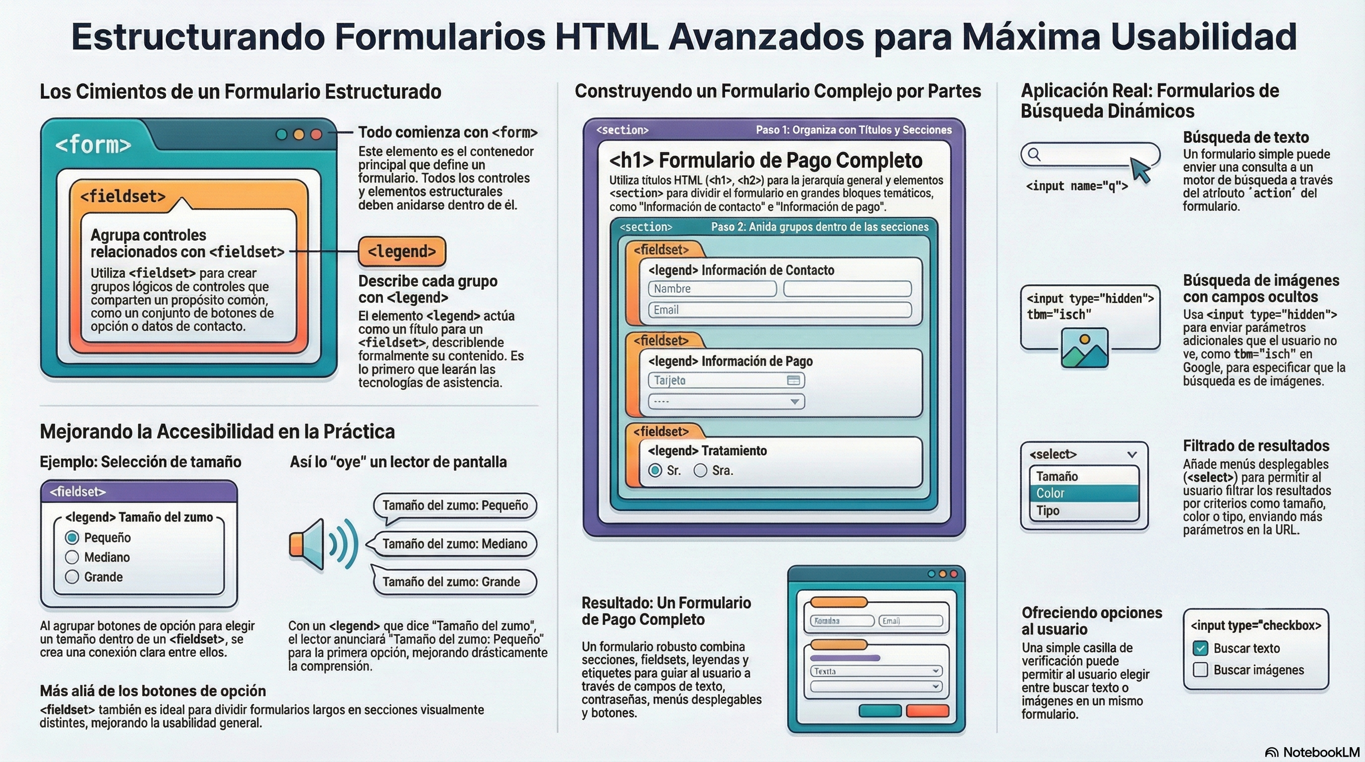
Esta unidad profundiza en la creación de formularios HTML avanzados, priorizando una estructura semántica correcta mediante el uso de elementos como <fieldset> y <legend> para agrupar controles y mejorar tanto la usabilidad como la accesibilidad para tecnologías de asistencia. A través de ejemplos prácticos, como un formulario de pago, se enseña a organizar la información en secciones lógicas utilizando etiquetas estándar de bloque y atributos específicos para validar datos. Además, el contenido abarca la interacción real con motores de búsqueda (como Google o Bing) mediante la manipulación del atributo action y el uso de campos ocultos (input type="hidden") y menús desplegables para enviar parámetros complejos por la URL, permitiendo funcionalidades como la búsqueda específica de imágenes o el filtrado de resultados por tamaño, color y licencia.
Cómo estructurar un formulario HTML
Una vez examinados los conceptos básicos, vamos a ver más en detalle los elementos que se utilizan para proporcionar estructura y significado a las diferentes partes de un formulario. La flexibilidad que presentan los formularios los convierte en una de las estructuras más complejas y completas en HTML, puesto que puedes crear cualquier tipo de formulario básico a partir de los elementos y atributos destinados a esta función. El uso de una estructura correcta al crear un formulario HTML te ayudará a garantizar que el formulario presente las características de usabilidad y accesibilidad adecuadas.
El elemento <form>
Tal como explicamos en la unidad anterior, el elemento <form> se utiliza para definir un formulario y los atributos que determinan su comportamiento. Cada vez que desees crear un formulario HTML, debes empezar utilizando este elemento y anidando todo el contenido dentro de él.
Es posible usar controles de formulario fuera de un elemento <form>. Si lo haces, por defecto ese control no tendrá nada que ver con ningún formulario específico, a menos que lo asocies a algún formulario con el atributo form. Esto se introdujo para permitir vincular explícitamente un control a un formulario, incluso si no está dentro de él.
A continuación vamos a exponer los elementos que se pueden utilizar en un formulario.
Los elementos <fieldset> y <legend>
El elemento <fieldset> es una forma cómoda de crear grupos de controles de formulario (también denominados widgets) que comparten el mismo propósito, con fines semánticos y de aplicación de estilo. Puedes etiquetar un elemento <fieldset> incluyendo un elemento <legend> justo debajo de la etiqueta de apertura <fieldset>. El contenido textual del elemento <legend> describe formalmente el propósito del elemento <fieldset> que está incluido dentro.
Para lograr la máxima usabilidad/accesibilidad, se recomienda rodear cada lista de ítems relacionados con un <fieldset>, acompañado con un título dentro de un elemento <legend> que proporcione una descripción general de la lista. Cada uno de los ítems de esa lista estará compuesto a su vez por pares individual de elementos <label>/<input>. Por ejemplo, si utilizamos varios botones de radio o casillas de verificación para elegir una o varias opciones relativas a un dato específico, habitualmente colocaremos un <label> inmediatamente después cada opción, e indicaremos el propósito del grupo de botones de radio o casillas de verificación mediante el elemento <legend>.
Muchas tecnologías de asistencia utilizarán el elemento <legend> como si fuera una parte de la etiqueta de cada control dentro del elemento <fieldset> correspondiente. Por ejemplo, algunos lectores de pantalla como Jaws y NVDA leerán el contenido de la leyenda antes de decir la etiqueta de cada control.
Aquí tenemos un pequeño ejemplo:
<form>
  <fieldset>
    <legend>Tamaño del zumo de frutas</legend>
    <p>
      <label><input type="radio" name="size" value="small">Pequeño</label>
    </p>
    <p>
      <label><input type="radio" name="size" value="medium">Mediano</label>
    </p>
    <p>
      <label><input type="radio" name="size" value="large">Grande</label>
    </p>
  </fieldset>
</form>
El caso de uso que se muestra en este ejemplo es uno de los más habituales. Cada vez que tengamos un conjunto de botones de opción o casillas de verificación, deberíamos anidarlos dentro de un elemento <fieldset>. De esta forma, al leer el formulario anterior, un lector de pantalla dirá «Tamaño del zumo de fruta: pequeño» para el primer control de formulario, «Tamaño del zumo de fruta: mediano» para el segundo y «Tamaño del zumo de fruta: grande» para el tercero.
El elemento <fieldset> también se puede usar en muchos otros casos, simplemente con el propósito de dividir un formulario en diferentes secciones. Idealmente, si un formulario se alarga mucho, podremos mejorar su usabilidad colocando las diferentes opciones que estén relacionadas dentro de secciones independientes.
Ejercicio propuesto: Bebida y hamburguesa
Utilizando el código del ejemplo anterior, crea una página web para elegir el tamaño tanto de una bebida como de una hamburguesa, ambas opciones dentro de un
<fieldset>diferente con el<legend>correspondiente. Además, como se hizo antes, el usuario debería poder elegir entre tres tamaños diferentes: pequeño, mediano y grande:
Un formulario con secciones
Es importante recordar que el marcado de un formulario se realiza utilizando HTML. Esto significa que podemos utilizar cualquiera de las etiquetas habituales para organizar cada una de las opciones y conseguir que el formulario sea más legible. Por ejemplo, como podemos ver en los ejemplos anteriores, es una práctica común anidar cada etiqueta y su widget dentro de elementos <p>. También se recomienda el uso de listas para estructurar múltiples casillas de verificación o botones de radio.
Además del elemento <fieldset>, también es una práctica común usar títulos HTML (por ejemplo, <h1>, <h2>) y seccionamiento (por ejemplo, <section>) para estructurar formularios complejos. Depende de cada desarrollador encontrar un estilo de codificación que permita obtener formularios accesibles y con una alta usabilidad. Cada sección que agrupe cierta funcionalidad debe estar contenida en un elemento <section> separado, con elementos <fieldset> para agrupar por ejemplo botones de radio que nos permitan seleccionar un valor específico para una determinada opción.
Pongamos estas ideas en práctica y construyamos un formulario un poco más complejo: un formulario de pago. Este formulario contendrá más tipos de controles que el ejemplo anterior. Sigue las instrucciones que se muestran a continuación y fíjate en los elementos que estamos usando para estructurar el formulario.
- Primero, crearemos el formulario añadiendo el elemento externo
<form>:
<form>
    ...
</form>
- Dentro de las etiquetas
<form>, añadiremos un encabezado y un párrafo para indicar a los usuarios cuáles serán los campos obligatorios:
<form>
  <h1>Formulario de Pago</h1>
  <p>Los campos obligatorios se han marcado con <strong>*</strong>.</p>
  ...
</form>
- También añadiremos un simple
<button>de tipo submit, en la parte inferior, para enviar los datos del formulario:
<form>
  <h1>Formulario de Pago</h1>
  <p>Los campos obligatorios se han marcado con <strong>*</strong>.</p>
  ...
  <p><button type="submit">Validar el pago</button></p>
</form>
- Luego añadiremos una sección más grande de código en el formulario, debajo de nuestra entrada anterior. Aquí verás que estamos encerrando los campos de información de contacto dentro de un elemento
<section>distinto. Además, tenemos un conjunto de tres botones de radio, cada uno de los cuales colocamos en una nueva línea. También tenemos dos<input>de texto estándar y sus elementos<label>asociados, cada uno contenido dentro de un<p>, y un input de contraseña para introducir una clave:
<form>
  <h1>Formulario de Pago</h1>
  <p>Los campos obligatorios se han marcado con <strong>*</strong>.</p>
  <section><fieldset>
    <legend><h2>Información de contacto</h2></legend>
    <fieldset>
      <legend>Tratamiento</legend>
      <label><input type="radio" name="title" value="sr">Sr/Sra</label><br>
      <label><input type="radio" name="title" value="dr">Dr/Dra</label><br>
      <label><input type="radio" name="title" value="otro">Otro</label> <br>
    </fieldset>
    <p><label>Nombre: <input type="text" name="name" required> *</label></p>
    <p><label>Correo electrónico: <input type="email" name="email" required> *</label></p>
    <p><label>Contraseña: <input type="password" name="password" required> *</label></p>
  </fieldset></section>
  ...
  <p><button type="submit">Validar el pago</button></p>
</form>
- El segundo elemento
<section>de nuestro formulario contiene la información de pago. Tenemos tres controles distintos junto con sus etiquetas, cada uno contenido dentro de un<p>. El primero es un menú desplegable (<select>) para seleccionar el tipo de tarjeta de crédito. El segundo es un elemento<input>de tipotel, para introducir un número de tarjeta de crédito. Aunque podríamos haber usado el tipo número, no queremos la interfaz de usuario del spinner del número. El último es un elemento<input>de tipo fecha, para introducir la fecha de vencimiento de la tarjeta. Este campo aparecerá con un widget de selector de fecha en navegadores compatibles y se revertirá a una entrada de texto normal en navegadores no compatibles.
<form>
  <h1>Formulario de Pago</h1>
  <p>Los campos obligatorios se han marcado con <strong>*</strong>.</p>

  <section><fieldset>
    <legend><h2>Información de contacto</h2></legend>
    <fieldset>
      <legend>Tratamiento</legend>
      <label><input type="radio" name="title" value="sr">Sr/Sra</label><br>
      <label><input type="radio" name="title" value="dr">Dr/Dra</label><br>
      <label><input type="radio" name="title" value="otro">Otro</label> <br>
    </fieldset>
    <p><label>Nombre: <input type="text" name="name" required /> *</label></p>
    <p><label>Correo electrónico: <input type="email" name="email" required> *</label></p>
    <p><label>Contraseña: <input type="password" name="password" required> *</label></p>
  </fieldset></section>

  <section><fieldset>
    <legend><h2>Información de pago</h2></legend>
    <p><label>Tipo de tarjeta:
      <select name="card_type">
        <option value="visa">Visa</option>
        <option value="mc">Mastercard</option>
        <option value="amex">American Express</option>
      </select>
    </label></p>
    <p><label>Número de tarjeta: <input type="tel" name="card_number" required> *
    </label></p>
    <p><label>Fecha de vencimiento: <input type="date" name="expiration" required> *
    </label></p>
  </fieldset></section>

  <p><button type="submit">Validar el pago</button></p>
</form>
Ejercicio propuesto: Formulario de pago
Utilizando el código del ejemplo anterior, crea un formulario de pago más sofisticado. Dentro de la sección «Información de contacto», debes añadir un grupo de botones de opción para que el usuario pueda seleccionar su estado (ya sea «Estudiante», «Profesor» u «Otro») y un nuevo campo de texto para introducir el número de teléfono. Y dentro de la sección «Información de pago» tienes que añadir una nueva casilla de selección para que el usuario pueda elegir el tipo de pago preferido (ya sea «Tarjeta de crédito» o «Paypal») y un nuevo campo de correo electrónico para introducir la cuenta Paypal:
Un ejemplo real: formularios de buscadores
Buscando texto
Ahora vamos a crear un formulario muy sencillo que proporcionará todos los datos necesarios (un texto simple) para realizar búsquedas en algunos de los buscadores más conocidos:
<form action="https://google.com/search" method="GET">
  <label>Google: <input type="text" name="q" required /></label>
  <button type="submit">Buscar</button>
</form>
...
<form action="https://duckduckgo.com/" method="GET">
  <label>DuckDuckGo: <input type="text" name="q" required /></label>
  <button type="submit">Buscar</button>
</form>
...
<form action="https://bing.com/search" method="GET">
  <label>Bing: <input type="text" name="q" required /></label>
  <button type="submit">Buscar</button>
</form>
Habrás notado que cuando presionas el botón de enviar, la consulta (parámetro q) se incluye en la URL, y de esta manera el motor de búsqueda sabrá qué buscar. Por ejemplo, si estamos buscando la palabra «perros» en Google, la URL resultante al enviar el formulario será esta: https://www.google.es/search?q=dog.
Ejercicio propuesto: Búsqueda de texto
Usando el ejemplo del formulario anterior para buscar información en Google, DuckDuckGo y Bing, desarrolla una página web similar a la de abajo para buscar información en varios motores de búsqueda (al menos cinco).
La única diferencia de un formulario a otro es el valor del atributo action (“https://google.com/search”, “https://duckduckgo.com/”, “https://bing.com/search”, “https://www.ecosia.org/search”, “https://search.givewater.com/serp”, etc.). Esta dirección se puede adivinar echando un vistazo a la URL cuando estás utilizando cada motor de búsqueda en particular.
Buscando imágenes
Ahora cambiaremos un poco el código para que los resultados proporcionados por los motores de búsqueda sean imágenes en lugar de texto. En algunos casos solo necesitamos cambiar el atributo action, pero a veces tenemos que agregar algunos campos adicionales:
<form action="https://google.com/search" method="GET">
  <label>Google: <input type="text" name="q" required></label>
  <input type="hidden" name="tbm" value="isch">
  <button type="submit">Buscar</button>
</form>
...
<form action="https://duckduckgo.com/" method="GET">
  <label>DuckDuckGo: <input type="text" name="q" required></label>
  <input type="hidden" name="iax" value="images">
  <input type="hidden" name="ia" value="images">
  <button type="submit">Buscar</button>
</form>
...
<form action="https://search.givewater.com/serp" method="GET">
  <label>giveWater: <input type="text" name="q" required></label>
  <input type="hidden" name="qc" value="images">
  <button type="submit">Buscar</button>
</form>
Podrás apreciar que cuando presionas el botón de enviar, esos campos ocultos (que no son introducidos por el usuario) se incluyen automáticamente en la URL para que el motor de búsqueda sepa que tiene que mostrar imágenes en lugar de texto. De esta manera, en este ejemplo estamos pasando dos parámetros: q (la cadena de búsqueda) y tbm (para buscar imágenes). Por ejemplo, si estamos buscando imágenes sobre perros en Google, la URL resultante al enviar el formulario será esta: https://www.google.es/search?q=dog&tbm=isch.
Ejercicio propuesto: Búsqueda de imágenes
Usando el código del ejercicio anterior, desarrolla una nueva página web para buscar imágenes en varios motores de búsqueda (al menos cinco).
Para buscar imágenes usando Bing y Ecosia, solo tienes que usar el valor correcto para el atributoaction(“https://bing.com/images/search”, “https://www.ecosia.org/images”). Solo tienes que usar los campos ocultos para Google (tbm), DuckDuckGo (iax,ia) y giveWater (qc), como se hizo en el ejemplo anterior. Tanto las direcciones como los campos ocultos se pueden adivinar echando un vistazo a la URL cuando estás utilizando cada motor de búsqueda en particular.
Eligiendo entre búsqueda de texto e imágenes
Ahora centrémonos en el motor de búsqueda de Google y avancemos un paso más para añadir una casilla de verificación que le dé al usuario la opción de elegir entre buscar texto o imágenes:
<form action="https://google.com/search">
  <label>Google: <input type="text" name="q" required /></label>
  <label>Buscar imágenes <input type="checkbox" name="tbm" value="isch" /></label>
  <button>Buscar</button>
</form>
Ejercicio propuesto: Texto o imágenes
Desarrolla una página web para buscar texto o imágenes en los motores de búsqueda de Google y giveWater. Debes proporcionar al usuario una casilla de verificación para que pueda cambiar fácilmente de un tipo a otro:
Filtrando los resultados
Finalmente, centrémonos nuevamente en el motor de búsqueda de Google para añadir varios controles de manera que el usuario pueda filtrar los resultados al buscar imágenes. También añadiremos un botón de reinicio para establecer los valores predeterminados:
<fieldset>
<form action="https://google.com/search" method="GET">
  <p>Buscar: <input type="text" name="q" class="big" required></p>

  <fieldset>
    <legend>Tamaño</legend>
    <select name="tbs">
      <option selected disabled>Cualquier tamaño</option>
      <option value="isz:l">Grande</option>
      <option value="isz:m">Mediano</option>
      <option value="isz:i">Icono</option>
    </select>
  </fieldset>
  <fieldset>
    <legend>Color</legend>
    <select name="tbs">
      <option selected disabled>Cualquier color</option>
      <option value="ic:color">Color</option>
      <option value="ic:gray">Blanco y negro</option>
      <option value="ic:trans">Transparente</option>
   </select>
  </fieldset>
  <fieldset>
    <legend>Tipo</legend>
    <select name="tbs">
      <option selected disabled>Cualquier tipo</option>
      <option value="itp:clipart">Clip art</option>
      <option value="itp:lineart">Dibujo lineal</option>
      <option value="itp:animated">GIF</option>
    </select>
  </fieldset>
  <fieldset>
    <legend>Fecha</legend>
    <select name="tbs">
      <option selected disabled>Cualquier fecha</option>
      <option value="qdr:d">Últimas 24 horas</option>
      <option value="qdr:w">Última semana</option>
    </select>
  </fieldset>
  <fieldset>
    <legend>Licencia</legend>
    <select name="tbs">
      <option selected disabled>Cualquier licencia</option>
      <option value="il:cl">Creative Commons</option>
      <option value="il:ol">Comercial y otras</option>
    </select>
  </fieldset>

  <input type="hidden" name="tbm" value="isch">

  <button type="reset">Reiniciar</button>
  <button type="submit">Buscar</button>
</form>
</fieldset>
Como verás, hemos añadido muchas opciones para establecer diferentes valores para un parámetro llamado “tbs” (hemos adivinado este parámetro y todos sus posibles valores observando la URL al buscar cualquier información en Google). De esta manera, en este ejemplo estamos pasando tres parámetros: q (la cadena de búsqueda), tbm (para buscar imágenes) y tbs (para filtrar los resultados). Por ejemplo, si estamos buscando imágenes GIF sobre perros, la URL resultante al enviar el formulario será esta: https://www.google.es/search?q=dog&tbm=isch&tbs=itp:animated.
También podrás apreciar que dentro de cada elemento estamos usando una opción predeterminada: <option selected disabled>...</option> para que, por defecto, ninguna de las opciones disponibles esté seleccionada y los resultados no estén filtrados.
Ejercicio propuesto: Filtrar imágenes con listas desplegables
Utilizando el código del ejemplo anterior, desarrolla una página web para buscar imágenes en Google y filtrar los resultados utilizando varias listas desplegables:
Ejercicio propuesto: Filtrando imágenes con botones de radio
Crea una nueva página web para buscar imágenes en Google y filtrar los resultados utilizando botones de radio:
Test
Comprueba tus conocimientos con este test sobre formato de texto y otros conceptos relacionados con esta unidad.