You will find in this post several free and open-source 2D sprite editors and pixel art tools that can be used on your browser to create fancy pictures and animations.
Pixelorama
Pixelorama is an awesome free and open source pixel art editor, proudly created with the Godot engine, by Orama Interactive. Whether you want to make animated pixel art, game graphics, tiles and any kind of pixel art you want, Pixelorama has you covered with its variety of tools and features (you can find online documentation here). Free to use for everyone:
A variety of different tools to help you draw, with the ability to map a different tool in each left and right mouse buttons.
Are you an animator? Pixelorama has its own animation timeline just for you! You can work at an individual cel level, where each cel refers to a unique layer and frame. Supports onion skinning, cel linking, motion drawing and frame grouping with tags.
Custom brushes, including random brushes.
Create or import custom palettes.
Import images and edit them inside Pixelorama. If you import multiple files, they will be added as individual animation frames. Importing spritesheets is also supported.
Export your gorgeous art as PNG, as a single file, a spritesheet or multiple files, or GIF file.
Pixel perfect mode for perfect lines, for the pencil, eraser & lighten/darken tools.
Autosave support, with data recovery in case of a software crash.
Horizontal & vertical mirrored drawing.
Tile mode for pattern creation.
Rectangular & isometric grid types.
Scale, rotate and apply multiple image effects to your drawings.
Multi-language localization support! See the Crowdin page for more details.
Did you know that you can create pixel art using CSS? Pixel Art to CSS is an online editor that helps you with that task. Combining the power of both box-shadow and keyframes CSS properties, you will get CSS code ready to use in your site. Furthermore, you can download your work in different formats such as a static image, animated GIF or sprite like image.
Pixel Art to CSS aims to be an intuitive tool by its simplicity, however it is equipped with a wide range of features: customize your color palette, go back and forth in time, modify animation settings, save or load your projects, among others.
In this unit we will build a clone of Google Chrome “secret” Dino game (the original game can be revealed by entering “chrome://dino” in the address bar). We will use simple web technologies such as HTML, CSS, JavaScript and Phaser 3, so that any user can play on any device just using any browser (not only Chrome).
The result is a game which looks almost the same as the original one using less than 10% lines of code. As it can be seen from the Chromium source code, the original game is made of more than 4000 lines of code, whereas the one in this unit has been developed using around 300 lines of code. This means that Phaser could be a much better option than simple JavaScript when thinking about game development.
Some features
This version of the game clones almost every feature of the original one:
The speed of the game is increased gradually.
Both cactuses and birds will appear randomly to hurt you.
Two scores are shown: current and highest.
Each time the user reaches 100 points, the score blinks and a sound is played.
It can be played on desktop computers using both the mouse and the keyboard:
By clicking on the screen to jump or to restart the game.
Using the up arrow key or the space bar to jump, the down arrow key to duck under the enemy, and the enter key to restart the game.
It can be played on mobile devices by touching the screen, the same way as any single button game.
The game is automatically adjusted to fit the screen size, even if it changes after the page is loaded (for example, in case the user rotates the device).
Vibration is activated on mobile devices when the game over screen appears.
CSS code (styles.css)
We are going to insert some CSS code to remove any margin and padding, and also to remove the scrollbars, so that the whole window size is used when the game is started:
html, body {
  margin: 0px;
  padding: 0px;
  overflow: hidden;
}
HTML code (index.html)
We are going to use a single HTML file to link all the files in the project. This is going to be the “index.html” file:
We are going to define some constants (i.e. screen width and height and text styles) so that we can use them inside every JavaScript file. We will also define a function to set the initial values of some variables before the game is started, together with the usual Phaser configuration, which must be performed as usual.
Moreover we are adding a piece of code to check whether the screen is being resized (i.e. when the device is rotated or the window size is adjusted) so that the whole game is reloaded to fit the new values of the screen width and height.
// Fill the whole width and height of the screen
const WIDTH = window.innerWidth;
const HEIGHT = window.innerHeight;

// Time in milliseconds for each obsticle (lower = faster)
const OBSTICLE_TIME = 750;

// Text style to be used when printing texts (scores, etc.)
const TEXT_STYLE = { fill: "#535353", font: '900 35px Courier', resolution: 10 };

// Variables to be initialized each time the game is restarted
function initVariables() {
  this.isGameRunning = false;
  this.gameSpeed = 10;
  this.respawnTime = 0;
  this.score = 0;
}

// Phaser initialization
let game = new Phaser.Game({
  type: Phaser.AUTO,
  width: WIDTH,
  height: HEIGHT,
  pixelArt: true,
  transparent: true,
  physics: {
    default: 'arcade',
    arcade: {
      debug: false
    }
  },
  scene: { preload: preload, create: create, update: update }
});

// Reload the game when the device orientation changes or the user resizes the window
let resizing = false;
window.addEventListener('resize', () => {
  if (resizing) clearTimeout(resizing);
  resizing = setTimeout(() => window.location.reload(), 500);
});
The assets
We will need some images, sprites and sounds. You may use any assets you like, but we are providing the original ones so that you can easily develop the same game as the one available in Google Chrome. Some examples are shown below, and also a zip file containing all the assets can be downloaded here.
Images
CloudCactuses
Game overRestart
Sprites
Dino waiting and runningBird enemy
Sounds
HitJumpReach
Loading all the assets (preload.js)
So that we can use all those images, sprites and sounds, they have to be loaded previously. That is the purpose of the “preload()” function.
Inside the “initSounds()” and “createAnims()” we will set the volume of the sounds and the frames of the animations respectively.
Creating the scores, the clouds, the dino, and the game over message (create.js)
Scores: Two boxes are used to print both the current and highest scores on the right hand side of the screen.
Clouds: A loop will be used to create 3 clouds at once printing the same image on random positions.
Dino: The dino will collide with the ground below, and it will jump using the keys defined here (in our case we will use both the up cursor key and the space bar). The mouse functionality is already available by default.
Game over: A message will be shown when the user collides with either the birds or the cactuses. After the user clicks on it, this message will be hidden using the “setAlpha(0)” function call.
// Score text on the right side of the screen
function createScore() {
  this.scoreText = this.add.text(WIDTH - 25, HEIGHT / 3, "", TEXT_STYLE).setOrigin(1, 1);
  this.highScoreText = this.add.text(0, HEIGHT / 3, "", TEXT_STYLE).setOrigin(1, 1).setAlpha(0.75);
}

// Three clouds hidden at the beginning
function createClouds() {
  this.clouds = this.add.group();
  for (let i = 0; i < 3; i++) {
    const x = Phaser.Math.Between(0, WIDTH);
    const y = Phaser.Math.Between(HEIGHT / 3, HEIGHT / 2);
    this.clouds.add(this.add.image(x, y, 'cloud'));
  }
  this.clouds.setAlpha(0);
}

// Dino starts running and the the ground is created
function createGround() {
  this.startText.destroy();
  this.dino.setVelocityX(100);
  this.dino.play('dino-run', 1);

  const interval = setInterval(() => {
    this.ground.width += (WIDTH / 100);
    if (this.ground.width >= WIDTH) {
      clearInterval(interval);
      this.dino.setVelocityX(0);
      this.scoreText.setAlpha(1);
      this.clouds.setAlpha(1);
      this.isGameRunning = true;
    }
  }, 50);
}

// Dino waiting animation, keyboard initilization and starting text
function createDino() {
  this.dino = this.physics.add.sprite(0, HEIGHT / 1.5, 'dino-idle').setSize(50).setGravityY(5000).setOrigin(0, 1);
  this.dino.play('dino-waiting', true);

  this.physics.add.collider(this.dino, this.belowGround);
  this.physics.add.collider(this.dino, this.obsticles, () => stopGame.call(this));

  this.cursors = this.input.keyboard.createCursorKeys();
  this.spaceBar = this.input.keyboard.addKey(Phaser.Input.Keyboard.KeyCodes.SPACE);

  this.startText = this.add.text(WIDTH - 15, HEIGHT / 1.5, "Press to play", TEXT_STYLE).setOrigin(1);
}

// Game over screen and pause until player starts the game again
function createGameOverScreen() {
  this.gameOverText = this.add.image(0, 0, 'game-over');
  this.restart = this.add.image(0, 50, 'restart').setInteractive();
  this.gameOverScreen = this.add.container(WIDTH / 2, HEIGHT / 2 - 50);
  this.gameOverScreen.add([this.gameOverText, this.restart]);

  this.input.keyboard.on('keydown_ENTER', () => startGame.call(this));
  this.restart.on('pointerdown', () => startGame.call(this));
}

// Define the physical ground and obsticles group
function createWorld() {
  this.ground = this.add.tileSprite(0, HEIGHT / 1.5, 88, 26, 'ground').setOrigin(0, 1);
  this.belowGround = this.add.rectangle(0, HEIGHT / 1.5, WIDTH, HEIGHT / 3).setOrigin(0, 0);
  this.physics.add.existing(this.belowGround);
  this.belowGround.body.setImmovable();
  this.obsticles = this.physics.add.group();
}

// Create all the elements in the game and initilize the score
function create() {
  initVariables.call(this);
  initSounds.call(this);
  createAnims.call(this);
  createWorld.call(this);
  createClouds.call(this);
  createScore.call(this);
  createDino.call(this);

  setInterval(() => updateScore.call(this), 100);
}
Controlling the player and displaying the birds and the cactuses (update.js)
Starting the game and building the ground: The “createGround()” method will build the ground progresively, just once, when the game is started the very first time (after the user taps the screen or presses either the up arrow key or the space bar).
Restarting the game: After the game over message appears, the user may click on the screen to start a new game. This is done inside the “startGame()” method, which clears the message using the “destroy()” method call, restarts the score and resumes all the physics.
Updating the scores: The function “updateScore()” will not only update the current score, but it will also increment the game speed, and it will play a sound each time the user reaches 100 points, making the numbers blink at the same time. The “updateHighScore()” function will keep a record of the highest score each time a game is over.
Placing and moving the birds and the cactuses: The “placeObsticle()” function will create either birds or cactuses randomly, and the “update()” function will move everything to the left except the dino, which will always remain in the same position.
// Restart the game after dino is hurt
function startGame() {
  this.dino.setVelocityY(0);
  this.physics.resume();
  this.anims.resumeAll();
  this.obsticles.clear(true, true);
  this.gameOverScreen.destroy();
  this.isGameRunning = true;
}

// On game over a sound is played and all physics are paused
// The game over screen will be shown and mobile devices will vibrate
function stopGame() {
  initVariables.call(this);
  updateHighScore.call(this);
  this.hitSound.play();
  this.physics.pause();
  this.anims.pauseAll();
  this.dino.setTexture('dino-hurt');
  createGameOverScreen.call(this);
  if (window.navigator.vibrate) window.navigator.vibrate(50);
}

// Update the score and increase the game speed
function updateScore() {
  if (!this.isGameRunning) return;

  this.score++;
  this.gameSpeed += 0.01;

  if (this.score % 100 == 0) {
    this.reachSound.play();

    this.tweens.add({
      targets: this.scoreText,
      duration: 100,
      repeat: 3,
      alpha: 0,
      yoyo: true
    })
  }

  this.scoreText.setText(("0000" + this.score).slice(-5));
}

// Update the high score in case is higher than the previous one
function updateHighScore() {
  this.highScoreText.x = this.scoreText.x - this.scoreText.width - 30;

  const highScore = this.highScoreText.text.substr(this.highScoreText.text.length - 5);
  const newScore = Number(this.scoreText.text) > Number(highScore) ? this.scoreText.text : highScore;

  this.highScoreText.setText(`HI ${newScore}`);
}

// Place a new obsticle on the screen (either cactuses or birds)
function placeObsticle() {
  let obsticle;
  const obsticleNum = Phaser.Math.Between(1, 7);

  if (obsticleNum > 6) {
    obsticle = this.obsticles.create(WIDTH, HEIGHT / 1.5 - Phaser.Math.Between(20, 50), 'enemy-bird');
    obsticle.body.height /= 1.5
    obsticle.play('enemy-bird-anim', 1);
  } else {
    obsticle = this.obsticles.create(WIDTH, HEIGHT / 1.5, `obsticle-${obsticleNum}`)
  }

  obsticle.setOrigin(0, 1).setImmovable();
}

// Update the screen (obsticles, ground, clouds and dino) and check the keyboard and mouse (or touch screen) continuously
// Dino will start running and jump if the user taps the screen or presses either the arrow up key or the spacebar
function update() {
  let jump = this.cursors.up.isDown || this.spaceBar.isDown || this.input.activePointer.isDown;

  if (this.isGameRunning) {
    this.ground.tilePositionX += this.gameSpeed;

    this.respawnTime += this.gameSpeed;
    if (this.respawnTime >= OBSTICLE_TIME) {
      this.respawnTime = 0;
      placeObsticle.call(this);
    }

    this.obsticles.getChildren().forEach(obsticle => {
      obsticle.x -= this.gameSpeed;
      if (obsticle.getBounds().right < 0) {
        obsticle.destroy();
      }
    })

    this.clouds.getChildren().forEach(cloud => {
      cloud.x -= 0.5;
      if (cloud.getBounds().right < 0) {
        cloud.x = WIDTH;
      }
    })

    if (this.dino.body.onFloor()) {
      if (jump) {
        this.jumpSound.play();
        this.dino.anims.stop();
        this.dino.setVelocityY(-1600);
        this.dino.setTexture('dino', 0);
      }
      else {
        this.dino.play('dino-run', true);
      }
    }
  }
  else if (jump && (this.ground.width < WIDTH)) {
    createGround.call(this);
  }
}
Proposed exercise: Using your own assets
Create a new version of the Dino game using your own assets (images, sprites and sounds). You can also change any other things you like.
Do not forget to create all the files required to run the code in this unit:
styles.css
index.html
preload.js
create.js
update.js
config.js
assets folder
You may find many free assets in OpenGameArt, and some new versions of the Dino game in github:
You can download this zip file to get the source code and all the assets.
Updating the map
As done previously, you can use the tile map editor to update the map. In case you have not done it yet, you can download the editor from this link and install it on your computer.
To update the map you have to go the assets folder and open the file “town.tmx” which contains the map of the example in this unit. Select a layer (on the right corner, at the top) and change anything you like (by adding or removing some objects to or from the map). When you finish, export the map to JSON format using the option “File” -> “Export as…”, and overwrite the file “town.json”, located inside the “assets” folder.
Finally check the results using your browser and move the player to go to each part of the map. You will notice that the camera will follow you on each movement. Do not forget to fully refresh the contents of the browser by pressing Ctrl+F5, since the map and some other contents are usually cached by the browser. Also move the player and check that the map has been updated with the changes you have made.
Frames per second (FPS)
You can update the number of frames per second to choose the best renderization performance for your computer:
const MAX_FPS = 25;
Using the keyboard and the mouse
In this game we are using the keys A (left), S (down), D (right), W (up) to move the player on desktop computers and the joystick for mobile devices:
  let vX = 0, vY = 0;

  // Horizontal movement
  if (wsadKeys.A.isDown || joyStick.left) vX = -speed;
  else if (wsadKeys.D.isDown || joyStick.right) vX = speed;

  // Vertical movement
  if (wsadKeys.W.isDown || joyStick.up) vY = -speed;
  else if (wsadKeys.S.isDown || joyStick.down) vY = speed;
The mouse is used for shooting on desktop computers:
  let pointer = this.input.activePointer;
  if (pointer.isDown && this.sys.game.device.os.desktop) createBullet.call(this, pointer.worldX - player.x, pointer.worldY - player.y);
In case you do not have any mouse, you may use the cursor keys on desktop computers, or the second joystick on mobile devices, to shoot the bullets and to choose the shooting direction:
  let vX = 0, vY = 0;

  // Horizontal bullets
  if (cursors.left.isDown || joyStick2.left) vX = -speed;
  else if (cursors.right.isDown || joyStick2.right) vX = speed;

  // Vertical bullets
  if (cursors.up.isDown || joyStick2.up) vY = -speed;
  else if (cursors.down.isDown || joyStick2.down) vY = speed;

  if (vX || vY) createBullet.call(this, vX, vY);
Enjoy the game!
You may enjoy playing this wonderful game online here.
You can have a look at this preview of the whole map.
The source code and the assets
You can download this zip file to get the source code and all the assets.
Updating the map
As done previously, you can use the tile map editor to update the map. In case you have not done it yet, you can download the editor from this link and install it on your computer.
To update the map you have to go the assets folder and open the file “town.tmx” which contains the map of the example in this unit. Select a layer (on the right corner, at the top) and change anything you like (by adding or removing some objects to or from the map). When you finish, export the map to JSON format using the option “File” -> “Export as…”, and overwrite the file “town.json”, located inside the “assets” folder.
Since we are working with a lot of tilesets, in this case we are setting the collisions with all the objects in some of the layers: “Terrain_3”, “Buildings_1” and “Buildings_2”. The player and the enemies will collide with all the objects that you drawn in these three layers.
Finally check the results using your browser and move the player to go to each part of the map. You will notice that the camera will follow you on each movement. Do not forget to fully refresh the contents of the browser by pressing Ctrl+F5, since the map and some other contents are usually cached by the browser. Also move the player and check that the map has been updated with the changes you have made.
Renderization problems
Due to the large amount of resources this game is going to use from your computer, you might need to adjust a couple of parameters. It seems it works fine on Chrome browser, but if you are using another browser, or in case you find any problems, you can try updating the following parameters.
Phaser renderer
I have selected “Phaser.CANVAS” inside the phaser configuration settings, which seems to work much better on Chrome browser, but you may try “Phaser.AUTO” instead:
const config = {
  type: Phaser.AUTO
  ...
}
Frames per second (FPS)
You can also change the number of frames per second to choose the right renderization performance:
const MAX_FPS = 25;
Using the keyboard and the mouse
In this game we are using the keys A (left), S (down), D (right), W (up) to move the player on desktop computers and the joystick for mobile devices:
  let vX = 0, vY = 0;

  // Horizontal movement
  if (wsadKeys.A.isDown || joyStick.left) vX = -speed;
  else if (wsadKeys.D.isDown || joyStick.right) vX = speed;

  // Vertical movement
  if (wsadKeys.W.isDown || joyStick.up) vY = -speed;
  else if (wsadKeys.S.isDown || joyStick.down) vY = speed;
The mouse is used for shooting on desktop computers:
  let pointer = this.input.activePointer;
  if (pointer.isDown && this.sys.game.device.os.desktop) createBullet.call(this, pointer.worldX - player.x, pointer.worldY - player.y);
In case you do not have any mouse, you may use the cursor keys on desktop computers, or the second joystick on mobile devices, to shoot the bullets and to choose the shooting direction:
  let vX = 0, vY = 0;

  // Horizontal bullets
  if (cursors.left.isDown || joyStick2.left) vX = -speed;
  else if (cursors.right.isDown || joyStick2.right) vX = speed;

  // Vertical bullets
  if (cursors.up.isDown || joyStick2.up) vY = -speed;
  else if (cursors.down.isDown || joyStick2.down) vY = speed;

  if (vX || vY) createBullet.call(this, vX, vY);
Enjoy the game!
You may enjoy playing this wonderful game online here.
In this unit we are going to use Phaser together with a tilemap editor to build a maze. You may find more information at the official page of the Tiled editor and you may also have a look at some interesting demonstrations at the Phaser’s examples page, and also performing some search on the latest examples.
HTML and CSS code
The first thing we should do is linking the Phaser library. We will use the last version at the time this unit has been written:
After that we are going to insert some CSS code to remove any margin and padding, and also to remove the scrollbars, so that all the window size is used when the game is started:
We are going to define some constants at the beginning of the code so that we can easily change the number of coins, fruits and ghosts that will be created:
Following the constants we are going to create some variables so keep all the information about the game and also to start the initialization of Phaser:
We will need some images, sprites and sounds. You may use any assets you like, but we are also providing some examples so that you can easily start testing (they can also be downloaded here):
Images
Tileset containing almost every image needed to build the gameRestart button
Sounds and music
When the player gets a coinWhen the user collects a fruitWhen the user gets hurt by a ghostWhen the user kills a ghostBackground music always playing
Loading all the assets
So that we can use all those images, sprites and music, they have to be loaded previously. That is the purpose of the “preload()” function. We will also include here the initialization of the joystick so that we can use it in another section of this unit.
Proposed exercise: Game initialization
Create a specific folder for your game in your domain to put all the code and assets inside. After that, create an “index.html” inside that folder with the code below, and also create an “assets” folder to put all the images and sounds, which can be downloaded here. After uploading everything to your domain, test the game using the url of that folder in your browser, and you should get a full black screen. Click on it and the background music should start playing.
You can see the result here (you can also look at the source code by pressing Ctrl+U).
Download any other music file you like to use it as a background music and change the JavaScript code inside the “preload()” function to set the file name accordingly. Also in the “initSounds()” function you will find that you may change the volume of the music (volume:0.4). Try changing that value from 0.1 to 1 and you will notice that the volume of the music will also change.
You may find in the following sites some free images and sounds which you can download and use for your own game:
Once we have initialized Phaser and after loading all the assets, we can go ahead and display the maze on the screen.
Proposed exercise: Displaying the maze
Add the function “createWorld()” (provided below) to your code, and modify the calling function “create()” so that it is called when the game is started (also shown below). Finally test everything in your browser from your domain.
About the music, do not forget to click on the screen after loading the game (the music will not start playing unless the browser gets the focus). Also, you can see the result here (you can look at the source code by pressing Ctrl+U).
This is the new function you have to insert in your code to create the world:
function createWorld() {
    map = this.make.tilemap({ key: "map" });

    // Parameters are the name you gave the tileset in Tiled and then the key of the tileset image in
    // Phaser's cache (i.e. the name you used in preload)
    tileset = map.addTilesetImage("tileset", "tiles");

    // Parameters: layer name (or index) from Tiled, tileset, x, y
    belowLayer = map.createLayer("Below Player", tileset, 0, 0).setDepth(1);
    worldLayer = map.createLayer("World", tileset, 0, 0).setDepth(2);
    aboveLayer = map.createLayer("Above Player", tileset, 0, 0).setDepth(3);

    worldLayer.setCollisionByProperty({ collides: true });

    this.physics.world.setBounds(0, 0, map.widthInPixels, map.heightInPixels);

    // Find empty tiles where new zombies, coins or health can be created
    emptyTiles = worldLayer.filterTiles(tile => (tile.index === -1));

    this.scale.resize(map.widthInPixels, map.heightInPixels).refresh();
}
Do not forget to update the “create()” function to create the world. This is the only line you should add to that function:
function create() {
    ...
    createWorld.call(this);
}
Proposed exercises: Modifying the maze
Download the tile map editor from this link and install it on your computer (if you don’t have installed it yet). Go to the assets folder and open the file “map.tmx” which contains the map of the example explained in this unit. Select the layer “World” (on the right corner, at the top) and change anything you like (by adding or removing some objects to or from the map). When you finish, export the map to JSON format using the option “File” -> “Export as…”, and overwrite the file “map.json”, located inside the “assets” folder. Finally check the results using your browser.
Do not forget to fully refresh the contents of the browser by pressing Ctrl+F5, since the map and some other contents are usually cached by the browser. Then you can check that the map has been updated with the changes you have made.
The animations (sprites)
We will use sprites to create the player and the animated objects. Let’s have a look at the the picture containing all the sprites:
Tileset containing all the sprites
We may appreciate that we have several groups of images. This way, we may easily create the animations:
The coin: Pictures from 0 to 7
The point: Picture 8
The ghosts:
Blue: Pictures from 17 to 20
Pink: Pictures from 21 to 24
Yellow: Pictures from 25 to 28
Green: Pictures from 34 to 37
Orange: Pictures from 38 to 41
Red: Pictures from 42 to 45
The player:
Left: Pictures from 51 to 58
Right: Pictures from 68 to 75
Down: Pictures from 85 to 92
Up: Pictures from 102 to 109
The fruits: Pictures 46, 47, 114, 143
Controlling the player’s animations
So that this game can be used in both desktop and mobile devices, we have to initialize both the cursor keys and the joystick. Once this is done, we must change the player’s velocity and the current animation when the user presses the keys or moves the joystick. In the next exercise we will first define the animations inside the “createAnimations()” function, and after that we will go ahead with the “createPlayer()” function, where we will display the player. We will finally include in the “update()” function some conditions to adjust the player’s speed and current animation.
Proposed exercise: Adding the player
Add the code below to your game and check both the player animations and movements. After that, look for another sprite and change the code accordingly to use your own sprite. Finally, change the values of the constant “speed” (at the top of your code) and check the results.
You can see the result here (you can look at the source code by pressing Ctrl+U). Also, as listed above, you may find many free assets in OpenGameArt and choose other sprites you like.
These are the new functions you have to insert in your code to create the animations and initialize everything related to the player:
function newAnimation(name, rate, sprites, context) {
    context.anims.create({
        key: name, frameRate: rate, repeat: -1,
        frames: context.anims.generateFrameNumbers('sprites', sprites),
    });
}

function createAnimations() {
    // Player
    newAnimation("left", 10, { start: 51, end: 58 }, this);
    newAnimation("right", 10, { start: 68, end: 75 }, this);
    newAnimation("down", 10, { start: 85, end: 92 }, this);
    newAnimation("up", 10, { start: 102, end: 109 }, this);
    // Point
    newAnimation("point", 1, { start: 8, end: 8 }, this);
    // Coin
    newAnimation("spinning", 10, { start: 0, end: 7 }, this);
    // Fruits
    newAnimation("fruits", 2, { frames: [46, 47, 114, 143] }, this);
    // Ghosts
    newAnimation("blue", 5, { start: 17, end: 20 }, this);
    newAnimation("pink", 5, { start: 21, end: 24 }, this);
    newAnimation("yellow", 5, { start: 25, end: 28 }, this);
    newAnimation("green", 5, { start: 34, end: 37 }, this);
    newAnimation("orange", 5, { start: 38, end: 41 }, this);
    newAnimation("red", 5, { start: 42, end: 45 }, this);
}

function createPlayer() {
    // Object layers in Tiled let you embed extra info into a map - like a spawn point or custom
    // collision shapes. In the tmx file, there's an object layer with a point named "Spawn Point"
    const spawnPoint = map.findObject("Objects", obj => obj.name === "Spawn Point");

    // Create a sprite with physics enabled via the physics system
    player = this.physics.add.sprite(spawnPoint.x, spawnPoint.y, "sprites").setDepth(2);

    // Watch the player and worldLayer for collisions, for the duration of the scene
    this.physics.add.collider(player, worldLayer);

    // Show points on empty tiles
    emptyTiles.forEach(tile => {
        let point = this.physics.add.sprite(tile.pixelX, tile.pixelY, 'sprites').setOrigin(0).anims.play('point', true);
        this.physics.add.overlap(player, point, collectPoint, null, this);
    });

    cursors = this.input.keyboard.createCursorKeys();

    // Show the joysticks only in mobile devices
    if (!this.sys.game.device.os.desktop) {
        joyStick = this.plugins.get('rexvirtualjoystickplugin').add(this, {
            x: 380, y: 420, radius: 20,
            base: this.add.circle(0, 0, 20, 0x888888).setAlpha(0.5).setDepth(4),
            thumb: this.add.circle(0, 0, 20, 0xcccccc).setAlpha(0.5).setDepth(4)
        }).on('update', update, this);

        joyStick2 = this.plugins.get('rexvirtualjoystickplugin').add(this, {
            x: 40, y: 420, radius: 20,
            base: this.add.circle(0, 0, 20, 0x888888).setAlpha(0.5).setDepth(4),
            thumb: this.add.circle(0, 0, 20, 0xcccccc).setAlpha(0.5).setDepth(4)
        }).on('update', update, this);
    }
}

function showScore() {
    if (!scoreText) scoreText = this.add.text(map.widthInPixels/2, 4, '', { fontSize: (18) + 'px', fill: '#FFF' }).setOrigin(0.5, 0).setScrollFactor(0).setDepth(4);
    scoreText.setText('Score:' + score + ' / Lives:' + lives);
}

function collectPoint(player, point) {
    bell.play();
    point.destroy();

    score += 5;
    showScore();
}
Also you have to insert some code inside the “update()” function to respond to the cursor keys and the joystick:
function update(time, delta) {
    if (gameOver) return;

    // Choose the right animation depending on the player's direction
    if (player.x > prevX) player.anims.play('right', true);
    else if (player.x < prevX) player.anims.play('left', true);
    else if (player.y > prevY) player.anims.play('down', true);
    else if (player.y < prevY) player.anims.play('up', true);

    // If the player goes outside the map
    if (player.x < 0) player.x = map.widthInPixels - 20;
    else if (player.x > map.widthInPixels) player.x = 0;

    let key = player.anims.currentAnim.key;
    let blocked = player.body.blocked;

    // Reset the velocity when the player touches a wall
    if (key == 'right' && blocked.right || key == 'left' && blocked.left) vX = 0;
    if (key == 'up' && blocked.up || key == 'down' && blocked.down) vY = 0;

    // Horizontal movement
    if (cursors.left.isDown || joyStick.left || joyStick2.left) vX = -speed;
    else if (cursors.right.isDown || joyStick.right || joyStick2.right) vX = speed;

    // Vertical movement
    if (cursors.up.isDown || joyStick.up || joyStick2.up) vY = -speed;
    else if (cursors.down.isDown || joyStick.down || joyStick2.down) vY = speed;

    player.setVelocity(vX, vY);

    if ((time - prevTime) > 100) {
        prevX = player.x;
        prevY = player.y;
        prevTime = time;
    }
}
And finally do not forget to update the “create()” function to create the animations, the player and the score. You just have to insert some new lines:
function create() {
    ...
    createAnimations.call(this);
    createPlayer.call(this);
    showScore.call(this);
}
Coins, fruits, and ghosts
We will create many different objects at once using the images from the same tileset. We will just use a loop to print as many objects as we like.
Proposed exercises: Adding the coins
Add the code below to your file and check the results. After that, change the value of the constant “numCoins” (at the top of your code) to check how easily you can customize your game. Refresh the page several times and you will notice that the generated coins appear at random positions. Finally, look for another sprite sheet (it may be a coin or any other object you like) and change the code accordingly to use your own animated object.
You can see the result here (you can look at the source code by pressing Ctrl+U). Also, as listed above, you may find many free assets in OpenGameArt and choose the images you like.
function create() {
    ...
    for (i = 0; i < numCoins; i++) setTimeout(() => createCoin.call(this), Phaser.Math.Between(0, 5000));
}
Proposed exercises: Adding the fruits
Add the code below to your game and check the results. After that, change the value of the constants “numFruits” (at the top of your code) to check how easily you can customize your game. Finally, look for another sprite and change the code accordingly to use your own object to provide the player with extra lives and points.
You may click here to see how the game looks like. As listed above, you may find many free assets in OpenGameArt.
function createFruits() {
    let fruits = newObject('fruits', this);
    fruits.body.setAllowGravity(false);
    this.physics.add.overlap(player, fruits, collectFruits, null, this);
}

function collectFruits(player, fruits) {
    bell2.play();
    fruits.destroy();
    createFruits.call(this);

    score += 15;
    showScore();
}
function create() {
    ...
    for (i = 0; i < numFruits; i++) setTimeout(() => createFruits.call(this), Phaser.Math.Between(0, 5000));
}
Proposed exercises: Adding the ghosts
Add the code below to your game and check the results. After that, change the value of the constants “numGhosts” (at the top of your code) to check how easily you can customize your game. Finally, look for another sprite and change the code accordingly to display your own ghosts.
You may click here to see how the game looks like. As listed above, you may find many free assets in OpenGameArt.
function newGhost(animation, context) {
    const spawnPoint = map.findObject("Objects", obj => obj.name === "Spawn Point 2");
    return context.physics.add.sprite(spawnPoint.x, spawnPoint.y, 'sprites').setOrigin(0).anims.play(animation, true).setDepth(2);
}

function createGhost() {
    const colors = ['blue', 'pink', 'yellow', 'green', 'orange', 'red'];
    let ghost = newGhost(colors[Phaser.Math.Between(0, colors.length - 1)], this).setCollideWorldBounds(true).setBounce(1);
    ghost.setVelocity(Phaser.Math.Between(speed / 3, speed / 2), Phaser.Math.Between(-speed / 2, -speed / 3)).body.setAllowGravity(false);
    this.physics.add.collider(ghost, worldLayer);
    this.physics.add.overlap(player, ghost, hitGhost, null, this);
}

function hitGhost(player, ghost) {
    // If the player is already hurt, it cannot be hurt again for a while
    if (player.tintTopLeft == 0xFF00FF) return;

    if (timeout) {
        score += 15;
        dead.play();
    }
    else {
        lives--;
        hurt.play();
        protect(0xFF00FF);
    }

    showScore();

    if (lives == 0) {
        this.physics.pause();
        gameOver = true;
        this.add.image(210, 230, 'restart').setScale(2).setScrollFactor(0).setDepth(4)
            .setInteractive().on('pointerdown', () => location.reload());
    }
    else {
        ghost.destroy();
        createGhost.call(this);
    }
}
function create() {
    ...
    for (i = 0; i < numGhosts; i++) setTimeout(() => createGhost.call(this), Phaser.Math.Between(0, 15000));
}
Enjoy the game!
You may enjoy playing this wonderful game online here.
In this unit we are going to use Phaser together with a tilemap editor to build our world. You may find more information at the official page of the Tiled editor and you may also have a look at some interesting demonstrations at the Phaser’s examples page, and also performing some search on the latest examples.
HTML and CSS code
The first thing we should do is linking the Phaser library. We will use the last version at the time this unit has been written:
After that we are going to insert some CSS code to remove any margin and padding, and also to remove the scrollbars, so that all the window size is used when the game is started:
We are going to define some constants at the beginning of the code so that we can easily change the game appearance, difficulty, and some other parameters:
Following the constants we are going to create some variables so keep all the information about the game and also to start the initialization of Phaser:
We will need some images, sprites and sounds. You may use any assets you like, but we are also providing some examples so that you can easily start testing (they can also be downloaded here):
Images
Tileset to be used to build the mapRestart button
Sprites (player and animated objects)
Player’s sprite sheetEnemy’s sprite sheet Sprite sheet to animate the coinsSprite sheet to animate the health objectsSprite sheet to animate the power object
Sounds and music
When the player gets a coinWhen the user collects a health objectWhen the user gets hurt by a zombieBackground music always playing
Loading all the assets
So that we can use all those images, sprites and music, they have to be loaded previously. That is the purpose of the “preload()” function. We will also include here the initialization of the joystick so that we can use it in another section of this unit.
Proposed exercise: Game initialization
Create a specific folder for your game in your domain to put all the code and assets inside. After that, create an “index.html” inside that folder with the code below, and also create an “assets” folder to put all the images and sounds, which can be downloaded here. After uploading everything to your domain, test the game using the url of that folder in your browser, and you should get a full black screen. Click on it and the background music should start playing.
You can see the result here (you can also look at the source code by pressing Ctrl+U).
Download any other music file you like to use it as a background music and change the JavaScript code inside the “preload()” function to set the file name accordingly. Also in the “initSounds()” function you will find that you may change the volume of the music (volume:0.4). Try changing that value from 0.1 to 1 and you will notice that the volume of the music will also change.
You may find in the following sites some free images and sounds which you can download and use for your own game:
Once we have initialized Phaser and after loading all the assets, we can go ahead and display the map on the screen.
Proposed exercise: Displaying the map
Add the function “createWorld()” (provided below) to your code, and modify the calling function “create()” so that it is called when the game is started (also shown below). Finally test everything in your browser from your domain.
About the music, do not forget to click on the screen after loading the game (the music will not start playing unless the browser gets the focus). Also, you can see the result here (you can look at the source code by pressing Ctrl+U).
This is the new function you have to insert in your code to create the world:
function createWorld() {
    map = this.make.tilemap({ key: "map" });

    scale *= Math.max(screenWidth/map.widthInPixels, screenHeight/map.heightInPixels);

    worldWidth = map.widthInPixels * scale;
    worldHeight = map.heightInPixels * scale;
    speed *= scale;
    joystickSize *= scale;

    // Parameters are the name you gave the tileset in Tiled and then the key of the tileset image in
    // Phaser's cache (i.e. the name you used in preload)
    tileset = map.addTilesetImage("tileset", "tiles");

    // Parameters: layer name (or index) from Tiled, tileset, x, y
    belowLayer = map.createLayer("Below Player", tileset, 0, 0).setScale(scale).setDepth(1);
    worldLayer = map.createLayer("World", tileset, 0, 0).setScale(scale).setDepth(2);
    aboveLayer = map.createLayer("Above Player", tileset, 0, 0).setScale(scale).setDepth(3);

    worldLayer.setCollisionByProperty({ collides: true });

    // Find empty tiles where new zombies, coins or health can be created
    emptyTiles = worldLayer.filterTiles(tile => (tile.index === -1 || !tile.collides));
}
Do not forget to update the “create()” function to create the world. This is the only line you should add to that function:
function create() {
    ...
    createWorld.call(this);
}
Proposed exercise: Scaling the map
Change the value of the “scale” variable (at the top of your code) and refresh the map in your browser to check that it is scaled accordingly. You can set values such as “scale = 0.5” and you will notice that the map just fits half the screen. Set also higher values and check the results again.
The animations (sprites)
We will use sprites to create the player and the animated objects. For example, let’s have a look at the player:
Player’s sprite sheet
We may appreciate that we have 36 pictures divided into 4 different groups. This way, we may easily create all four animations:
Up: Pictures from 0 to 8
Left: Pictures from 9 to 17
Down: Pictures from 18 to 26
Right: Pictures from 27 to 35
Controlling the player’s animations
So that this game can be used in both desktop and mobile devices, we have to initialize both the cursor keys and the joystick. Once this is done, we must change the player’s velocity and the current animation when the user presses the keys or moves the joystick. In the next exercise we will first define the animations inside the “createAnimations()” function, and after that we will go ahead with the “createPlayer()” function, where we will display the player. We will finally include in the “update()” function some conditions to adjust the player’s speed and current animation.
Proposed exercise: Adding the player
Add the code below to your game and check both the player animations and movements. After that, look for another sprite and change the code accordingly to use your own sprite. Finally, change the values of the constant “speed” (at the top of your code) and check the results. You will also notice that the camera will follow you on each player’s movement.
You can see the result here (you can look at the source code by pressing Ctrl+U). Also, as listed above, you may find many free assets in OpenGameArt and choose other sprites you like.
These are the new functions you have to insert in your code to create the animations and initialize everything related to the player:
function createAnimations() {
    const anims = this.anims;
    // Player
    anims.create({
        key: "left", frameRate: 10, repeat: -1,
        frames: this.anims.generateFrameNumbers('player', { start: 9, end: 17 }),
    });
    anims.create({
        key: "right", frameRate: 10, repeat: -1,
        frames: this.anims.generateFrameNumbers('player', { start: 27, end: 35 }),
    });
    anims.create({
        key: "up", frameRate: 10, repeat: -1,
        frames: this.anims.generateFrameNumbers('player', { start: 0, end: 8 }),
    });
    anims.create({
        key: "down", frameRate: 10, repeat: -1,
        frames: this.anims.generateFrameNumbers('player', { start: 18, end: 26 }),
    });
    anims.create({
        key: "waiting", frameRate: 3, repeat: -1,
        frames: this.anims.generateFrameNumbers('player', { start: 19, end: 21 }),
    });
    // Coin
    anims.create({
        key: "flying", frameRate: 10, repeat: -1,
        frames: this.anims.generateFrameNumbers('coin', { start: 0, end: 7 }),
    });
    // Health
    anims.create({
        key: "floating", frameRate: 5, repeat: -1,
        frames: this.anims.generateFrameNumbers('health', { start: 0, end: 3 }),
    });
    // Power
    anims.create({
        key: "growing", frameRate: 5, repeat: -1,
        frames: this.anims.generateFrameNumbers('power', { start: 0, end: 3 }),
    });
    // Zombie
    anims.create({
        key: "moving", frameRate: 5, repeat: -1,
        frames: this.anims.generateFrameNumbers('zombie', { start: 0, end: 11 }),
    });
}

function createPlayer() {
    // Object layers in Tiled let you embed extra info into a map - like a spawn point or custom
    // collision shapes. In the tmx file, there's an object layer with a point named "Spawn Point"
    const spawnPoint = map.findObject("Objects", obj => obj.name === "Spawn Point");

    // Create a sprite with physics enabled via the physics system. The image used for the sprite has
    // a bit of whitespace, so I'm using setSize & setOffset to control the size of the player's body
    player = this.physics.add
        .sprite(spawnPoint.x * scale, spawnPoint.y * scale, "player")
        .setSize(16, 32).setOffset(24, 32).setScale(scale)
        .setCollideWorldBounds(true).setDepth(2);

    // Watch the player and worldLayer for collisions, for the duration of the scene
    this.physics.add.collider(player, worldLayer);

    const camera = this.cameras.main;
    const world = this.physics.world;
    camera.startFollow(player);
    camera.setBounds(0, 0, worldWidth, worldHeight);
    world.setBounds(0, 0, worldWidth, worldHeight);

    cursors = this.input.keyboard.createCursorKeys();

    // Do not show the joysticks on desktop devices
    if (!this.sys.game.device.os.desktop) {
        joyStick = this.plugins.get('rexvirtualjoystickplugin').add(this, {
            x: screenWidth - joystickSize * 2,
            y: screenHeight - joystickSize * 2,
            radius: joystickSize,
            base: this.add.circle(0, 0, joystickSize, 0x888888).setAlpha(0.5).setDepth(4),
            thumb: this.add.circle(0, 0, joystickSize, 0xcccccc).setAlpha(0.5).setDepth(4)
        }).on('update', update, this);

        joyStick2 = this.plugins.get('rexvirtualjoystickplugin').add(this, {
            x: joystickSize * 2,
            y: screenHeight - joystickSize * 2,
            radius: joystickSize,
            base: this.add.circle(0, 0, joystickSize, 0x888888).setAlpha(0.5).setDepth(4),
            thumb: this.add.circle(0, 0, joystickSize, 0xcccccc).setAlpha(0.5).setDepth(4)
        }).on('update', update, this);
    }
}
Also you have to insert some code inside the “update()” function to respond to the cursor keys and the joystick:
function update(time, delta) {
    if (gameOver) return;

    let vX = 0, vY = 0;

    // Horizontal movement
    if (cursors.left.isDown || joyStick.left || joyStick2.left) vX = -speed;
    else if (cursors.right.isDown || joyStick.right || joyStick2.right) vX = speed;

    // Vertical movement
    if (cursors.up.isDown || joyStick.up || joyStick2.up) vY = -speed;
    else if (cursors.down.isDown || joyStick.down || joyStick2.down) vY = speed;

    // Set and normalize the velocity so that player can't move faster along a diagonal
    player.setVelocity(vX, vY).body.velocity.normalize().scale(speed);

    // Choose the right player's animation
    if (vX < 0) player.anims.play('left', true);
    else if (vX > 0) player.anims.play('right', true);
    else if (vY < 0) player.anims.play('up', true);
    else if (vY > 0) player.anims.play('down', true);
    else player.anims.play('waiting', true);
}
And finally do not forget to update the “create()” function to create the animations and the player. You just have to insert a couple of new lines:
function create() {
    ...
    createAnimations.call(this);
    createPlayer.call(this);
}
Proposed exercises: Modifying the map
Download the tile map editor from this link and install it on your computer. Go to the assets folder and open the file “town.tmx” which contains the map of the example explained in this unit. Select the layer “World” (on the right corner, at the top) and change anything you like (by adding or removing some objects to or from the map). When you finish, export the map to JSON format using the option “File” -> “Export as…”, and overwrite the file “town.json”, located inside the “assets” folder. Finally check the results using your browser and move the player to go to each part of the map. You will notice again that the camera will follow you on each movement.
Do not forget to fully refresh the contents of the browser by pressing Ctrl+F5, since the map and some other contents are usually cached by the browser. Also move the player and check that the map has been updated with the changes you have made.
Score, coins, power, health, and enemies
We will create many different objects at once using the same images. We will just change the size of the objects by scaling them, and we will use a loop to print as many objects as we like.
Proposed exercise: Adding the score
Using the global variables, we may easily show both the score and number of remaining lives. Add the code below to your game and check the results. After that, change the value of the variable “lives” (at the top of your code) to check how easily you can customize that text.
You can see the result here (you can look at the source code by pressing Ctrl+U).
Add the code below to your file and check the results. After that, change the value of the constant “numCoins” (at the top of your code) to check how easily you can customize your game. Refresh the page several times and you will notice that the generated coins have random sizes and they appear at random positions. Finally, look for another sprite sheet (it may be a coin or any other object you like) and change the code accordingly to use your own animated object.
You can see the result here (you can look at the source code by pressing Ctrl+U). Also, as listed above, you may find many free assets in OpenGameArt and choose the images you like.
function create() {
    ...
    for (i = 0; i < numCoins; i++) setTimeout(() => createCoin.call(this), Phaser.Math.Between(0, 5000));
}
Proposed exercises: Adding the health
Add the code below to your game and check the results. After that, change the value of the constants “numHealth” (at the top of your code) to check how easily you can customize your game. Finally, look for another sprite and change the code accordingly to use your own object to provide the player with extra lives.
You may click here to see how the game looks like. As listed above, you may find many free assets in OpenGameArt.
function createHealth() {
    let health = newObject('health', 'floating', this).setSize(16, 32).setScale(1.2 * scale);
    health.body.setAllowGravity(false);
    this.physics.add.overlap(player, health, collectHealth, null, this);
}

function collectHealth(player, health) {
    bell2.play();
    health.destroy();
    createHealth.call(this);

    lives++;
    showScore();
}
function create() {
    ...
    for (i = 0; i < numHealth; i++) setTimeout(() => createHealth.call(this), Phaser.Math.Between(0, 5000));
}
Proposed exercises: Adding the power
Add the code below to your game and check the results. After that, change the value of the constants “numPower” (at the top of your code) to check how easily you can customize your game. Finally, look for another sprite and change the code accordingly to use your own power object.
You may click here to see how the game looks like. As listed above, you may find many free assets in OpenGameArt.
function createPower() {
    let power = newObject('power', 'growing', this).setSize(32, 64).setScale(scale/2);
    power.body.setAllowGravity(false);
    this.physics.add.overlap(player, power, collectPower, null, this);
}

function protect(color) {
    player.setTint(color);
    if (timeout) clearTimeout(timeout);
    timeout = setTimeout(() => { timeout = false; player.clearTint() }, 5000);
}

function collectPower(player, power) {
    bell2.play();
    power.destroy();
    createPower.call(this);

    protect(0xFFFF00);
}
function create() {
    ...
    for (i = 0; i < numPower; i++) setTimeout(() => createPower.call(this), Phaser.Math.Between(0, 5000));
}
Proposed exercises: Adding the enemies
Add the code below to your game and check the results. After that, change the value of the constants “numZombies” (at the top of your code) to check how easily you can customize your game. Finally, look for another sprite and change the code accordingly to display your own enemies.
You may click here to see how the game looks like. As listed above, you may find many free assets in OpenGameArt.
function createZombie() {
    const v = Phaser.Math.Between(-speed / 4, -speed / 3);
    let zombie = newObject('zombie', 'moving', this).setSize(16, 32).setOffset(16, 32).setScale(1.2 * scale).setBounce(1).setVelocity(0, v);
    zombie.body.setAllowGravity(false).setCollideWorldBounds(true);
    this.physics.add.collider(zombie, worldLayer);
    this.physics.add.overlap(player, zombie, hitZombie, null, this);
}

function hitZombie(player, zombie) {
    // If the player is already hurt, it cannot be hurt again for a while
    if (player.tintTopLeft == 0xFF0000) return;

    if (timeout) {
        score += 15;
        showScore();
    }
    else {
        protect(0xFF0000);
        lives--;
    }

    dead.play();
    showScore();

    if (lives == 0) {
        this.physics.pause();
        gameOver = true;
        this.add.image(screenWidth / 2, screenHeight / 2, 'restart')
            .setScale(4).setScrollFactor(0).setDepth(4)
            .setInteractive().on('pointerdown', () => location.reload());
    }
    else {
        zombie.destroy();
        createZombie.call(this);
    }
}
function create() {
    ...
    for (i = 0; i < numZombies; i++) setTimeout(() => createZombie.call(this), Phaser.Math.Between(0, 5000));
}
Enjoy the game!
You may enjoy playing this wonderful game online here.
In this unit we are going to expand our world with a whole different scene. We will use the game developed in the previous unit so that by modifying or adding some code, we will have double the entertainment than before 🙂
The new assets
These are the new assets that we will use to build the next scene (you can download all the assets here):
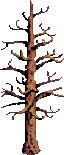
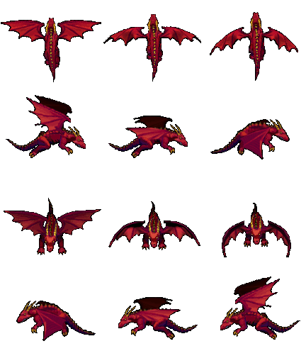
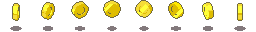
An arrow to jump to the next sceneFlying stars that will increase the scoreDead treesFlying dragons trying to kill the playerSound to be played after collecting a star
Expanding the world
The first thing we are going to do is creating a wider sky and platform, using new colors for the new scene.
Proposed exercise: Expanding sky and platform
First check that you have a working game on your domain. After that, follow the instructions below, and upload the new code and the new assets to your domain (you can get all the assets from this link). Finally, check the results in your browser.
Now you should have an arrow on the right corner, at the top of the screen, so that you can easily jump to the next scene. Your new game should look now like this one.
Insert at the top of your code a new constant with the new size of the world (double than before):
const maxWorldWidth = worldWidth * 2;
Modify the function “createWorld()” so that both the camera and world bounds use this new constant, and also insert the new sky and the new platform:
Activate the collision between the player and the new platform. This can be done with a single line inside the “createPlayer()” function:
function createPlayer() {
    ...
    this.physics.add.collider(player, platform2);
}
Load the new assets (the button to jump to the next scene, the dead tree, the stars to be collected, the sound to be played when collecting the stars, and the sprite sheet of the flying dragon) inside the “preload()” function:
And finally you must execute that code, just by adding a new line to the “create()” function:
function create() {
    ...
    showArrow.call(this);
}
Proposed exercise: A big tree between the two scenes
To achieve a better transition between one scene to the other, we will put a dead tree in the middle. You just need to insert one line of code at the end of the “createWorld()” function:
function createWorld() {
    ...
    this.add.image(worldWidth, 0, 'tree2').setOrigin(0.5, 0).setDisplaySize(screenWidth/5, screenHeight);
}
Proposed exercise: Changing the new scene’s colors
Choose any colors you like for the new scene, and change the colors of both the sky and the platform. You only have to change a couple of values inside the function “createWorld()”.
You can use a color picker to get the values of the new colors in hexadecimal notation.
More trees, more fires, more clouds…
Now we have to show the fires and the clouds in the new scene. And to change even more the appearance of the new scene, we will not change only the colors but also the background images, by using new trees.
Proposed exercise: More trees
Update the constant with the number of trees to be displayed, and also, add a new line to the “createTree()” function so that lots of new trees are shown inside the new scene.
Update the constant to show as many trees as you like:
const numTrees = 100;
Create new trees in the new scene (you will notice that these trees are shown at ‘x+worldWidth’ position, and also the ‘scale’ is adjusted for the new image):
function createTree() {
    ...
    this.add.image(x + worldWidth, y, 'tree2').setOrigin(1).setScale(scale * 2);
}
Proposed exercise: More fires
Update the constant with the number of fires to be displayed, and also, update the “createFire()” function to use the constant ‘maxWorldWidth’ as the limit to generate the fires.
Update the constant to show as many fires as you like:
const numFires = 50;
Update the following line to use ‘maxWorldWidth’ constant instead:
function createFire() {
    const x = Phaser.Math.Between(screenWidth/2, maxWorldWidth);
    ...
}
Proposed exercise: More clouds
Update the constant with the number of clouds to be displayed, and also, update the “createClouds()” function to use the constant “maxWorldWidth” as the limit to generate the clouds.
Update the constant to show as many clouds as you like:
const numClouds = 100;
Update the following line to use “maxWorldWidth” constant instead:
function createCloud() {
    const x = Phaser.Math.Between(0, maxWorldWidth);
    ...
}
The new moving objects (stars and dragons)
Now we will add to the new scene a couple of moving objects: stars and dragons. After collecting a star, a new sound will be played, and as a new feature, we will be protected for several seconds so that in case we hit a killing object, we remain unaffected. About the dragons, we may get the same behaviour as if we hit the bombs or the fires.
Proposed exercise: Adding the stars
Add or modify all the required code that will be in charge of creating the stars in the new scene and that will also handle the events related to the new objects (playing sound, increasing lives, etc.). You will have to follow the steps below.
Create the new variables (the number of stars to be displayed, and the timeout to be protected when you are hit by the bombs, the fires, or the dragons):
const numStars = 50;
var timeout = false;
Initialize the sound to be played when collecting the stars, just by adding a single line inside the existing “initSounds()” function. You might also need to adjust the volume by using the right value from 0.1 to 1:
Add the new functions to your code. The “collectStar()” function will print each star, the “protect()” function will activate a player’s protection to avoid being killed for a while, and the “collectStar()” function will contain the code be executed each time you collect a star:
function createStar() {
    const x = Phaser.Math.Between(worldWidth, worldWidth * 2);
    const vX = Phaser.Math.Between(-velocityX, velocityX);
    const vY = Phaser.Math.Between(velocityY/2, velocityY);
    let star = this.physics.add.image(x, 0, 'star').setScale(0.5).setBounce(1).setCollideWorldBounds(true).setVelocity(vX, vY);
    star.body.setAllowGravity(false);
    this.physics.add.collider(star, platform);
    this.physics.add.collider(star, platform2);
    this.physics.add.collider(player, star, collectStar, null, this);
}

function protect(color) {
    player.setTint(color);
    if (timeout) clearTimeout(timeout);
    timeout = setTimeout(() => { timeout=false; player.clearTint() }, 3000);
}

function collectStar(player, star) {
    bell2.play();
    star.destroy();
    createStar.call(this);

    protect(0xFFFF00);

    score += 10;
    if (score % 100 == 0) lives++;
    showScore();
}
And finally insert the loop to create all the stars at once inside the “create()” function:
funtion create() {
    ...
    for (i = 0; i < numStars; i++) createStar.call(this);
}
Proposed exercise: Adding the dragons
Add or modify all the required code that will be in charge of creating the dragons in the new scene and that will also handle the events related to them (playing sound, decreasing lives, etc.). You will have to follow the steps below.
Add the new functions “createDragon()” and “hitDragon()” to your code, to display each dragon and to perform any action we want to be done after being hit:
function createDragon() {
    const x = Phaser.Math.Between(worldWidth, worldWidth * 2);
    const y = Phaser.Math.Between(0, screenHeight - platformHeight);
    const v = Phaser.Math.Between(velocityY/2, velocityY);
    let dragon = this.physics.add.sprite(x, y, 'dragon').setOrigin(1).setSize(72, 64).setScale(2).anims.play('flying', true).setBounce(1).setVelocity(0, v);
    dragon.body.setAllowGravity(false).setCollideWorldBounds(true);
    this.physics.add.collider(dragon, platform2);
    this.physics.add.collider(player, dragon, hitDragon, null, this);
}

function hitDragon(player, dragon) {
    dead.play();
    lives--;
    showScore();

    protect(0xFF0000);

    if (lives == 0) {
        this.physics.pause();
        gameOver = true;
        this.add.image(screenWidth/2, screenHeight/2, 'restart').setScale(5).setScrollFactor(0).setInteractive().on('pointerdown', () => location.reload());
    }
    else {
        dragon.destroy();
    }
}
And finally, add a new loop to the “create()” function to print all the dragons at once:
function create() {
    ...
    for (i = 0; i < numDragons; i++) createDragon.call(this);
}
Enjoy the game!
You may enjoy playing this wonderful game online here.
Phaser is one of the best frameworks to develop Desktop and mobile HTML games. You will be able to create 2D games and make them available to everyone with a simple domain with less than 10MB storage capacity. Also, it is fast, free, and opensource!
You may find more information at the Phaser official page and you may also have a look at some interesting demonstrations at the examples page.
HTML and CSS code
The first thing we should do is linking the Phaser library. We will use the last version at the time this unit has been written:
After that we are going to insert some CSS code to remove any margin and padding, and also to remove the scrollbars, so that all the window size is used when the game is started:
We are going to define some constants at the beginning of the code so that we can easily change the game appearance, difficulty, and some other parameters:
// The game will use the whole window
const screenWidth = window.innerWidth;
const screenHeight = window.innerHeight;

// The world width will be 10 times the size of the screen
const worldWidth = screenWidth*10;

// Height of platform and joystick size (at the bottom)
const platformHeight = screenHeight/6;
const joystickSize = platformHeight/3;

// Both x and y velocity (depending on the screen size)
const velocityX = screenWidth/4;
const velocityY = screenHeight/2;

// Number of clouds, tries, fires and coins
const numClouds = 50;
const numTrees = 100;
const numFires = 25;
const numCoins = 50;
Phaser configuration and other variables
Following the constants we are going to create some variables so keep all the information about the game and also to start the initialization of Phaser:
var config = {
    type: Phaser.AUTO,
    width: screenWidth,
    height: screenHeight,
    physics: {
        default: 'arcade',
        arcade: {
            gravity: { y: velocityY }
        }
    },
    scene: {
        preload: preload,
        create: create,
        update: update
    }
};

var platform, player, bell, dead;
var cursors, joyStick;
var score = 0, lives = 5, scoreText = null;
var gameOver = false;

// Init Phaser
var game = new Phaser.Game(config);
The assets (images, sprites and sounds)
We will need some images, sprites and sounds. You may use any assets you like, but we are also providing some examples so that you can easily start testing (they can also be downloaded here):
Images
CloudTreeBombRestart button
Sprites (player and animated objects)
PlayerFireCoin
Sounds and music
When the player gets a coinWhen the user gets hurt by a bomb or a fireBackground music always playing
Loading all the assets
So that we can use all those images, sprites and music, they have to be loaded previously. That is the purpose of the “preload()” function. We will also include here the initialization of the joystick so that we can use it in another section of this unit.
Proposed exercise: Game initialization
Create a specific folder for your game in your domain to put all the code and assets inside. After that, create an “index.html” inside that folder with the code below, and also create an “assets” folder to put all the images and sounds, which can be downloaded here. After uploading everything to your domain, test the game using the url of that folder in your browser, and you should get a full black screen. Click on it and the background music should start playing.
You can see the result here (you can also look at the source code by pressing Ctrl+U).
Download any other music file you like to use it as a background music and change the JavaScript code inside the “preload()” function to set the file name accordingly. Also in the “initSounds()” function you will find that you may change the volume of the music (volume:0.5). Try changing that value from 0.1 to 1 and you will notice that the volume of the music will also change.
You may find in the following sites some free images and sounds which you can download and use for your own game:
Once we have initialized Phaser and after loading all the assets, we can go ahead and paint something on the screen. We are going the create a couple of rectangles filled with any color we like, and this way we will create the sky and the platform.
We will use the following colors (you may find more information about colors in hexadecimal notation here):
Sky (light blue): 0x87CEEB
Platform (brown): 0xB76743
Proposed exercise: Adding sky and platform
Add the function “createWorld()” (provided below) to your code, and modify the calling function “create()” so that it is called when the game is started (also shown below). Finally test everything in your browser from your domain. You may also change the colors of both the platform and the sky.
You may easily get the hexadecimal code of any color you like with a simple color picker. About the music, do not forget to click on the screen after loading the game (the music will not start playing unless the browser gets the focus). Also, you can see the result here (you can look at the source code by pressing Ctrl+U).
This is the new function you have to insert in your code to create the world:
Do not forget to update the “create()” function to create the world (sky, platform, camera, and world boundaries). This is the only line you should add to that function:
function create() {
    ...
    createWorld.call(this);
}
Objects in background (trees)
We will first create the trees so that they remain in the background. We may create all of them using the same image. We will just change the size of the trees by scaling them randomly, and we will also choose a random position for each of them. Finally we will use a loop to print as many trees as we like.
Proposed exercises: Adding the trees
Add the code below to your file and check the results. After that, change the value of the constant “numTrees” (at the top of your code) and also the value of the “scale” variable to check how easily you can customize your game. Refresh the page several times and you will notice that the generated trees have random sizes and they also appear in random positions. Finally, look for another image (a tree or any other object) and change the code accordingly to use your own image.
You can see the result here (you can look at the source code by pressing Ctrl+U). Also, as listed above, you may find many free assets in OpenGameArt.
This is the new function you have to insert in your code to create each tree:
function createTree() {
    const x = Phaser.Math.Between(0, worldWidth);
    const y = screenHeight-platformHeight;
    const scale = Phaser.Math.FloatBetween(0.5, 2);
    this.add.image(x, y, 'tree').setOrigin(1).setScale(scale);
}
Do not forget to update the “create()” function to create all the trees. You only need one single line to create all trees at once using a loop:
function create() {
    ...
    for(i=0; i<numTrees; i++) createTree.call(this);
}
The animations (sprites)
We will use sprites to create the player and the animated objects. For example, let’s have a look at the player:
Sprite with three player animations
We may appreciate that we have 9 pictures divided into 3 different groups. This way, we may easily create all three animations:
Left: Pictures from 0 to 3
Turn: Picture number 4
Right: Pictures from 5 to 8
Controlling the player’s animations
So that this game can be used in both desktop and mobile devices, we have to initialize both the cursor keys and the joystick. Once this is done, we must change the player’s velocity and the current animation when the user presses the keys or moves the joystick. In the next exercise we will first define the animations inside the “createAnimations()” function, and after that we will go ahead with the “createPlayer()” function, where we will display the player. We will finally include in the “update()” function some conditions to adjust the player’s speed and current animation.
Proposed exercise: Adding the player
Add the code below to your game and check both the player animations and movements. After that, look for another sprite and change the code accordingly to use your own sprite. Finally, change the values of the constants “velocityX” and “velocityY” (at the top of your code) and check the results.
You can see the result here (you can look at the source code by pressing Ctrl+U). Also, as listed above, you may find many free assets in OpenGameArt and choose other sprites you like.
These are the new functions you have to insert in your code to create the animations and initialize everything related to the player:
Also you have to insert some code inside the “update()” function to respond to the cursor keys and the joystick:
function update() {
    if (gameOver) return;

    if (cursors.left.isDown || joyStick.left) {
        player.setVelocityX(-velocityX).anims.play('left', true);
    }
    else if (cursors.right.isDown || joyStick.right) {
        player.setVelocityX(velocityX).anims.play('right', true);
    }
    else {
        player.setVelocityX(0).anims.play('turn');
    }

    if ((cursors.up.isDown || joyStick.up) && player.body.touching.down) {
        player.setVelocityY(-velocityY);
    }
}
And finally do not forget to update the “create()” function to create the animations and the player. You just have to insert a couple of new lines:
function create() {
    ...
    createAnimations.call(this);
    createPlayer.call(this);
}
The clouds, the score, the fires and the coins
We will create many different objects (clouds, fires and coins) at once using the same images. We will just change the size of the objects by scaling them randomly, and we will use a loop to print as many objects as we like choosing random positions.
Proposed exercises: Adding the clouds
Add the code below to your file and check the results. After that, change the value of the constant “numClouds” (at the top of your code) and also the value of the “scale” variable to check how easily you can customize your game. Refresh the page several times and you will notice that the generated clouds and also the trees have random sizes and they appear in random positions. Finally, look for another image (a cloud or any other object) and change the code accordingly to use your own image.
You can see the result here (you can look at the source code by pressing Ctrl+U). Also, as listed above, you may find many free assets in OpenGameArt and choose the images you like.
function createCloud() {
    const x = Phaser.Math.Between(0, worldWidth);
    const y = Phaser.Math.Between(0, screenHeight-platformHeight*2);
    const scale = Phaser.Math.FloatBetween(0.5, 1.5);
    this.add.image(x, y, 'cloud').setScale(scale);
}
function create() {
    ...
    for(i=0; i<numClouds; i++) createCloud.call(this);
}
Proposed exercise: Adding the score
Using the global variables, we may easily show both the score and number of remaining lives. Add the code below to your game and check the results. After that, change the value of the constant “numLives” (at the top of your code) and also the value of the “scale” variable to check how easily you can customize that text.
You can see the result here (you can look at the source code by pressing Ctrl+U).
Proposed exercises: Adding the fires and the coins
Add the code below to your game and check the results. After that, change the value of the constants “numFires” and “numCoins” (at the top of your code) and also the value of the “scale” variables to check how easily you can customize your game. Finally, look for another sprites (fires, coins, or any other objects) and change the code accordingly to use your own sprites.
You may click here to see how the game looks like. As listed above, you may find many free assets in OpenGameArt.
function createFire() {
    const x = Phaser.Math.Between(screenWidth/2, worldWidth);
    const y = Phaser.Math.Between(screenHeight-platformHeight, screenHeight);
    let fire = this.physics.add.sprite(x, y, 'fire').setOrigin(1).setScale(3).setImmovable(true).anims.play('burning', true)
    fire.body.setAllowGravity(false);
    this.physics.add.collider(player, fire, hitBombOrFire, null, this);
}

function createCoin() {
    const x = Phaser.Math.Between(screenWidth/2, worldWidth);
    const bounce = Phaser.Math.FloatBetween(0.1, 0.5);
    let coin = this.physics.add.sprite(x, 0, 'coin').setOrigin(1).setScale(3).setBounce(bounce).anims.play('rotate');
    coin.body.setOffset(0, -10);
    this.physics.add.collider(coin, platform);
    this.physics.add.overlap(player, coin, collectCoin, null, this);
}

function createBomb() {
    const x = Phaser.Math.Between(0, worldWidth);
    const v = Phaser.Math.Between(-velocityX, velocityX);
    let bomb = this.physics.add.image(x, 0, 'bomb').setScale(2).setBounce(1).setCollideWorldBounds(true).setVelocity(v, velocityY);
    bomb.body.setAllowGravity(false);
    this.physics.add.collider(bomb, platform);
    this.physics.add.collider(player, bomb, hitBombOrFire, null, this);
}

function collectCoin(player, coin) {
    bell.play();
    coin.destroy();
    createCoin.call(this);
    createBomb.call(this);

    score += 10;
    if (score % 100 == 0) lives++;
    showScore();
}

function hitBombOrFire(player, thing) {
    dead.play();
    lives--;
    showScore();
    player.setTint(0xff0000).anims.play('turn');

    if (lives == 0) {
        this.physics.pause();
        gameOver = true;
        this.add.image(screenWidth/2, screenHeight/2, 'restart').setScale(5).setScrollFactor(0).setInteractive().on('pointerdown', ()=>location.reload());
    }
    else {
        thing.destroy();
        setTimeout(()=>player.clearTint(), 3000);
    }
}
Through this presentation, these slides, and this video, you’ll get familiar with the key contents of this unit.
Why flexbox?
Flexbox is a one-dimensional layout method for laying out items in rows or columns. Items flex to fill additional space and shrink to fit into smaller spaces. This unit explains all the fundamentals.
For a long time, the only reliable cross browser-compatible tools available for creating CSS layouts were things like floats and positioning. These are fine, and they work, but in some ways they are also rather limiting and frustrating.
The following simple layout requirements are either difficult or impossible to achieve with such tools, in any kind of convenient, flexible way:
Vertically centering a block of content inside its parent.
Making all the children of a container take up an equal amount of the available width/height, regardless of how much width/height is available.
Making all columns in a multiple-column layout adopt the same height even if they contain a different amount of content.
As you’ll see in subsequent sections, flexbox makes a lot of layout tasks much easier. Let’s dig in!
Introducing a simple example
In this unit we are going to get you to work through a series of exercises to help you understand how flexbox works. To get started, we will use some simple code like this one:
<header>
  <h1>Valencian Community</h1>
</header>

<section>
  <article>
    <h2>Alicante</h2>
    <p>The campus of the University of Alicante lies in San Vicente del Raspeig, bordering the city of Alicante to the north. More than 25,000 students attend the University.</p>
  </article>

  <article>
    <h2>Valencia</h2>
    <p>Valencia is the capital of the autonomous community of Valencia and the third-largest city in Spain after Madrid and Barcelona, surpassing 800,000 inhabitants in the municipality.</p>
  </article>

  <article>
    <h2>Castellón</h2>
    <p>The city is notorious for its music festivals, among which we find: the Tanned Tin music festival for alternative music, the Benicàssim's International Festival, the Arenal Sound and the Rototom Sunsplash Festival, known for its reggae music.</p>
  </article>
</section>
* {
  box-sizing: border-box; /* Includes padding and border in the total width/height of each element */
  font-family: sans-serif; /* Sets the basic text font for the entire page */
}

header {
  background: purple; /* Header background color */
  border: 1px solid black; /* Header border */
  height: 75px; /* Fixed height of the header */
}

h1 {
  text-align: center; /* Centers the text horizontally */
  color: white; /* White text color */
  line-height: 75px; /* Centers the text vertically inside the header */
  margin: 0; /* Removes the default title margin */
}

article {
  padding: 1%; /* Internal padding for the article */
  border: 1px solid purple; /* Article border */
  background: aqua; /* Article background color */
}
You’ll see that we have a <header> element with a top level heading inside it, and a <section> element containing three <article>s. We are going to use these to create a fairly standard three column layout.
Proposed exercise: Simple boxes
Using the code of the previous example, create a new webpage with a similar content. You can use any other colors and styles you like.
Specifying what elements to lay out as flexible boxes
To start with, we need to select which elements are to be laid out as flexible boxes. To do this, we set a special value of display on the parent element of the elements you want to affect. In this case we want to lay out the <article> elements, so we set this on the <section>:
section {
  display: flex; /* Converts the element into a flexible container to use Flexbox */
}
This causes the <section> element to become a flex container, and its children to become flex items. The result of this should be something like so:
So, this single declaration gives us everything we need — incredible, right? We have our multiple column layout with equal-sized columns, and the columns are all the same height. This is because the default values given to flex items (the children of the flex container) are set up to solve common problems such as this.
To be clear, let’s reiterate what is happening here. The element we’ve given a display value of flex to is acting like a block-level element in terms of how it interacts with the rest of the page, but its children are being laid out as flex items. The next section will explain in more detail what this means. Note also that you can use a display value of inline-flex if you wish to lay out an element’s children as flex items, but have that element behave like an inline element.
Proposed exercise: Flexible boxes
Add some CSS code to the previous exercise so that all the contents inside the <section> element are displayed as flexible boxes (display:flex) which are shown from left to right, all of them having the same height.
As explained, you only have to add three lines of code and everything is done! You will have flexible boxes:
section {
  display: flex; /* Converts the element into a flexible container to use Flexbox */
}
The flex model
When elements are laid out as flex items, they are laid out along two axes:
The main axis is the axis running in the direction the flex items are being laid out in (e.g. as rows across the page, or columns down the page.) The start and end of this axis are called the main start and main end.
The cross axis is the axis running perpendicular to the direction the flex items are being laid out in. The start and end of this axis are called the cross start and cross end.
The parent element that has display: flex set on it (the <section> in our example) is called the flex container.
The items being laid out as flexible boxes inside the flex container are called flex items (the <article> elements in our example).
Bear this terminology in mind as you go through subsequent sections. You can always refer back to it if you get confused about any of the terms being used.
Columns or rows?
Flexbox provides a property called flex-direction that specifies what direction the main axis runs in (what direction the flexbox children are laid out in). By default this is set to row, which causes them to be laid out in a row in the direction your browser’s default language works in (usually from left to right), but you can also use the following declaration inside your <section> rule: flex-direction: column (this would put the items back in a column layout, much like they were before we added any CSS).
Wrapping
One issue that arises when you have a fixed amount of width or height in your layout is that eventually your flexbox children will overflow their container, breaking the layout. And also if you have many boxes, the final result will be presented with some quite narrow columns. Have a look at our example when we add more columns:
Here we see that the children are indeed breaking out of their container for small screens of filling the window with narrow columns. One way in which you can fix this is to use the following declaration of your <section> rule:
section {
  display: flex; /* Converts the element into a Flex Container */
  flex-wrap: wrap; /* Allows items to wrap to a new line when they run out of horizontal space */
  gap: 1%; /* Sets the spacing (gutters) between rows and columns of items */
  justify-content: space-between; /* Distributes items along the main axis, placing maximum space between them */
}
Also, we should use the following declaration for your <article> rule:
article {
  padding: 1%; /* Internal spacing around content */
  margin-top: 1%; /* External spacing above the articles */
  flex-basis: 49%; /* Sets the desired initial width (base size) to 49% */
  flex-grow: 1; /* Allows the article to grow and fill any available space on its line */
  border: 1px solid purple; /* Border of the articles */
  background: aqua; /* Background color of the articles */
}
You’ll see that the layout looks much better with the flexbox CSS code we are using:
We now have multiple rows, as many flexbox children are fitted onto each row as makes sense, and any overflow is moved down to the next line. The flex-basis:49% declaration set on the articles means that each will be at least half the window size (49% wide, since we have 1% margins). You might also notice that the last few children on the last row are each made wider so that the entire row is still filled.
But there’s more we can do here. For example, you can try changing your flex-direction property value to row-reverse. Now you’ll see that you still have your multiple row layout, but it starts from the opposite corner of the browser window and flows in reverse.
Proposed exercise: Wrapped content
Using the code of the last example above, add three more towns you like (to show at least 9 towns in total), and also insert a picture for each one. You may also change the colors of the boxes and text as you like, or you can even add more styles to your code (box and text shadows, etc.).
Through this presentation, these slides, and this video, you’ll get familiar with the key contents of this unit.
Introduction
Everything in CSS has a box around it, and understanding these boxes is key to being able to create layouts with CSS, or to align items with other items. In this lesson, we will take a proper look at the CSS Box Model so that you can build more complex layout tasks with an understanding of how it works and the terminology that relates to it.
What is the CSS box model?
The full CSS box model applies to block boxes. This model defines how the different parts of a box (margin, border, padding, and content) work together to create a box that you can see on the page.
Parts of a box
When making up a block box in CSS we will have to keep in mind the following parts:
Content box: The area where your content is displayed, which can be sized using properties like width and height.
Padding box: The padding sits around the content as white space; its size can be controlled using padding and related properties.
Border box: The border box wraps the content and any padding. Its size and style can be controlled using border and related properties.
Margin box: The margin is the outermost layer, wrapping the content, padding and border as whitespace between this box and other elements. Its size can be controlled using margin and related properties.
The below diagram shows these layers:
In the standard box model, if you give a box a width and a height attribute, this defines the width and height of the content box. Any padding and border is then added to that width and height to get the total size taken up by the box. This is shown in the image below.
If we assume that the box has the following CSS defining width, height, margin, border, and padding:
The space taken up by our box using the standard box model will actually be 410px (350 + 25 + 25 + 5 + 5), and the height 210px (150 + 25 + 25 + 5 + 5), as the padding and border are added to the width used for the content box:
The margin is not counted towards the actual size of the box. Sure, it affects the total space that the box will take up on the page, but only the space outside the box. The box’s area stops at the border (it does not extend into the margin).
Proposed exercise: Playing with box models
In the below example, you can see a couple of boxes with a CSS class which gives some values to width, height, margin, border, and padding. Using that code, create a web page with five different boxes, each one with different styles. You have to change also the color of the text (you can choose the colors your like). And finally add some shadows to the text using different styles and colors.
<div class="box1">This is a 250x200px box with a 5px red border, and lightgray background, 10px padding and 25px margin.</div>
<div class="box2">This is a 300x200px box with a 7px green border, gray background, white text color, 5px padding and 0px margin.</div>
...
And the result:
Margins, padding and borders
You’ve already seen the margin, padding, and border properties at work in the example above. The properties used in that example are shorthands and allow us to set all four sides of the box at once. These shorthands also have equivalent longhand properties, which allow control over the different sides of the box individually.
Let’s explore these properties in more detail.
Margin
The margin is an invisible space around your box. It pushes other elements away from the box. Margins can have positive or negative values. Setting a negative margin on one side of your box can cause it to overlap other things on the page.
We can control all margins of an element at once using the margin property, or each side individually using the equivalent longhand properties:
Create a web page with the example below, and change the margin values to see how the boxes are pushed around due to the margin creating or removing space (if it is a negative margin) between this element and the containing element. Finally, add three more boxes with any style you like inside the same container.
<div class="container">
  <div class="box1">This is a box with 50% width and 10px from top and left inside a container</div>
  <div class="box2">This is a box with 50% width and 10px from top and 50px left inside a container</div>
  <div class="box3">This is a box with 50% width and 10px from top and 100px left inside a container</div>
  ...
</div>
Padding
The padding sits between the border and the content area. Unlike margins you cannot have negative amounts of padding, so the value must be 0 or a positive value. Any background applied to your element will display behind the padding, and it is typically used to push the content away from the border.
We can control the padding on each side of an element individually using the padding property, or each side individually using the equivalent longhand properties:
If you change the values for padding on the classes .box in the example below you can see that this changes where the text begins in relation to the box. Padding can be changed on any element, and will make space between its border and whatever is inside the element. Create a web page with the code below and add three more boxes using different paddings and styles.
<div class="box1">
  This is a box without padding
</div>
<div class="box2">
  This is a box with 25 px padding
</div>
<div class="box3">
  This is a box with 50px padding
</div>
...
Borders
The border is drawn between the margin and the padding of a box. If you are using the standard box model, the size of the border is added to the width and height of the box.
For styling borders, there are a large number of properties (there are four borders, and each border has a style, width and color that we might want to manipulate).
You can set the width, style, or color of all four borders at once using the border property.
To set the properties of each side individually, you can use:
In the example below we have used various shorthands and longhands to style the borders. Create a new web page with that code and have a play around with the different properties to check that you understand how they work. Finally add three more boxes and set the border styles as you like.
You can have a look at the MDN pages (linked above) to get information about the different styles of border you can choose from. Also you can have a look at the different colors here: https://developer.mozilla.org/en-US/docs/Web/CSS/color_value.
<div class="box1">This is a box with different types of borders</div>
<div class="box2">This is another box with different types of borders</div>
<div class="box1">
  <div class="box2">This is a box with different types of borders inside another box</div>
</div>
<div class="box3">
  <div class="box3">
    <div class="box3">
      <div class="box3">
        <div class="box3">
          <div class="box3">
            These are boxes inside boxes
          </div>
        </div>
      </div>
    </div>
  </div>
</div>
...
Quiz
Test your skills with this quiz about the box model.
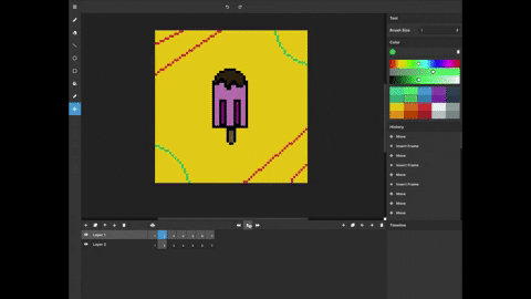
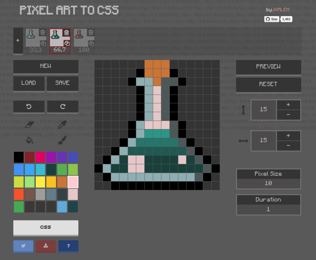
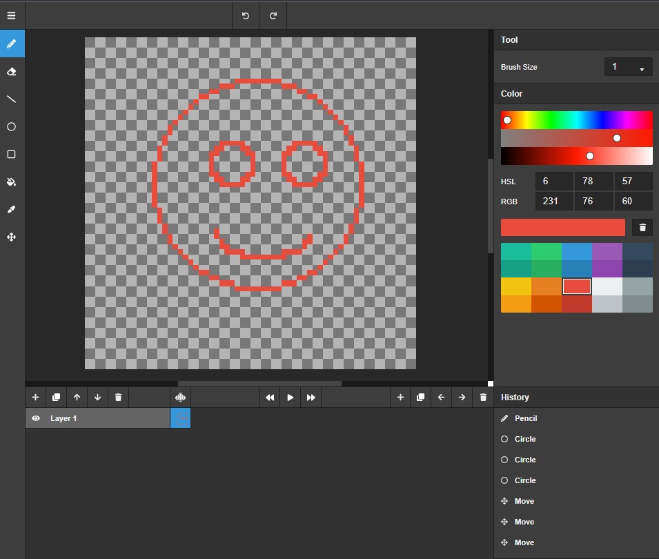
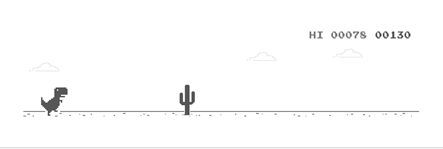


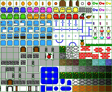

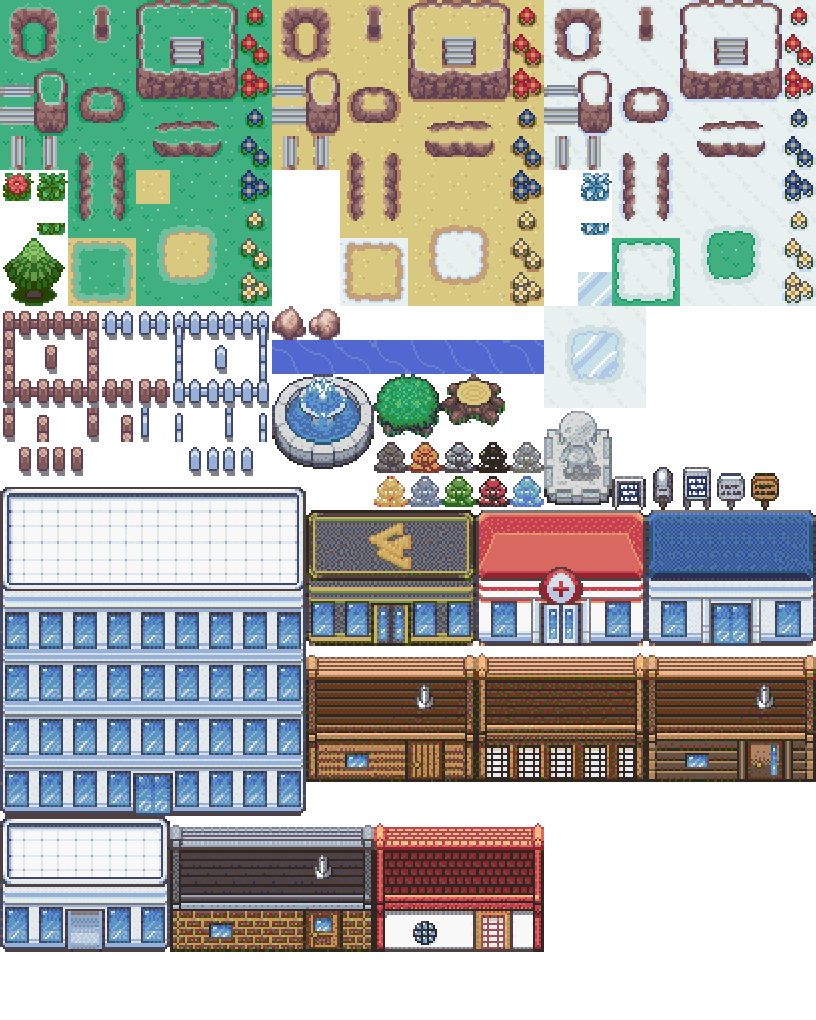
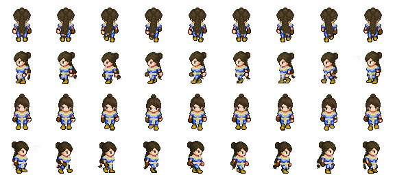
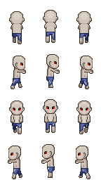


