Presentación
Infografía
Diapositivas y vídeo
A través de esta presentación, estas diapositivas, y este vídeo, te familiarizarás con los contenidos clave de esta unidad.
Introducción
En esta unidad repasaremos en detalle todos los fundamentos básicos del estilo de texto y fuentes, incluyendo la configuración del peso (o grueso) de la fuente, familia y estilo, la propiedad abreviada (shorthand) de fuente, alineación de texto y otros efectos, así como el espaciado entre líneas y letras.
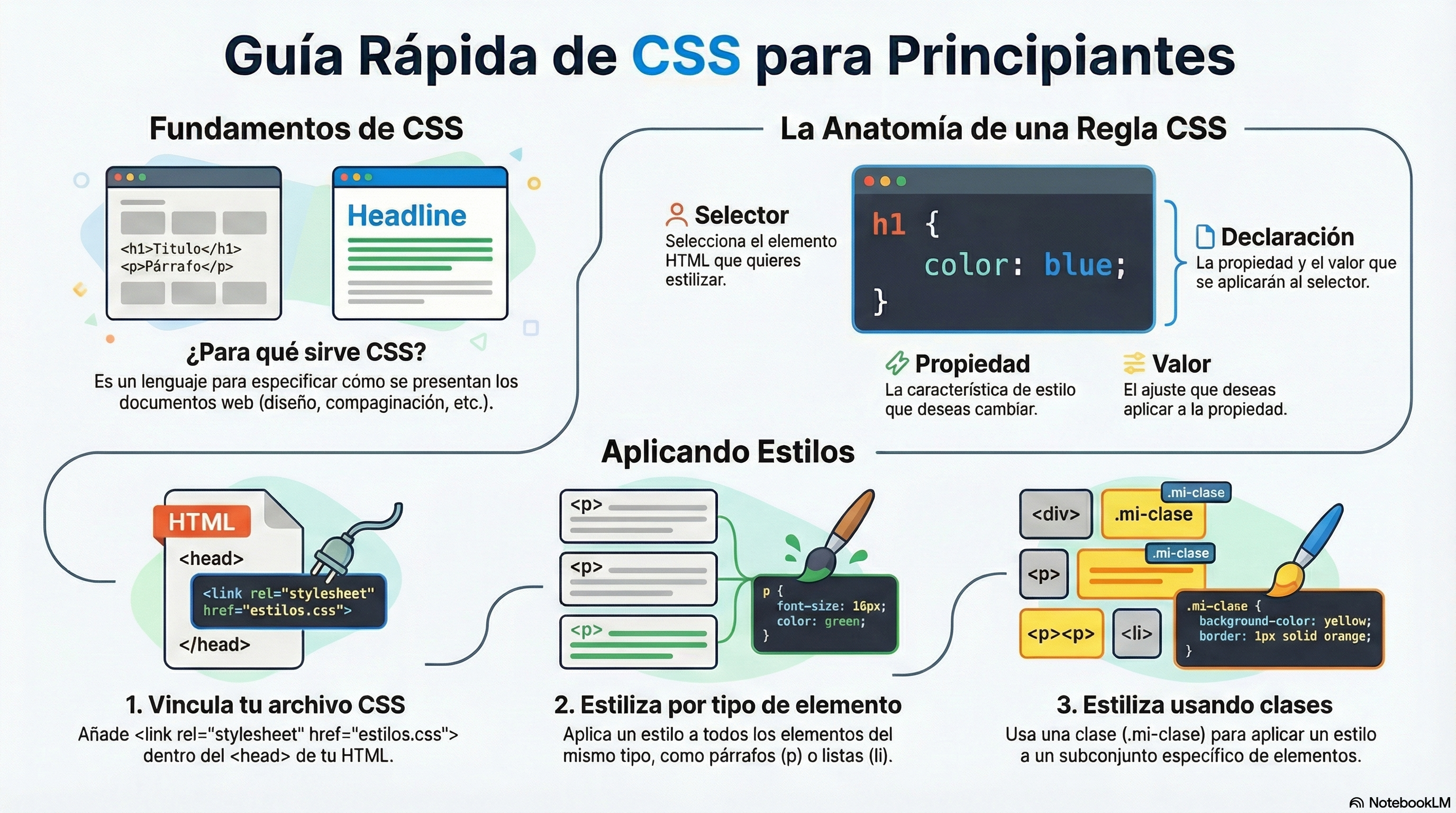
¿Qué implica dar estilo al texto en CSS?
Las propiedades CSS utilizadas para dar estilo al texto generalmente se dividen en dos categorías, que veremos por separado en esta unidad:
- Estilos de fuente: Propiedades que afectan a la fuente que se aplica al texto, influyendo qué tipografía se usa, qué tamaño tiene, si es negrita, cursiva, etc.
- Estilos de diseño de texto: Propiedades que afectan al espaciado y otras características de diseño del texto, permitiendo manipular, por ejemplo, el espacio entre líneas y letras, y cómo se alinea el texto dentro del cuadro de contenido.
Debemos tener en cuenta que el texto dentro de un elemento se ve afectado como una sola entidad. No podemos seleccionar y dar estilo a subsecciones de texto a menos que las incluyamos dentro de otro elemento (<span> o <strong>, por ejemplo).
Color de la fuente
Pasemos directamente a ver las propiedades para estilizar fuentes. En esta sección aplicaremos diferentes propiedades CSS a la misma muestra HTML.
La propiedad color establece el color del contenido en primer plano de los elementos seleccionados (que generalmente es el texto, pero también puede incluir otras cosas, como un subrayado o una línea superior colocada en el texto usando la propiedad text-decoration):
p {
  color: red;
}
Ejercicio propuesto
Crea una nueva página web compuesta por 2 archivos: un archivo HTML con el código de abajo, y otro con algún código CSS para cambiar los elementos
<h1>y<p>a cualquier color que te guste. No olvides vincular el archivo CSS desde el archivo HTML y validar tu código.
<h1>Tommy el gato</h1>

<p>Bien recuerdo que fue hace como una comida...</p>

<p>Dijo Tommy el Gato mientras se tambaleaba hacia atrás para despejar cualquier materia extraña que pudiera haberse anidado en su poderosa garganta. Muchas ratas gordas de callejón habían encontrado su fin mientras miraban a quemarropa el cavernoso cañón de esta impresionante máquina merodeadora. Verdaderamente una maravilla de la naturaleza este depredador urbano — Tommy el gato tenía muchas historias que contar. Pero fue en una rara ocasión como esta que lo hizo.</p>
Familias de fuentes
Para establecer una fuente diferente en tu texto, puedes usar la propiedad font-family — esto te permite especificar una fuente (o lista de fuentes) para que el navegador la aplique a los elementos seleccionados. El navegador solo aplicará una fuente si está disponible en el ordenador o dispositivo desde donde se accede al sitio web; si no, simplemente usará una fuente predeterminada del navegador. Un ejemplo muy simple para utilizar la fuente «Arial» podría ser el siguiente:
p {
  font-family: arial;
}
Esto haría que todos los párrafos de una página adopten la fuente Arial, que debería estar disponible en la mayoría de ordenadores o dispositivos que permiten utilizar un navegador web.
Fuentes predeterminadas
CSS define cinco nombres genéricos para fuentes: serif, sans-serif, monospace, cursive y fantasy. Estos son muy genéricos y el tipo de letra exacto utilizado al usar esos nombres depende de cada navegador y puede variar para cada sistema operativo en el que se estén ejecutando. El navegador intentará proporcionar al menos una fuente que parezca apropiada. Por un lado, los tipos serif, sans-serif y monospace son bastante predecibles y deberían proporcionar algo razonable. Por otro lado, cursive y fantasy son menos predecibles y recomendamos usarlos sólo si se ha comprobado el resultado previamente.
Los cinco nombres se definen de la siguiente manera (encontrarás abajo algunos ejemplos de cómo se ven):
serif: Fuentes que tienen remates (los adornos y otros pequeños detalles que ves al final de los trazos en algunas tipografías).sans-serif: Fuentes que no tienen remates (sin serifa).monospace: Fuentes donde cada carácter tiene el mismo ancho, típicamente usadas en listados de código.cursive: Fuentes que pretenden emular la escritura a mano, con trazos fluidos y conectados.fantasy: Fuentes que pretenden ser decorativas.
Ejercicio propuesto: Fuentes predeterminadas
Usando el código del ejercicio anterior, copia y pega los párrafos varias veces (5 en total) y define algunas clases para aplicar todas las fuentes predeterminadas (serif, sans-serif, monospace, cursive, fantasy). Debes establecer una fuente y color diferente cada vez. Tu código fuente y el resultado deberían parecerse a lo siguiente:
Código HTML:
<h1>Tommy el gato</h1>

<p class="serif">Bien recuerdo que fue hace como una comida...</p>
<p class="serif">Dijo Tommy el Gato mientras se tambaleaba hacia atrás para despejar cualquier materia extraña que pudiera haberse anidado en su poderosa garganta. Muchas ratas gordas de callejón habían encontrado su fin mientras miraban a quemarropa el cavernoso cañón de esta impresionante máquina merodeadora. Verdaderamente una maravilla de la naturaleza este depredador urbano — Tommy el gato tenía muchas historias que contar. Pero fue en una rara ocasión como esta que lo hizo.</p>

...

<p class="fantasy">Bien recuerdo que fue hace como una comida...</p>
<p class="fantasy">Dijo Tommy el Gato mientras se tambaleaba hacia atrás para despejar cualquier materia extraña que pudiera haberse anidado en su poderosa garganta. Muchas ratas gordas de callejón habían encontrado su fin mientras miraban a quemarropa el cavernoso cañón de esta impresionante máquina merodeadora. Verdaderamente una maravilla de la naturaleza este depredador urbano — Tommy el gato tenía muchas historias que contar. Pero fue en una rara ocasión como esta que lo hizo.</p>
Código CSS:
.serif {
    font-family: serif;
    color: blue;
}

...

.fantasy {
    font-family: fantasy;
    color: green;
}
Y el resultado:
Fuentes seguras para la web
Cuando nos referimos a la disponibilidad de fuentes, solo hay un cierto número de fuentes que están generalmente disponibles en todos los sistemas y, por lo tanto, se pueden usar sin mucha preocupación. Estas son las llamadas fuentes seguras para la web.
La mayoría de las veces, como desarrolladores web queremos tener un control más específico sobre las fuentes utilizadas para mostrar nuestro contenido de texto. El problema es encontrar una manera de saber qué fuente está disponible en el ordenador o dispositivo utilizado para ver nuestras páginas web. No hay forma de saber esto en todos los casos, pero las fuentes seguras para la web se sabe que están disponibles en casi todas las instancias de los sistemas operativos más usados (Windows, macOS, las distribuciones de Linux más comunes, Android e iOS).
La lista de fuentes seguras reales cambiará a medida que los sistemas operativos evolucionen, pero es razonable considerar las siguientes fuentes como seguras, al menos por ahora (muchas de ellas se popularizaron gracias a la iniciativa de Microsoft Core fonts for the Web a finales de los 90 y principios de los 2000):
- Arial (sans-serif)
- Courier New (monospace)
- Georgia (serif)
- Times New Roman (serif)
- Trebuchet MS (sans-serif)
- Verdana (sans-serif)
Entre varios recursos, el sitio web cssfontstack.com mantiene una lista de fuentes seguras disponibles en sistemas operativos Windows y macOS, lo que puede ayudarte a tomar la decisión sobre qué consideras seguro para tu uso.
Ejercicio propuesto: Fuentes seguras más habituales
Crea una nueva página web con un encabezado (
<h1>) y otros seis párrafos (<p>) con cualquier contenido que te guste, y establece una fuente diferente para cada uno de ellos (Arial, Courier New, Georgia, Times New Roman, Trebuchet MS, Verdana). También puedes cambiar el color del texto.Los nombres de fuentes que tienen más de una palabra (como
Trebuchet MS) deben estar acotados por comillas, por ejemplo:
font-family: "Trebuchet MS";
Pilas de fuentes
Dado que no puedes garantizar la disponibilidad de las fuentes que quieres usar en tus páginas web (incluso una fuente web podría fallar por alguna razón), puedes suministrar una pila de fuentes para que el navegador tenga múltiples fuentes de donde elegir. Esto simplemente implica un valor de font-family que consiste en múltiples nombres de fuentes separados por comas, por ejemplo:
p {
  font-family: "Trebuchet MS", Verdana, sans-serif;
}
En tal caso, el navegador comienza al inicio de la lista y verifica si esa fuente está disponible en el ordenador o dispositivo correspondiente. Si es así, aplica esa fuente a los elementos seleccionados. Si no, pasa a la siguiente fuente, y así sucesivamente.
Es una buena idea proporcionar un nombre de fuente genérica adecuada al final de la pila para que, si ninguna de las fuentes listadas está disponible, el navegador pueda al menos proporcionar algo aproximadamente adecuado. En este punto conviene enfatizar que la fuente por defecto aplicada al texto de los párrafos de una página web suele ser de tipo serif, en muchos casos Times New Roman.
Ejercicio propuesto: Más fuentes seguras y pilas de fuentes
Crea una nueva página web con un encabezado y otros cinco párrafos con cualquier contenido que te guste, y establece una fuente diferente para cada uno de ellos, pero esta vez no puedes utilizar ninguna fuente usada anteriormente: debes seleccionar otras fuentes de cssfontstack.com. Además, en este ejercicio tienes que usar pilas de fuentes para asegurar que al menos una fuente esté siempre disponible, y también puedes cambiar el color. Finalmente, verifica tu página web usando varios navegadores desde varios dispositivos y sistemas operativos, para asegurarte de que todas las fuentes se muestran.
Si estás cambiando el color y la familia de fuentes usando pilas de fuentes, tu código CSS y HTML debería parecerse al siguiente:
.font-book {
  color: blue;
  font-family: "Book Antiqua", Arial, sans-serif;
}
<p class="font-book"> ... </p>
Usar un servicio de fuentes online
Los servicios de fuentes online generalmente almacenan y sirven fuentes para ti, por lo que no tienes que preocuparte por la disponibilidad de la fuente, y generalmente solo necesitas insertar una línea o dos de código en tu sitio para hacer que todo funcione. Ejemplos incluyen Adobe Fonts y Cloud.typography. La mayoría de estos servicios son por suscripción, con la notable excepción de Google Fonts, un servicio gratuito muy útil, especialmente para trabajos de prueba rápida y creación de demos.
La mayoría de estos servicios son fáciles de usar, por lo que no los cubriremos en gran detalle. Echemos un vistazo rápido a Google Fonts, para que te hagas una idea. Estos son los pasos que tienes que seguir para usar una o varias de las fuentes que proporcionan:
- Ve a Google Fonts.
- Puedes usar los filtros para mostrar los tipos de fuentes que te gusten.
- Para seleccionar una familia de fuentes, haz clic en ella.
- Una vez que hayas seleccionado la fuente, presiona el botón
Get fonten la esquina superior derecha. - Presiona ahora el botón
<> Get embed codeen la esquina superior derecha. - Copia el código que se muestra dentro del cuadro etiquetado como
Embed code in the <head> of your html. Esos son los enlaces a la fuente seleccionada. - Pega el código en el
headde tu archivo HTML. Ponlo encima de los elementos<link>existentes que puedas tener en tu página web, para que la fuente se importe antes de que intentes usarla en tu propio CSS. - Luego necesitas seleccionar la fuente usando una declaración CSS dentro de tu CSS para aplicar la fuente personalizada a tu HTML, como por ejemplo:
font-family: "Permanent Marker";
Ejercicio propuesto: Google fonts
Crea una página web con diez párrafos, cada uno usando una fuente de Google diferente.
Por ejemplo, para usar las fuentes de Google «Nerko One», «Permanent Marker» y «Rock Salt», tu código HTML debería parecerse al siguiente:
<!doctype html>
<html>
  <head>
    <meta charset="utf-8">
    <title>Ejemplo de fuentes de texto</title>
    <link rel="preconnect" href="https://fonts.gstatic.com">
    <link rel="stylesheet" href="https://fonts.googleapis.com/css2?family=Nerko+One&family=Permanent+Marker&family=Rock+Salt&display=swap">
    <link rel="stylesheet" href="styles.css">
  </head>
  <body>
    <h1>Ejemplo de fuentes de texto</h1>
    <p class="nerko">Este es un texto con la fuente Nerko One</p>
    <p class="marker">Este es un texto con la fuente Permanent Marker</p>
    <p class="rock">Este es un texto con la fuente Rock Salt</p>
  </body>
</html>
Y el código CSS dentro de tu propio archivo styles.css podría ser el siguiente:
.nerko {
  font-family: 'Nerko One', cursive;
}
.marker {
  font-family: 'Permanent Marker', cursive;
}
.rock {
  font-family: 'Rock Salt', cursive;
}
Y el resultado:
Tamaño de la fuente
El tamaño de la fuente (establecido con la propiedad font-size) puede tomar valores medidos en varias unidades (como porcentajes), sin embargo, las unidades más comunes que se suelen utilizar para dimensionar texto son:
px(píxeles): El número de píxeles de alto que quieres que sea el texto (esta es una unidad absoluta).em: 1emes igual al tamaño de fuente establecido en el elemento padre del elemento actual que estamos estilizando (más específicamente, el ancho de una letra M mayúscula contenida dentro del elemento padre). Esto puede volverse complicado de calcular si tienes muchos elementos anidados con diferentes tamaños de fuente establecidos, pero es bastante natural una vez que te acostumbras, y puedes usarempara dimensionar todo, no solo texto. Puedes tener un sitio web completo dimensionado usandoem, lo cual facilita el mantenimiento.rem: Estos funcionan igual queem, excepto que 1remes igual al tamaño de fuente establecido en el elemento raíz del documento (es decir,<html>), no el elemento padre. Esto hace que resulte mucho más fácil calcular tus tamaños de fuente, aunque si quieres soportar navegadores realmente antiguos, podrías tener problemas (remno es compatible con Internet Explorer 8 y versiones anteriores).
Tamaño absoluto (píxeles)
La forma más fácil de cambiar el tamaño de tu texto es estableciendo un número específico de píxeles. Sin embargo, esta podría no ser la mejor solución, ya que en caso de que quieras aumentar (o disminuir) el tamaño de todo el texto en tu sitio web, deberías cambiar cada valor manualmente (una vez por cada regla CSS). Así que, vamos a seguir adelante con un primer ejercicio usando píxeles, pero después de eso usaremos una forma más conveniente en otro ejercicio usando valores relativos.
Ejercicio propuesto: Tamaño absoluto con «px»
Crea una nueva página web con al menos 15 párrafos de algún texto que te guste, y establece el tamaño de la fuente para cada párrafo un poco más grande cada vez. Debes usar píxeles para establecer cada tamaño de fuente.
Tu código fuente y el resultado deberían parecerse al que se muestra a continuación (puedes elegir cualquier nombre de clase, colores y tamaños que te gusten):
.ten {
  color: black;
  font-size: 10px;
}

.eleven {
  color: blue;
  font-size: 11px;
}

.twelve {
  color: green;
  font-size: 12px;
}

.thirteen {
  color: brown;
  font-size: 13px;
}

...
<p class="ten">Este es un texto con tamaño de fuente de 10 px</p>
<p class="eleven">Este es un texto con tamaño de fuente de 11 px</p>
<p class="twelve">Este es un texto con tamaño de fuente de 12 px</p>
<p class="thirteen">Este es un texto con tamaño de fuente de 13 px</p>
...
Tamaño relativo («em» y «rem»)
El font-size de un elemento se hereda del elemento padre de ese elemento. Todo esto comienza con el elemento raíz de todo el documento (<html>), cuyo font-size está establecido en 16 px como estándar en todos los navegadores. Cualquier párrafo (u otro elemento que no tenga un tamaño diferente establecido por el navegador) dentro del elemento raíz tendrá un tamaño final de 16 px. Otros elementos pueden tener diferentes tamaños predeterminados, por ejemplo, un elemento <h1> tiene un tamaño de 2 em establecido por defecto, por lo que tendrá un tamaño final de 32 px.
Las cosas se vuelven más complicadas cuando empiezas a alterar el tamaño de fuente de elementos anidados. Por ejemplo, si tuvieras un elemento <article> en tu página, y establecieras su font-size a 1.5 em (lo que resultaría en un tamaño final de 24 px), y luego quisieras que los párrafos dentro de los elementos <article> tuvieran un tamaño de fuente calculado de 20 px, ¿qué valor em usarías?
<!-- El tamaño base para todo el documento es de 16px -->
<article> <!-- Si el font-size de este elemento es 1.5em -->
  <p>My paragraph</p> <!-- ¿Cómo podríamos obtener un tamaño de fuente de 20px aquí? -->
</article>
Necesitarías establecer su valor em a 20/24, o 0.83333333 em. Las matemáticas pueden ser complicadas, así que necesitas tener cuidado sobre cómo estilizas las cosas. Es mejor usar rem donde puedas, para mantener las cosas simples, y evitar establecer el font-size de elementos contenedores donde sea posible.
Al dimensionar tu texto, suele ser una buena idea establecer el font-size base del documento a 10px, para que luego las matemáticas sean mucho más fáciles de calcular (los valores (r)em requeridos son entonces el tamaño de fuente en píxeles dividido por 10, no 16). Después de hacer eso, puedes dimensionar fácilmente los diferentes tipos de texto en tu documento a lo que quieras. También es una buena idea listar todos tus conjuntos de reglas de font-size en un área designada en tu hoja de estilos, para que sean fáciles de encontrar.
Ejercicio propuesto: Tamaño relativo con «rem»
Crea una nueva página web con al menos 15 párrafos de algún texto que te guste, y establece el tamaño de la fuente para cada párrafo un poco más grande cada vez. Esta vez, debes usar tamaño relativo para establecer cada tamaño de fuente (por ejemplo, con unidades «rem»). Cuando termines de escribir tu código, verifica los resultados usando tu navegador, y establece diferentes valores para el tamaño principal (dentro del elemento html) y verifica que el tamaño de todos los párrafos cambia en consecuencia.
Tu código fuente y resultado deberían parecerse a lo siguiente (puedes elegir cualquier nombre de clase, colores y tamaños que te gusten):
html {
  color: black;
  font-size: 10px;
}

.eleven {
  color: blue;
  font-size: 1.1rem;
}

.twelve {
  color: green;
  font-size: 1.2rem;
}

.thirteen {
  color: olive;
  font-size: 1.3rem;
}

...
<p>This is a text with 1 rem font size</p>
<p class="eleven">This is a text with 1.1 rem font size</p>
<p class="twelve">This is a text with 1.2 rem font size</p>
<p class="thirteen">This is a text with 1.3 rem font size</p>
...
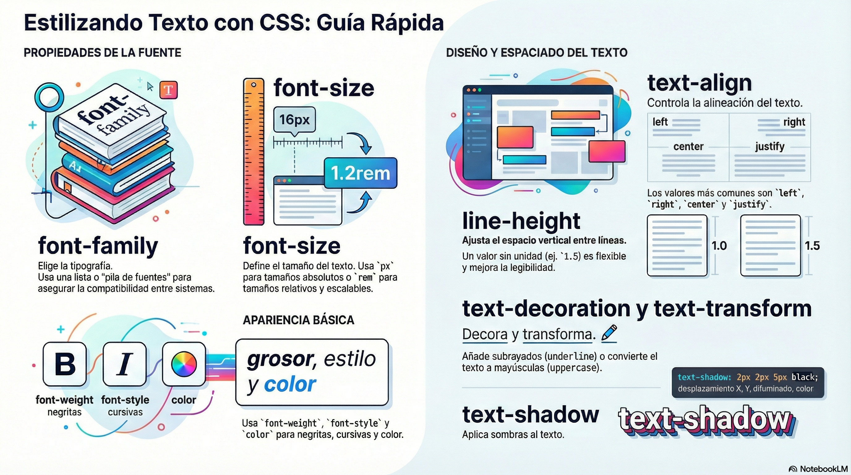
Estilo de fuente, peso, transformación y decoración
CSS proporciona cuatro propiedades comunes para alterar la apariencia visual del texto:
- font-style: Se usa para activar y desactivar la cursiva en el texto. Los valores posibles son los siguientes (rara vez usarás esto, a menos que quieras desactivar algún estilo de cursiva por alguna razón):
normal: Establece el texto en la fuente normal (desactiva las cursivas existentes).italic: Establece el texto para usar la versión cursiva de la fuente si está disponible; si no, simulará las cursivas con oblicua en su lugar.oblique: Establece el texto para usar una versión simulada de la fuente cursiva, creada inclinando la versión normal.
- font-weight: Establece qué tan grueso o delgado debe mostrarse el texto. Esto puede tomar valores de palabras clave
normal,bold,lighter,bolder, o valores numéricos de100a900. - text-transform: Te permite configurar tu fuente para que se transforme. Los valores incluyen:
none: Evita cualquier transformación.uppercase: Transforma todo el texto a MAYÚSCULAS.lowercase: Transforma todo el texto a minúsculas.capitalize: Transforma todas las palabras para que la primera letra sea Mayúscula.full-width: Transforma todos los glifos para que se escriban dentro de un cuadrado de ancho fijo, similar a una fuente monoespaciada, permitiendo alinear glifos latinos junto con glifos de idiomas asiáticos (como chino, japonés, coreano).
- text-decoration: Establece o desactiva las decoraciones de texto. Se utiliza principalmente
text-decoration: none;para eliminar el subrayado predeterminado de los enlaces al estilizarlos. También puedes usarunderline(subrayado),overline(línea superior), yline-through(tachado). Ten en cuenta quetext-decorationpuede aceptar múltiples valores a la vez, por ejemplotext-decoration: underline overline. También ten en cuenta que text-decoration es una propiedad abreviada para text-decoration-line, text-decoration-style, y text-decoration-color. Puedes usar combinaciones de estos valores de propiedad para crear efectos interesantes, como por ejemplo:
p {
  font-size: 1.5rem;
  font-family: sans-serif;
  font-weight: bold;
  text-transform: uppercase;
  text-decoration: underline red wavy;
}
Ejercicio propuesto: Estilo, peso, transformación y decoración
Crea un sitio web con al menos 15 párrafos para mostrar la mayoría de los valores que se pueden usar con las propiedades
font-style,font-weight,font-transformyfont-decoration.Este es un ejemplo del resultado que deberías obtener (puedes elegir tus propias combinaciones):
Sombras de texto
Puedes aplicar sombras proyectadas a tu texto usando la propiedad text-shadow. Esto toma hasta cuatro valores, como se muestra en el ejemplo a continuación:
text-shadow: 4px 4px 5px red;
Las cuatro propiedades son las siguientes:
- El desplazamiento horizontal de la sombra desde el texto original. Esto puede tomar la mayoría de las unidades de longitud y tamaño disponibles en CSS, pero usarás más comúnmente
px. Los valores positivos mueven la sombra a la derecha, y los valores negativos a la izquierda. Este valor debe incluirse. - El desplazamiento vertical de la sombra desde el texto original; se comporta básicamente igual que el desplazamiento horizontal, excepto que mueve la sombra hacia arriba/abajo, no izquierda/derecha. Este valor debe incluirse.
- El radio de difuminado. Un valor más alto significa que la sombra se dispersa más ampliamente. Si este valor no se incluye, por defecto es
0, lo que significa que no tendrá difuminado. Esto puede tomar la mayoría de las unidades de longitud y tamaño disponibles en CSS. - El color base de la sombra, que puede tomar cualquier unidad de color CSS. Si no se incluye, por defecto es currentColor, es decir, el color de la sombra se toma de la propiedad color del elemento.
También puedes aplicar múltiples sombras al mismo texto incluyendo múltiples valores de sombra separados por comas, por ejemplo:
text-shadow: 1px 1px 1px red,
             2px 2px 1px red;
Ejercicio propuesto: Sombras simples
Crea un sitio web con al menos 15 párrafos con sombras, cada uno con diferentes desplazamientos y colores. También puedes cambiar cualquier otra propiedad que te guste, como la familia de fuentes. Deberías usar Google Fonts para asegurarte de que todo se muestra de la manera correcta para todos los sistemas operativos y navegadores.
Este es un ejemplo del resultado que deberías obtener (puedes elegir tus propias combinaciones):
Ejercicio propuesto: Sombras múltiples
Crea un sitio web con al menos 10 párrafos, cada uno con múltiples sombras y también diferentes desplazamientos y colores. También puedes cambiar cualquier otra propiedad que te guste, como la familia de fuentes y el tamaño de fuente. Deberías usar Google Fonts para asegurarte de que todo se muestra de la manera correcta para todos los sistemas operativos y navegadores.
Este es un ejemplo del resultado que deberías obtener (puedes elegir tus propias combinaciones):
Alineación de texto
La propiedad text-align se usa para controlar cómo se alinea el texto dentro de su cuadro de contenido contenedor. Los valores disponibles son los siguientes, y funcionan casi de la misma manera que lo hacen en una aplicación regular de procesador de textos:
left: Justifica el texto a la izquierda.right: Justifica el texto a la derecha.center: Centra el texto.justify: Hace que el texto se expanda, variando los espacios entre las palabras para que todas las líneas de texto tengan el mismo ancho. Necesitas usar esto con cuidado, ya que a veces puede verse terrible, especialmente cuando se aplica a un párrafo con muchas palabras largas. Si vas a usar esto, también deberías pensar en usar algo más junto con ello, como hyphens, para romper algunas de las palabras más largas a través de las líneas.
Por ejemplo, puedes centrar algún texto simplemente usando el siguiente código CSS:
text-align: center;
Ejercicio propuesto: Tipos de alineación
Crea una página web con 4 encabezados y 4 párrafos, cada uno con un tipo de alineación diferente.
Puedes usar cualquier texto que te guste, pero teniendo en cuenta que debes insertar varias líneas para ver correctamente cómo se realiza la alineación:
Altura de línea
La propiedad line-height establece la altura de cada línea de texto. Esto puede ayudar a mejorar la legibilidad. A menudo se establece como un valor sin unidades (como 1.5), que actúa como un multiplicador del tamaño de la fuente.
p {
  line-height: 1.5;
}
Ejercicio propuesto: Alturas de línea
Experimenta con diferentes alturas de línea en un párrafo de texto largo para ver cómo afecta a la legibilidad. Prueba valores como 0.8, 1, 1.5 y 2.
Espaciado entre letras y palabras
Las propiedades letter-spacing y word-spacing te permiten establecer el espaciado entre letras y palabras en tu texto. No usarás esto muy a menudo, pero podrías encontrar un uso para obtener una cierta apariencia, o para mejorar la legibilidad de una fuente particularmente densa. Pueden tomar la mayoría de las unidades de longitud y tamaño.
Así que como ejemplo, podríamos aplicar algo de word-spacing y letter-spacing así:
word-spacing: 4px;
letter-spacing: 4px;
Ejercicio propuesto: Espaciado
Crea una página web con al menos 2 encabezados y 2 párrafos, cada uno con diferente espaciado de palabras y letras (puedes elegir los valores que quieras).
Especificación de fuente abreviada
Muchas propiedades de fuente también se pueden establecer a través de la propiedad abreviada (shorthand) font. Estas son: font-style, font-variant, font-weight, font-stretch, font-size, line-height, y font-family.
Si quieres usar estas propiedades abreviadas, hay algunas cosas que debes tener en cuenta:
- Debes especificar valores para estas propiedades en el siguiente orden:
font-style,font-variant,font-weight,font-stretch,font-size,line-height, yfont-family. - Si omites valores para cualquier propiedad, se usará el valor predeterminado (o heredado), excepto para
font-sizeyfont-family, que son obligatorios. - Se requiere una barra inclinada (
/) entrefont-sizeyline-height.
Un ejemplo completo podría ser el siguiente:
p {
  font: italic bold 16px/1.5 "Courier New", monospace;
}
Ejercicio propuesto: Propiedades de fuente en una línea
Intenta reescribir el CSS de uno de tus ejercicios anteriores usando la propiedad abreviada
fontsiempre que sea posible.
Otras propiedades que vale la pena mirar
En esta unidad queríamos cubrir sólo las propiedades más importantes. Una vez que te hayas acostumbrado a usar las anteriores, también deberías echar un vistazo a las siguientes propiedades:
Estilos de fuente:
- font-variant: Cambia entre alternativas de versalitas y fuentes normales.
- font-kerning: Activa y desactiva las opciones de interletraje de fuente.
- font-feature-settings: Activa y desactiva varias características de fuentes OpenType.
- font-variant-alternates: Controla el uso de glifos alternativos para una tipografía dada.
- font-variant-caps: Controla el uso de glifos de mayúsculas alternativos.
- font-variant-east-asian: Controla el uso de glifos alternativos para escrituras de Asia Oriental, como japonés y chino.
- font-variant-ligatures: Controla qué ligaduras y formas contextuales se utilizan en el texto.
- font-variant-numeric: Controla el uso de glifos alternativos para números, fracciones y marcadores ordinales.
- font-variant-position: Controla el uso de glifos alternativos de tamaños más pequeños posicionados como superíndice o subíndice.
- font-size-adjust: Ajusta el tamaño visual de la fuente independientemente de su tamaño de fuente real.
- font-stretch: Cambia entre posibles versiones estiradas alternativas de una fuente dada.
- text-underline-position: Especifica la posición de los subrayados establecidos usando el valor
underlinede la propiedadtext-decoration-line. - text-rendering: Intenta realizar alguna optimización de renderizado de texto.
Estilos de diseño de texto:
- text-indent: Especifica cuánto espacio horizontal se debe dejar antes del comienzo de la primera línea del contenido de texto.
- text-overflow: Define cómo se señala a los usuarios el contenido desbordado que no se muestra.
- white-space: Define cómo se manejan los espacios en blanco y los saltos de línea asociados dentro del elemento.
- word-break: Especifica si se deben partir las líneas dentro de las palabras.
- direction: Define la dirección del texto (esto depende del idioma y generalmente es mejor dejar que HTML maneje esa parte ya que está ligada al contenido del texto).
- hyphens: Activa y desactiva la separación silábica para los idiomas compatibles.
- line-break: Suaviza o refuerza el salto de línea para idiomas asiáticos.
- text-align-last: Define cómo se alinea la última línea de un bloque o una línea, justo antes de un salto de línea forzado.
- text-orientation: Define la orientación del texto en una línea.
- overflow-wrap: Especifica si el navegador puede o no partir líneas dentro de las palabras para evitar el desbordamiento.
- writing-mode: Define si las líneas de texto se disponen horizontal o verticalmente y la dirección en la que fluyen las líneas subsiguientes.
Test
Comprueba tus conocimientos con este test sobre los conceptos básicos de CSS, los colores y selectores tratados en esta unidad.